Hi there,
I’m hearing/researching a lot about logos and the lack of need for illustration. This is a pretty stark change of course for me and when I began designing, so I want to hear what you’ve learned and what your internal (or external) wisdom reveals and do you have a hard and fast teqnique? I’ve also attached an illustrated logo for your critique.
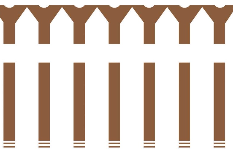
The logo was created for a company who does mostly residential new and renovated construction. In addition, they also offer interior design. Our collaborative goal was to create a logo that depicted their ability to make a house; a home.
This version doesn’t include the company name, which is located directly below the image, on a single deck.
The white fence stands for the quintessential American dream of a white picket fence surrounding a home. In the negative space, you’ll see the fence is created using screws.
Please share your critique as well as your thoughts on convincing clients (if you agree) that a logo doesn’t have to be illustrated in order to properly sell the company’s abilities.
Many thanks!
strong text
I agree that a logo doesn’t necessarily need to have a graphic.
A logo’s job, I believe, is to support the brand visually and be memorable enough to help people remember the company’s name. It has to work in black and white, and at all sizes.
My default is to start with just the name, see if it works as a logo with an appropriate font, maybe just initials, maybe the whole thing spelled out, maybe incorporate a graphic, or maybe not. It really depends.
I do like to have the name with the logo, because potential customers aren’t going to remember the name from the graphic. (Until it’s Nike, anyway.) And if they can’t remember the company name, they can’t contact them. So I start with the name and go from there.
For a construction company, if the name alone didn’t work, I’d probably explore adding tools, toolbox, saw, backhoe, etc.. Something that clearly says construction, because I’m kinda OCD about clarity and specificity. 
You said they “offer” interior design? Paired with construction? Is it an afterthought, or a large share of their work? I’d almost certainly just go with the name, for this combination.
Thanks for sharing your thoughts! This logo does have a company name that goes with the illustration but for critique purposes, I am more interested in a critique of the illustration itself.
The company does equal renovation construction and interior design. The goal is to communicate their intention to “make your house a home.” So in terms of construction, I thought the screws were enough to convey that portion especially with the white picket fence, again a major American symbol.
So I definitely agree with what you’re saying but at what point do you believe a designer stops with illustrated logos and utilizes the name design only?
My experience has shown that client’s are looking for something that is a literal communication and to create a mark like Nike or Amazon takes a lot of marketing reinforcement…which is probably a good lesson in and of itself…don’t sell a logo alone…
First off critique; I see a line of cigarettes before I see a picket fence.
The point at which a designer stops with illustrated logos is where the market is, what the attitude of the brand is, client request, and shouldn’t be but is, how well the chosen designer can pull off an illustration.
1 Like
Is it really a good idea to represent a company to the end client as either
a) a bunch of loose screws or
b) the suggestion of screwing the client
?
Not that I see screws in your illustration to begin with. A row of crutches maybe. The fence didn’t even quite register.
Logos do not have to spell out what the company does, nor do logos have to be as abastract as Nike’s swoosh. The logo does have to convey a certain “market feel” that appeals to the end client demographic. For instance, is a screw going to appeal to that person who just wants their kitchen remodeled? No one cares how it goes together. They care about good quality and good looks. A screw or two isn’t going to do that. Not for the high end buyer anyway. For a handyman service maybe.
Is the white picket fence still a symbol of the American Dream to Millennials?
(That’s a serious question. I don’t know the answer.)
I’ts interesting to me that you saw it that way. Millennials were most definitely not the audience here.
Well thank you all for your opinions.
If “home” is the key word here, then how about something like these?
(reversed and without the gradients)
1 Like
Oh, I’m a pessimist where it comes to screws and home improvements, after having been ripped off by so many contractors over time.
Millennials were most definitely not the audience here.
And therein lies the difficulty with trying to critique a logo design without knowing the full design brief.
DocPixel, So you want this company to look like all those other companies and blend right in?
I had to look twice to be sure the first two weren’t the same logo. LOL.
1 Like
I know, I know…
These were just examples of a more home-type graphic, as opposed to screws, picket fences and cigarettes. I’m sure US_IdeaS could design a more unique and original one. 
1 Like
I’m good thanks so much! I’m not looking to redesign as this was an old logo, that’s already been used. Just wanted a critique and dialogue on illustrative vs non-illustrative logos.