In one of the Crit Pit entries the OP showed a logo (I hope). It was a rather pedestrian piece of work, and the typeface that went with it, to my mind, was downright ugly. That got me thinking … Has there ever been a particular typeface that pierced your heart like a long rusty nail (of which I’ve had many)?
Blippo Black is right up there. I couldn’t stand it when it was popular back in the 1970s. For that matter, it’s likely the first typeface I ever really noticed, and I noticed it because it was (and still is) so ugly.
I’ve always detested Hobo, even though it was designed by Morris Fuller Benton who also designed one of my all-time favorite typefaces, Franklin Gothic.
I cringe each time I see Algerian used, and I can’t even begin to imagine why someone would choose that typeface over any other one of the tens of thousands of typefaces available.
There are a few typefaces I never use because I have no need for them and also because they’re so common and misused. I’d put Comic Sans, Papyrus, Zapf Chancery, Impact, Brush Script, etc., into this category. Otherwise, they likely wouldn’t make my dislike list. Instead, it’s the awfulness of their ubiquity that makes them so terrible.
There are other typefaces I won’t use for the simple reason they conjure up images of decades past. I’d place Korinna, Souvenir, Eras, Eurostyle/Microgramma, Cooper Black and Avant Garde into this category.
Several other typefaces, like Helvetica and Times Roman have been cursed due to them being the default faces of every clunky website and homemade printed flyer ever made. They’re great typefaces, but their reputations have been irreversibly sullied.
There are still other typefaces that I just dislike because I don’t like how they look, but I’ve already mentioned them.
There are times in the work I do where typefaces that conjure up decades past is very very appropriate. For instance doing an educational exhibit about an early 1800’s textile mill or the Civil War makes Copperplate totally acceptable.
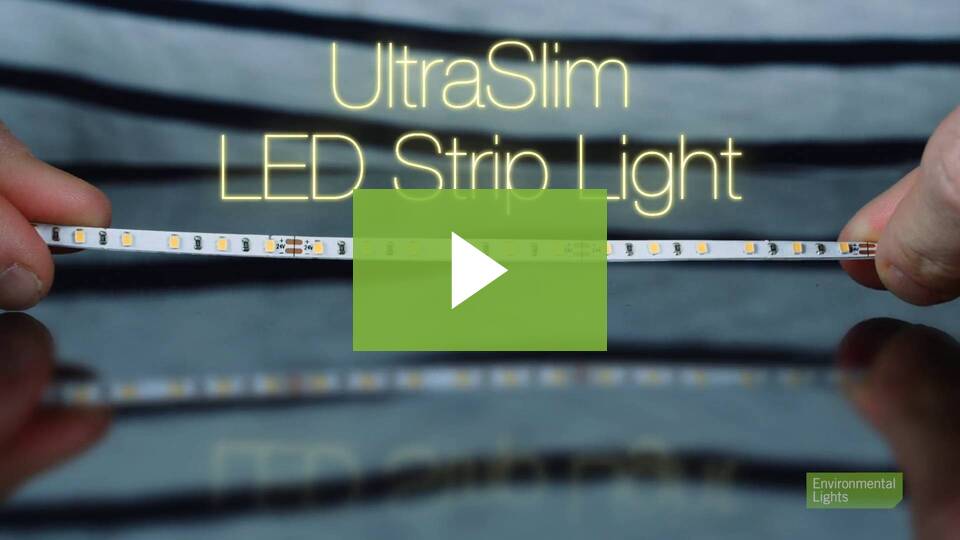
I don’t particularly think any typeface is “ugly.” Sure I really dislike skinny stick faces, but only if used in logos and only if you want something other than a printed sign on a board. Just yesterday someone sent me an RFQ for a bunch of words they wanted as halo lit can letters on a wall. The face wasn’t ugly, and the photoshop mockup they made for the client looked totally beautiful, but because the serifs and crossbars were too narrow to fit LED tape into, the halo-lit result would have been pretty darn ugly.
We have everything from gomping big-lensed LEDs to skinny LightWire (EL Wire)
What it has to do is throw enough light against a wall to read as a halo in an already lit room. A lot of times being dimmable needs to be an option too. The tape we usually use is around 8mm.