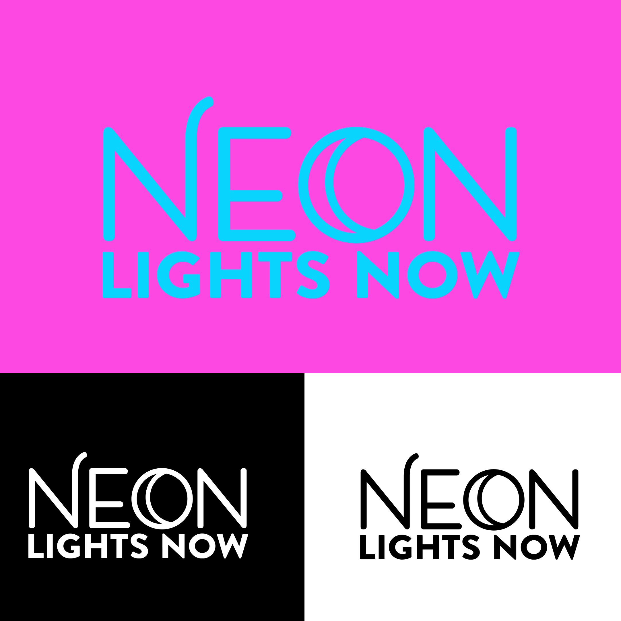
Hello. I’m in the process of creating a logo for a neon sign company. I have come up with two versions with different fonts and icons. The theme is the moon. The logos presents contain all the aspects that can be rearranged for different usages. I’m looking for constructive criticism. Thanks in advance!
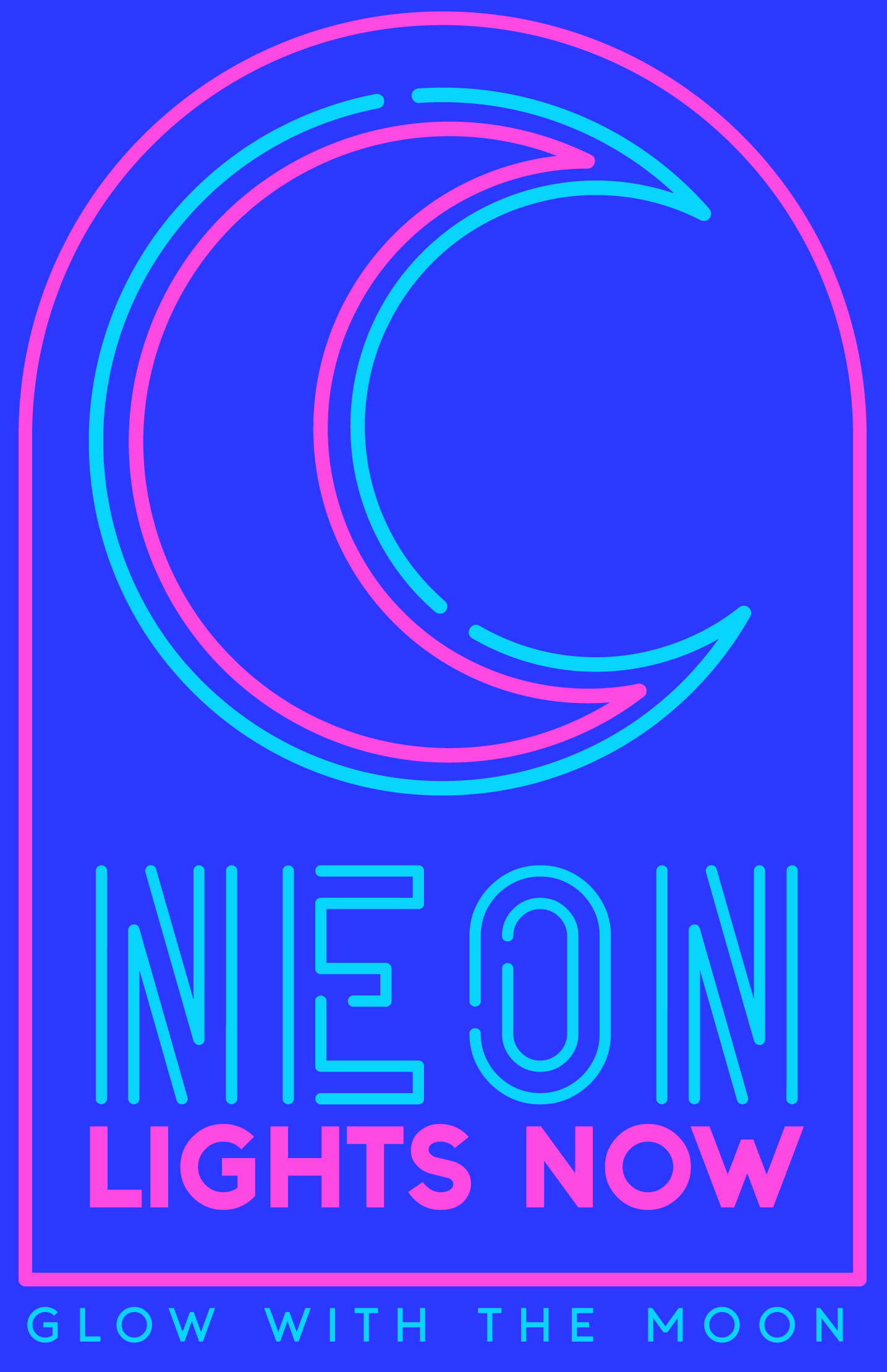
What is the name of the company? If it’s Neon Lights Now, It’s not legible. It may be because you are sharing the line of the N with the E. Reconsider that maybe.
The line under is actually more visually eye-attracting, so is that maybe the company name?
Also, you might want to run this by the client. You have things in there that neon doesn’t do. The H and the O in particular. And the filled back angles of the light blue moon too
Thank you for your feedback.
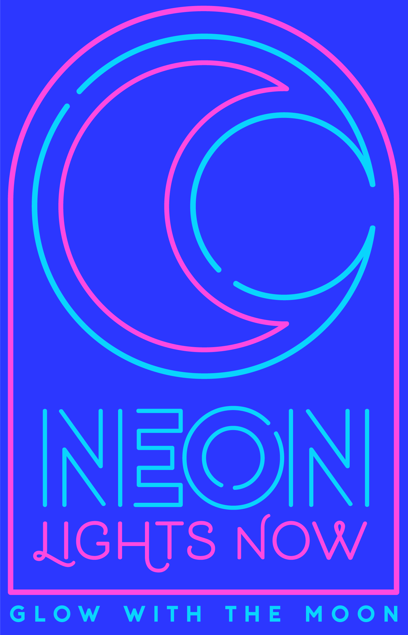
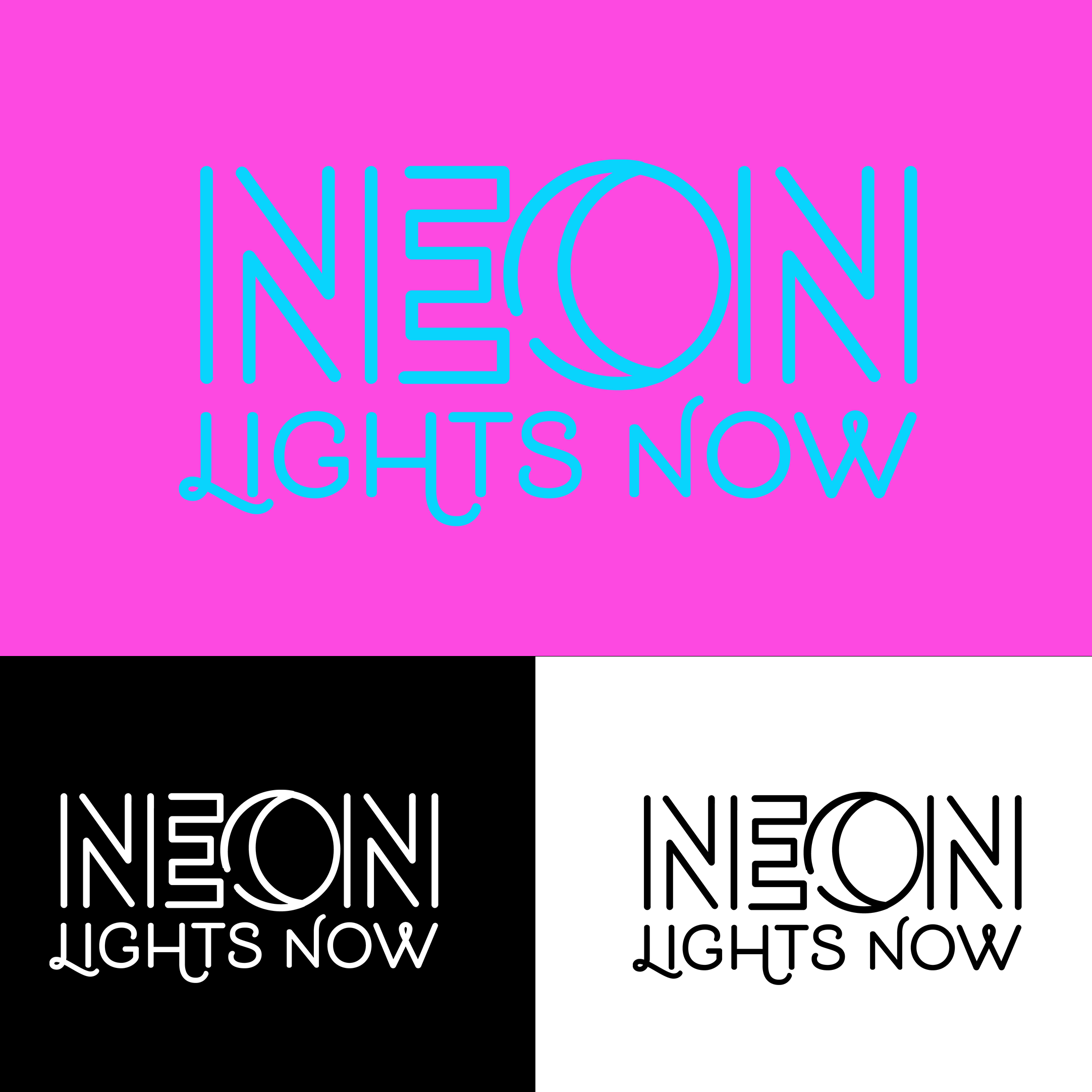
The name of the company is Neon Lights Now. In which version? I combined the N and E in the second one. I found two line unnecessary next two either and they looked like I or a lower case L. Another font may be a better choice.
The client loves them both, but it open to another concept. Can you elaborate on the “things that neon doesn’t do,” the H and O?
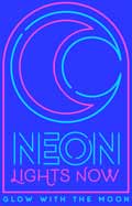
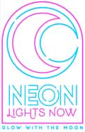
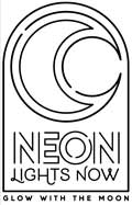
Yes. This is one version of the logo. The client will have multiple arrangements. This version of their logo is mainly for the purpose of their physical neon light that would be installed in their shop.
I think the top versions you showed have way too much going on — they’re a bit cluttered. Although appropriate for a neon lighting company, the neon colors aren’t printable, but it seems you also have thought about CMYK and B&W versions.
If it were me, I wouldn’t even consider a colored background other than black. A colored background competes with the colored letters.
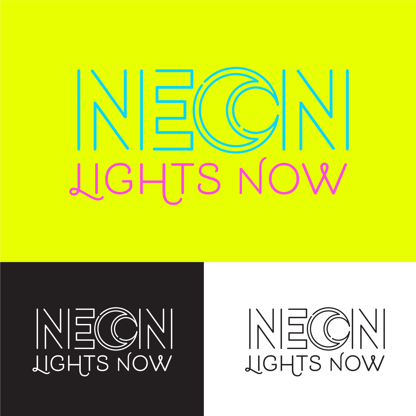
I’d scrap the first ideas you showed us and concentrate on your simpler, more recent ones. Experimenting with the O being the moon is a good idea, but I’d probably skip the double lines or find a way to better match them with the letters.
If you use the moon, the tagline in the first example does help provide a rationale for the moon. However, that tagline also creates a problem in that it’s too complex for neon tubing.
I do like how you’ve combined the N and the E. To me, the two letters are instantly recognizable.
Thank you. That’s the reason it’s main purpose is going to be used as a neon sign, minus the tagline.
Same thought. The royal blue, or yellow won’t be used for their branding colors, just the bright pink and indigo blue. Their website colors are pink, blue, and white.
The moon O has been a challenge to make it visible as a moon in smaller sizes. I came up with double lines to make it unique and not just the typical moon. I have shown friends the logo and they’ve said they can see it’s a moon. One said they see the moon and sun.
I’m not sure I understand how it’s too complex for neon tubing. Care to give more details? My thought process with it is neon lights have a “glow”, are more attractive and visible in the darkness just as the moon. Would “Glow like the moon.” be a better fit?
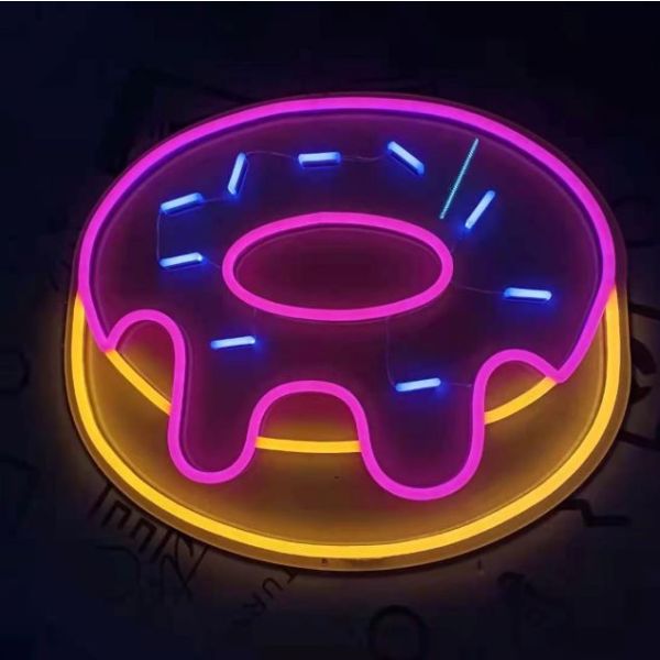
The gallery here gives you a real understanding of how true bent neon tubing is constructed. The O will always have a gap somewhere. With the H, the bendback depth and blackout to hide the H bar connections will determine whether or not that bar is split back through the sign face. You can only bend a glass tube in an arc, not a point. The arc depends on the glass tube diameter. You cannot mix diameters on the same line of a letter or element, though you can use two different tubes in the same sign.
Have a look:
1 Like
Hi! Thank you for that information. However, I should have been more specific. They are a silicone and acrylic neon sign company. Silicone tubing allows for connecting letters and artwork unlike glass tubing.
LED signs then.
I’m pretty sure you can’t join the ends of an O even with that fake LED tubing.
I really hate going to a website for neon only to find that fake plastic stuff. Nothing wrong with it for some applications, but you know, sometimes people do want the Real Thing in all it’s high voltage, gaseous glory.
You most certainly can with silicone tubing.
That’s your opinion, but there’s definitely a huge demand “fake” LED signs.
I guess I’m just old school. With emphasis on old, LOL
It mighta been useful info for critique though. Looks like everyone assumed glass.
Yeah, and why wouldn’t they? Instead, it’s yet another case where language is bent until it breaks. The company’s name is “NEON,” and it’s a full-on misrepresentation of their product, but we’re not supposed to care.
Correct me if I’m wrong, neon has multiple definitions…one being very bright or fluorescent in color; which fits what they sell. That makes sense to me.
Okay I will. No, neon does not mean
That was also a bastardization of the word.
The electro-fluorescence of neon gas enabled its use in fluorescent lighting. As can be said of several known gases, under certain conditions, neon emits fluorescence. The two words were never rightly synonymous.
1 Like
My comment about the original “Glow With The Moon” tagline being too complicated for neon tubing in a logo was based on the assumption we were talking about neon tubing — not LED lights.
Until I looked it up just now, I didn’t realize how many companies were misrepresenting their lighting as neon when no neon gas is involved. This seems a bit like a fast-food chain advertising hamburgers when they actually sell vegi-burgers or an artificial sweetener being labeled as sugar. There’s nothing wrong with LED tubing, but it’s not neon and shouldn’t be mislabeled as such.
None of that’s your fault, of course, but as you said, you probably should have mentioned it.
@HotButton You never mentioned anything about the design of the logos: which leads to believe your intention was never to offer feedback and I’m not here for semantics. I’ll leave it at that with you, unless you have feedback in regards to the logos presented. Thanks for your time and information.
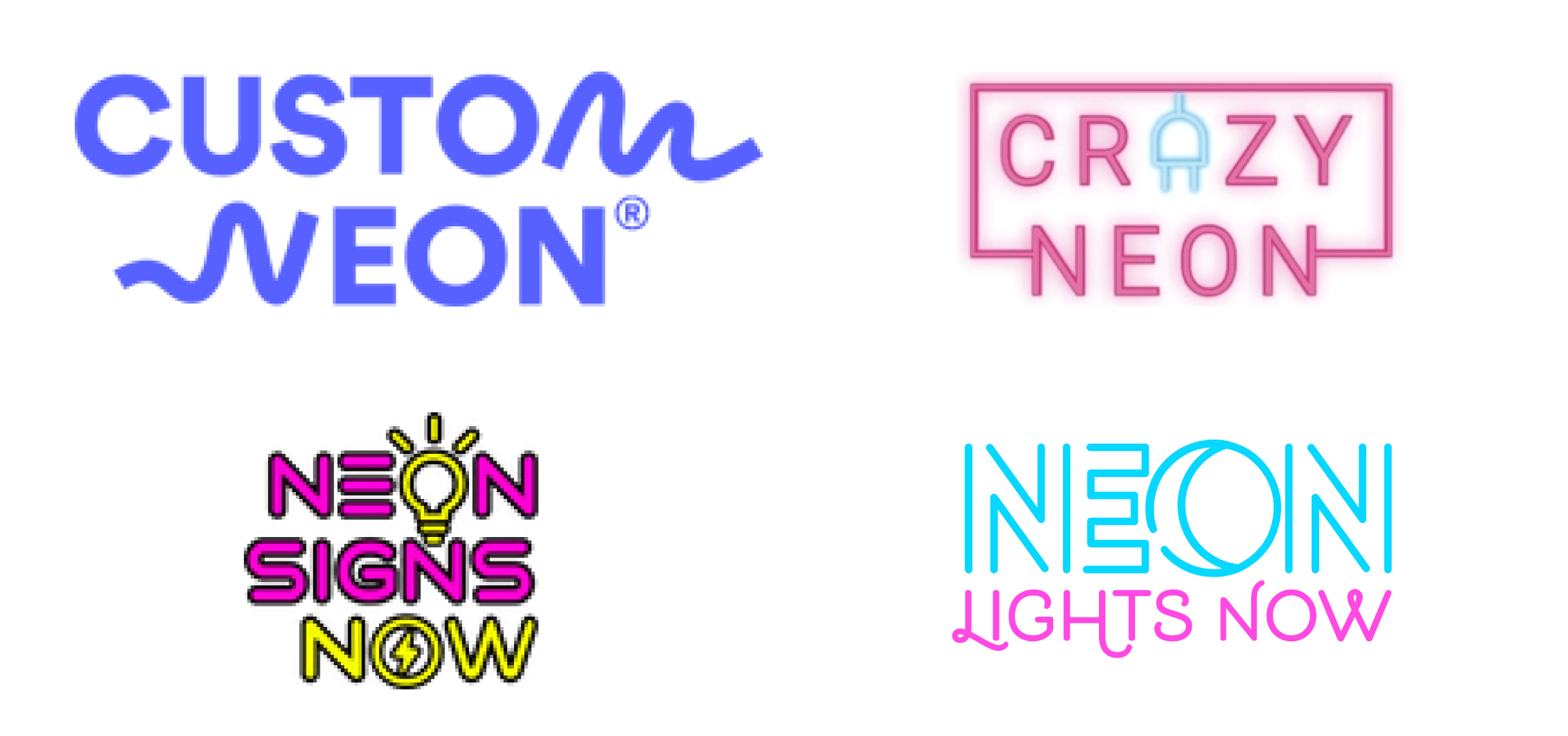
@Just-B Ah, I understand. The tagline won’t be used on their sign. But that is their tagline. I think I’ve managed to add the moon into the design that is visibly pleasing. I’ve included the logos of top neon sign companies for comparison.
I hear you, but I both agree and disagree. It’s accurate to me because it’s being used as an adjective in regards to the luminance and color range of the lights they offer; which is how it’s most commonly used.
Well I am, when it’s called for. Some bloke that a lot of people hold in very high regard for some reason is credited with the holy words (paraphrased), “design isn’t just how it looks, it’s how it works.” My comments were entirely relevant to the design, and how it works. I know you didn’t name the company, and (hopefully) you also aren’t responsible for conflating tubular lighting with one of Earth’s moons, but no matter what you do with the graphics, those two inescapable flaws ruin the design of the brand. You can receive it as semantics because that’s how people decline to debate, but I deliver it as critique, and that is what you’re here for.