I like the Flamingo in #3
though as stated above, it could be a person bending over and waiting for someone to come [sic] by.
I like the Flamingo in #3
though as stated above, it could be a person bending over and waiting for someone to come [sic] by.
Thank you for your reply!
As for the lightbulb I don´t like it very much either, just throwing some idea out there.
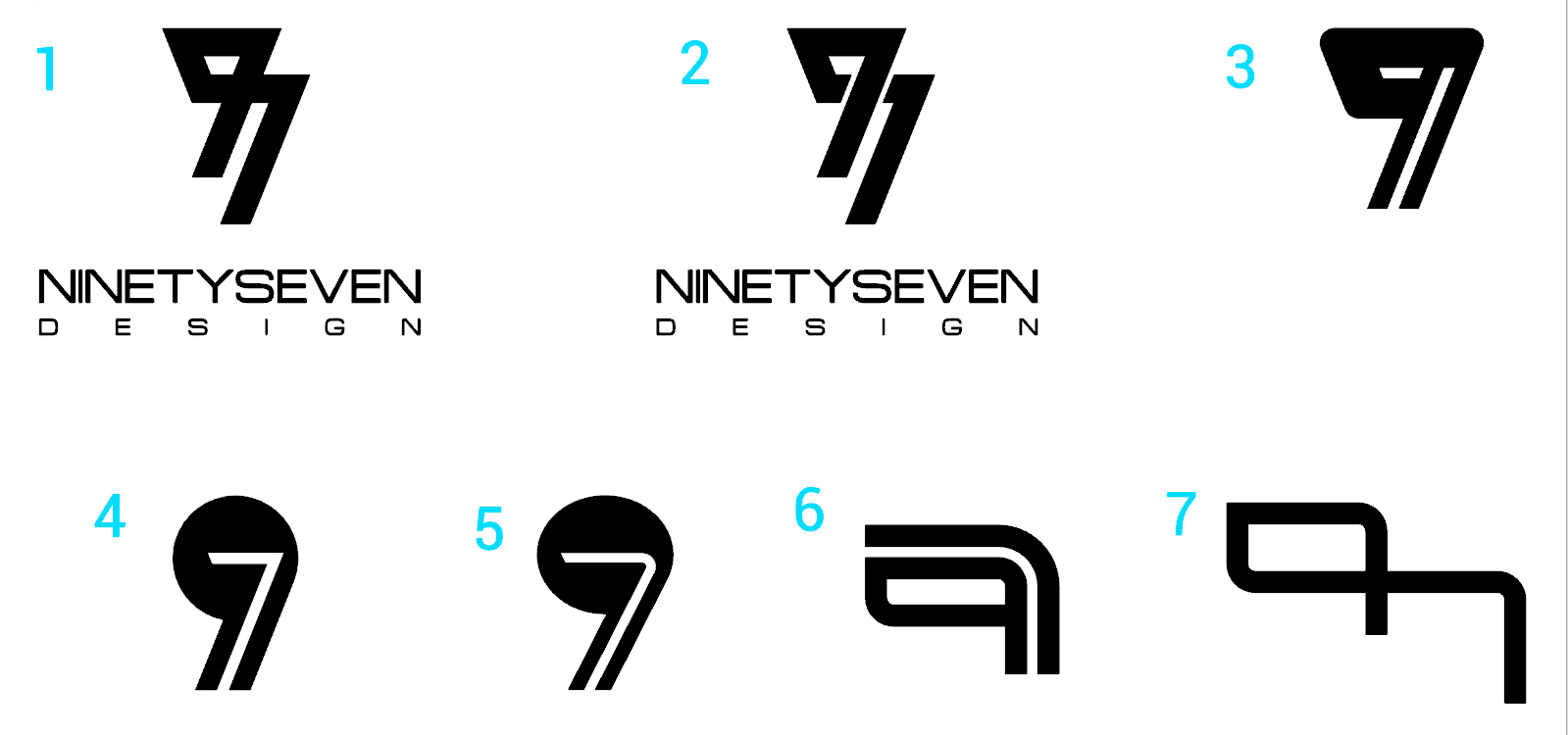
Do you think the 7 is stressed more in #3 tan the 9?
Oh and the letter I is the 9th and the G is the 7th of the alphabet.
Thanks for your feedback
Thank you very much for your critique. Any ideas as to how I can make them right or which has the most promise?
Thanks for your reply! No, I wasn´t trying to aim for a person bent over. It is supposed to be a 9 and a 7 merged.
I´ll keep sketching.
Thanks for your reply!
For what it’s worth, ninety-seven should be hyphenated. Companies with typos in their names can make a bad first-impression.
As for the numeral 97, I think you’re trying to force those two glyphs to do things they just don’t want to do. One thing I learned early in my career is that when a seemingly good idea doesn’t pan out quickly, the best thing to do is move on to the next idea.
Ok so I kept sketching as some of you suggested and made it simpler. I only included the name on the first two but all of them would have it. I´m looking to have a name and a mark that can be recognizable for itself.
What do you think?
I get what you say about the hyphen being the correct grammar but on this case I think I´m gonna leave it without it for aesthetic purposes.
Do you think my new designs work out better?
Thanks for your feedback!
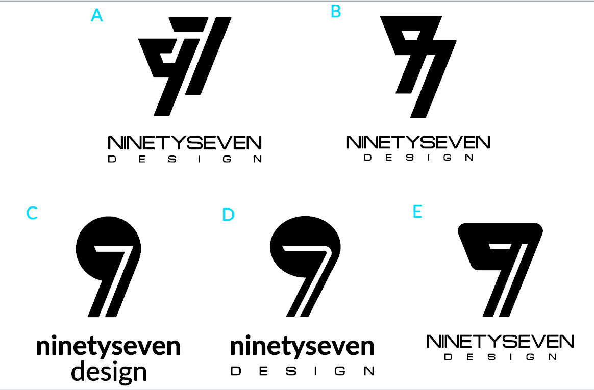
#1 is the best, however it still needs some adjustments and maybe some shape of enclosure or partial enclosure.
Some of the other users suggested to make it more simple, which I think I made. Don´t you think that by adding enclosure I´m gonna make it more complex or ´overdesigned´?
Thanks for your feedback!
It seems too open. Just a collection of shapes beside each other. Something like a half circle border might make everything appear as a single element. But that’s just my opinion.
Or all reversed out of a half circle solid black.
The 97 is too far away from text too.
Also use the ninetyseven from the old one’s #4 (Not the word “design” tho)
Hi NinetySeven,
Nice designs…
I like the idea of the 9 and 7 being part of your name in I and G. I would think that the company name should be nine seven myself… 97 technically goes outside the alphabet  But I understand how people would read it too… so… there is a quandary.
The design that i would like to see more like a 9 and 7 is your logo design idea number 4-5…
Perhaps the way to make it work would somehow to work the 9 as the outer portion of the bulb and the 7 as the filament.
I look forward to seeing what comes of this post and your logo!
-Line
Hi everybody! Thank you all for your kind feedback and critique. It seems that I´m getting mixed comments and ideas from my logos and I´m kinda lost as to what direction I should go for. So I´ve selected my 5 personal favorites from all the options that I posted and now using letters to identify them and avoid confusion.
I would appreciate a lot your help since I don´t havea lot of logo design expertise.
What do you guys think???
Version A Aside from it being a 9 and 7, i’m not sure what else it could be. It is recognizable though and a cool looking design.
Version C is also nice. Easily identifiable. The only issue I have is the way the corner point of the top right of the 7 doesn’t blend with the 9 like Version D sort of does. Perhaps adding a curve to that corner in Version C would be cool. (Don’t forget the inner corner of the 7 for a curve as well)
I like B. There’s something elegant about how the 97 is made up one unit. Have you tried making the top left point a round instead of a sharp corner? That might help the readability of the 9.
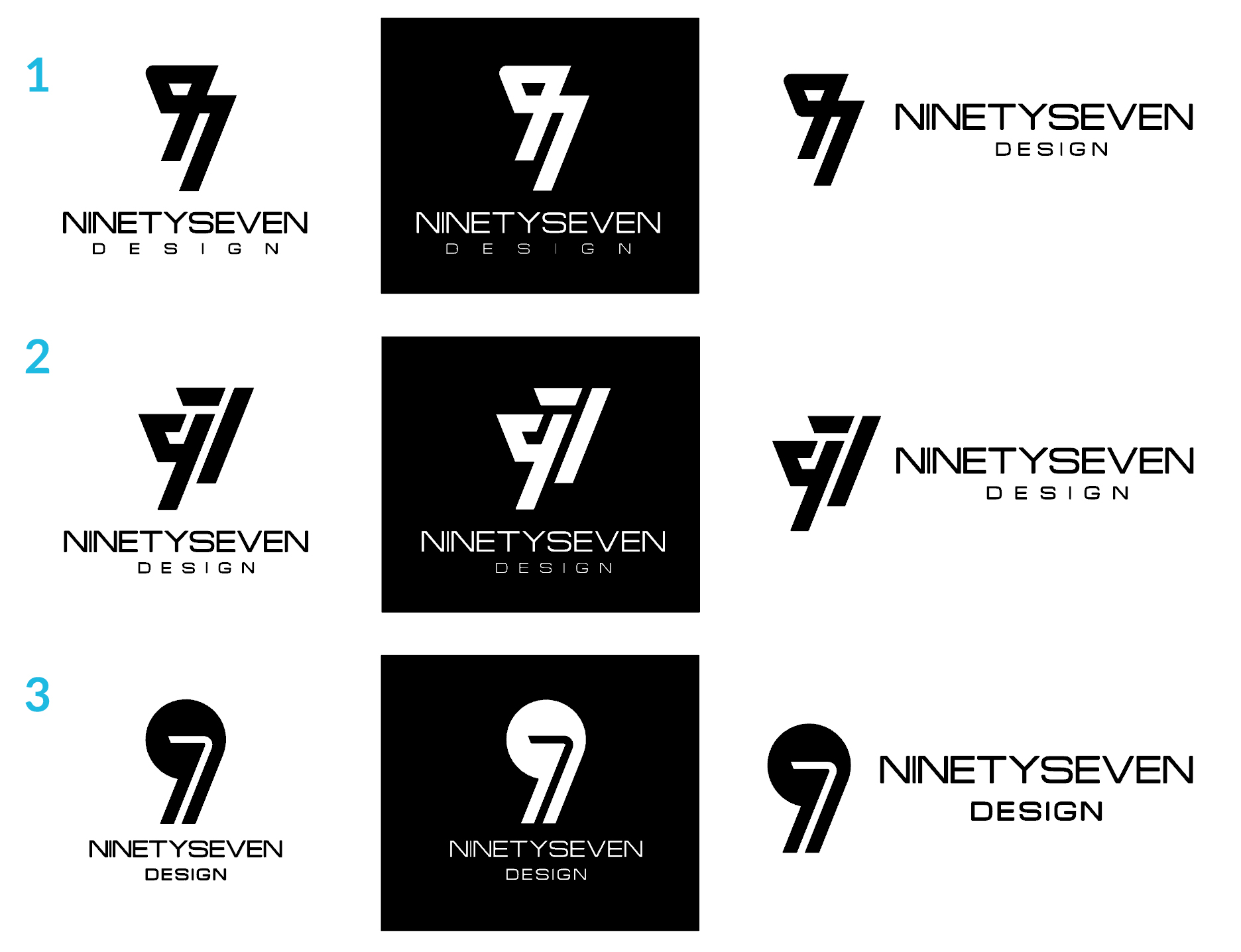
Thank you Line and Buda for your comments. I took your advice and made those changes to the designs and this is what I came out with. I´ve narrowed it to 3 options and included for each a black background and the logo in horizontal mode to see how they work in different situations. I think I´m getting close!!
I’m a student, so don’t take my word as expert advice, but at first glance, I’m really drawn to the third option. The first two seem too intense for me. I like the contrast you have between the rounded icon and the more box-like type of option 3. And it’s nice and simple!