OK. I can see it now, but I couldn’t figure it out to begin with. The trouble is that if others are like me, they won’t have you there to tell them the K’s are running.
This is hard to read, the Ks do look like lower case Ys, the running Ks are not immediately obvious, and the halo and other flourishes seem like a tack-ons. On top of it, nothing about this seems luxury or upscale. Sorry, not trying to be harsh or throw flames or whatever it is people say these days. My comments are simply my observations and intended to help you get the best solution possible. I’d say it’s time to go back to the drawing board on this one.
Thanks Steve_O. it would be a lot more helpful if you could provide some suggestions for improvement. Even if they are just small ones. Criticisms alone are not really helpful.
On first reading I really thought it said ‘Kindy Kit’ - perhaps separating the words out a little more might help? Or at least not joing the second K into the D which is giving me the idea that it’s a Y and a K joining up.
I didn’t get that it was a halo until I read your description.
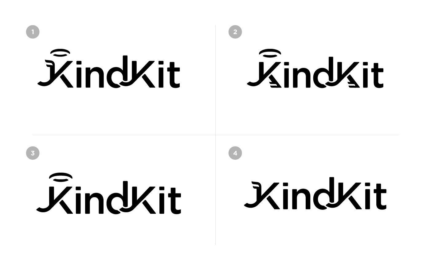
I really like the detailing on the K in the #2 logo - it gives a nice sense of motion and speed.
K is looking like Y in both the places. At first, I was confused when I saw it. If you want to show running and motion you can use some other fonts. Btw second one is better than others.
By your own admission, you’re “driving [yourself] insane tweaking this logo” and you’re asking for “suggestions for improvement,” yet you seem to be ignoring the consensus of three seasoned professionals who are indicating that you have legibility issues. It could be that you need to explore a different direction rather than finding the magic bullet that will turn the current iteration into a great logo.
You’ve done some things right with this logo: it works in one color, it doesn’t rely on drop shadows or gradients, it could be easily reproduced across a wide variety of mediums, etc. This makes me think that you have some experience and this isn’t your first logo. I know from personal experience that sometimes designers fall in love with an idea and try to force a solution.
The core idea of a K that shows motion is a good thought. What if the K or KK monogram becomes a stand-alone mark that was accompanied by simplified and more legible KindKit type? Think Under Armour logo. The K could then be running (which still could be tough to pull off) or with the Mercury-esque wings added.
I agree with @Steve_O. You’re asking for suggestions to fix what you have, but the trouble might be that what you’re trying to do can’t be fixed because it’s based on something that’s unlikely to work. It’s a nice idea, but there reaches a point where the options are explored and it becomes obvious that the flaws can’t be overcome without a big rethink.
Your attempts to make the K’s look like they’re running have made the name of the brand less readable, which is something that’s always bad in a logo design. Several of us have commented on not knowing for sure whether the letters are K’s or Y’s and whether the brand name is KindyKat or KindYat or something else.
I haven’t played around with it, but I’m doubtful there’s a way to make a K look like it’s running while still maintaining an aesthetically pleasing composition. And if there is, it shouldn’t compromise the readability of the word. A better approach when readability suffers is to remove the idea from the word mark and create a stand-alone logo with a more readable brand name to the side or below.
The latest advice posted should get you back on track, if you follow it. One thing I’d add is more of a general principle than specific advice:
Even the best logo designers rarely hit on a design that pulls off a truly effective “stunt”. No designer ever hits on a logo design that pulls off more than one. No matter how many cool ideas you have, always limit yourself to ONE instance of ONE visual trick . . . per logo. And in many cases, achieving zero visual tricks is just as good as achieving one. The most recognizable brands across the world are simple graphics with nothing overtly clever about them.
Two quick thoughts come to mind - an eco logo for women 25-35 made in black? Looking at this logo, I would never have guessed it is a sportswear brand.
Thanks HotButton, this is probably the best advice I’ve ever received about logo design and it’s really helped me clarify how to move forward with this one. I really appreciate it. Thanks to everyone else too for the specific advice on my logo. Very helpful.