Hey Guys
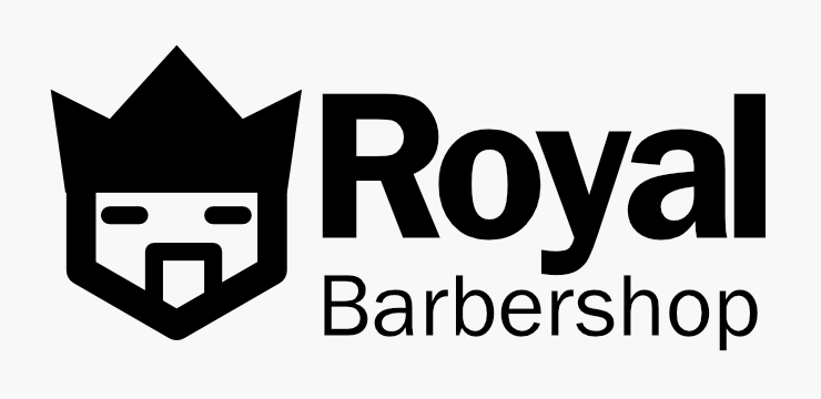
what you think about this logo for a fake barbershop
Needs a lot more context.
I get it’s for a Barbershop called Royal.
But why have you picked these elements?
Off the bat - the font choice and treatment is not very good.
The icon - the mouth is off centre.
It doesn’t look like a crown - it looks like spiked hair.
Why are the eyes closed?
The contrast of the straight lines vs the typeface roundness makes it look uneven.
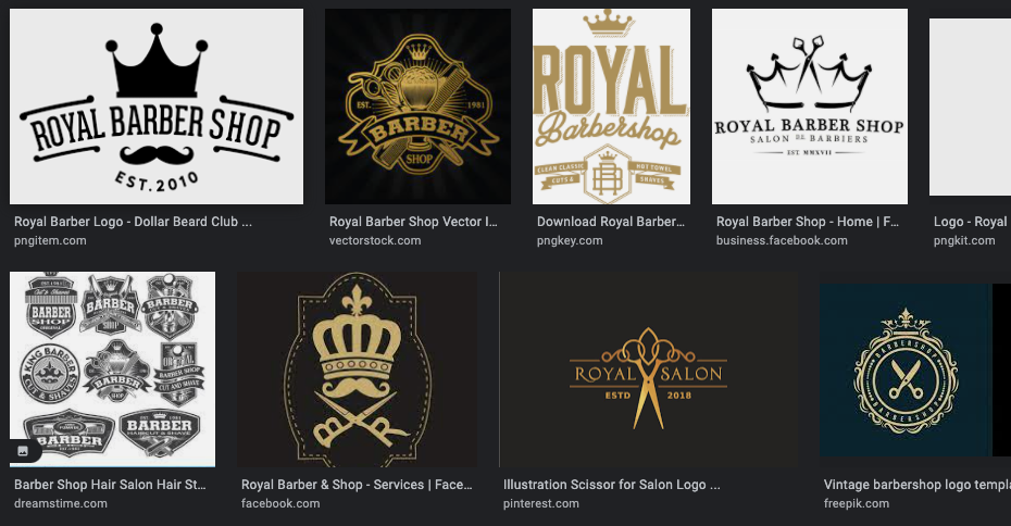
Looking at the first few hits in Google Image search shows much better logos in this area with the same name.
Have done any research?
I entirely agree with a Smurf. The whole feel is off, I’m afraid. It looks anything but regal. I do quite like the fact you haven’t gone for cliché with the symbol, but it all feels like you need to dig deeper and that you have stopped too early in the process.
Also, depending on your location, you could have a problem with the name. If the company is UK-based (and I believe this may well apply to all commonwealth countries as well), you need to seek permission from the palace. You cannot been seen to imply royal patronage unless you actually have it.
Have a look at this link for more information.
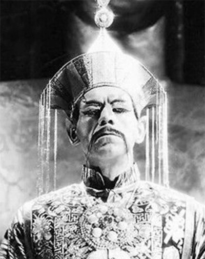
The logo seems a little too Fu Manchuish to me.
Which came first in this practice exercise? The name or the logo? Part of the problem with self-directed practice exercises is that they aren’t realistic. It’s too easy to fit a name to the solution, whereas that’s never an option in real life. The problems are usually more challenging with less obvious solutions. For example, a logo design for Joe’s 32nd Street Barbershop and Grooming Salon would be a more typical and awkward problem.
The Franklin Gothic typeface you’ve used doesn’t suggest barbers; it’s too corporate and sterile. The mark matches the type, but like the typography, it doesn’t have the personality of a barbershop. Unfortunately, it’s heavy and lacks grace. A barbershop is not a concrete contractor or a machine shop — a barbershop logo requires a certain amount of style, poise, and, perhaps, trendiness.
Finally, there’s the uncentered mustache or mouth this @sprout mentioned. There’s no good excuse for that oversight.
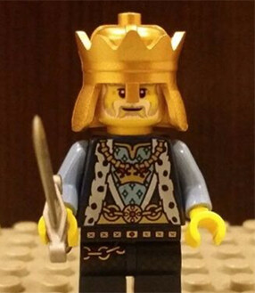
If done right, spiked hair in the shape of a crown could be the basis for a pretty good Royal Barbershop logo. ![]()
I think that was me ![]()
Agreed - if done right.
Just occurred to me - looks like a Lego head.
Yes. Sorry. I should have checked.
How’d you find that so quick … ![]()
![]()
![]()
![]()
It’s not even the same name
Barbershop is far too pedestrian for Royalty and therefore off-brand.
You don’t get to make that choice
That would be true if there were a client but there is no client, or rather, the imaginary client trusts my judgment implicitly.
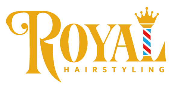
I presume there’s a technical difference between a hairstyling salon and a barbershop…
I think only a barber can give straight razor shaves - a hairstylist cannot.
The typical ‘stripe’ is traditionally white and red - as barbers used to be the local dentist, as well as cut your hair, and the pole of white and red was due to the bloodied rags being hung outside.
So in this case - hairstylist with a barber pole - it is not in keeping with tradition and has lost it’s meaning. Blue would appear to be added later on - it’s not clear why - but in your rendition there is no white - it’s transparent - so I see it as blue/red/black on my monitor.
Nice try - but it’s jarring in it’s defintions.
I hate to publicly school you but the red/blue barbers pole advertises bloodletting services, with dark red leeches and blue Appalachian endorheic basin leeches respectively.
Also, you may have noticed that bloodletting is no longer in fashion, so to suggest that its signage is meaningless is rather meaningless itself. It’s merely an icon that can be used to make a desired impression. Your analysis doesn’t reflect the impression offered and generally received.
I’ve combined two well known icons that instantaneously say ‘royal barbershop (without being so vulgar as to actually say barbershop)’ and fused with a regal font, this design is on-brand and on target to business success!
No - it’s not combined well, in my opinion.
There’s differences between hairstylists and barbers. So you’ve missed the mark.
You’re not schooling anyone…
Perhaps the problem is that you don’t understand the basic business model. This service caters to ROYALTY, and royalty wouldn’t be caught dead in a barbers shop.
Associating leeches with royalty might cause a kerfuffle at the palace.
Hmm… good point.