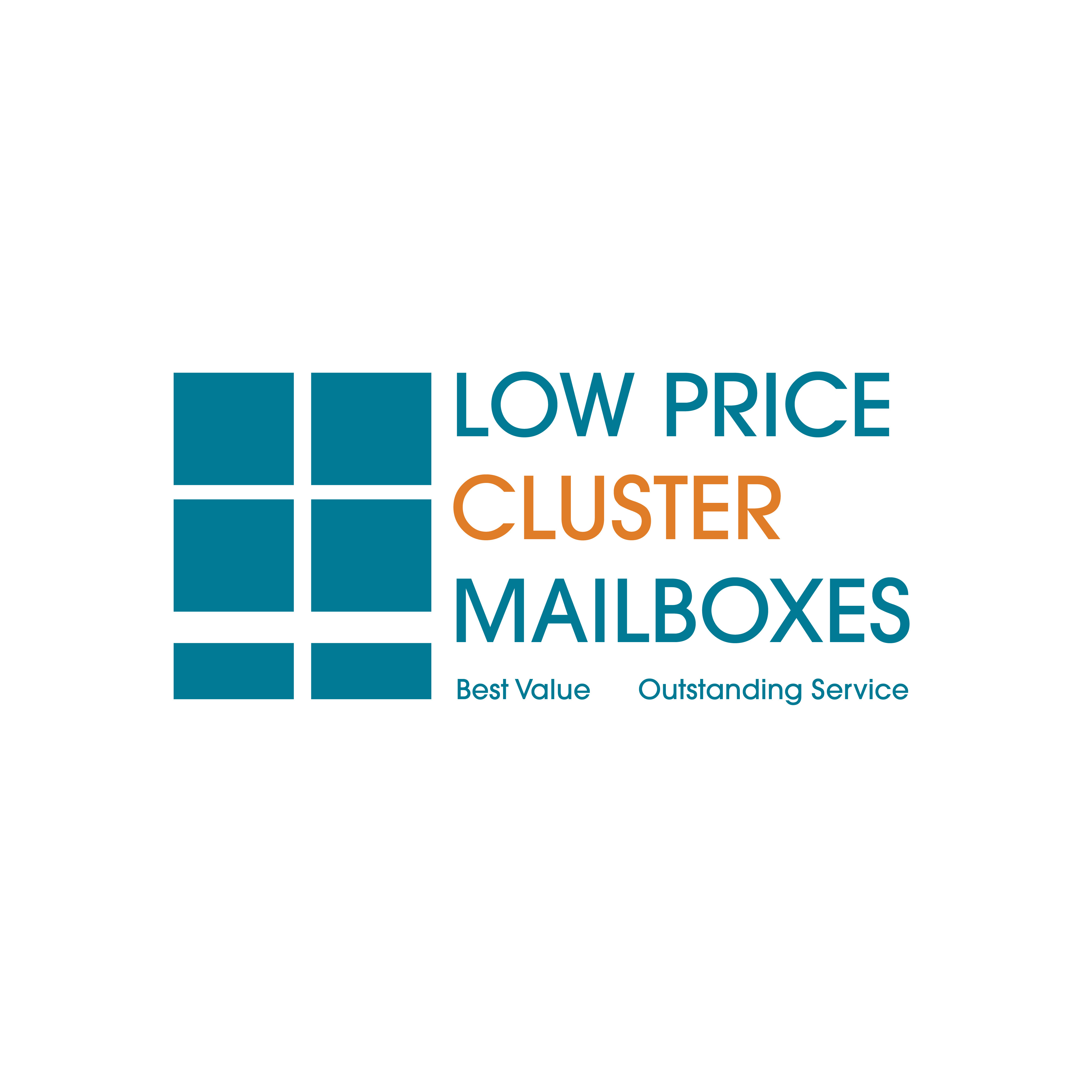
Hello everyone. I’m a self-taught graphic designer. I lack formal training and would therefore love any critiques that would help me grow and become a better designer. I designed a logo for a potential client and would love any advice I can get on the proportions and the design in general. The company sells cluster mailboxes to contractors, property managers, and residential developers. They requested a modern, geometric, literal, masculine, and economical logo. I look forward to your feedback.
What do you mean a potential client? Surely he has already hired you, you’ve agreed a fee, and you’ve agreed terms/conditions - iterations, timelines, etc.?
Or do you mean you’re designing a logo for someone who hasn’t agreed to even pay you?
What is going on here?
Anyway - do you think that it looks like a cluster mailbox? I see the Windows logo.
Could be for a window/framing company.
Anyway - it’s nice and simple, ticks boxes in terms of use in web and print.
Don’t know why Cluster is in a different colour - nothing else is - typically it’s to link it to another portion of the logo.
It’s ok - but doesn’t blow it out of the water - if you know what I mean.
What else have you come up with?
1 Like
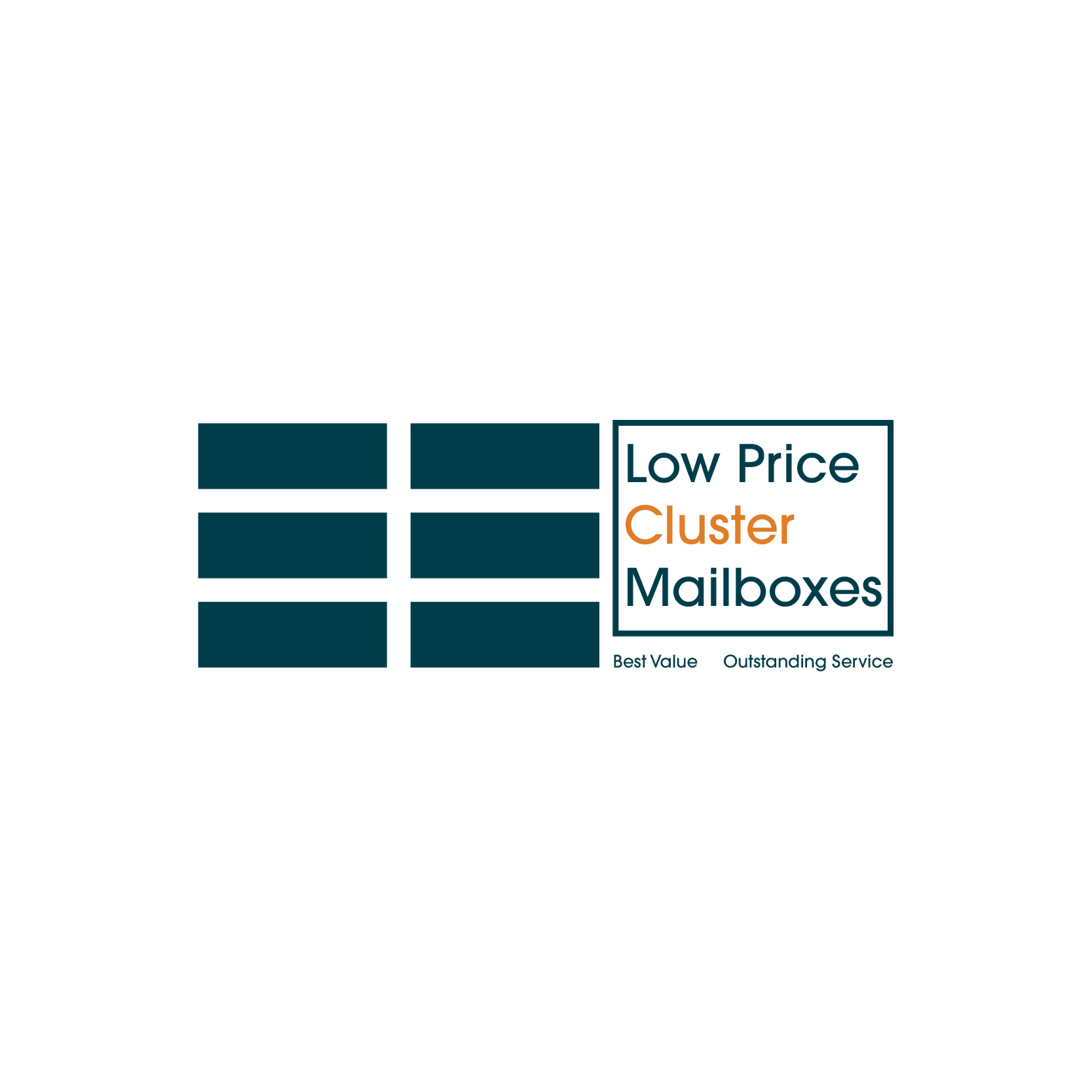
Only see the 2nd one now.
Still needs connection with the colour.
I’m with Smurf2 on this. What do you mean by potential client? That raises all sorts of red flags.
I said potential client because the design was submitted to a contest. The client also wanted the logo to include blues and oranges. I used blue as the main color and orange as an accent. I have other designs like the one attached. I was worried about the legibility at small scales.
It was a contest that’s why I said potential client. Sorry.
There is no potential client. Either they are or they aren’t.
You are an unpaid employee of whoever is holding the contest. Wasting billable time doing work for someone else where you have one chance in 3000 of maybe getting paid pennies on what its worth? Better to be flipping burgers for minimum wage where you at least know you’ll get paid for the work you do.
Are they really called Low Price Cluster Mailboxes? Best value compared to what? Other low price cluster mailboxes? SMH, leaving room talking to self…
1 Like
They named the company “Low Price [Product]” and then entrusted their identity development to crowdsource amateurs. It’s already destined to fail, and no logo design can save it.
Side note: Taglines are for campaigns, not brand identity. There are a thousand factors that can make or break a logo—many of them can be considered ‘intangible’— but one thing that is easily measured in a linear sense is how much reading is required. If the best logos achieve brand recognition with ZERO reading, where on the scale does one with 8 words fall?
2 Likes
As its a “contest” I am not going to help you … what’s my cut?
I believe this might be against forum rules. There is no client and the work is speculative
Not that it really matters, but LOW PRICE is a compound adjective that modifies the words CLUSTER MAILBOXES. Compound-adjectives need hyphens, as in LOW-PRICE.
Somehow, though, I doubt a punctuation error in the company’s name will matter much to this contest organizing “potential client.”
I’m sorry. I thought I was here to receive objective criticism on my design for the sake of improving. I must have signed up for the wrong forum. You have a good day though.
I’m sorry. I thought I was here to receive critique, not amateur kindergarten insults. Why do you and others like you feel the need to insult someone who came on a forum looking for advice? I would understand your frankly shitty attitude had I given you lip first.
Are you critiquing the design or are you trying to insult me/be a child? If you’re going to be a child about this kindly keep you unsolicited comments to yourself. Thank you. ![]()
That’s a good point.
Crowdsourcing contests don’t have a good reputation among professional designers. We don’t typically take on work without an assurance of getting paid. Any mention of contest websites here will get an immediate negative reaction.
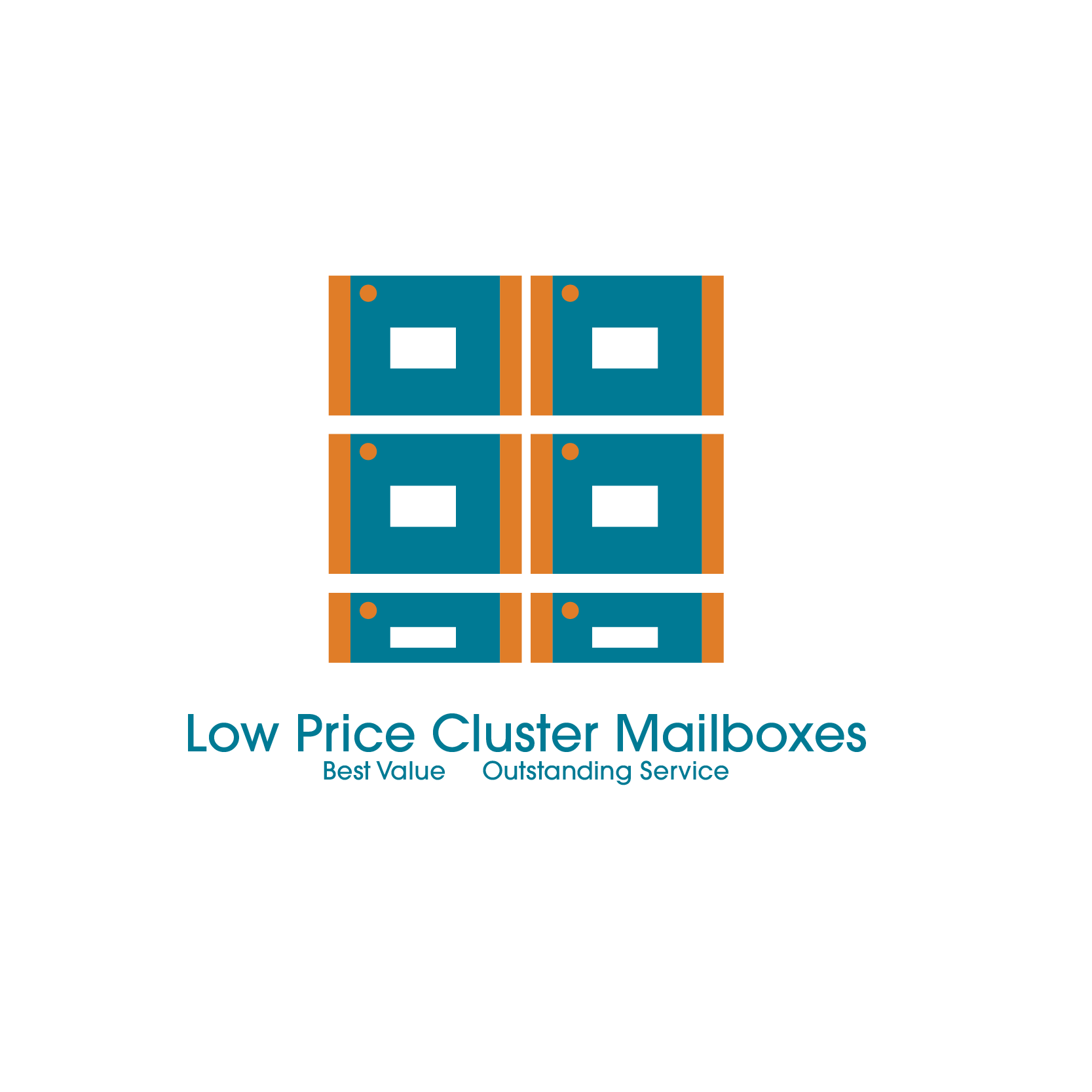
As for your logos, this person’s keywords included literal, which is what you’ve built. However, I think a solution probably needs to be more than a stack of rectangles. On your last design, do the colors represent anything? I’ve never seen aqua and orange mailboxes. This person might not like it — it’s hard to know where he/she’s coming from or what’s really needed (another problem with crowdsourcing), but a little less literal might work better.
Thank you for your advice so far. However, using your own logic, shouldn’t you also expect a cut if it were paying gig? Btw the contest is over.
I was saying that there is a punctuation error in the name of the company but that the client probably doesn’t care. Anyone who cares so little about his or her business to farm out something as important as a business logo to a crowdsourcing contest, likely isn’t concerned about such things.
It wasn’t meant as an insult to you or anyone — just a statement of fact about crowdsourcing sites and the people who organize contests on them.
I understand where you’re coming from, but the response was a bit unnecessary. I agree with you. The contest has it’s flaws. You can’t ask the individuals what their company values are or what emotions they want their logo to evoke. One can only work with the limited information provided. I tried to work within the framework given. The color scheme was provided. As you hinted, I probably should have taken the liberty of choosing a color scheme that matched the brand. I’m self taught. I don’t consider myself to be a spectacular designer, so forgive me if the design falls flat. I do understand what you’re saying about the design solution though. Thank you.
I didn’t feel a need, nor did I intend to insult you. If you took it as an insult, I can’t control that, but at least I didn’t resort to characterizing anything as “kindergarten”.
When you post to an online forum, you get what you get, and it’s best to be prepared for something you weren’t expressly seeking. Your misinterpretation notwithstanding, when you read my post, you did indeed “receive critique,” and despite your failure to recognize it, you also got advice.
For my critique, I’d like to focus on your business practices rather than your logo design.
What you’re doing is called “spec work.” It’s work you’re doing for free, without any client engagement, with the hopes of getting paid. This is not professional behavior and it should not be undertaken.
Would you take your tax documents to three different CPAs and ask them all to prepare returns and say that you’ll pay whoever got you the biggest refund? Of course not; and, if you did, you’d be laughed out of their office. Participating in design contests is basically the same thing.
You shouldn’t do work for free, and clients shouldn’t ask for free work. It de-values the service and generally produces mediocre results at best. I’m assuming you hope to make a living as a graphic designer, correct? By participating in spec work, you’re eroding the industry you hope to make your living from in the future.
1 Like
You came here looking for advice on how to improve your work. That advice is hidden in the admittedly snarky comments, and you spelled them out yourself in your last post.
Aside from the low pay or no pay aspect of crowdsourcing, as you mentioned, there’s no real opportunity to interact with clients, no chance to dig down deeper into their needs, analyze their businesses, inquire about their customers or look into their competitors. All you can really do is follow clients’ typically misguided instructions and less-than-good parameters that they impose on the problem — in this case, what seems to be an arbitrary color scheme.
In other words, there is no good way to improve a logo when it comes with these sorts of built-in limitations. All you can really do is follow the instructions and try to make it look nice. But that’s not what good logo design and good branding should be about. A crowdsourced, contest logo largely comes down to satisfying the largely unknown, naive and typically misguided whims of the client.
2 Likes