The improvements in your abilities from your first post in this thread have been impressive!
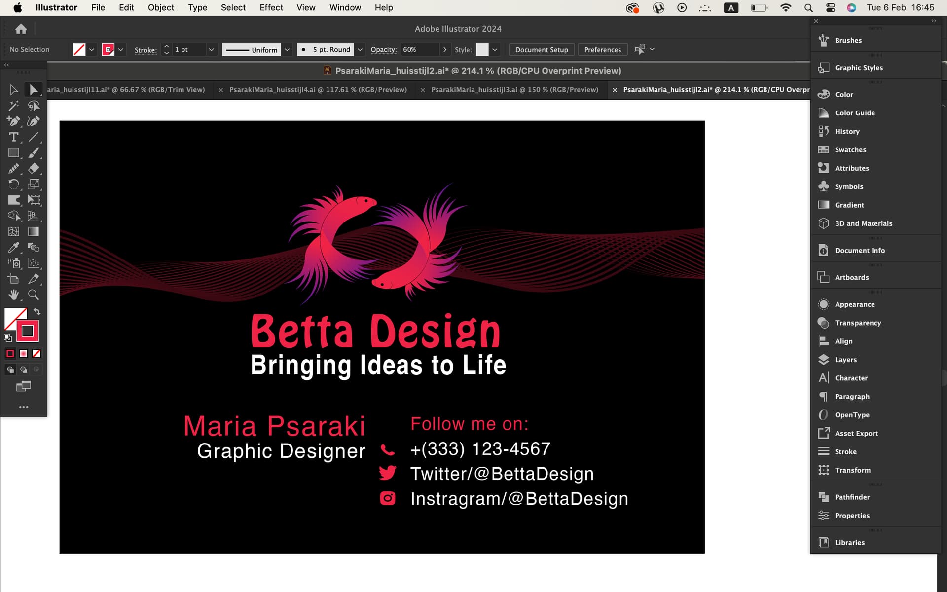
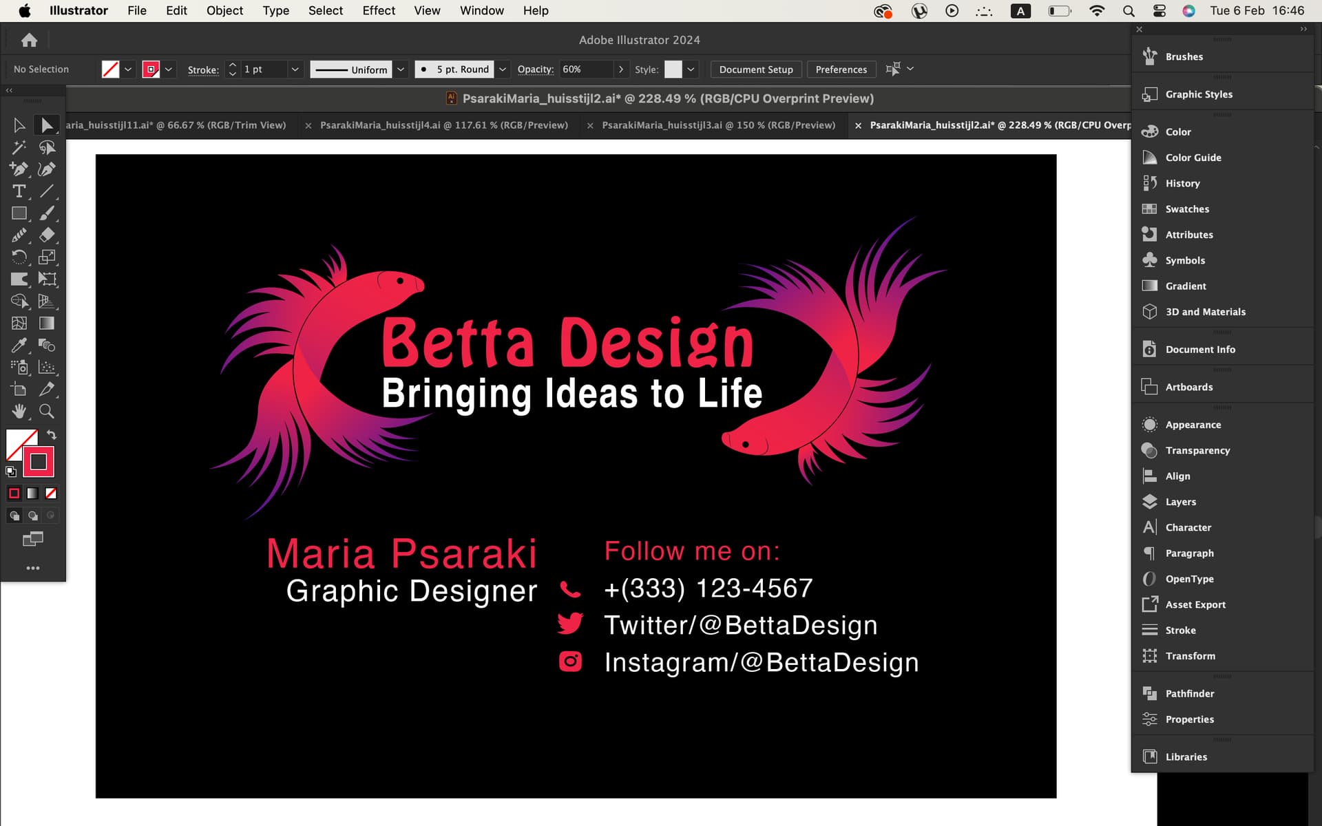
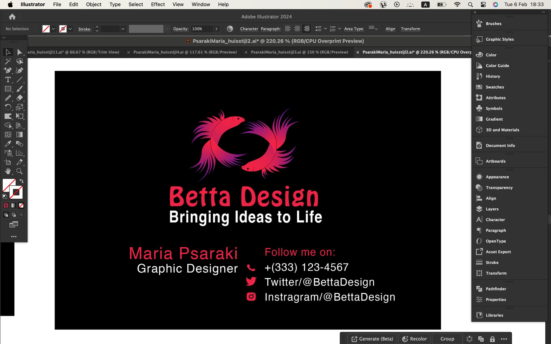
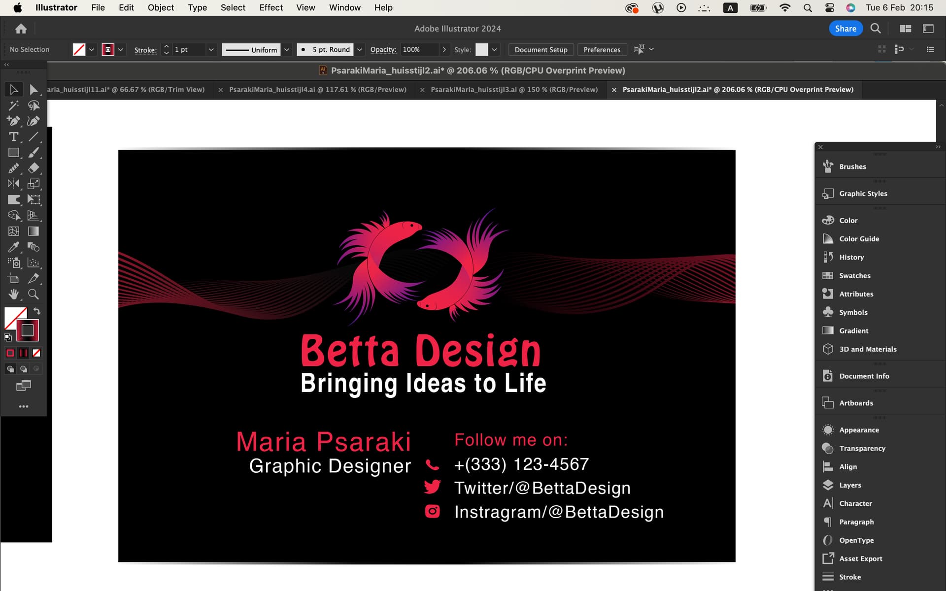
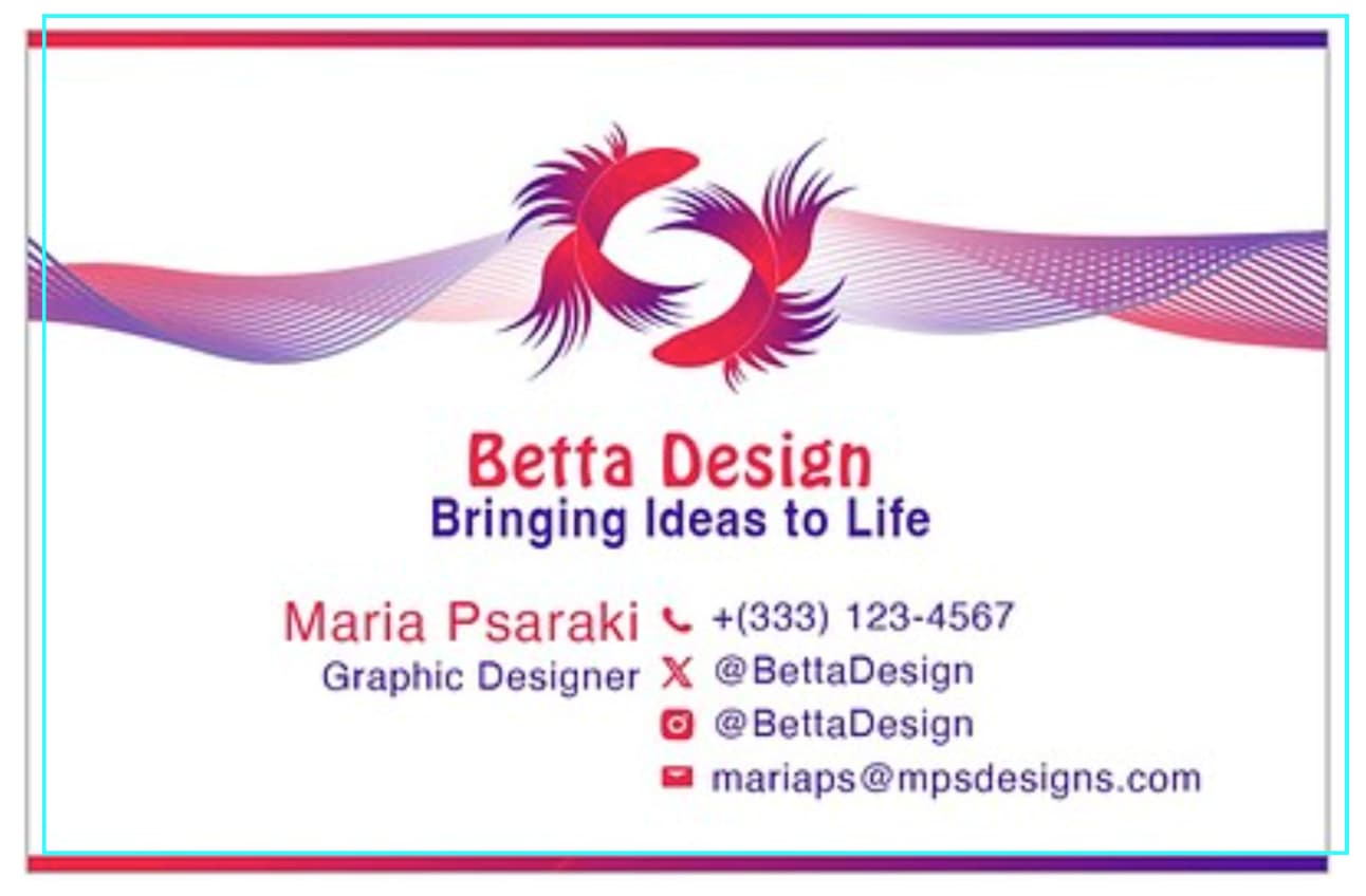
One thing that stands out in the wrong sort of way is the negative space between the two fish. The space creates a black Z, which was the first thing I noticed. Positioning the fish as you’ve done is clever, but Z is a problem. If it were me, I’d probably use only one fish.
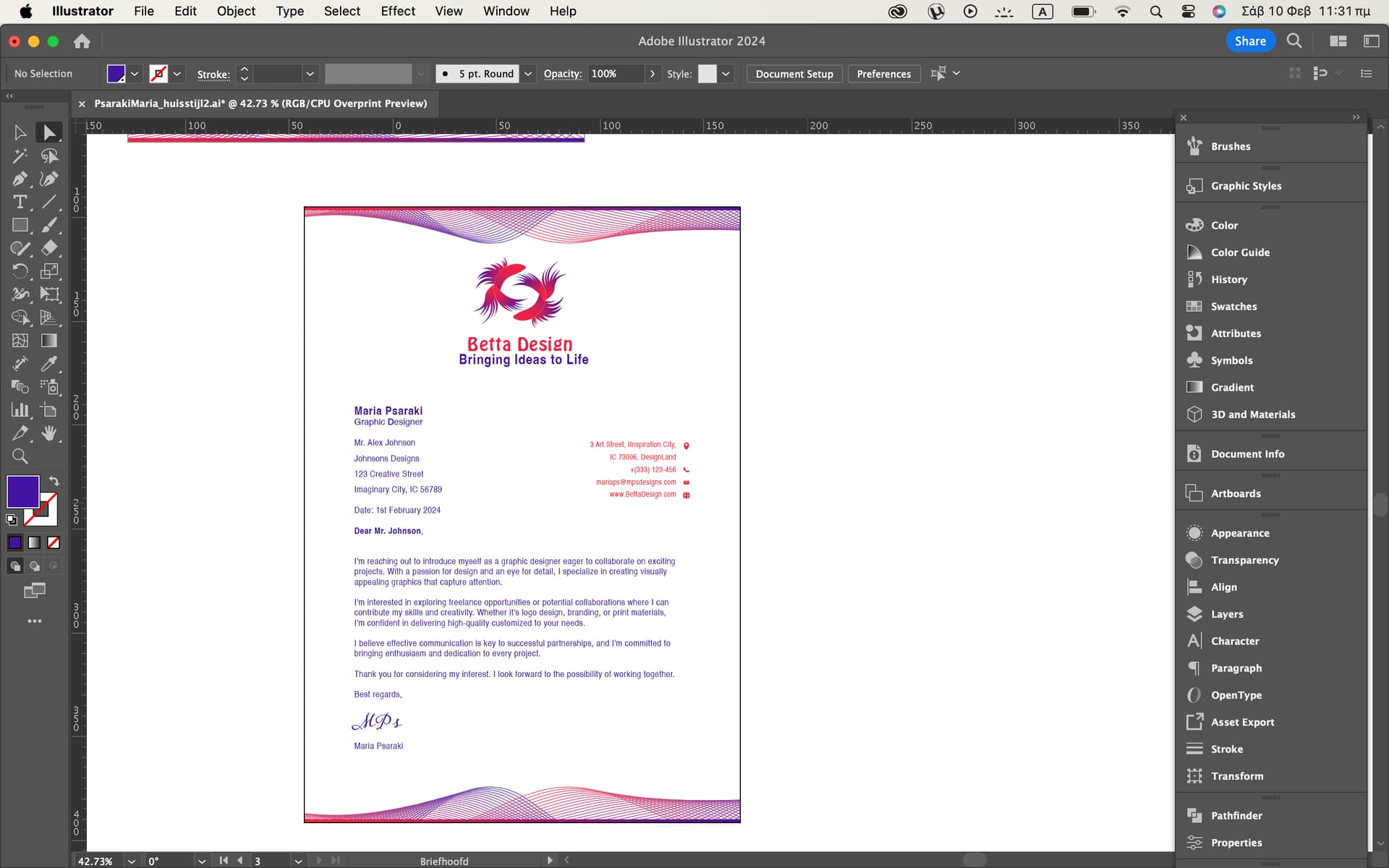
You might want to add a bit more leading between your name and the Graphic Design line below it.
If it were me, I’d be concerned about the subtleness of the colors and the fine lines holding up to dot gain and bleed problems during printing when reversed out of a rich black. It’s doable but would benefit greatly from a good commercial printer, coated stock, and a media coating, such as varnish or aqueous coating, to keep fingerprints at bay. Then again, if this is a student assignment, those concerns might be beyond the scope of the problem.
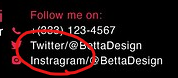
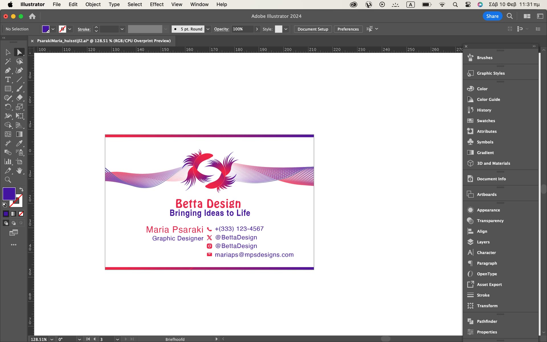
I can’t see a connection between “Follow me on” and “+(333) 123-4567”, and, furermore, what if you have a co-worker by the name of Bartholomew Wolfgang MacGregor?
You probably don’t need to included this text here, the icons should say enough:
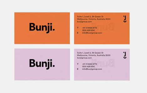
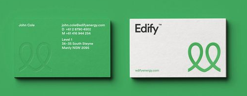
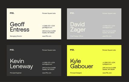
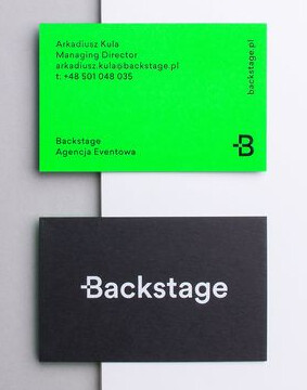
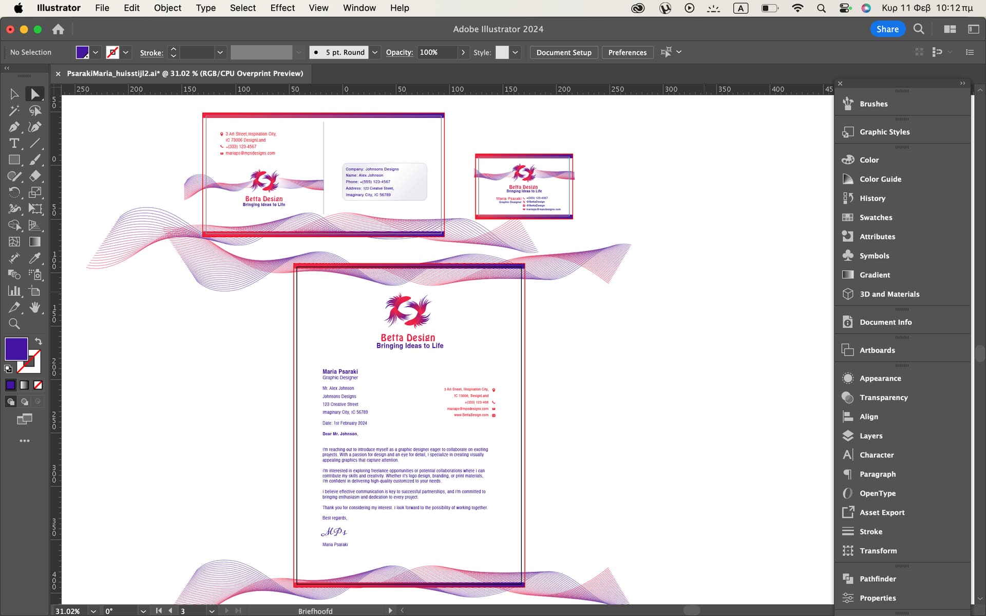
You’re also using a lot of different point sizes, have a look at all these business cards and pay attention to the colours, point size and weights for different pieces of type… good design exercises restraint:
Hey Pluto, a lot of people suggested that I should make my name larger than my position, the slogan smaller than the brand name, and the contact information smaller than both.
I also learned that white and black are not typically considered as colors, and my teacher instructed me to use only two Pantone colors in RGB format. Therefore, I will change the black background to white. Alternatively, I may consider using one color for the fish and another color for the background.
I advise against lining your work with slim borders. Machine cutting will inevitably create uneven lines, resulting in higher cost and paper wastage. You don’t want to hire a skilled craftsman to hand-cut every single piece do you?
One of a designer’s jobs is to identify any potential problem(s) and navigate around them. Until you‘re experienced enough to do so, always consult the printer when showing them your art.
Remember a few posts ago when I tried to explain the need for bleeds when any printing extends to the edge of where the printed paper will be trimmed? The reason is that when the sheets of paper are trimmed to their finished size, the printer needs a little wiggle room because the trim is never exact.
This wiggle room doesn’t only affect what lies outside the trim area; it affects what lies inside the trim area, too. If the printer requests a 3mm or 1/8-inch bleed. The printer is saying there’s a possibility the trim might be inaccurate by that much. It’s rare for the trim to be off by that far, but being off by a millimeter isn’t uncommon.
When the trim is off on one edge, it will likely be off in the other direction on the opposite edge.
Below is an exaggerated example of what I mean. The blue lines represent where the trim might occur on your card, but the same is true of anything else that’s printed. If the trim is less than perfect, those thin, printed bars along the edge might be trimmed off or be trimmed a bit narrower or wider than you intend, which will be very noticeable.
Designers compensate for these possible inaccuracies by including a bleed. However, this margin of error also applies to the inside of the trim area as well as the outside bleed area. The inside-the-trim-area is usually referred to as the safety. If the bleed is 1/8 inch, the safety is also 1/8 inch.
In other words, you don’t want to place anything along the edge of what you’re printing that will look bad or be noticeable if the trim is a little bit off.
The trim can be off a tiny bit for many reasons. Many steps take place during printing, and each step introduces the possibility of a small shift. In addition, big sheets of paper can expand or contract by a tiny bit due to changes in humidity. The final step — trimming the printed paper — can also be a little off.
The trim is made by a machine called a guillotine. These guillotines don’t trim one thing at a time — they slice through hundreds of sheets of paper stock like a knife through warm butter. Watch the video below to see one in operation. It should give you a better idea of why bleeds and safety areas are essential to consider.