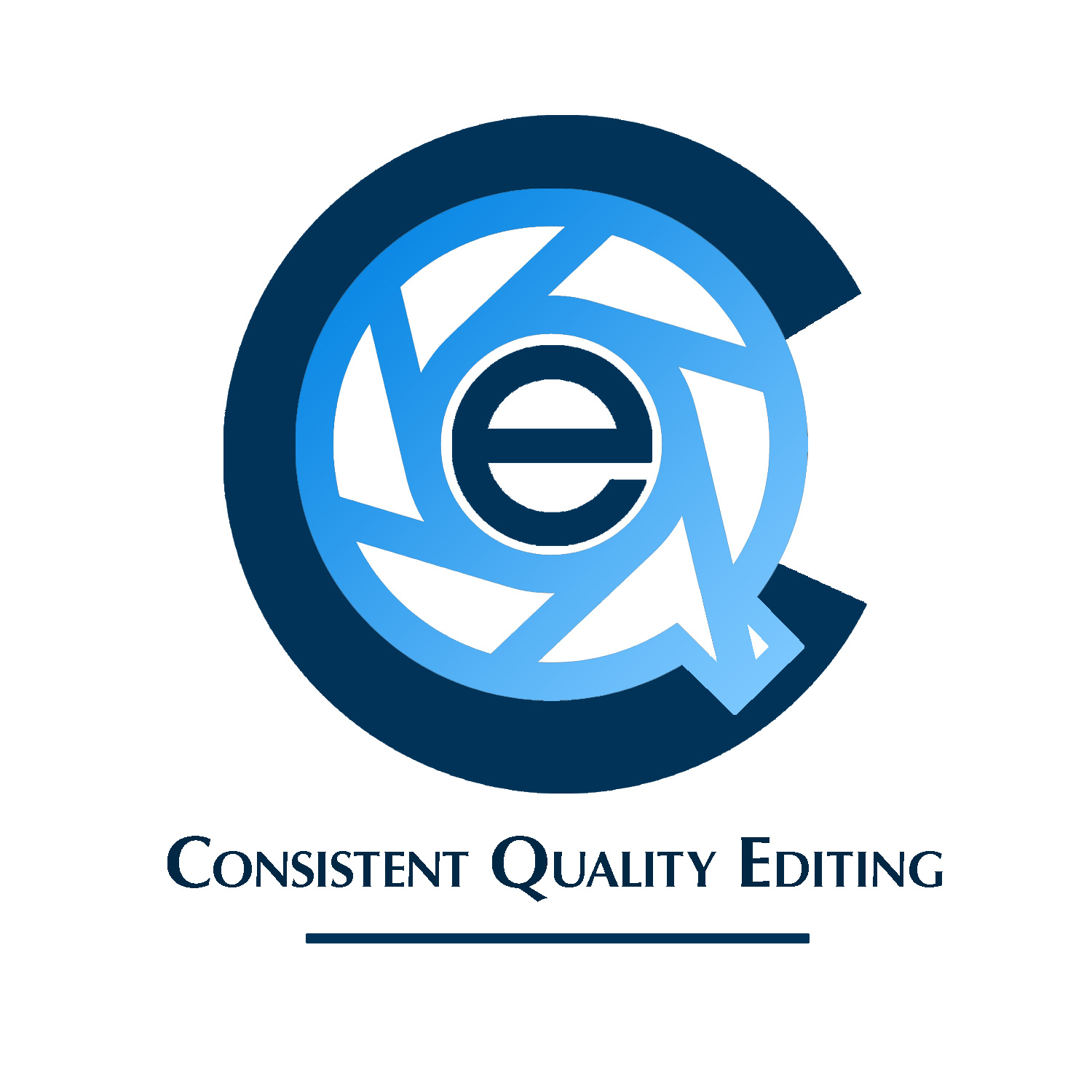
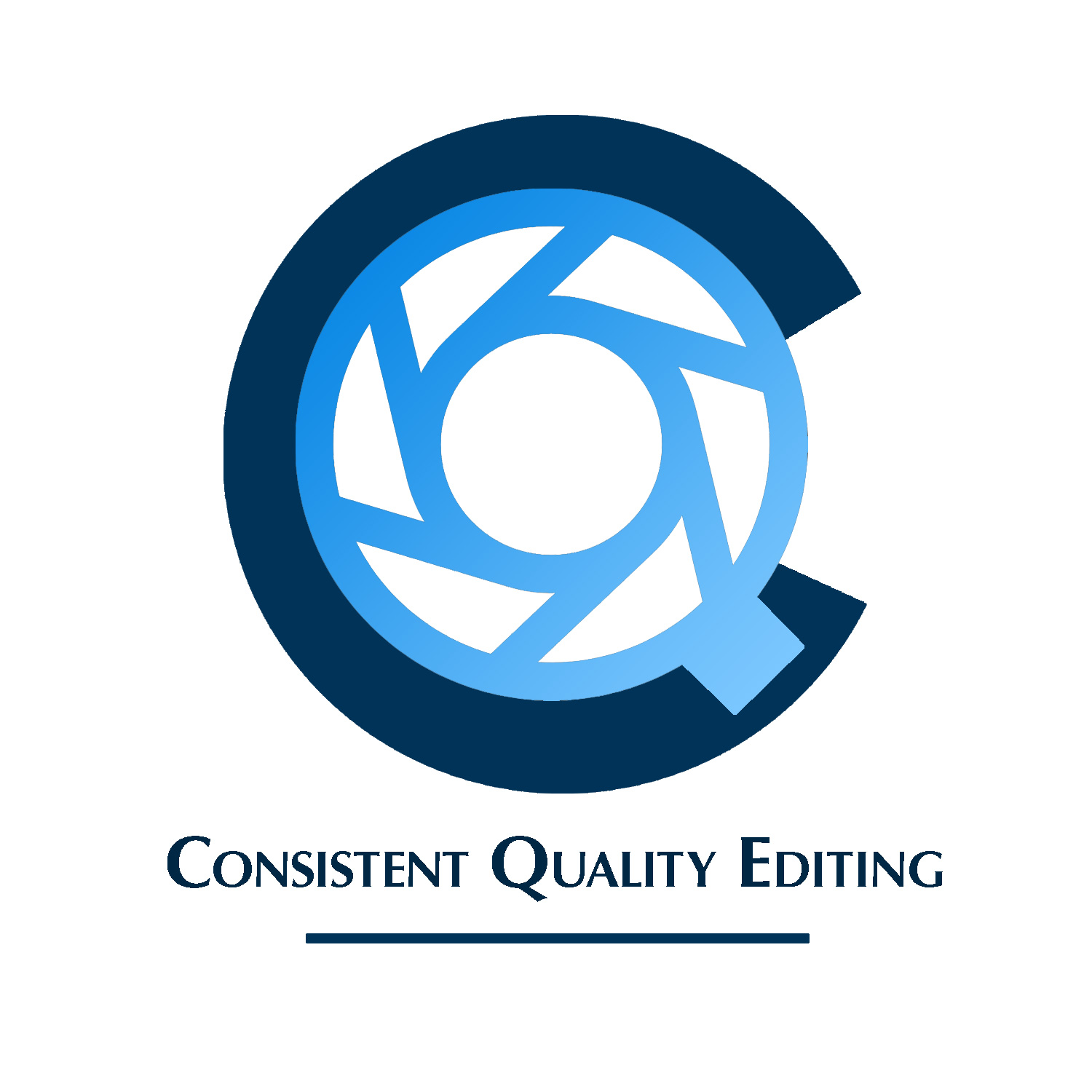
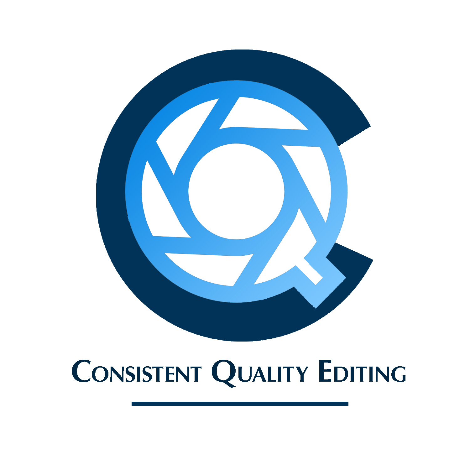
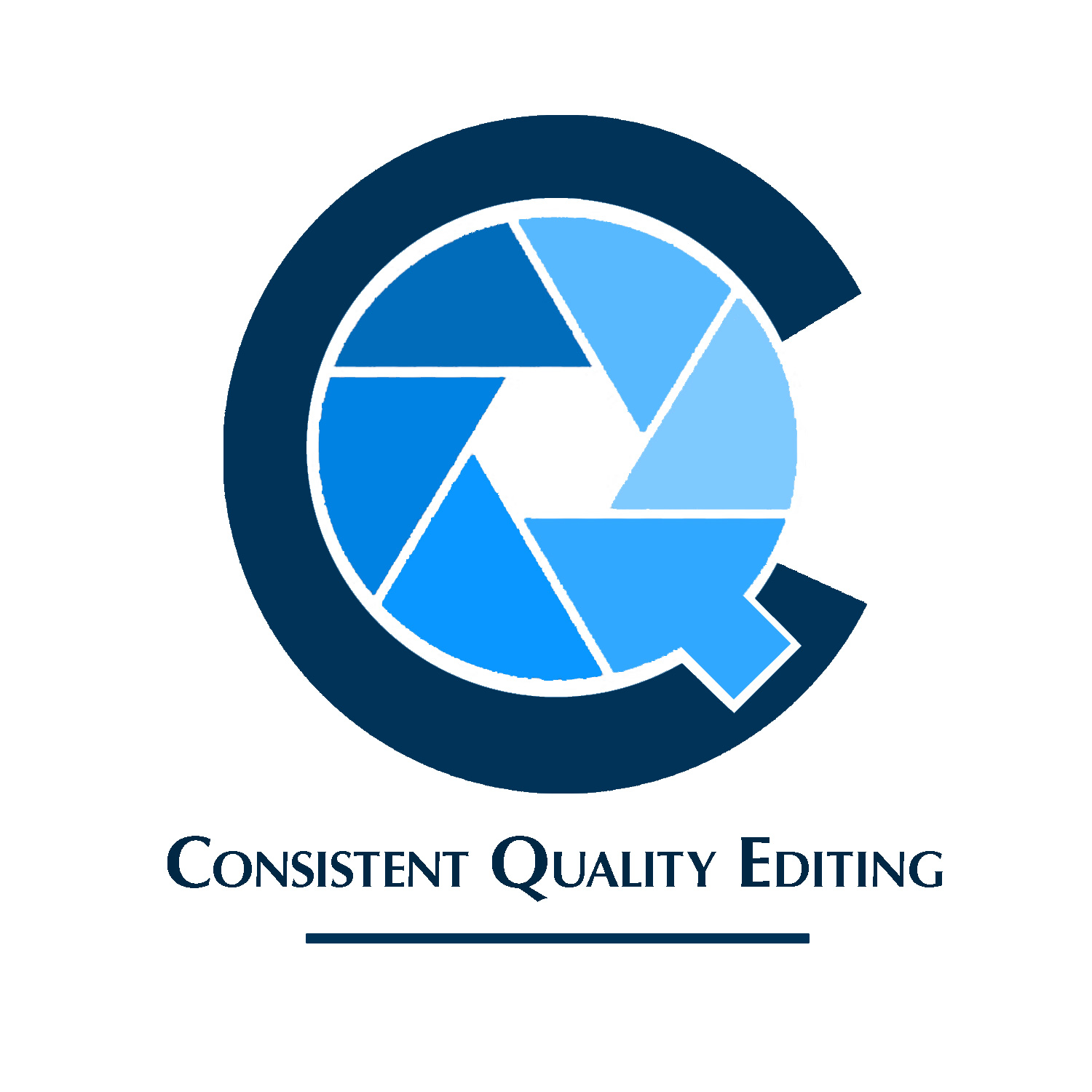
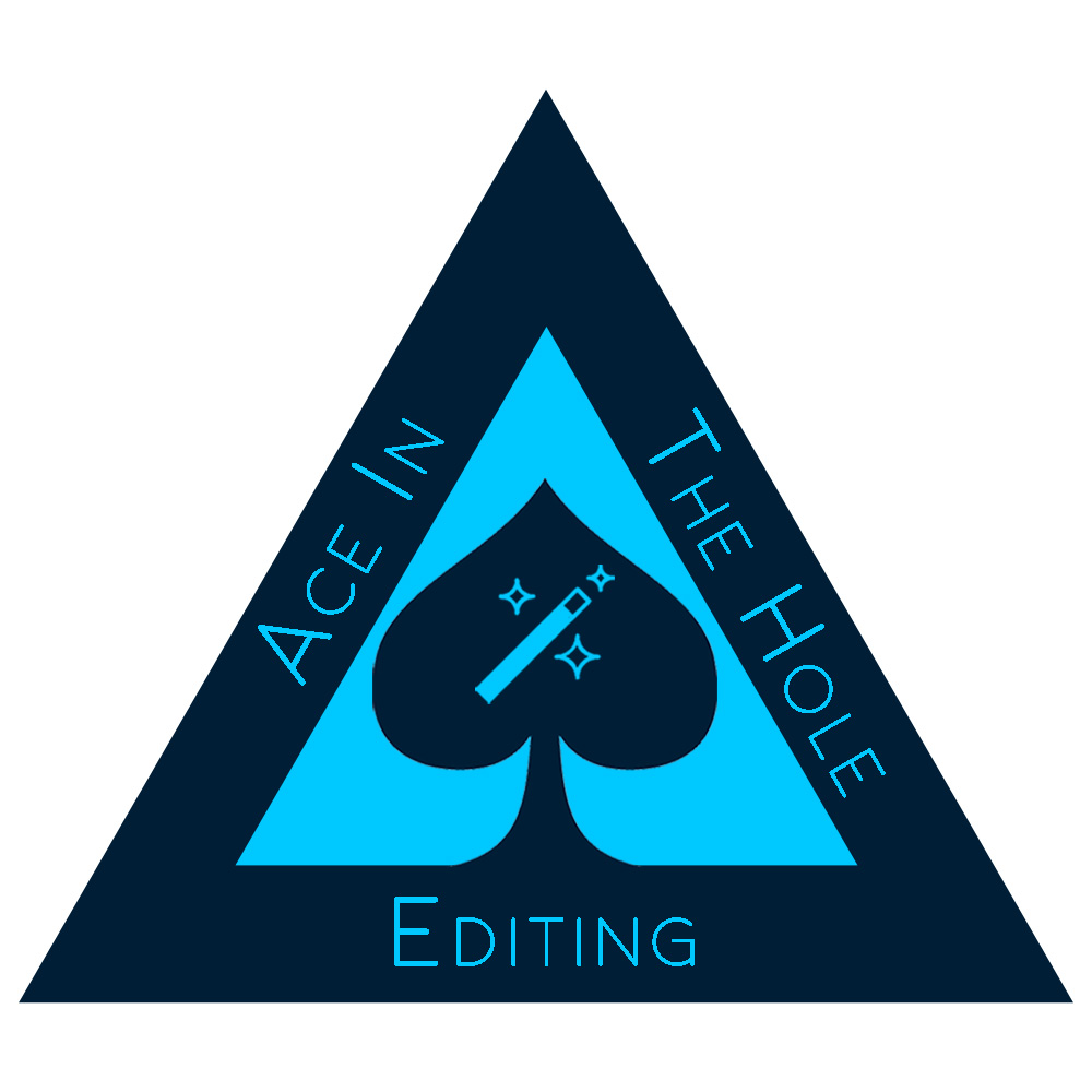
Spent some simplifying and came up with something different, if not exactly original. Hopefully it’s at least a little bit better. I’m in talks with a local graphic designer who is considering buying some of my larger equiment I can’t take with me on my move, so we’re hopefully going to do a partial trade for his services. Thought I’d run this by the forum to see if this is something I can present as a style I’m interested in (as opposed to the trite aperture inside a home clip art type imagery), a viable idea to be further worked on, or if like above, it’s best left to the digital scrap heap, never to be mentioned again. To reiterate, it’s only for a website header and the monogram for a favicon as well.
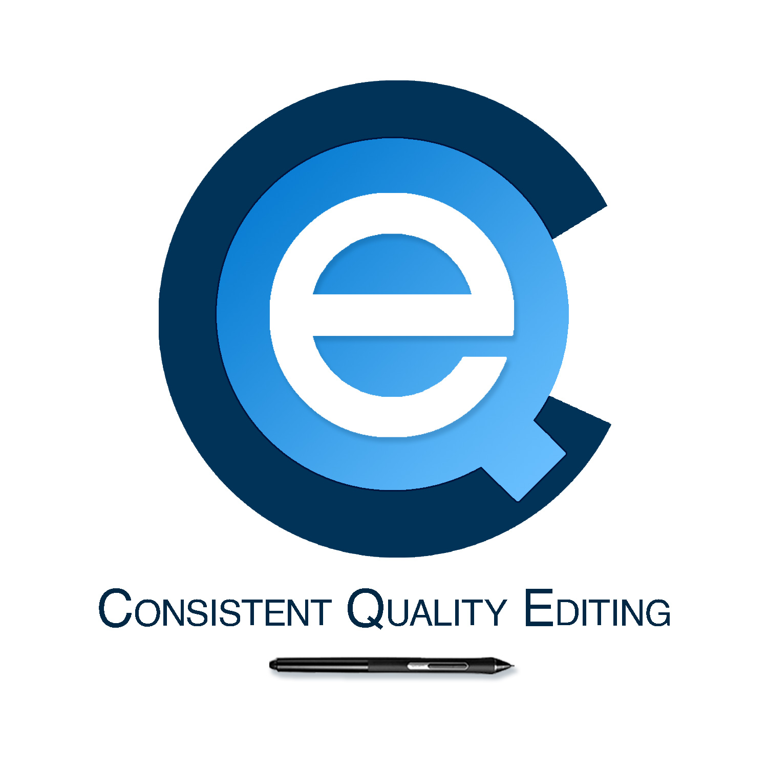
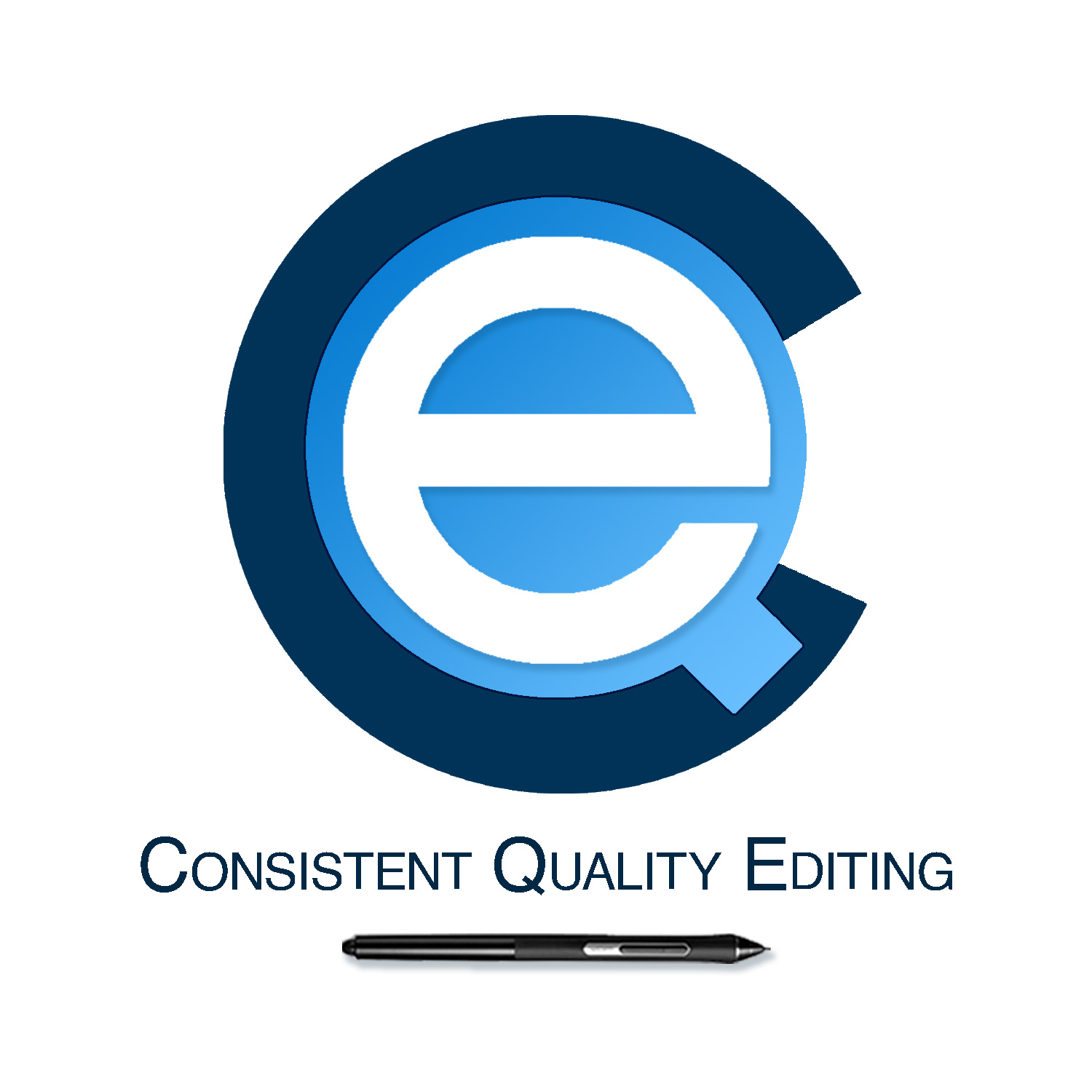
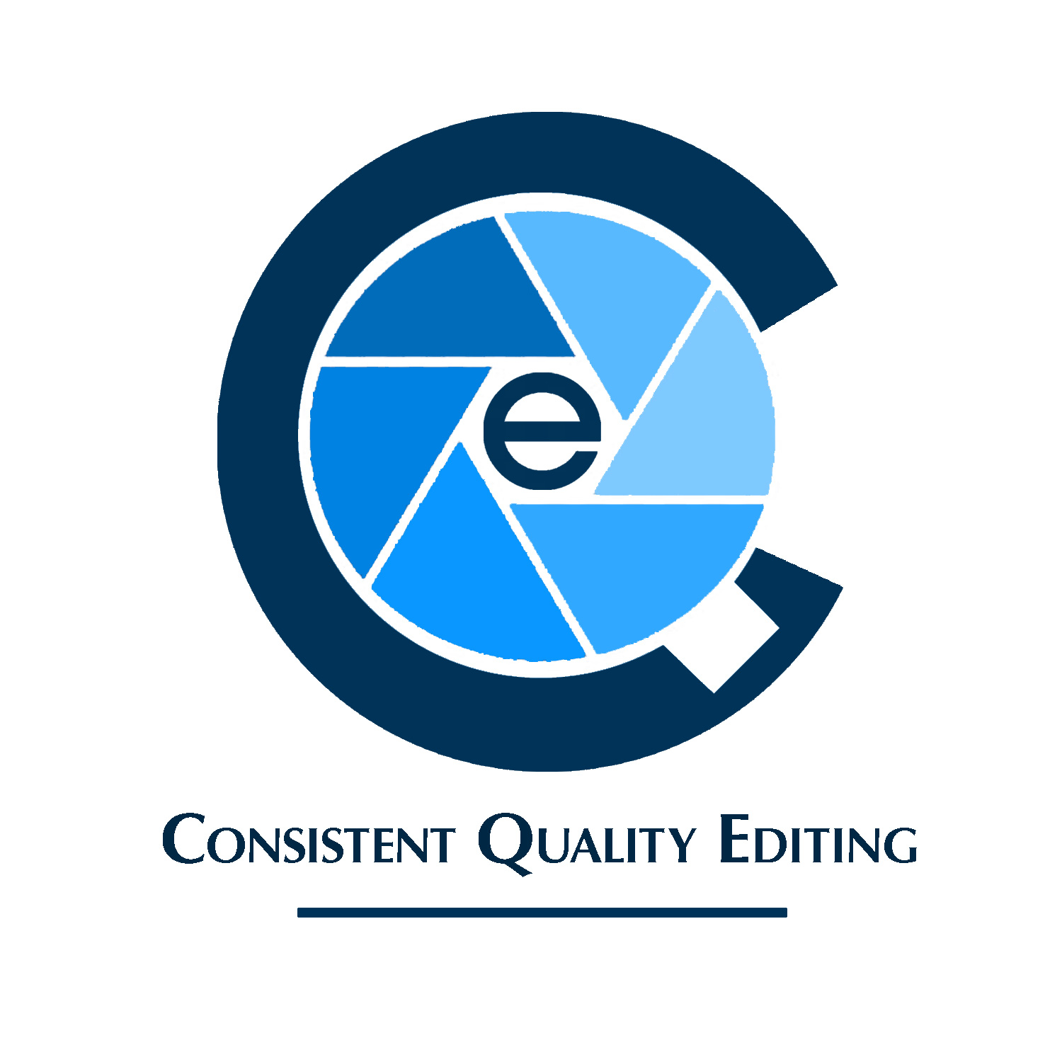
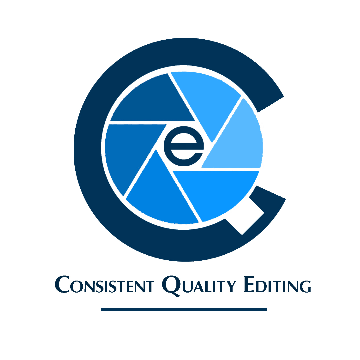
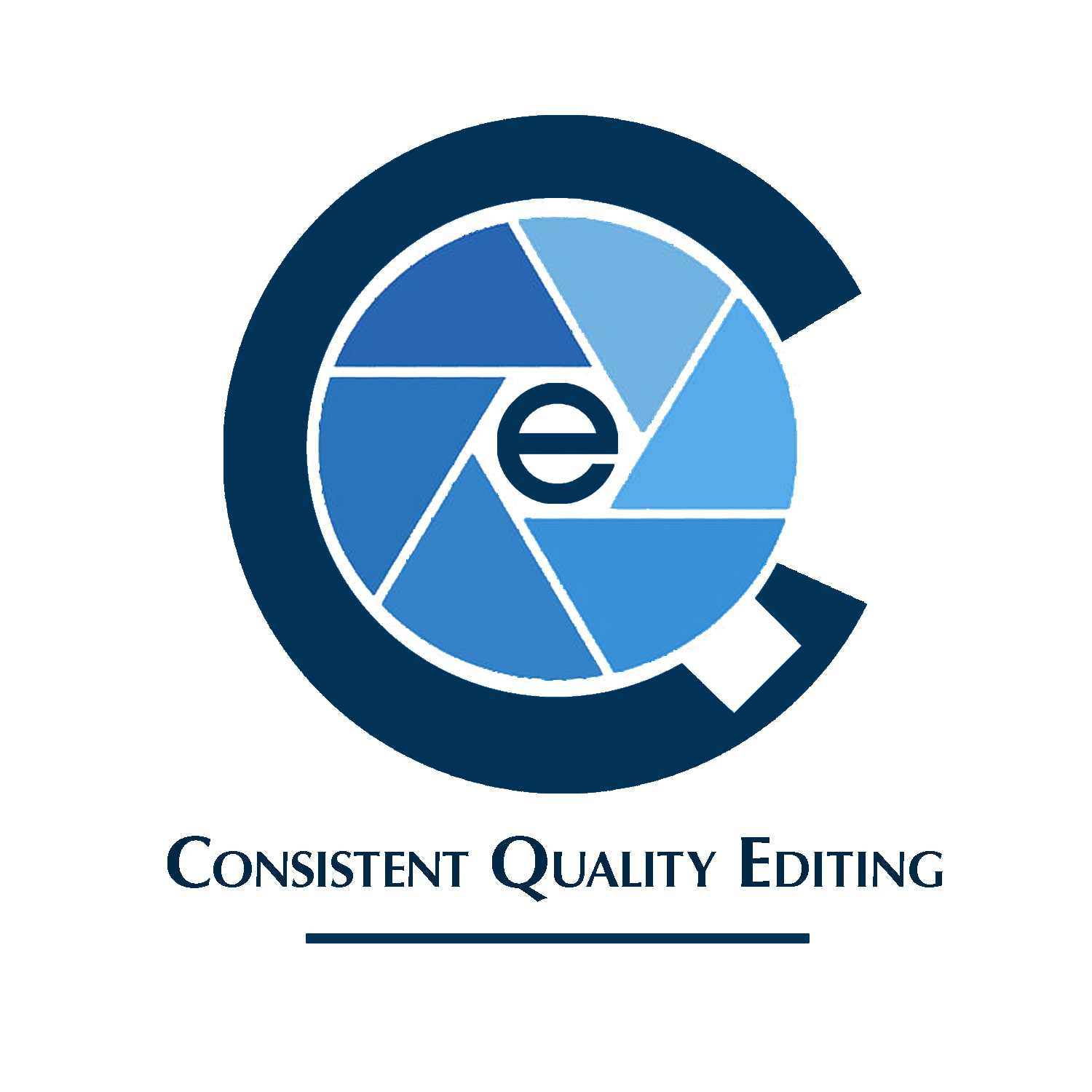
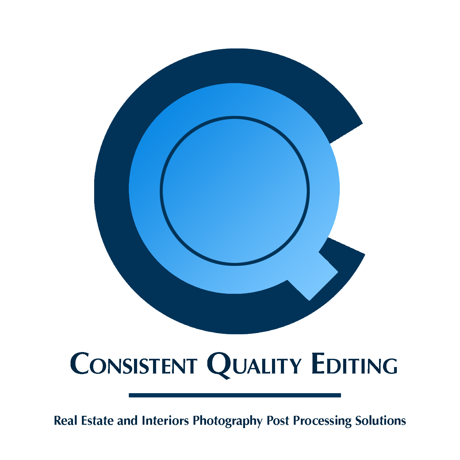
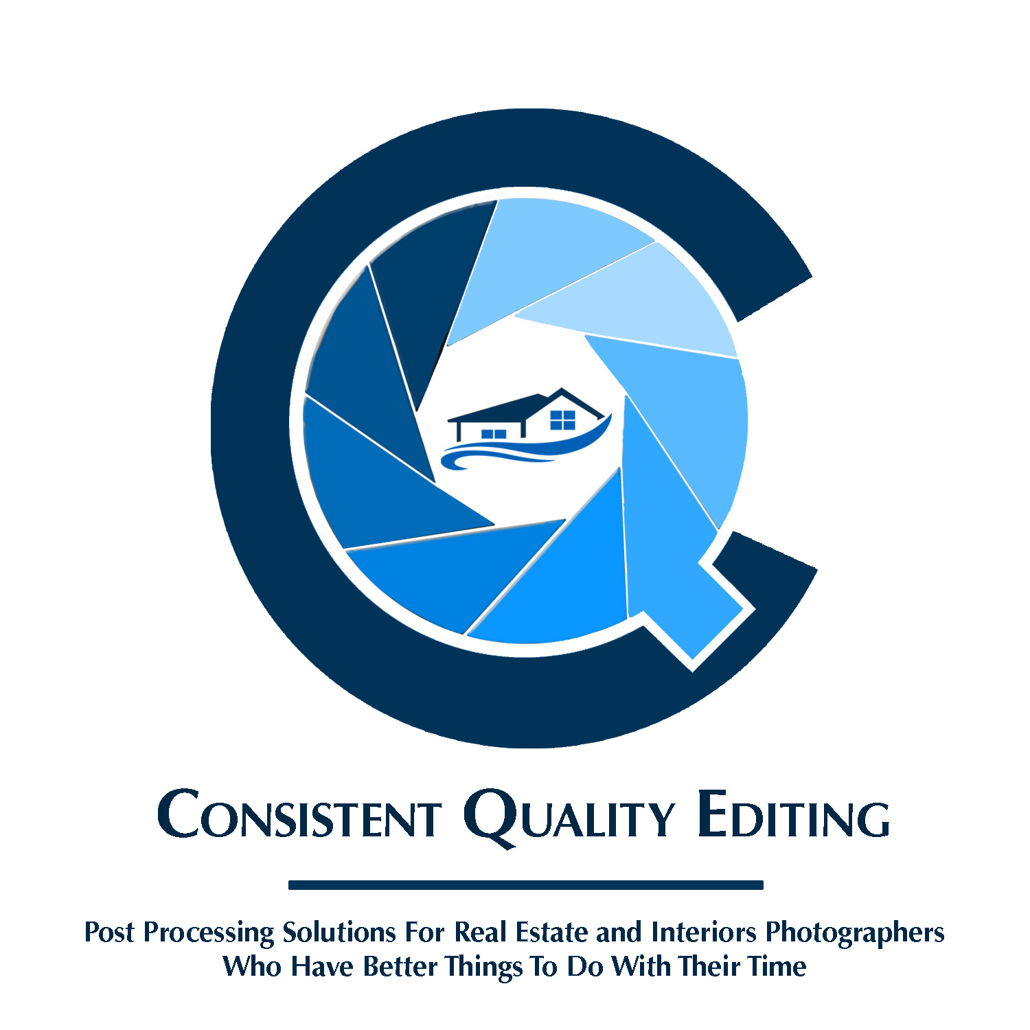
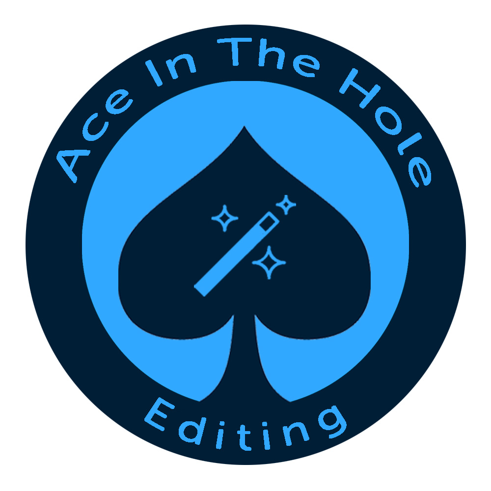
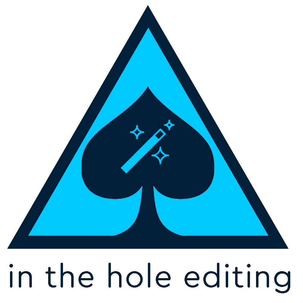
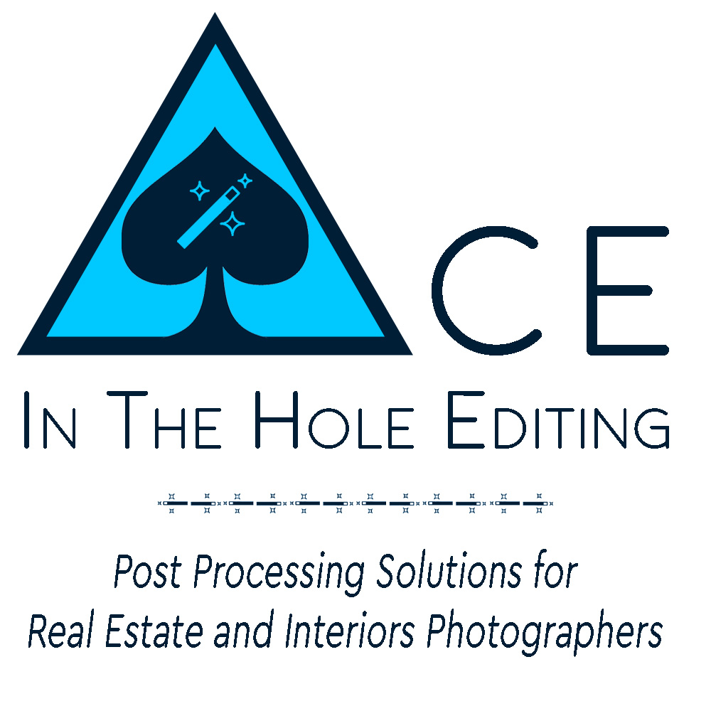
I noticed how all three letters in the business name are round and decided to superimpose them on top of each other. I took the blues from the failed attempts above and used shades and tints of those colors to tone things down a bit. I also used a tiny bit of drop shadow on the e so it popped a bit, but did a completely flat version as well. Used Helvetica because it comes close to replicating the shape of the letters in the monogram - though I’m open to font suggestions, weights, capitalization options, etc, if only to suggest to the graphic designer. Thinking of Ovoao’s comment, I used the Wacom pen in place of an underline to emphasize the photo editing nature of the business. Not sure if it’s cheesy, or if it even matters because there are far bigger problems. Guess I’ll find out.
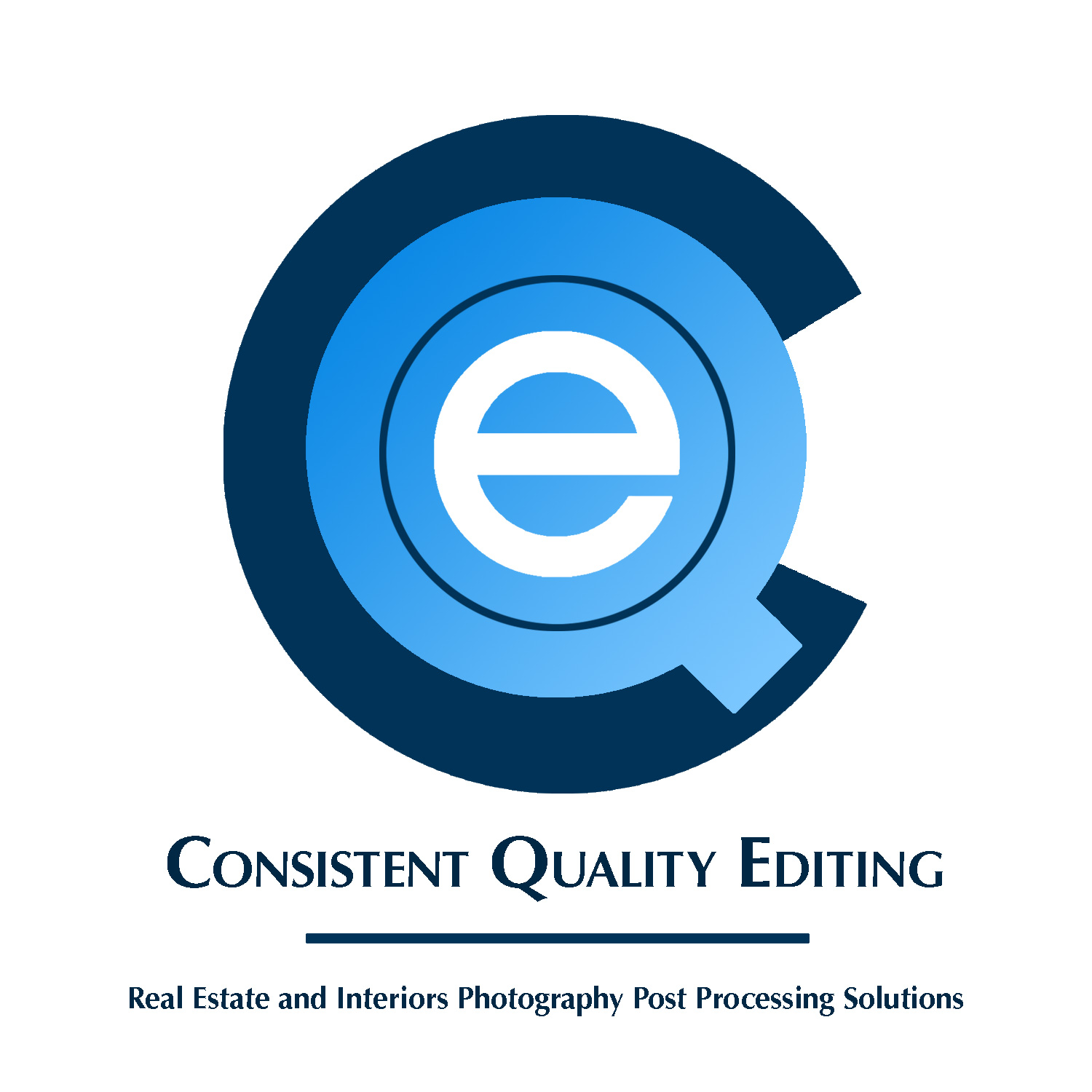
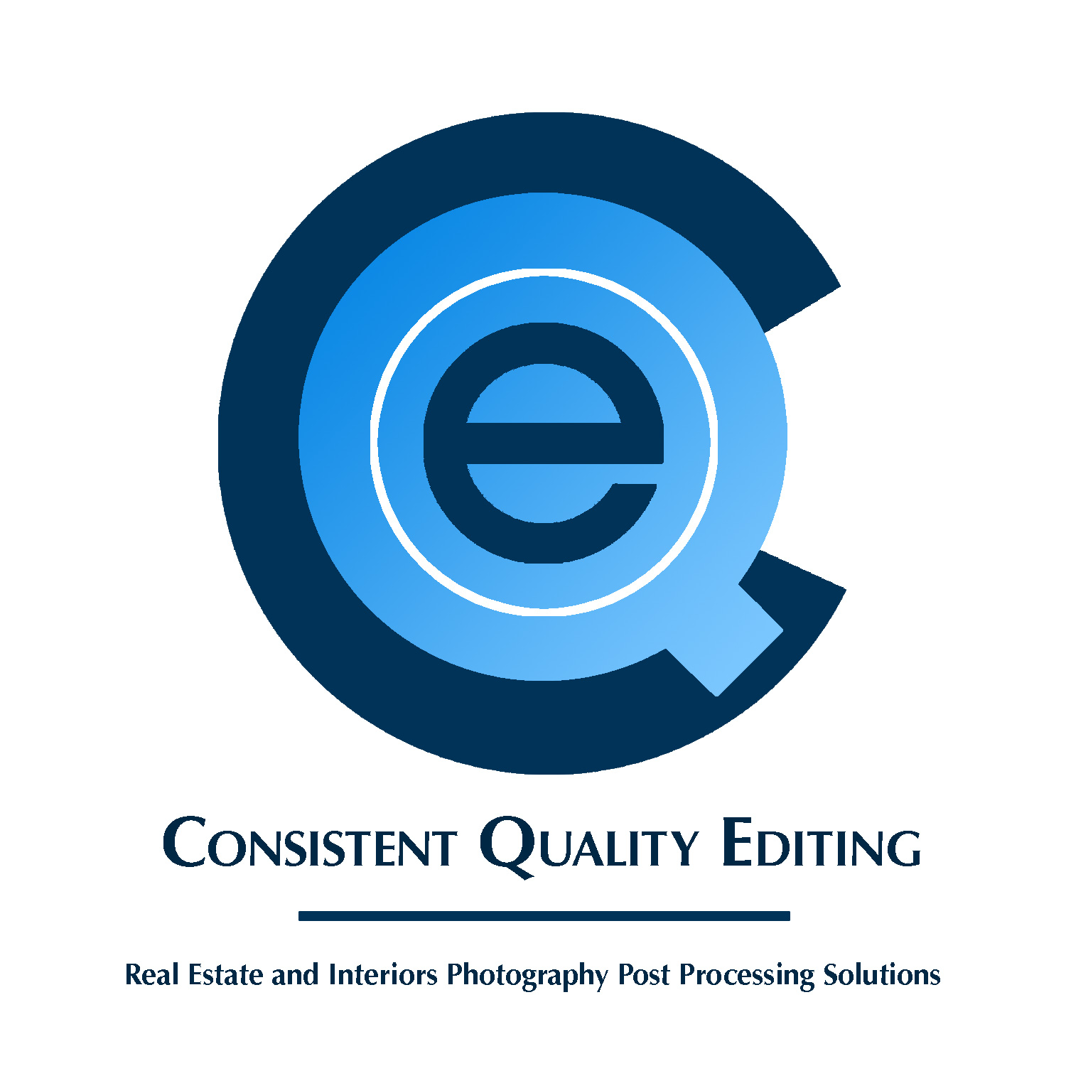
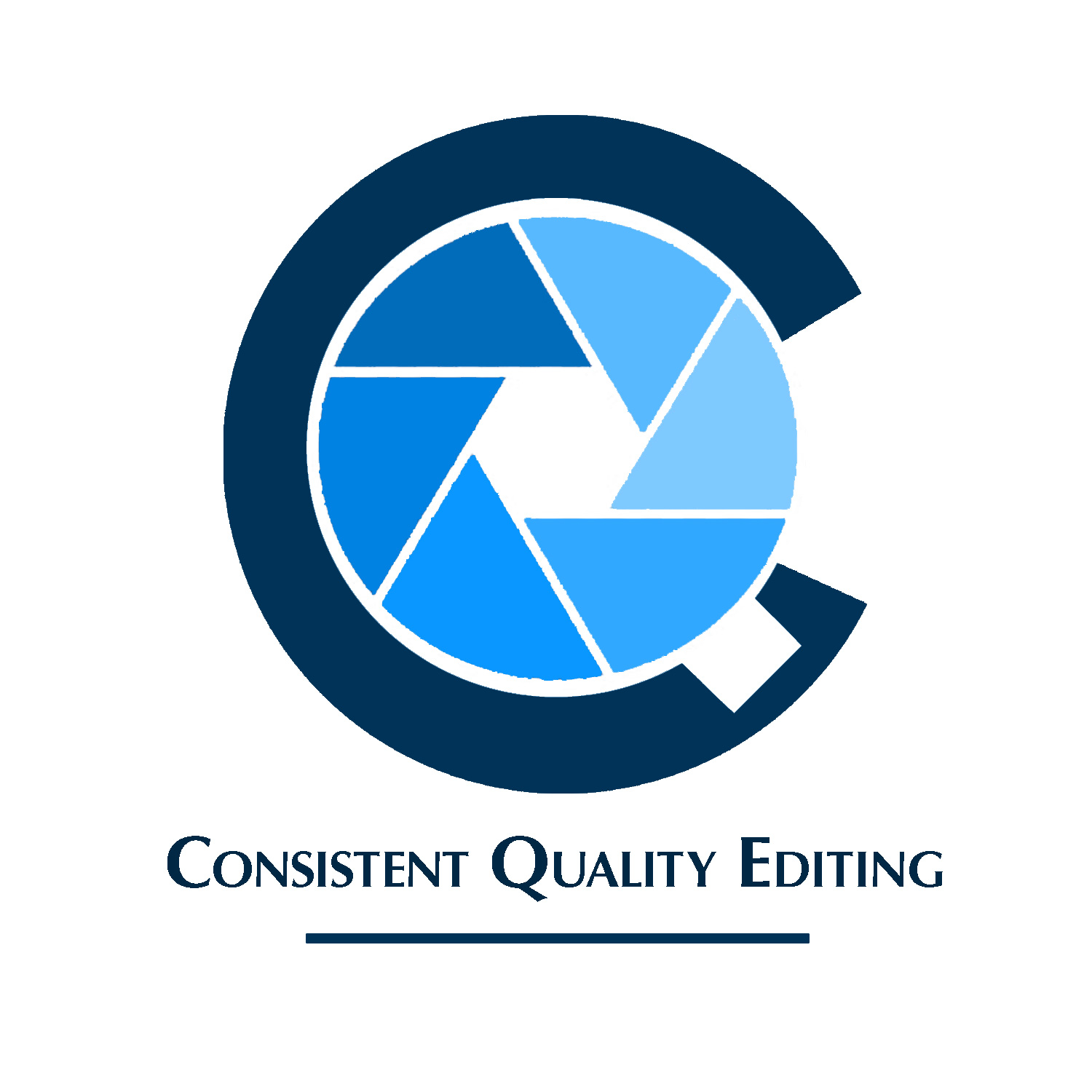
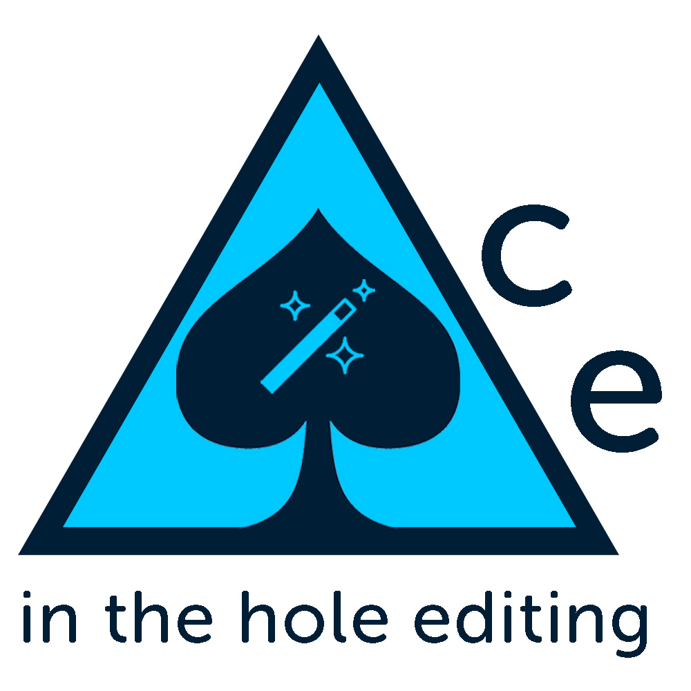
Did another version where instead of text on one line I stacked the three words on top of each other. Some of those versions have the pen standing up on the right with a dot at the bottom to suggest an exclamation point, some don’t, but I think of all of them I prefer these for the simplicity.