Personal matters and being separated from my computer over several international borders have kept me from working on this, or pretty much anything. Gave me time to think about your comments though.
Thanks to all for your excellent past criticisms and suggestions.
Rethought the name. Had an initial idea for ‘My Editing Guy,’ as in when we all at some point have to call “the guy” to take care of something we can’t, or don’t want to do ourselves, and also to suggest a personal, almost possessive, connection between photographer and editor. Few others, like “fixedpix,” but that sounded too derivative of Fix the Photo, and it never really grabbed me. Have to take domain name availably into account as well. I notice a lot of the competition have very vague sounding names that don’t mean anything (to me); such as omorfiamanila.
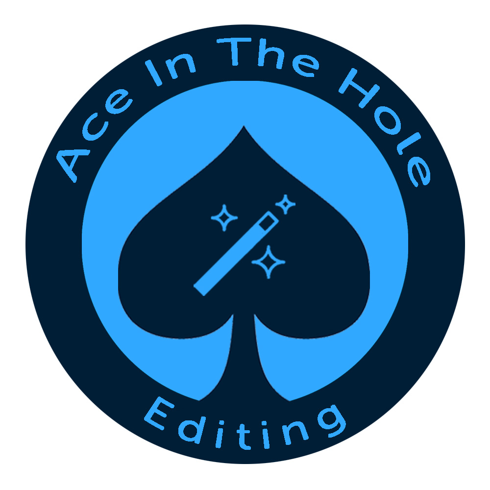
I was listening to a podcast by an industry leader on the subject of photo editing outsourcing services for real estate photographers and he mentioned how he doesn’t currently use one himself, but he’s open to it and would like to have an “ace in his hole” should he need it. I thought that was catchy and offered possibilities as far as visuals and the phrase has a positive significance whether someone has ever picked up a deck of cards or not.
I kind of like “Goldenhour” as well, but thought I’d stick with my first thoughts because it was very easy for me to visualize, whereas Goldenhour sounds like it has potential, but didn’t put any instant ideas in my head. Perhaps for someone else to work on should AITHE not pass the smell test.
I’d appreciate if anyone would chime in to give their thoughts on the following:
The name “Ace in The Hole Editing.” It’s long, but doesn’t seem too long. Adding anything more descriptive would seem to just lengthen the name and resulting URL.
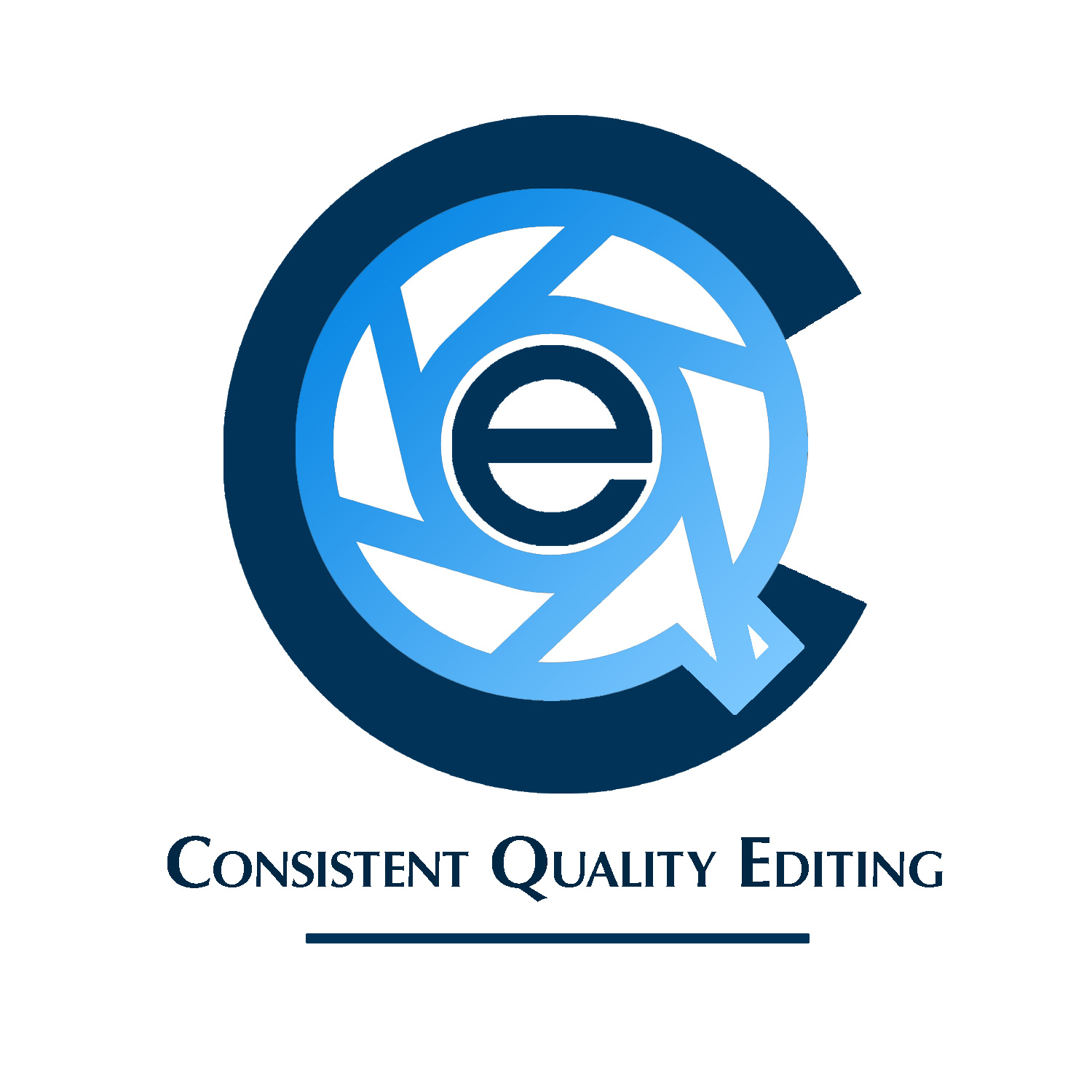
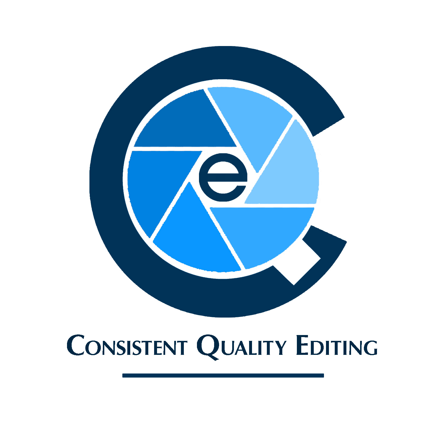
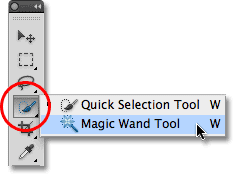
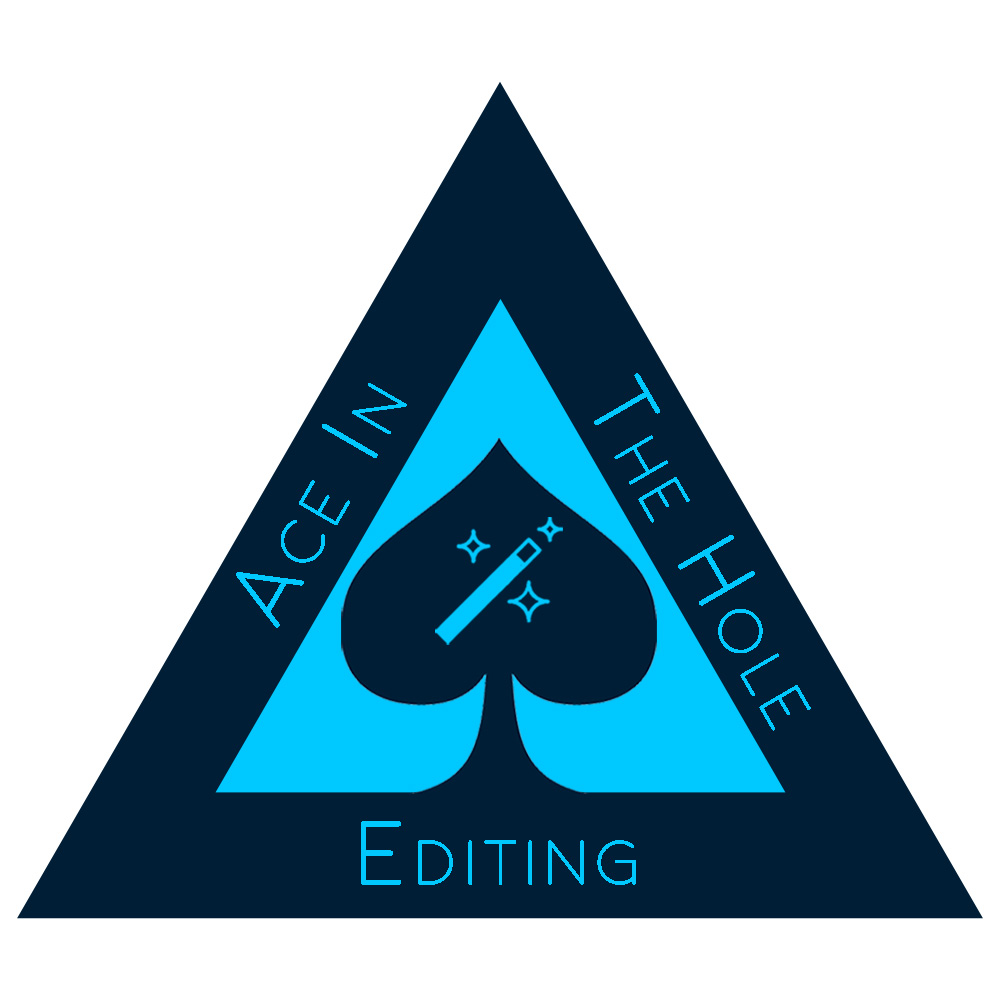
I liked the suggestion made by OVOAO (and reinforced by Kaegro) to incorporate “magic” in the form of the PS magic wand tool that is well known and suggests editing more than photography. I like the directness, suggestion of magic, tie in with playing cards (“pick a card, any card”) and with the name AITHE, and the fact that it’s a well-known (and loved) tool.
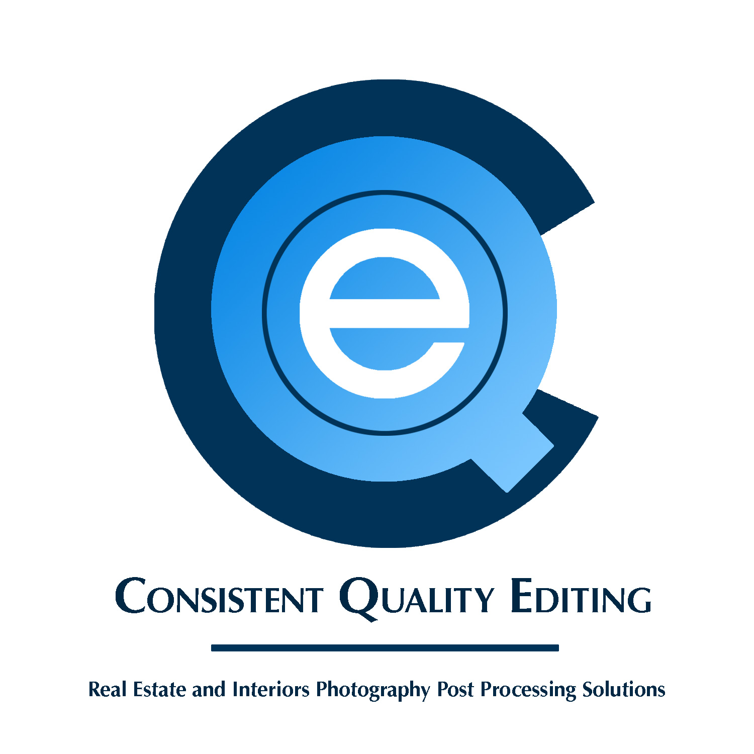
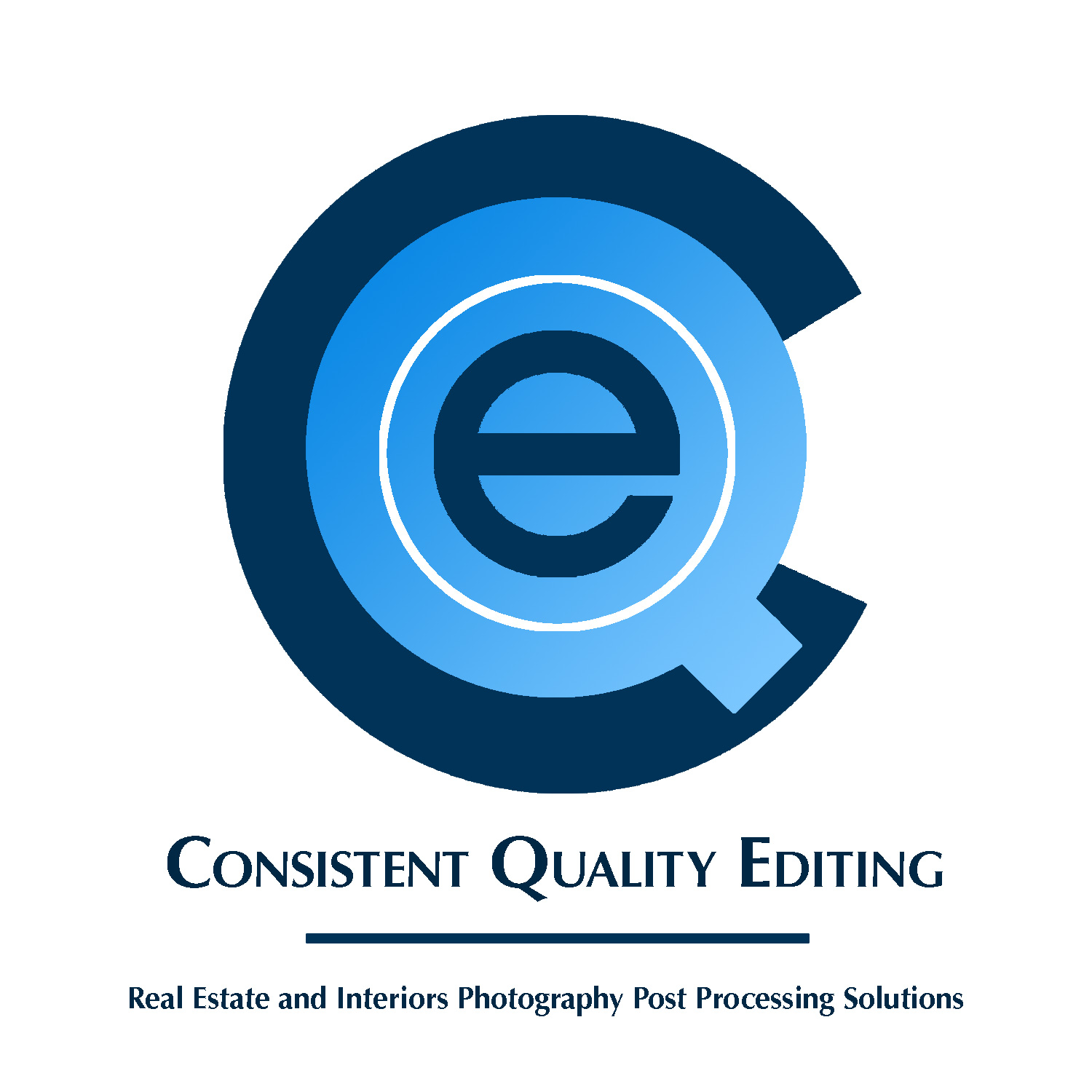
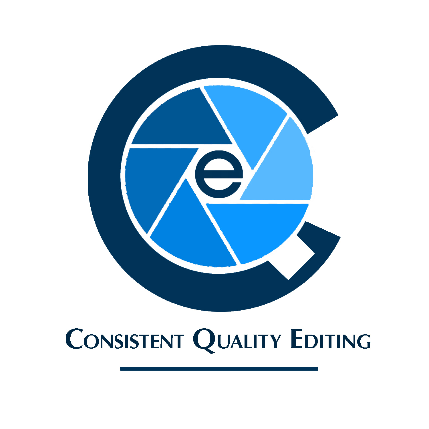
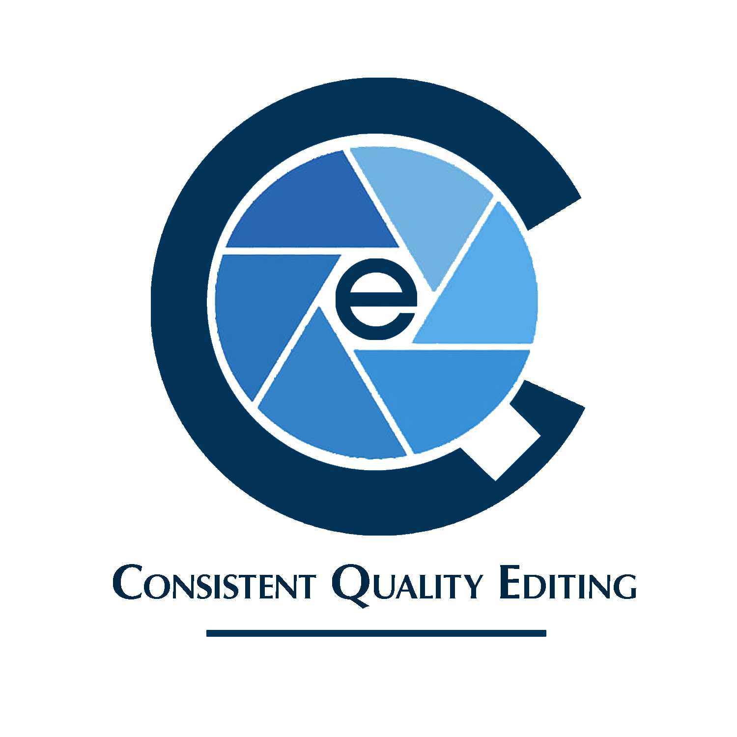
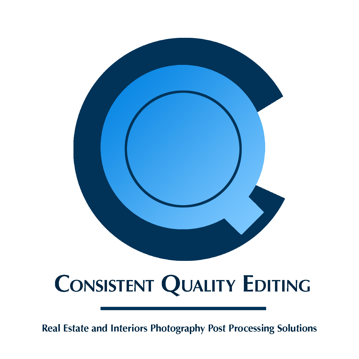
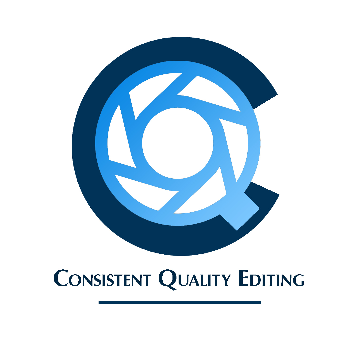
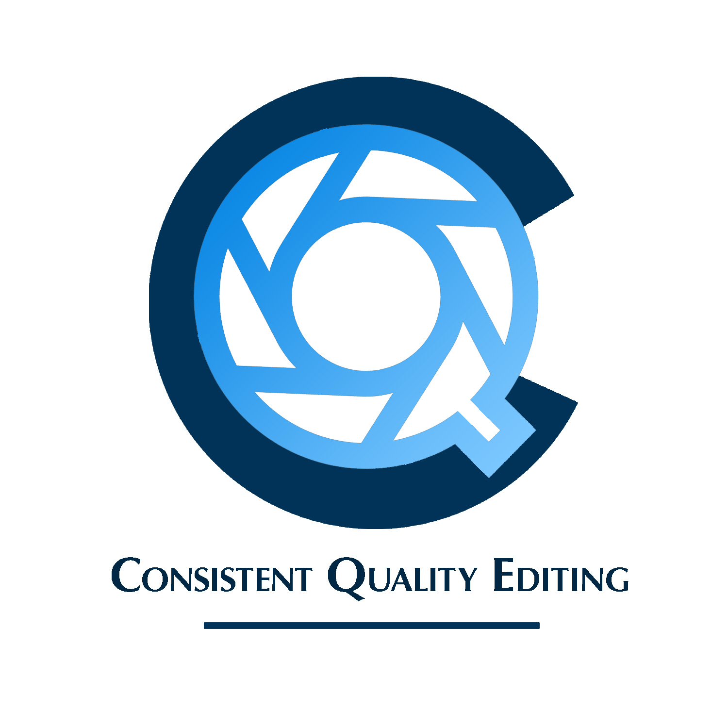
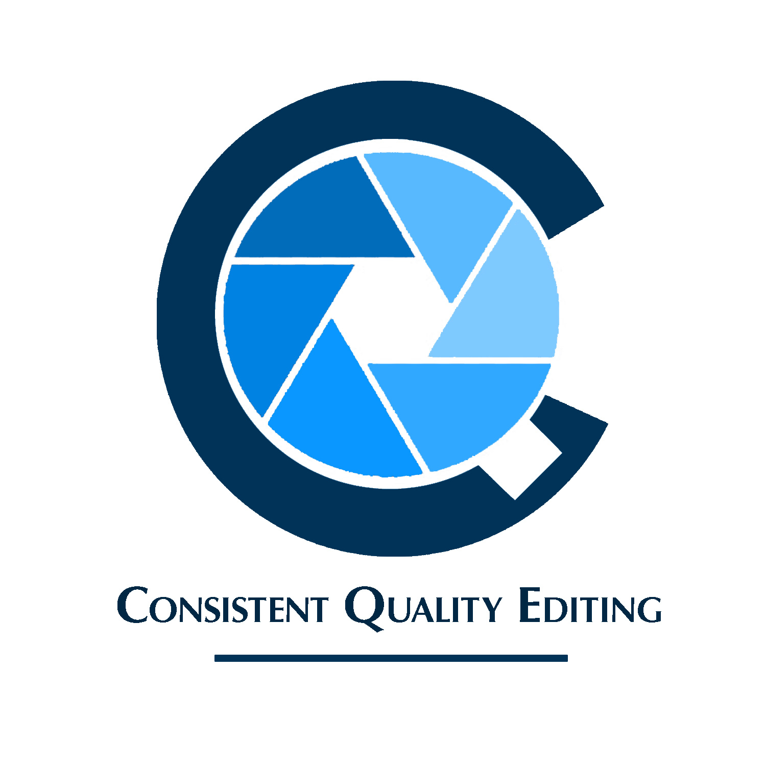
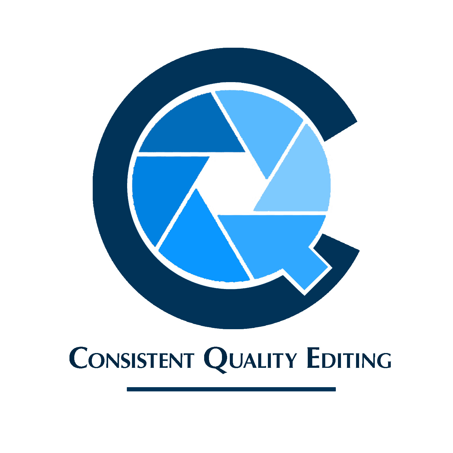
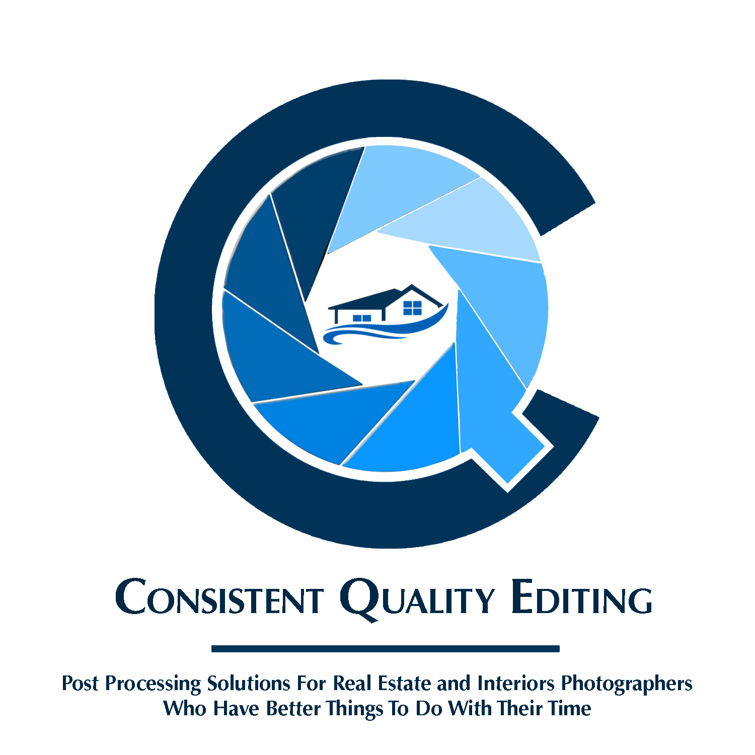
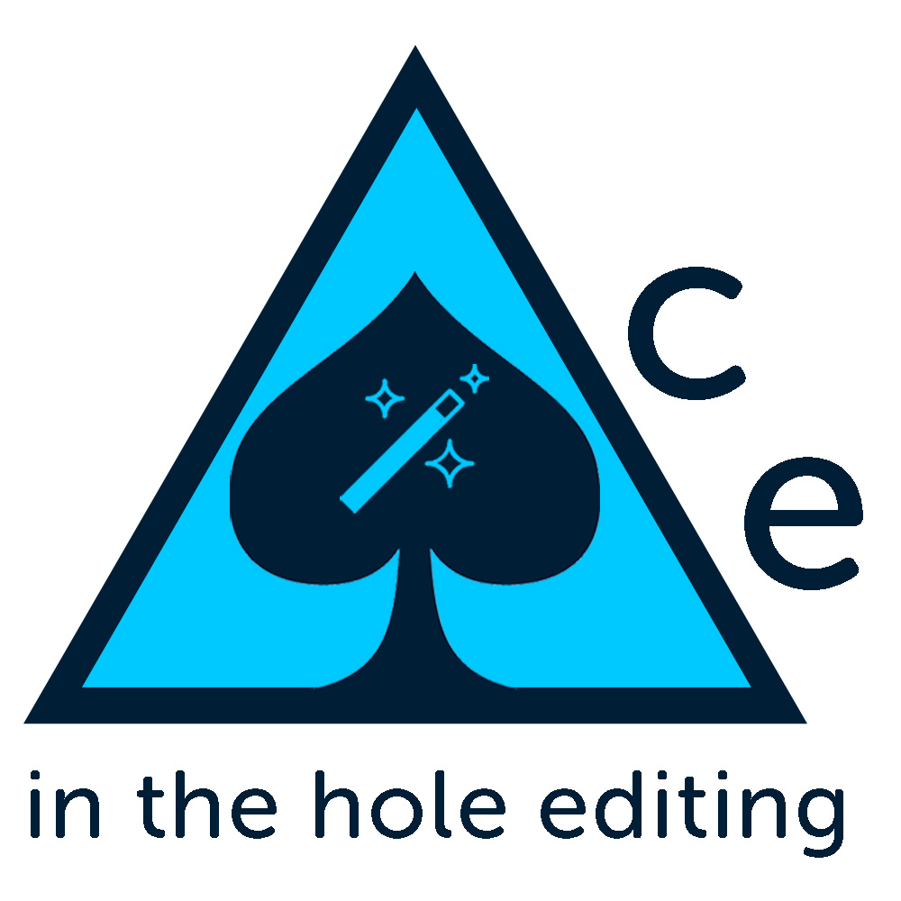
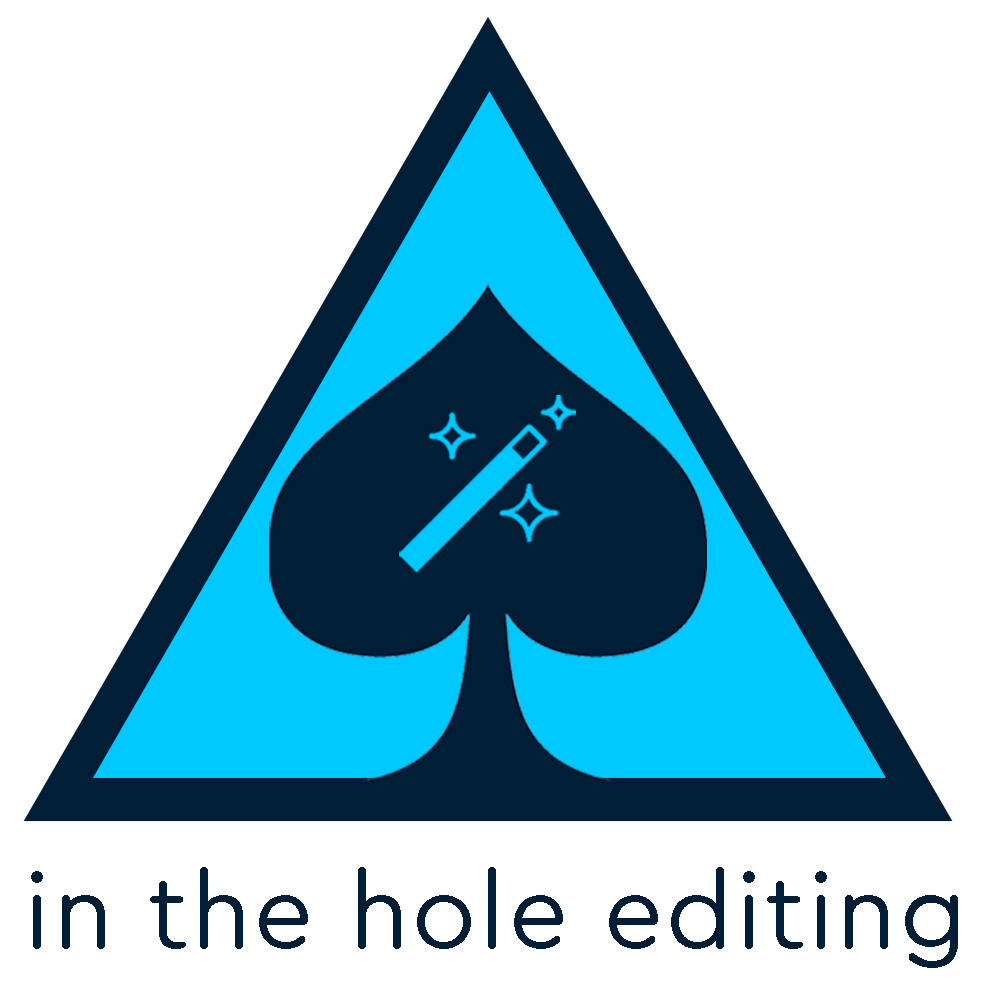
The following design concepts. Again, I’m just spit balling. Things I just threw together fairly quickly using PS. I’d sketch first if I could, but I can’t, so I didn’t. My goal was to keep things simple, though on a few I did add in some extra elements, such as a line of magic wands to separate text instead of just a plain ole solid line. The rounded fonts are sort of placeholders, as well as their locations in the designs, weight, kerning, etc. I’ve used the same darker blue color in all, but I’ve alternated between using two different lighter blues which makes some designs slightly more contrasty than others.
I’m mostly interested in knowing if any of these images have any elements that have merit as base ideas that I can pass along as a suggested concept to someone else for them to work on. Or should I just scrap this altogether, perhaps keep the name, and just give that to someone else to work with and go with the best looking idea suggested by them?
Also suggestions on shape. I chose a square canvass because this will likely only be used with a webpage header since it is an outsourcing business and clients are on different continents, so for now no print.