I am creating a logo for a butcher/ takeout shop (fictional). I hit a wall and looking for c&c. The name of the company is called “The PorkShop” a butcher shop that is also a take out for obviously all things pork. Get your cuts for home chefs or order out a menu list.
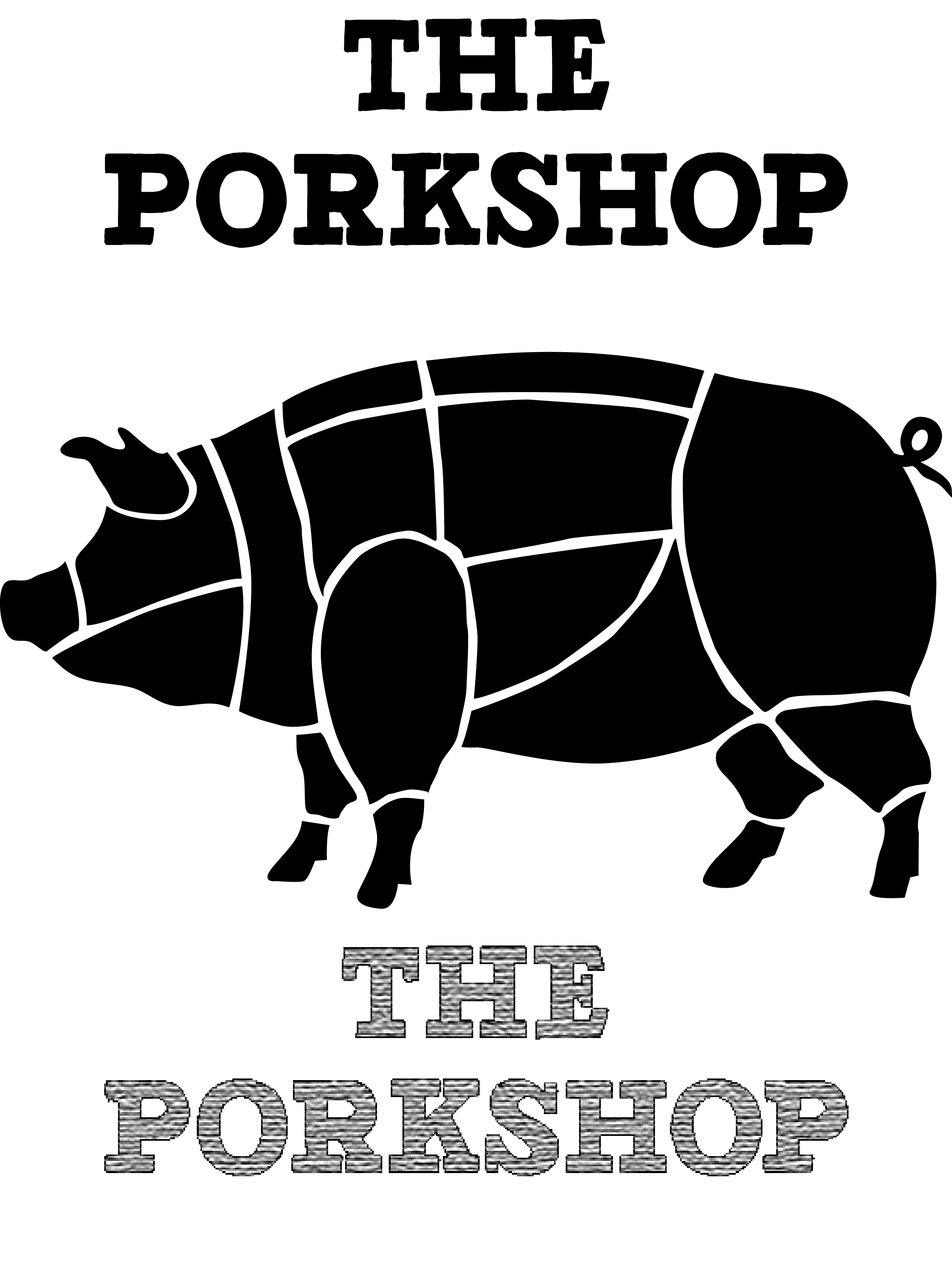
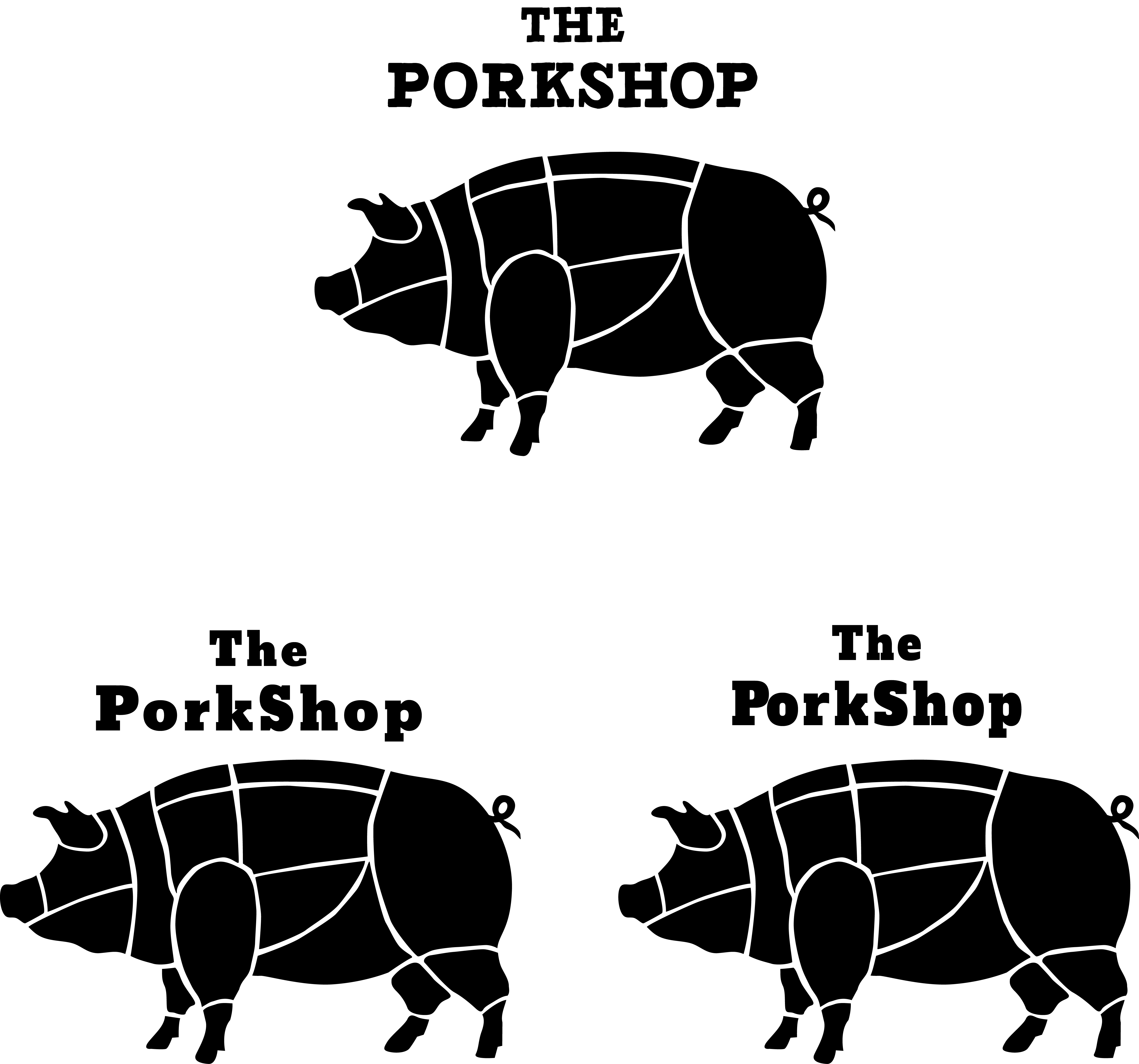
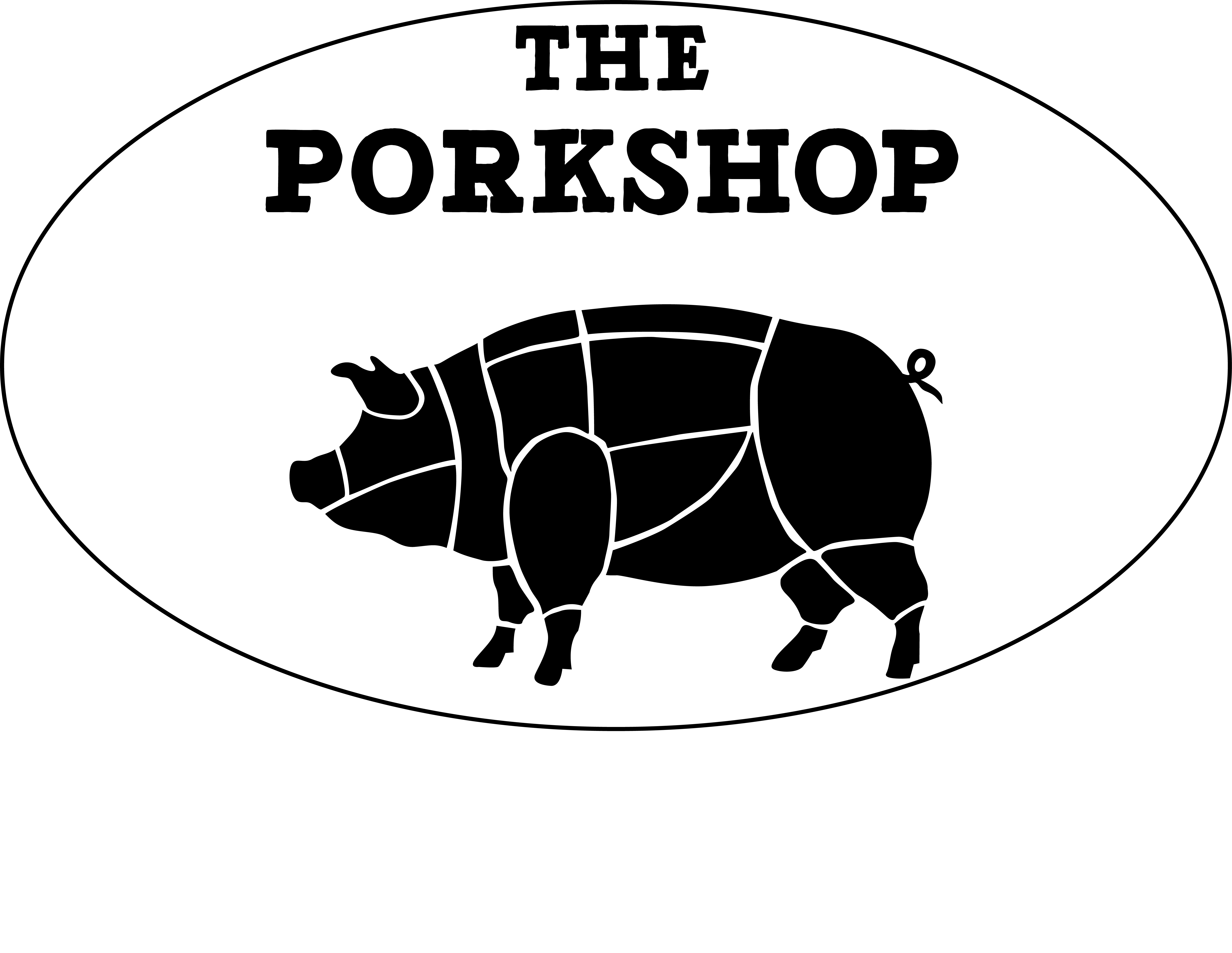
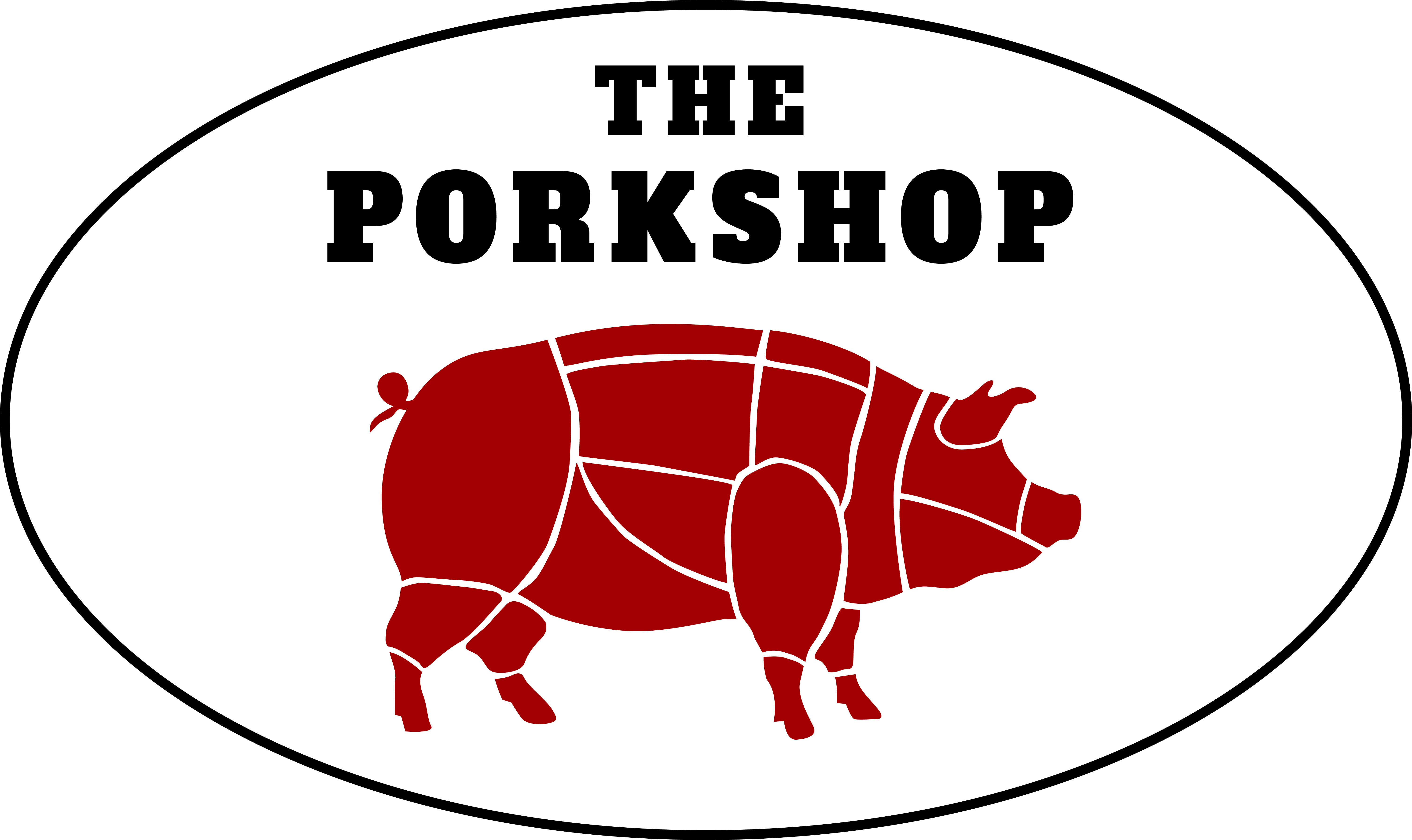
I have a whole idea for business card, and menu. I’m stuck with the logo in so far as typography. The logo is a whole pig with the different cuts. The cuts are the positive image. Playing with the name either on the bottom or top of the image (see image). The text i’ve settle with (see image) a blocky sarif font sort of like early 1900’s century signage. I’m at loss with coloring, playing with the type and simply making it more than a simple b/w logo.
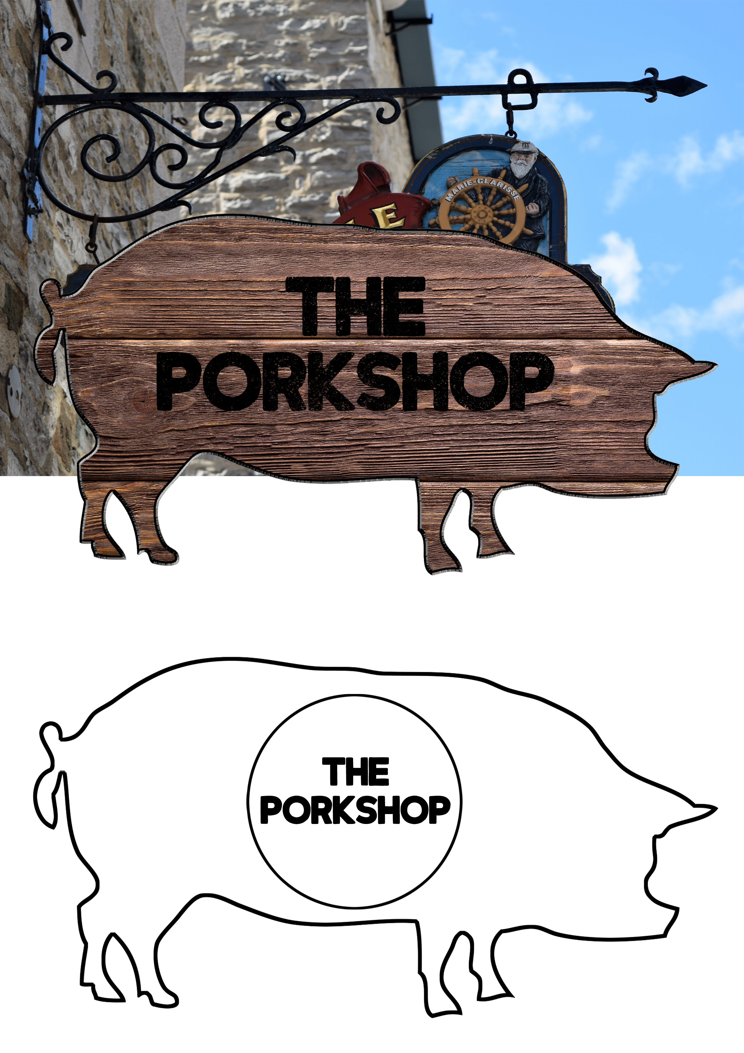
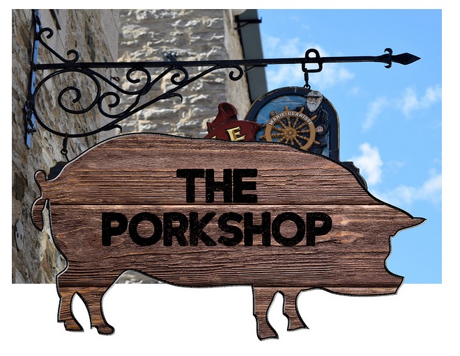
I also had a previous version that was a wooden cutout of a pig with the text branded on the wood signage. I like the pork cuts version better, but wanted to see if i can incorporate that into the wood block look. I wasn’t able to get the look of iron branding on the wood photo ref either. any photoshop tips??
If I’m reading your post correctly, you’re set on the mark (pig with cuts), you’re set on the type, and you’re looking for ways to use these assets to make them more powerful.
First of all, ditch the type on the bottom with the texture.
Second, I feel like the pig is too large in relation to the type. I’d say the pig should be much smaller – maybe to the tune of 20% of its current size.
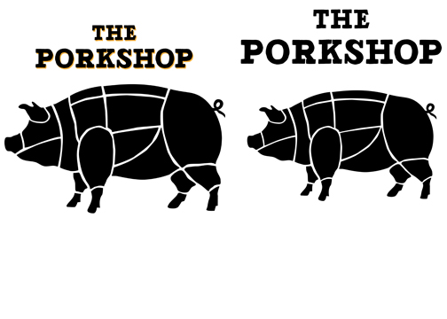
Try making THE smaller so it’s not the same size as PORKSHOP. This will help add visual interest and break up the type. Also, watch the kerning on your type.
good advice. ya the “porkshop” text looks better with The scaled down. regarding the kerning. Does it look too close together? the default kerning had the letters touching.
I also am thinking making a shadow or a slight 3d effect on the text may look less plan.
I might suggest a different slab serif — maybe Alfa Slab One or Bevan. The typeface you’ve chosen is a little wonky. Then again, maybe that’s part of the look you’re after since it sort of matches the pig.
Anyway, quit trying to improve the logo by decorating it. The best logos are usually very simple. On a letterhead, it can be just a couple of colors or even just one color. If you need it a bit fancier, choose an interesting paper stock or use thermography. Resist the temptation to decorate the logo with textures and shading. Keep it simple and concentrate on the form, not frills.
A storefront sign is a separate project from the logo and letterhead. The sign, if you’re even thinking of that, will need to be based around the logo, but can be a bit more elaborate.
For now, though, just refine what you have and present it in black and, perhaps, a couple of colors, like a dark red pig and black type, for example. Just play around a bit with the proportions, typeface and the pig. By the way,
Also look at what other people are doing (links below). Try to figure out why some of those logos and signs work and why some don’t. What do the good ones have in common?
Update.
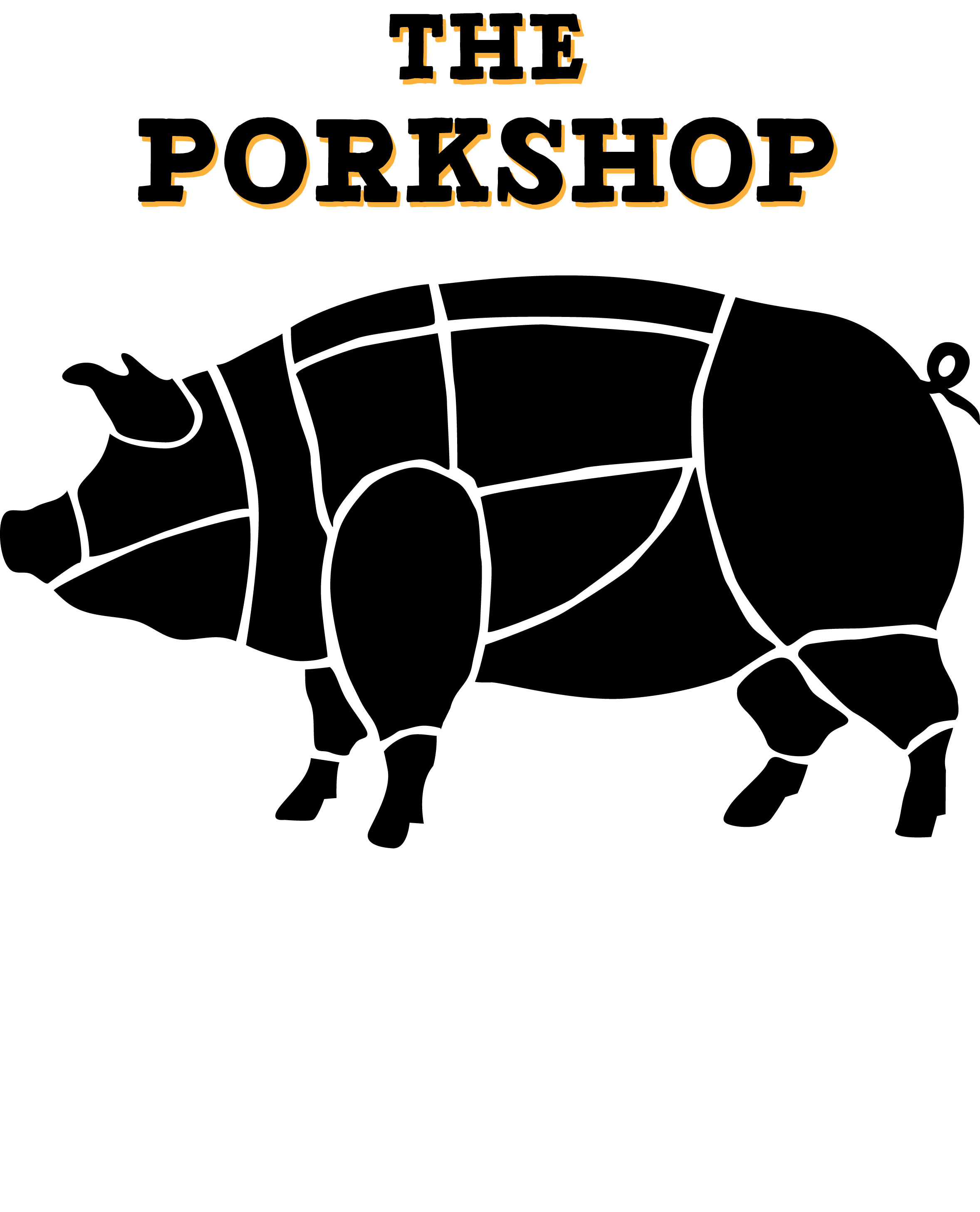
I’ve made 3 version. One with the original type, the other two in the suggested, Alfa slab and Bevan typeface. I still like the one I have its called Detroit, but I also like Alfa slab.
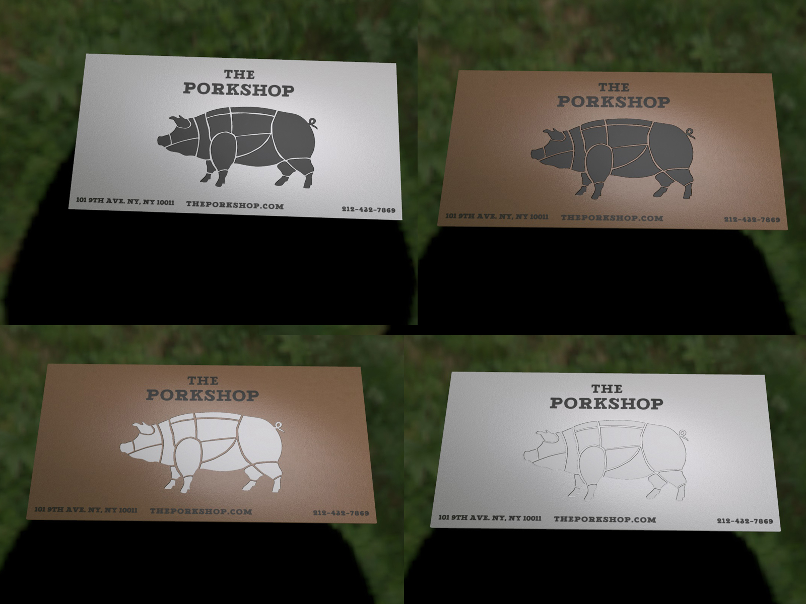
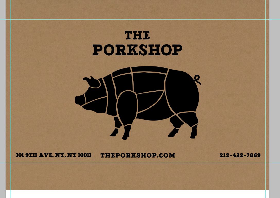
I’ve also started to test render it in 3D to see how it would look with the “pig” enbossed. I also tested if it looks better in a typical textured matte white vs. tan/brown color, imitating butcher paper.
Good letter spacing is critical. You can’t rely on just typing the letters in and assuming that they will be well-spaced. You need to carefully tweak the space between them all so that there’s the visual appearance of that space being more or less equal between them. Good kerning is essential.
Caps will likely work better with these slab serif typefaces than lowercase.
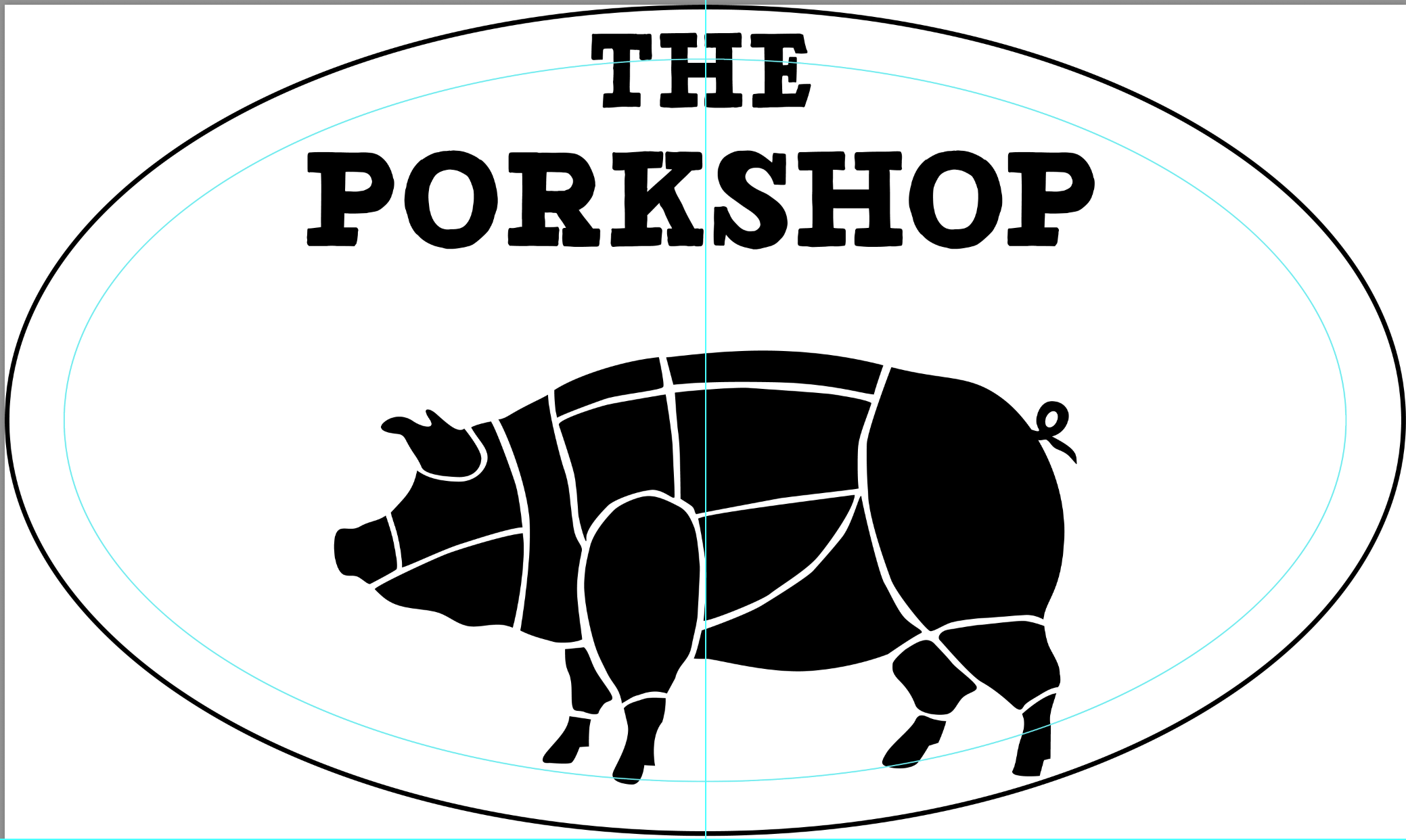
You’ve mathematically centered all the items, but what you’ve done is a good example of how optical illusions need to be considered. The type over the pig appears to be shifted too far to the left, even though it’s centered. For things like this, it’s more important that it look visually centered than mathematically centered.
Much the same is true with the composition that has the contact information at the bottom. Rather than center the middle line in the middle of the composition, it’s visually more important to center the middle line so that it’s equidistant between the other chunks of text.
I can’t speak for @Steve_O, but he suggested making the pig smaller in relationship to the type. However, you’ve made it larger.
Uh…
A logo needs to do all those things and more. Much, much more. But first a logo has to represent your client’s brand.
While a fully rendered sign isn’t the best starting point, that logo with some simplification is the better of all your ideas. A pig outline with the store name in the middle, no fancy junk. Steve-O had some other excellent ideas in your sizing and type choices.
Do not use textured infills on logo lockups. Do your initial work so that it will work in ANY medium, including things you wouldn’t necessarily be told to think of, like embroidered aprons and caps, cut vinyl window distractors, 3D elements for store fitouts, etc. After you have something that works, then you do things to it like adding bling or asking a sign shop to create a burnt-branded sign (we’ve developed a wicked pissah method of doing that too, LOL. We do quite a few.)
As an aside, on your wooden sign, you would do well to put the pig in an oval. Any small bits will break off at the wood grain direction, like the tail and all the legs. Showing something like that in a portfolio just shows you’ve never done it. You could say you didn’t plan on using real wood, but then you just increased the cost of the sign about 3x or more.
Yes, it does look better with the text larger than the pig element. Hmm, it wasn’t a good render as it was suppose to be a business card not signage. I wanted to visually see what the logo would look like with the element embossed, and if it looked better in black or plan embossed.
Going back to the logo, I revised and decreased the pig element and thought about the oval @printdriver mentioned and added it as another element. I may make the pig smaller as it feels like the wide of the word “porkshop” is visually competing with the width of the pig as they are practically the same.
As I mentioned, on that post it was a previous version. I should have explicitly mentioned it is scrapped and I may go back to that final idea if the logo works with it. The whole idea is porkshop/pork chop a modern butcher shop specializing in, of course, pork. Serving cooked pork foods, and providing pork cuts for those other white meat lovers. The wood sign going back to a butcher chopping wood block, and the burnt words links to animal branding and all things cooked pork.
I just pointed out that of all your options it is perhaps the more viable to pursue, sign mockup notwithstanding. I love doing burnt wood signs. Makes for an exciting afternoon. LOL.
Misteree, I hope you are a student. If not, you need to get a better grip on learning basic design principles. For instance, on the wood signage, the black lettering would severely lack visibility from a distance and visibility is critical to good signage design. Secondly, your sense of visual spacing (as seen on your first effort in incorporating the design within an ellipse) has the lettering way too close to the top with too much space between the lettering and the graphic. Always leave more “breathing room” for your design at the top and bottom. Third, the typeface you are using is definitely a poor substitute for a more classically designed typeface. Never get “cute” with typefaces when a much better common typeface already exists.
I havn’t decided to keep the oval shape or ditch it for just the text and pig. And the type will most likely be Alfa Slab.
My question is, is this too simple for a brand logo to be used on a business card, menu, and letter head? As far as that I do not have much experience on what would be considered enough or still needs to be refined.
Misteree—Simplicity has always been a key to great logo design. You can’t get “too” simple. in an earlier post you also asked about colors for this job. In my fifty years as a graphic design professional I have designed logos and marketing materials for countless food products and food services. If you look in any grocery store or butcher shop you would see the color red in all it’s value variations is always preferred, as are it’s complement bright green, orange, and yellow. All of these colors evoke freshness, which is always a prime food characteristic. I hope this helps you.
Making a minimal design work well means a huge attention to detail.
I quickly drew some guides. The oval guide shows how your type and the pig are too close to the outer circle.
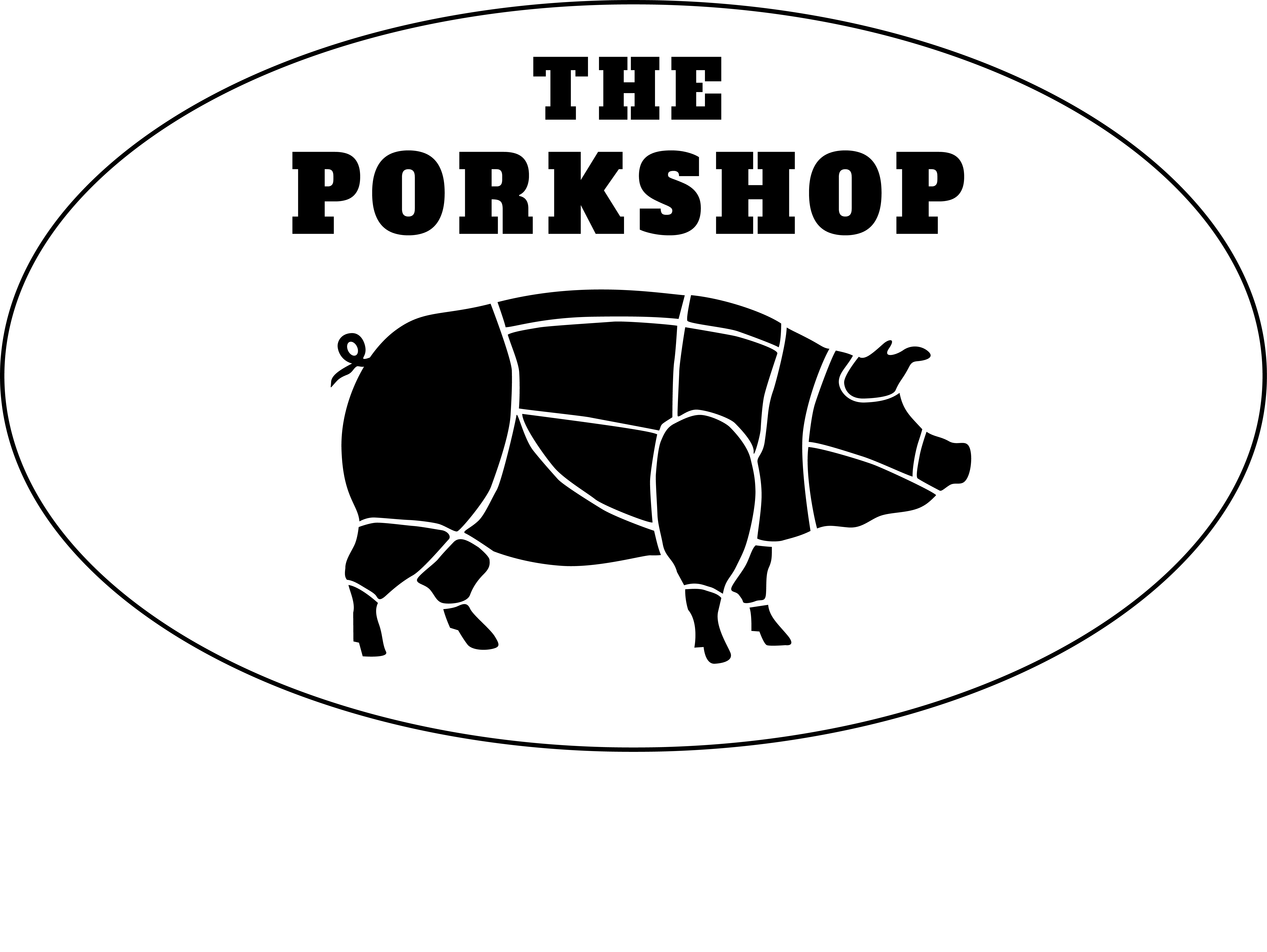
The pig should most likely be flipped to facing to the right. While it’s not a hard and fast rule, you generally want elements either directing the eye to the right or up.
The font choice of using a slab serif is fine, but the font you’ve chosen is pretty bad. The un-evenness of the forms, the crookedness of the serifs. The leg of the k, the “squished” e, the odd serifs on the s …
It may seem subtle, but when I think of a quality butcher shop, I expect cuts to be precise, I expect precision and care, cleanliness. The sloppiness of the font counters all of that.
Lastly, look at the middle dividing guide. Notice how while the pig may be centered form snout to tail, the majority of the visual weight is the back half of the pig. If you want it to appear more centered you have to balance the visual weight of the pig.
I update the logo with the alfa along with visual centering. flipping the pig from left to right looks odd but, its only because i’ve gotten used to seeing it positioned in the former. @CraigB You’re right about the left to right, and top down rule, I completely overlooked that rule when making this logo.
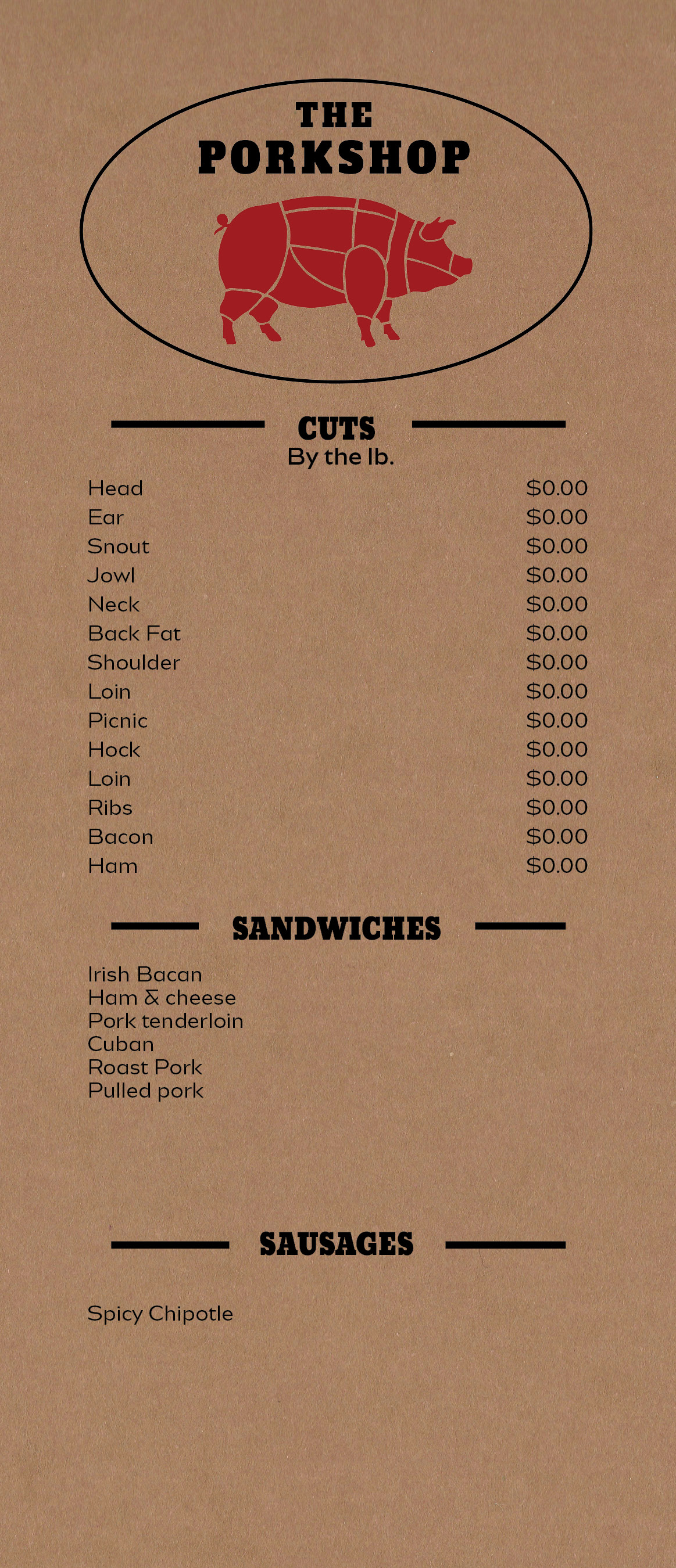
I added color and made a mock up menu with the logo. Is there a hard or fast rule for mixing types? There were not that many options to change the thickness or the logos type so I used a san-sarif font for the body of the menu (Bw aleta no. 10). I’ve herd the rule of thumb for type is 2 and rarely at most 3.