Hello! I need some help! I am working on this label and feel as though I am missing SOMETHING!! but just not sure what. Please let me know what you think, what I can add, how can I make it more professional but still fun. Really needing some help on this one. Honestly is best! I am here to learn so please don’t hold back. The more critique, the better! Thank you!
1 Like
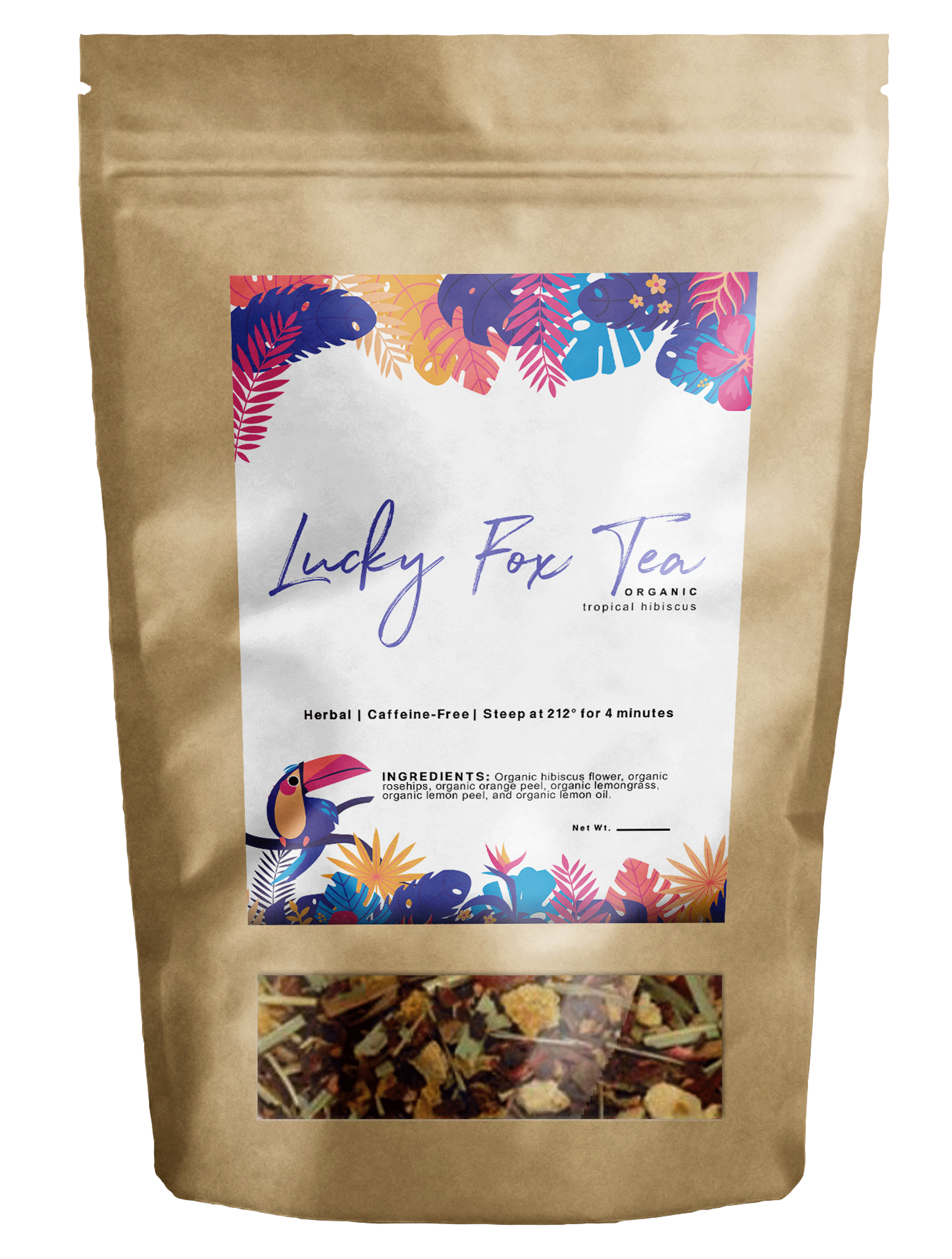
Why the Toucan on something that states Lucky Fox?
1 Like
It’s Tropical Hibiscus flavor?
…Lucky Fox is the Brand and Tropical Hibiscus is the flavor of tea which will have many flavors…The toucan relates the tropical aspect…each tea will have different labels relating to the flavor…
Is this just a label that will be applied to a purchased, blank package or is it a custom package where the printing can cover the entire face of the package? What is the image beneath the main label? Is it a photo of the tea itself or is it an actual window to view the contents?
The package, the name and the picture of the tea have a woodsy personality, yet you’ve used a tropical motif with tropical colors? Why?
Is this “tropical hibiscus” tea just one of several different varieties of tea this company makes? Is the tropical motif just unique to this variety of tea? If it’s just one variety in a larger line of teas, is there an overall brand that this needs to fit within?
I know I haven’t answered your questions or given much of a critique, but without knowing more about this and whatever parameters you’re working within, I have more questions than opinions.
1 Like
The label will be applied once purchased.
The package will have a window to show the tea that was purchased.Package will, actually, be silver but couldn’t find a silver package mock up.
The name of the product is the name of the tea, and can’t change it.
Tropical Hibisucus is just one of several different varieties that will be available and yes, each tea label will be unique to the product name.
I wanted to give each label, each tea, a style, it’s own “flavor” so to speak.
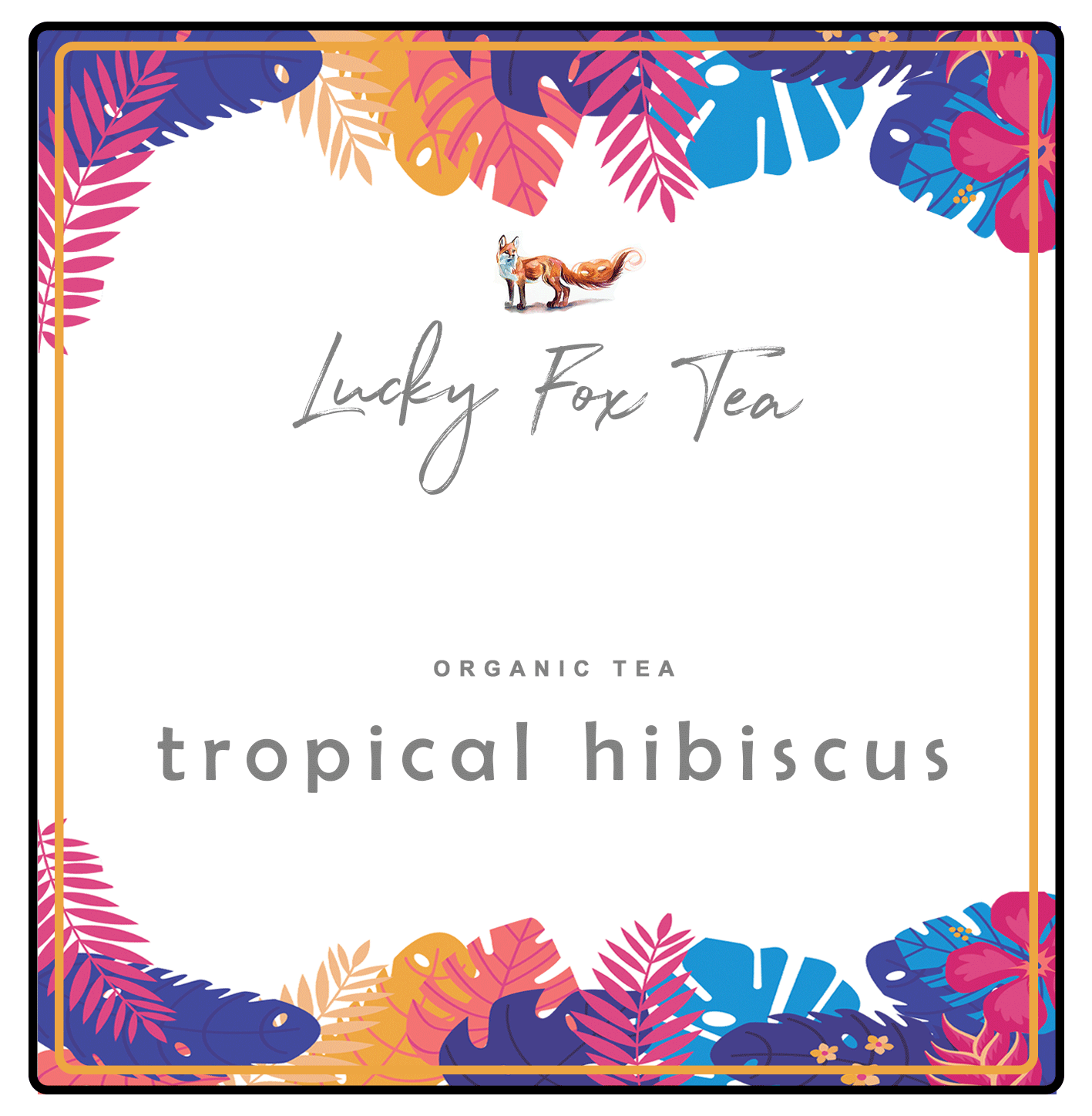
I guess, techincally, I could illustrate a fox in hawaiian shirt…rather than Toucan…
Thanks.
In the time it took me to write my questions, others had asked and you had answered them, so sorry if my questions seemed repetitive.
Given that this is one tea in a line of teas, I’m not seeing much of the larger brand identity beyond the Lucky Fox Tea script word mark. Instead, I’m seeing a clash between the woodsy package (which might be appropriate for the other teas) and the tropical-looking label. I do like the toucan and the tropical vegetation. I’m just not so sure how well they mesh with the brown paper bag. Maybe if I saw all the different teas side-by-side on a store shelf, it would make more sense. However, I’m still inclined to think the overall brand identity should come first, with the sub-brands of the individual teas fitting within that overarching brand. Then again, I’m not sure what your role in this is — designing a brand identity or just a label on one package.
From the looks of things, it seems the tea is composed of a bunch of different leaves, blossoms, stems, etc. With contents like this, things tend to settle out before landing on the store shelf, which the finer material settling to the bottom and the courser material rising to the top. With the window at the bottom, you might run a risk of the dusty, broken up materials collecting near the bottom and up against the window, which might not show the contents as well as it should.
Is there any options for die cutting the label? A rectangular label and a rectangular window seem a little basic and undynamic. Then again, maybe this is supposed to reflect a more rustic, small-scale, hand-made, organic look.
1 Like
“Lucky Fox Tea” is the corporate identity?
I know that the packaging will be different. I know that one complete side will be a window, so one will be able to see the loose leaf tea or tea bags in its totality. So it will not be a little window. I also know that the packaging will be silver. So the label on the package probably won’t help much as a true ‘mock-up’ of what the label will look like on the packaging.
I can work on the brand rather than the label first, maybe that’s where I’m getting stuck…I haven’t created the logo quite yet. So I should probably start there.
Can you expand on Corporate identity?
Yes, it would be the brand. Yet, it’s not a corporate company.
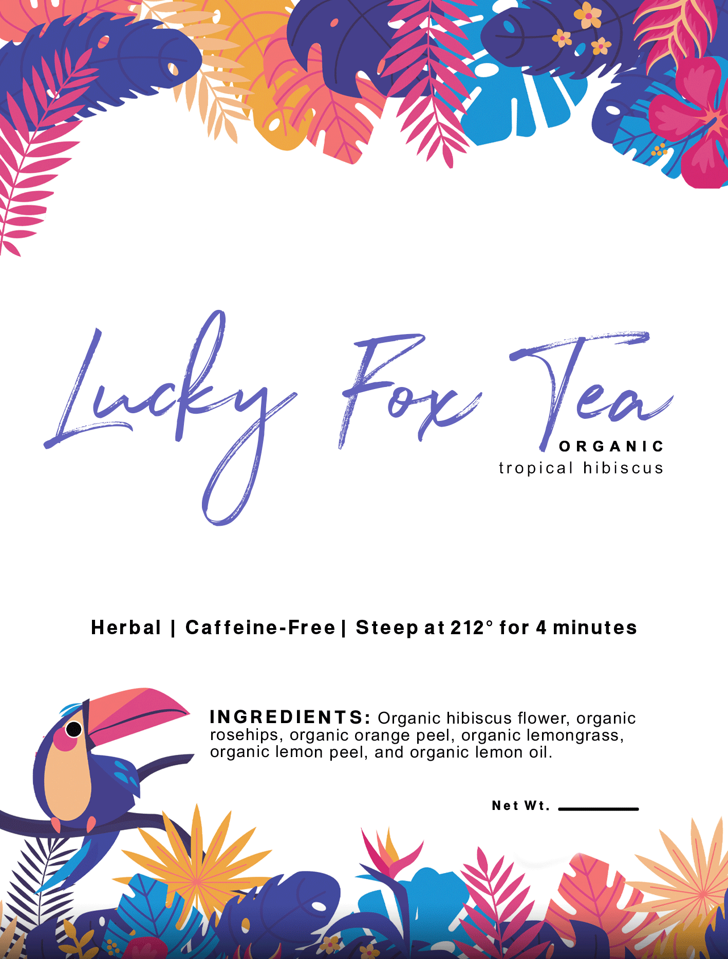
I think that “Tropical Hibiscus” is virtually invisible. If say you have 20 versions of this label with different “animals” and colors that could get very confusing very quickly trying to find the correct label for the correct flavor.
I would go for a “Lucky Fox Tea” presents… “Tropical Hibiscus” sort of feel.
1 Like
It kind of defeats the purpose of any attempt of critique, doesn’t it?
Yes, that’s where I would start.
I just needed to know if the darjeeling was produced by Fortnum & Mason. Thanks.
Hi @alexvanr!
First off, your label looks lovely, sweet and fun and it is well executed. But you’re looking for critique, so let me give you a “brutally honest” take: You completely missed the mark to tap into the potential that a name like “Lucky Fox Tea” gives you. It’s a potential to make a great, unique and quirky brand identity and you completely ignored it. Moreover, tea is a rather sophisticated, artisan brew and you gave it a Fruity Loops treatment. You see the colorful label and then the dried leaves of the tea in the window below and it simply does not match. Moreover, the tropical theme will only work for tropical tea blends, and you’ll have to abandon it as soon as someone orders an Earl Grey. Maybe that’s why the Toucan looks so sad and puzzled. ![]()
How about you actually center the label around the fox instead of the tropical theme? A cool faux-back vintage illustration might work magic here. Picture a fancy dapper fox with a tophat sipping a cup of tea, while holding a hibiscus flower in the other hand. Now that would be a label that would intrigue me to try out the tea! ![]()
Here are some illustrations I just googled, that might inspire you for your project:

https://pbs.twimg.com/media/DfyzvY1WAAAIS_0.jpg


1 Like
@alexvanr I think I can empathize with you in that I think something is missing from your package.
I’m not really liking the script typeface you’ve chosen for “Lucky Fox Tea,” as @OVOAO mentioned, I think it’s a bit of a lost opportunity and I actually struggled to read it (initially I thought it said “Lucky For Tea”!). I think it’s a nice typeface, however it feels like it lacks the visual weight to capitalize on the negative space around it and instead it kinda disolves into the background.
And being totally honest, I think the flavour “tropical hibiscus” is one of the hardest things on the label to read - was that your intention?
I know you’re trying to make it look good, but I think you should give more thought to the functionality and apply some visual heirachy to what you want the viewer to see 1st, 2nd and 3rd…
I think the leaf and flower illustrations are really well done, did you do them yourself?
UPDATED
Here is an update of the design. Let me know what ya’ll think. Orange is cutline. I thought I could leave out the ingredients and add it as a secondary label. Please let me know your thoughts. Thank you!
I hope you meant dieline.
It is called many things, especially found out working with a lot of people not the same nationality. Cutline/dieline/keyline/etc
I would have the flavour larger, the hierarchy is wrong.
1 Like
Can you elaborate and give me more information on the hierarchy? What about it is wrong?
Why is flavour small? Said this already.