Here’s the newest fodder for your amusement lol. While you’re laughing, at least tell me why you’re laughing please.
Thanks!
Here’s the newest fodder for your amusement lol. While you’re laughing, at least tell me why you’re laughing please.
Thanks!
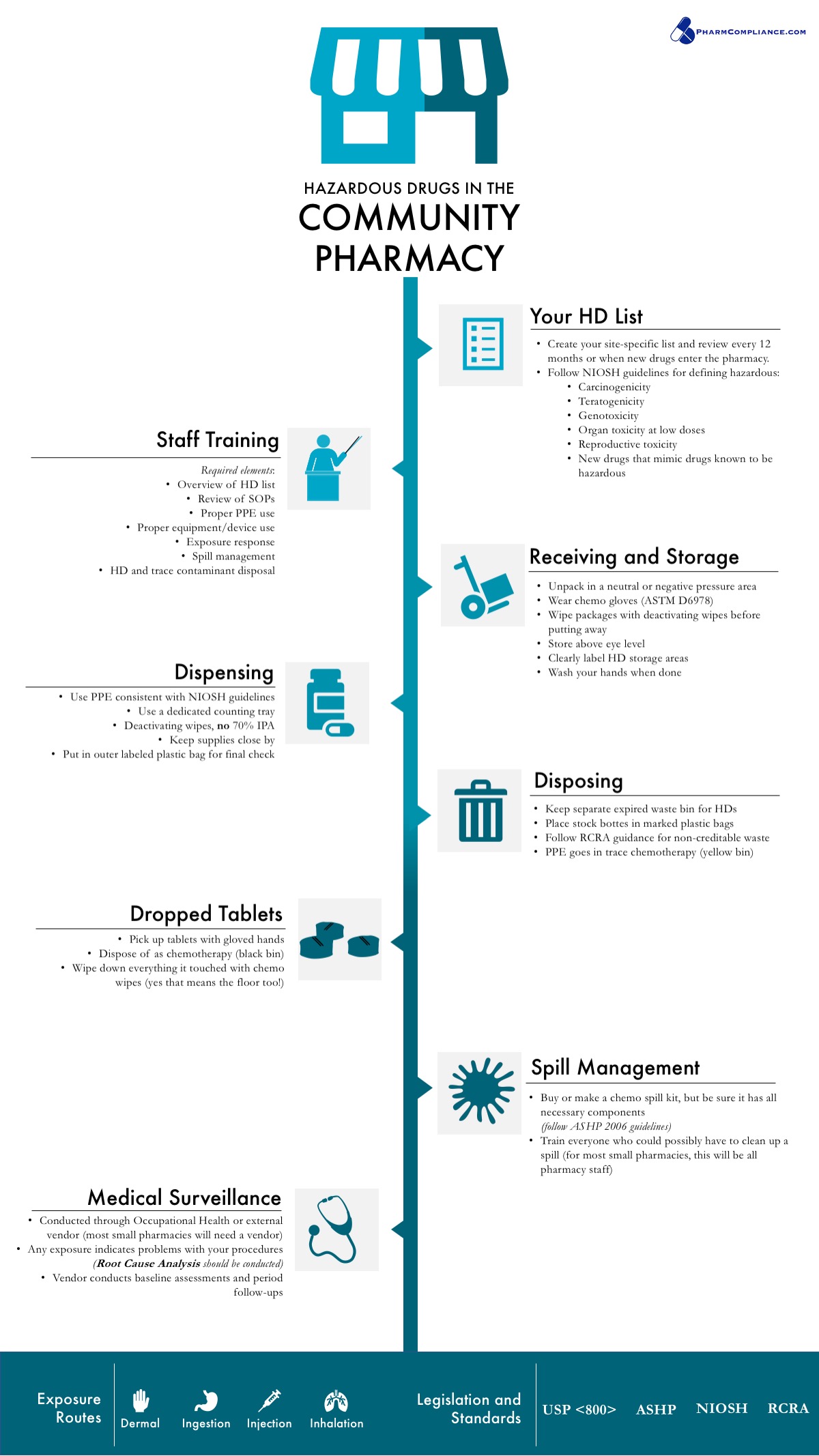
This is a big improvement over what you posted before: Infographic
Considering all the empty space, if it were me, I might squeeze things a bit closer together or enlarge the type to fill the space a little more.
I’m having some difficulty deciding who the target audience for this might be and how all the sections relate to one another. Is it a timeline of some kind? Would a brief introductory paragraph help explain what this is and who it’s for? Since I’m likely not the target audience, perhaps my concerns are misplaced.
Again, though, a big improvement.
For once, negative white space works against you. As I said before, infographic is for to present information. The body text can be adjusted to increase readability.
The left half of the text should not be flushed right. The bullet points are contradicting themselves. The lines below the subheads have no rhyme nor reason, and the spacings make even less sense.
I am not laughing.
I guess the intent is more of a process than a timeline, but I’m hoping to convey a chronological order. You would need to receive medicine in the pharmacy before you could dispense it, for example.
Pharmacy rules, laws, and standards are so complicated it’s hard for a lot of pharmacists to sort it all out, and my website is focused on making it easy to understand; I’m a medical writer, so blog posts aren’t an issue, but until my site is producing the revenue necessary to hire designers I’m hoping to be able to create graphics that at least aid in understanding key concepts in the pharmacy industry.
Anyway, thank you again for taking the time to comment!