Natural Cleaning Service Logo (NEED HARD CRITICS)

FIRST POST HERE
Pleasure having a space for judgement. Commence.

NMCombined-NEW-AllColor

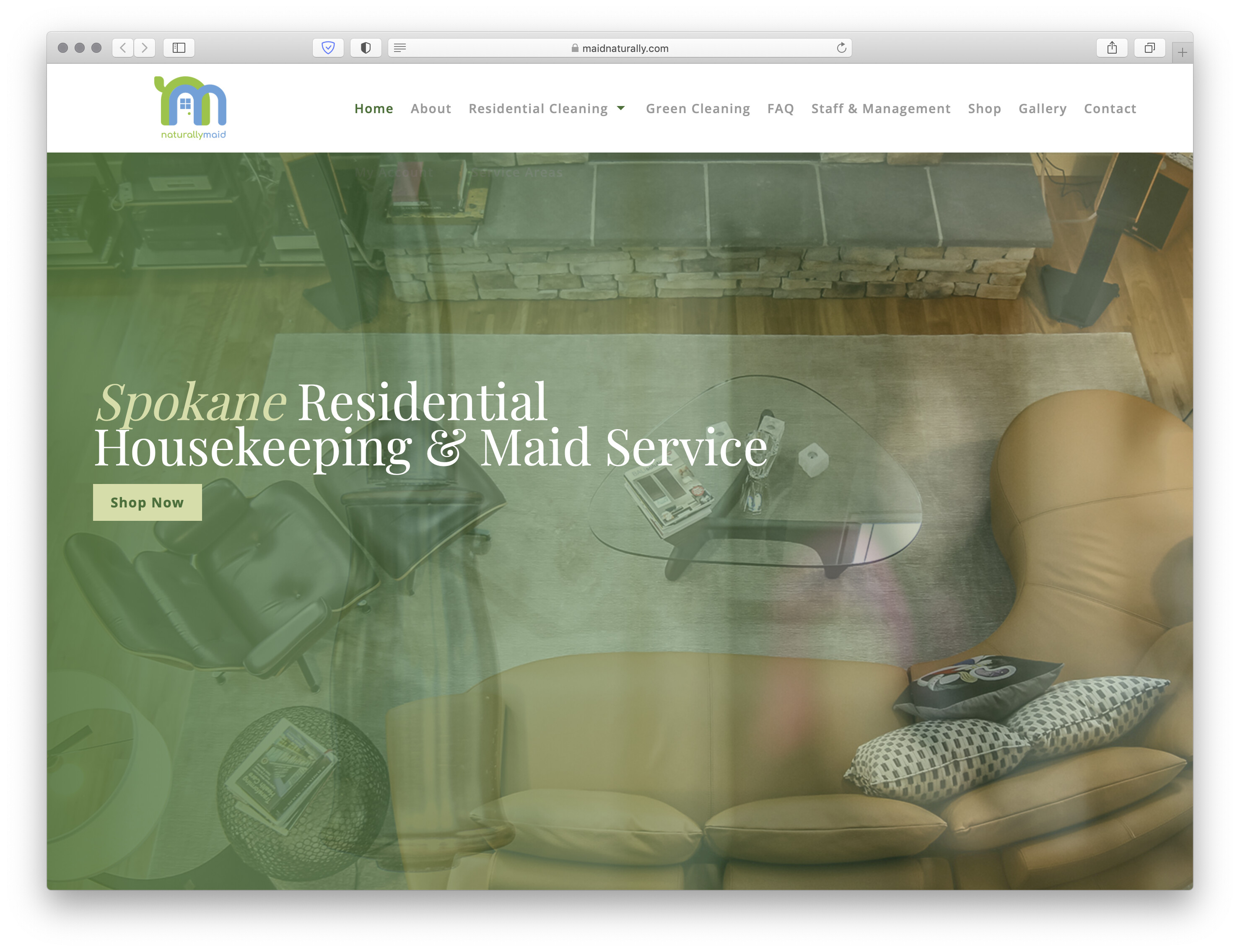
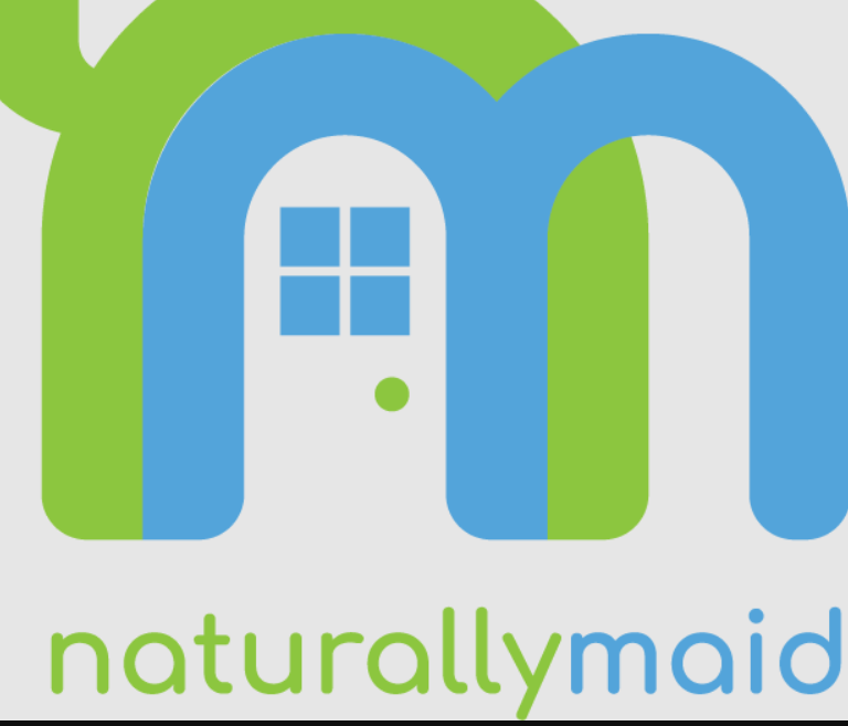
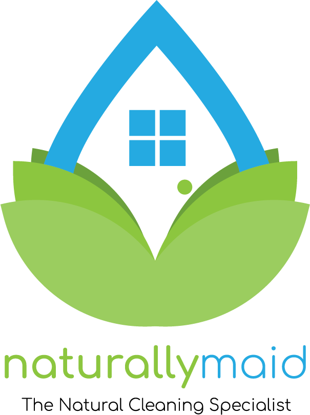
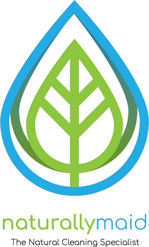
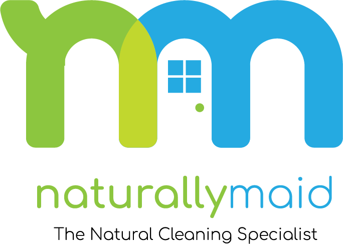
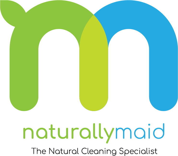
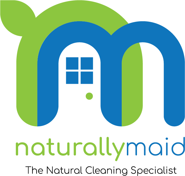
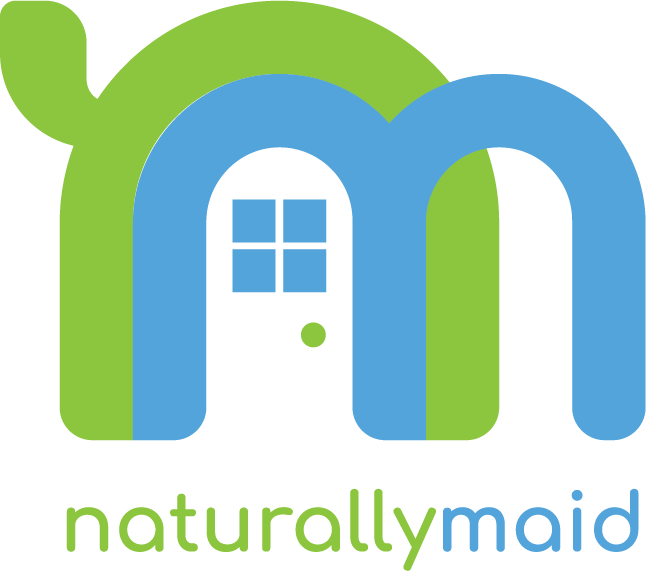
  • Concept : This is a logo idea that represents an all natural cleaning company that serves residential and light commercial (retail/boutique/studio) clients.

  • Purpose or Goal : The goal for this logo was to touch on the eco-friendly concept, while primarily conveying a fun, friendly and trustworthy tone. The trust is conveyed with the door in the negative space. The overlapping of the “n” and “m” create the feeling of a house paired with the door. The “n” wraps over the home, as if to protect it (from dirty germs, duh). The “m” does share the shape of a wiping motion associated with cleaning (I guess?). The font is Comforta.

  • Format : This will be used in embroidered polos, aprons, etc. It will also be used for some paper marketing materials, but primarily online.

  • Audience : Ideal audience is everyone. Realistic audience is airbnb host, parents, middle-aged upper class, elderly/chemically sensitive, and eco-conscience small businesses.

  • My Experience Level : Self taught since highschool (2013). I primarily design when myself or those in my circle need something done. From logos, banners, album covers, marketing material or just fun stuff, but nothing too major. I love logos, tho. Hit me up for my take on what you’re doing.

  • Nature of Job: This work is for myself and my own cleaning company start-up. Please be critical, but not without explanation or direction. The goal is growth, both in design and business. So please, use your words with intent. Any ideas you think would work outside of whats shown? Share any and all thoughts below.

If you’d like to see the 3-5 iterations before I got to this, ask below.

Grateful for your time,

Marshall

Firstly:
Is that supposed to be a leaf off the the supposed ‘n’?
And why is there a gap between the blue and green in the curves?

Aside from that the brief says domestic and commercial - but this looks just domestical to me.

The curve of the m to make the doorway is good - but you don’t need too many ‘tricks’.
It’s distracting from the logo. Logo should be simpler.

I can’t really make out an ‘n’ on the logo - other than you’ve told us it’s an ‘n’ in the name.

The name is also slightly confusing - as it could be misconstrued as a food company
‘Naturally Made’ instead of ‘Maid’

And is ‘maid’ a good word to be using in these times?
As ‘maid’ specifically refers to a female domestic servant.

I think the whole thing from the name conceptually to the execution and delivering on the brief is a huge miss.

I’d be starting again with a better company name to start with.

Something like
EcoCleaners
Domestic and Commercial Services

What’s your marketing strategy look like and how are you planning to generate new business?

When you target everyone, you actually end up targetting no one.

I think you need to pick one of these as your primary target audience as this will make your job of determining what’s appropriate a lot easier.

If you’re not sure which one to pick, you need to do some market research to understand what’s most viable/lucrative before investing energy, time and money into this.

Smurf, most designers don’t get to change the name of the company. You know this. At least, I don’t think this is a student project. But it could be.

I don’t know where this company is based but in the US there is a lot of play on the word Maid. It’s kind of an old-fashioned term now with a more quaint meaning rather than servitude. I honestly don’t even know what cleaning people prefer to be called these days.

Yeh and I also know how to read

Whups sorry. My bad.
I definitely need either more coffee or more sleep.

1 Like

Just one ( and a halve) point on an open list. The name is rather small compared to the icon.
When I put it just for example in the logo place of a website like let’s say https://maidnaturally.com the name is too small. Maybe check by search engine and trade mark protection search like this.

1 Like

I’d reinforce what others have said:
– leaf coming off the n needs refinement, reminds me a a Shrek ear the way it is now
– ratio of type to symbol needs work
– gap in the curves between the n and m

A few other comments
– kerning is pretty loose
– maybe tweak the color palette to get more contrast between the green color and the blue color

1 Like

The name is just there to show you guys the font used. The goal here was to just present the logo. I have cross verified TM reg and search engine results. On my website, the logo is actually not in the nav bar, instead I use the wordmark variation I’ve made.

It was “leaf shaped.” I recently changed it to this shape, but I’m not sure of it at all. And haven’t been sure of the whole thing… That is why I am here.

This is NOT a finished product. There actually isn’t a gap between them when using illustrator. I’ve verified this in outline mode. I am trying to figure out why it keeps showing up that way, tho. Corner radius are same, everything line up in outline mode, just not sure why it’s doing that. Any clue?

I agree this aims more toward residential clients, which is about 80% of our client base. I am curious what direction I could go to lean into commercial a bit.

As far as the word “MAID” being used in the name, I also felt that it was an older term and derogatory before doing extensive research. I’ve also found that the most successful cleaning services in the US do in fact use the term “MAID” in their names, and this tells me that consumers do not feel that it is derogatory, but instead spells out the service we offer in a clear manor. I’ve field tested this amongst locals paired with similar names, vibes, and intent, and Naturally Maid was chosen over 15 other options by people that fit our target audience. But i 100% thought the same thing, smurf. Also, my partner being a herbalist, we will offer hand made cleaning products sourced from organic ingredients as well, lending to the “naturally maid” reasoning. Beyond that, many things are made naturally, and most things should be. Not just food. That is something the company stands by, and what sets us apart from other services.

Your opinion is valid. I would agree the logo needs a lot of work. Again, that is why I’m here. SO I greatly appreciate your criticism. The name however is strong, clean, and also not why I am here. EcoCleaners is taken by atleast 100 different companies in a few states alone. It isn’t unique, and doesn’t allow for good scoring when considering SEO and online presence. A search would also present way to much information to get lost in before a potential client would have the chance to click on the actual company.

Please, I encourage you to give more direction on this. I like where your head is at. More logo suggestions, less name suggestions.

Thanks!

This wasn’t a name I was suggesting but rather just something clear to what you are offering. I know ecocleaners is not unique, and I wasn’t expecting you to use this.

You wanted critique and I gave it. Just my opinion.

In that case make it more obvious you also do commerical.

The n in the logo is not obvious but it’s there enough to be just about ok.

Marketing strategy will primarily be targeted ads, email marketing, and SEO. Aside from there there are platforms where we will post our services for specfic end buyers. Such as TurnoverBNB for airbnb host, or thumbtack for homeowners, etc. As a service company, you will serve most types of people in your community at various times. Events, move-outs, construction cleanup, maid service(recurring cleans), disinfecting, etc. However, the realistic audience listed is who NEEDS the service, and who will be actively searching for it (per research numbers and peer knowledge).

Any suggestions on the logo? Or direction on marketing that would be helpful?

Thanks pluto!

Do you feel that positioning a leaf in a more relative position to the N curve would be more clear? Given the leaf shape changed? Right now it is more of a “sprout” of sorts, and not a leaf.

Thank you for the direction when telling me what needs work. The name to logo size is not going to be that way. Just added to the bottom quickly to show the name and font used. I made no changes to the fonts character, but will given your direction.

Thanks.

You are correct. It isn’t seen so derogatory much anymore, though I’m sure it depends on location. The most successful cleaning services in US use the term “maid.”

They prefer to be called “Cleaners” “Housekeepers” or “Providers”

Maid isn’t used to designate a person, but rather a type of service.

A maid service when compared to a standard clean dictates a recurring service to maintain a property. This is commonly used by airbnb host, elderly, and the financially wealthy.

Any logo input?

Thanks

I suppose it helps to know our tagline, which will typically be paired with our name/logo. Again, name was just placed small below and centered to show the font used.

The tagline is:

Naturally Maid - The Natural Cleaning Specialist

Would love to hear unique suggestions from you.

I have the dark background mode on so I didn’t see a white background, I saw a black background.

Immediately when I read it in white I got a vibe

That you make doors…

When you say Naturally Maid - that’s fine the words are Naturally and Maid.

But given the illiteracy ratio I see online and on social media where people don’t know the difference between; there, their and they’re, or your and you’re.

I can see confusion in people reading this as Naturally MADE.

When you look at this image - you see they added some sparkle shapes to the design
image

It would also appear to very common addition to a lot of the logos.

I think you have a lot of work to do here.
The Ear on the N looks very awkward, it’s not a leaf and it’s not a sprout.

The wipe action is not clear.

1 Like

This is the type and directional critique I was looking for. Thanks smurf!

I like the nested n-m concept enough to get why you pursued it this far. The leaf is a bit cliché (to a designer’s eye—they’re everywhere now), but I’m not the target. I wouldn’t necessarily call it inappropriate, provided the “natural” feature is a major component of your service and image strategies. I’d say the door is superfluous at best; misleading, potentially.

The problem I see is the fat, round aesthetic and relatively bright colors give it a very juvenile quality, a rather inescapable baby toy aisle look. (And the door comprised of basic shapes only reinforces that.)

I understand that it’s the font, and the nested arrangement is facilitated significantly by it, but I’d be looking for ways to slim or trim it out, subdue the colors some (they aren’t reliably printable anyway), and get a bit more mature, problem-solving tone in there.

2 Likes

I’d have to say I agree 100% with your opinion. (My partner keeps saying she loves it, and to move on. Meanwhile, I don’t want to spend hundreds embroidering a shit logo, yes made my me, on a bunch of clothes, while trying to build a trustable strong brand.) Thanks HotButton!

I’ve been trying to find way to hint at “luxury” which in turn would be more mature, but I’m stuck mentally, as all my previous iterations are “fun and quirky” to some degree. Trying to change them to touch on maturity and professionalism leads me to want to start over completely. My problem is when starting over… I don’t know where to start…

Below are a few ideas previously explored. None are great. I know. But if you have a preference on a base idea, do any of these warrant a redesign?

Again, the name and tag are present only to see how they look (shape and curves of characters) in regards to the logo, not for size or finished product.

NMLotusDropAllColor
NMDropLeafAllColor
NM-3Hump-AllColor


NMCombined-AllColor