This is just my take … but you don’t need a leaf as a house for a cleaning business. That makes me think of landscape business. As for the word “Maid”, we have tons of cleaning companies here and 90% of them have “maid” somewhere in their name ![]() I think it’s a pretty common practice and no one would think it’s derogatory.
I think it’s a pretty common practice and no one would think it’s derogatory.
1 Like
Differences this side of the pond.
I think you’re trying to make the logo do too much.
A logo doesn’t need to show what you do, what service you provide but act as an extension of the brand.
The brand idea is there and the concept and supplemental materials will appear. Some rebrands happen because owners want the logo to show XY — well if the business expands into another ABC niche or area then the logo saying XYZ wont be reflective of the business XYZABC but only XYZ.
The logo is a identifying mark. It seems as if you have quite a bit of iterations to show for, did you jump right into Illustrator? or did you hash it out with sketches?
You want to hint at luxury — but seem to be getting fun and quirky. Have you considered elevating the typography? That may help solidify the direction you’re aiming for
2 Likes
Everything done this far has had the goal of fun and quirky, so that is what you see. I’m realizing now that I don’t like that and want to try the “luxury” route. The font was chosen because it is simple, modern, and the easy curves lend to the fun and quirky. If I redesign for luxury, I’d likely move to a serif font, and likely have to move to a wordmark logo as a whole, but need to hint to the “green” cleaning aspect in some way. As we are not just eco friendly, we are an ALL natural, sustainable, and use zero single use products, so having a logo that shows that will help identify what and who we are.
You’re right. This logo does not inhibit growth in different business directions, and growth is the goal. I want to fix that but I am at a mental road block. I need insight.
To answer your question, yes. I sketch, always, and then move to illustrator. Though many times I make spin offs of what I’ve traced in illustrator and do not move back to sketching, but instead play with new ideas directly in illustrator.
I’ve hesitated to comment because my post would get too long if I said everything that’s come into my head.
I’ll limit it to two things.
You’re wanting to stress nature and organic, yet the colors look synthetic rather than natural and organic.
Even though you said the typography is a bit incidental at this point, and the logo is where you want feedback, the two form a unified composition and should be considered together, not separately.
I almost mentioned that earlier. You used the term “female domestic servant.” On this side of the pond, that phrasing would be considered slightly offputting since it conjures up images of live-in servants who are paid (or worse, indentured) to serve someone of a higher class.
1 Like
Please, do share further thoughts… sincerely…
As far as the typography, yes, you are right, and I know they exist in unison, and should be displayed as such in the design, I was just rushing at 2am to get opinions. Noted. I will be better in that regard.
As far as the coloring goes, I’ll make changes for sure. I see what you mean. The colors chosen come from the green of a leaf, and the color of water. When combining the leaf and water, we get a natural cleaning product. I do see how the colors are not direct representations of those objects, but they were originally meant to be more “friendly” variations of green and blue. Naturally is green, as it lends to nature, maid is blue, and blue is a pretty universally used color in the cleaning industry (primarily because you can’t clean anything without water). IMO, a more organic green color almost needs to be paired with a darker blue, or lighter green. Fun fact: I cannot stand navy blue tones, so went with a brighter tone. While the colors will remain green and blue, the tones of each color have yet to be decided. I do understand your synthetic take, however, and will hold onto that when deciding final color!
Thanks Just-B!
I aim to be better. ![]()
As a description as what I would consider a maid would be a female. In those black and white uniforms.
We’d call it here a house cleaner, or housekeeper although that would be more live in.
The term maid draws images of female only workforce
Taking into consideration what everyone has said, I’ve went ahead and did a quick redesign in a completely different direction. Please let me know what you think!
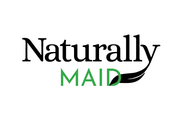
This detail will be completely lost at smaller sizes
I still think the name is confusing. Even moreso now.
What was the reasoning in this direction?
It looks like perhaps a maid service for something to do with nature.
Very confusing.
Sounds like “certified virgin” to me.
Depravity aside, how would this two-colour logo look as monochrome?
It is a maid service, directly dealing with nature. So thanks for that. You hit it right on the head! Furthermore, there will be no use of this at smaller sizes where it would be illegible. I could potentially broaden the gap, and have thought of extending the gap closer to the D for that reason. We all understand how you feel about the name, Smurf. I believe we are past that at this point. The name stands. It is simple and clearly states what service we provide. If that is beyond you, it is beyond YOU. It is not beyond the many people in my target audience that I’ve field tested the name, and many others, on. This name was chosen and polled higher 15 other options.
The reasoning is that its clear and simple. The font chosen has soft, yet intentful curves in the serifs and thus accepts the added feature of the extended leaf coming off the Y “nicely”. The serif font also lends to a more professional look, than the previously playful feel.
That is both silly and irrelevant to the topic.
As far as monochrome, it could all be black without any sacrifice to meaning or legibility.
I don’t think i got my point across to you.
It doesn’t make any sense and tells me nothing really.
Might as well call it Boramanarang
It is a MAID service, that uses NATURALLY MADE products to clean. You point is dull at best.
Overall, I’d say this doesn’t work. I’m not sure the font you chose for MAID pairs well with the other. Together they kind of present a monotone, a lack of focal point or visual anchor. Actually, the weight of the added flourish becomes an eye-draw…adding little meaning in a somewhat unfortunate location.
I’d keep chasing this; refining the flourish (if you’re set on keeping it), trying other fonts, and maybe most importantly, other alignments. (That is, without the flourish, the two words appear center-aligned, which isn’t a choice I’d make with words of such disparate widths. With the flourish, they appear center-misaligned, which is even worse.)
2 Likes
Thank you for providing valuable insight!
Wait…we count on you for that.
Small minds think alike. That’s what a medieval gentleman would patronize.
I like you more now.
Ditto at your logo.
It doesn’t say anything. The name is confusing.
There’s no style to it, not sure if your a maid service for glamping or camping or something along those lines.
There’s zero finesse or clarity. You’re literally sitting at the computer trying to come up with ideas.
Scrap the computer. Draw out thumbnails of the logo. 10 or 20 or 100.
You’re literally not getting anywhere and fast.