![]() this new draft would be closer to the existing one below by above mentioned maidnaturally[dot]com
this new draft would be closer to the existing one below by above mentioned maidnaturally[dot]com
It is, indeed, closer to that given its coming from a icon logo to a wordmark logo, and the Y has a leaf flourish (it is the most convenient of the characters to be used).
However, given the similarities in the name, there is only so many ways to go when comparing to two similar named wordmark logos. It doesn’t share alignment or tone in typography. The only thing shared in the typography is the fact that a serif font is used. There is also the flourish extending across 80% of the entirety, which is not a shared shape, color, or placement. Only that it stems from a Y.
Originally you mentioned SEO, how would you be able to set your company apart from others using a similar name? I’m seeing 8 different companies with the same name on the first page of google.
The Maid Naturally cleaning service in Spokane, WA @Joe found self-identifies as a national maid service, which arguably makes it a competitor. In addition to the similar name, you’re also proposing a similar leaf-like swoosh. What they do have that you don’t is a registered trademark. I’m not a lawyer, but in a trademark lawsuit, I’d give it better than 50-50 odds that you would lose. If you proceed, I’d strongly recommend consulting an attorney before rather than after.
In addition, there’s a cleaning service company in London named Naturally Made. They’re using a logotype that is all but identical to what you’re proposing — same typeface and same color palette.
https://naturallymaidclean.com/
You seem to be playing fast and loose with other companies’ trademarks. If it were me, I would re-evaluate that approach.
1 Like
Firstly:
The website you linked, naturallymaidclean.com, is my website… LOL. The color pallete and design you can find above, as a previous iteration… Its a London company shown because it is a random template thrown on there until I can get to it. However, I thought I put it under maintenance, I’ll have to double check that! (Thanks) I’m happy you found it though, given I’ve marketed zero, and the company isn’t even off the ground yet. Gives me some hope to be found in the future once SEO is started.
Secondly:
“Maid Naturally” is a cleaning service in WA only. It is not a national competitor nor a franchise. They do sell their cleaning products online, but that is the extent of their reach. Again, I wouldn’t call the leaf swoosh similar in anyway other than it comes from a Y, but I see your point.
Thirdly:
What I posted was not a final product, but just a base of an idea and part of the progression in the conversation to see if you all thought it would be worth exploring that style rather than the icon counterpart. When I said “quick redesign” what I meant to say was, “i know this does not look good, but i threw it together quicker than it would take me to upload the sketch of it, so i hope you get the idea. Is the wordmark worth pursing further or should i rescrap to a new styled icon logo?”
My apologies that intent was not clear.
SEO deals more with page content than it does the name of the company. Also people search for what they are looking for (Natural cleaning service, green cleaning near me, etc.), not the name of it (unless previously referred, of course.) Furthermore, when I use google and search my company name, there is one cleaning company that comes up, and it is MaidNaturally (which would not show up at all if location is an attribute of the search.) The irrelevance of a bunch of home cooking blogs, essential oil extractors, and the random nut grower are not something I am worried about when it comes to staying relevant on an organic search, which would typically include location, industry, etc.
So to answer your question, my plan is to focus on optimizing the websites content well, whilst also supplementing with paid search rankings and google local leads until we are more established in our local communities.
My question to you is… should I entertain the wordmark in some fashion or pursue a new, more simplistic icon - that actually, unlike the first post, gives insight to what we do.
Thanks!
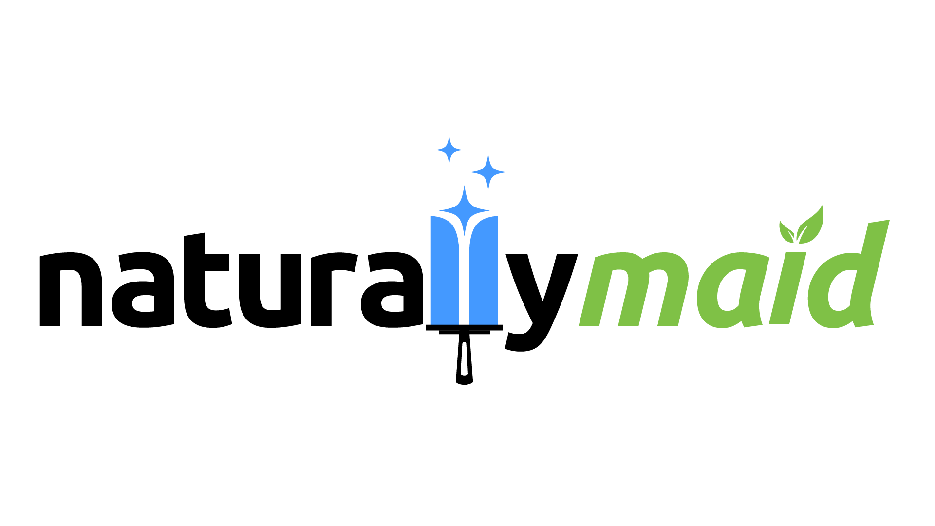
The squeegee might be mistaken for a paint roller, but I like the overall look.
1 Like
To me it’s a broad, short sword.
It is an improvement, but it feels like too many things going on. The stars are an unnecessary distraction.
Also, there are some very odd shapes going on with the italic of that font, especially between the a and i.

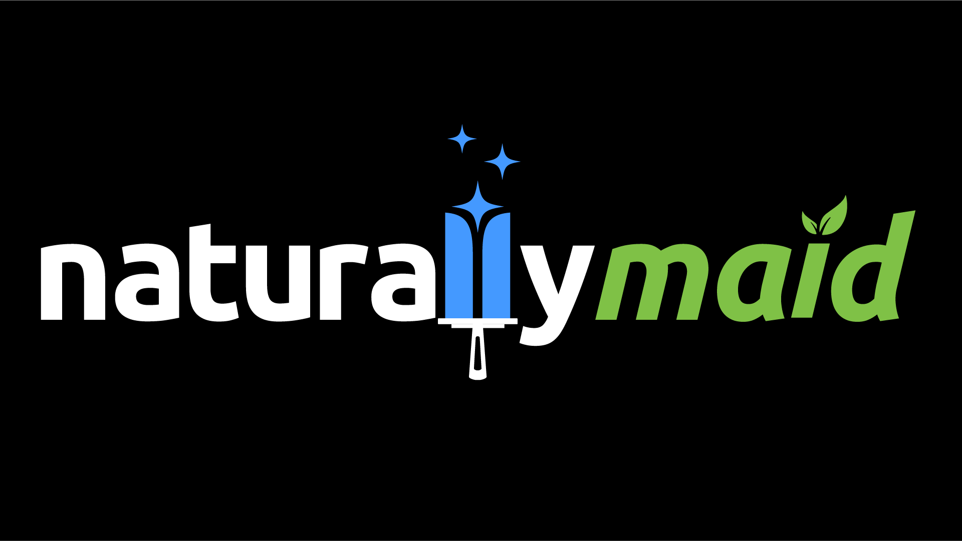
I agree the italics were a little weird. It took me a bit messing with spacing to find any balance (specifically between the a and i). Does what I’ve done here alleviate the previous problems you found?
For some reason I also curved the edges of the ascenders to match the Ls. does it work? Or go back to original slant?
As far as the stars, they play a vital role splitting the block to create the two L’s. I tried many variations with the concept and I lost those letters until I tried the splitting idea. It also lends to the service a bit. I wanted to show “cleaning service” without a bunch of tools. I managed with the squeegee, though it took a few variants of that to not look like naturaTymaid. I tried swooping, and it looked too much like a J, so I found that the sparkles add just what I needed for the problems that arose.
You are not wrong. I can’t unsee it now. But for some reason, its okay with me. LOL
Good eye. tips hat
Many iterations left it looking like a lot of things, to be honest. I’m glad you at least caught that it was a squeegee, and not an unwanted letter. While I don’t see a paint roller myself (as they have a single prong head with separation from the handle and roller) I did have some trouble deciding on a shape that spelled it out more directly. Any insight?
Side note on the paint roller: We do offer light interior painting with eco-friendly, zero-VOC, plant derived pigment options. So it would not kill us if a few saw that, though it isn’t the goal, and only an auxiliary service.
“I wanted to show “cleaning service” without a bunch of tools.”
I’m in the camp where if the logo has to show what you do then is it really effective?
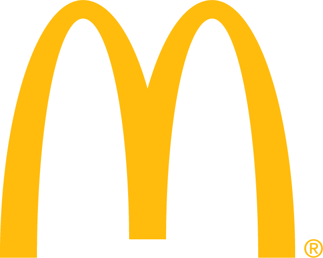
Without any context these guys could be in any industry. BUT with development of a brand system, consumer recognition and time that symbol now is a well recognized symbol for “fast food.”
They don’t need to show a burger, fries, shake, pie, or salad to say — look what we do. That comes with time, I think if you continue on the path of trying to depict what your business does in a logo you’ll eventually rebrand, or reconfigure what your logo means. The time you’re putting in now should matter.
Comparing that logo to yours is apples to oranges. In the most recent version of your logo there is a lot going on between the cleaning tool, stars, leaves that don’t mesh with the typography, and the kerning. All of that being said, the typography is an improvement.
1 Like
I’m sure there’s more that should bother me about this, but the angular disparity between the y and the m needs a fix.
1 Like
I completely agree with @Billyjeanplxiv.
I’ve been meaning to create a separate thread on this subject, but I keep getting bogged down in wordiness. I’ll keep it short.
The most well-known logos typically don’t include imagery of their products or services, nor are they typically built around visual cleverness. I wouldn’t rule out using a picture of the product as a logo — Burger King does — but it’s not the necessary go-to solution.
In addition, the most well-known logos rarely exist on their own as the face of the organization. Instead, these typically simple and straightforward logos are only one part of consistently applied visual brand strategies.
The boutique logo design industry that’s sprung up over the last several years rarely considers a visual strategy for presenting the company in a positive light and making it memorable. Instead, the entire problem gets reduced to a cute little illustration designed around the whims of whatever the head of the company likes.
Of course, not every company has the budget to spend on an entire identity plan, let alone its implementation. But they and this new breed of one-off boutique logo designers rarely think in these terms or plan a visual identity roadmap for the future. There’s little to no strategy — just a colorful and pretty little illustration the company president likes.
Instead, a naive designer draws up a logo the naive owner likes, and they both consider it done. The company has their logo they can stick on all their stuff and, as far as they’re concerned, they’re good to go. Unfortunately, they’ve typically missed the entire point of what the logo is supposed to do or why they needed it in the first place.
1 Like
Exactly that.
For me, communicating what a company actually does is the job of collateral and promotional items; brochures, websites, etc. The logo’s job is to embody the ethos of how they do it and, over time, evoke an emotional response in the target audience. It is the receptacle for a company’s hard-earned emotional capital.
The logo should indicate how a company operates and speak in the right tone of voice to the right audience.
There is some space for logos that show, blatantly, what a company does, but they tend to be very generalist, lower budget companies. In fact, doing so, usually resigns a company to a less than sophisticated market sector. Very occasionally, this is the approach needed.
This is why, it takes experience to produce logos and why crowd source sites are driving things into the ground. I am optimistic that it will come full circle in the end, though. Simply because such logos don’t work and if businesses are spending – albeit small amounts of – money on something that doesn’t work, they will get wise to it in the end. Or rather, the successful ones will. The others will go to the wall.
1 Like