Hi everyone,
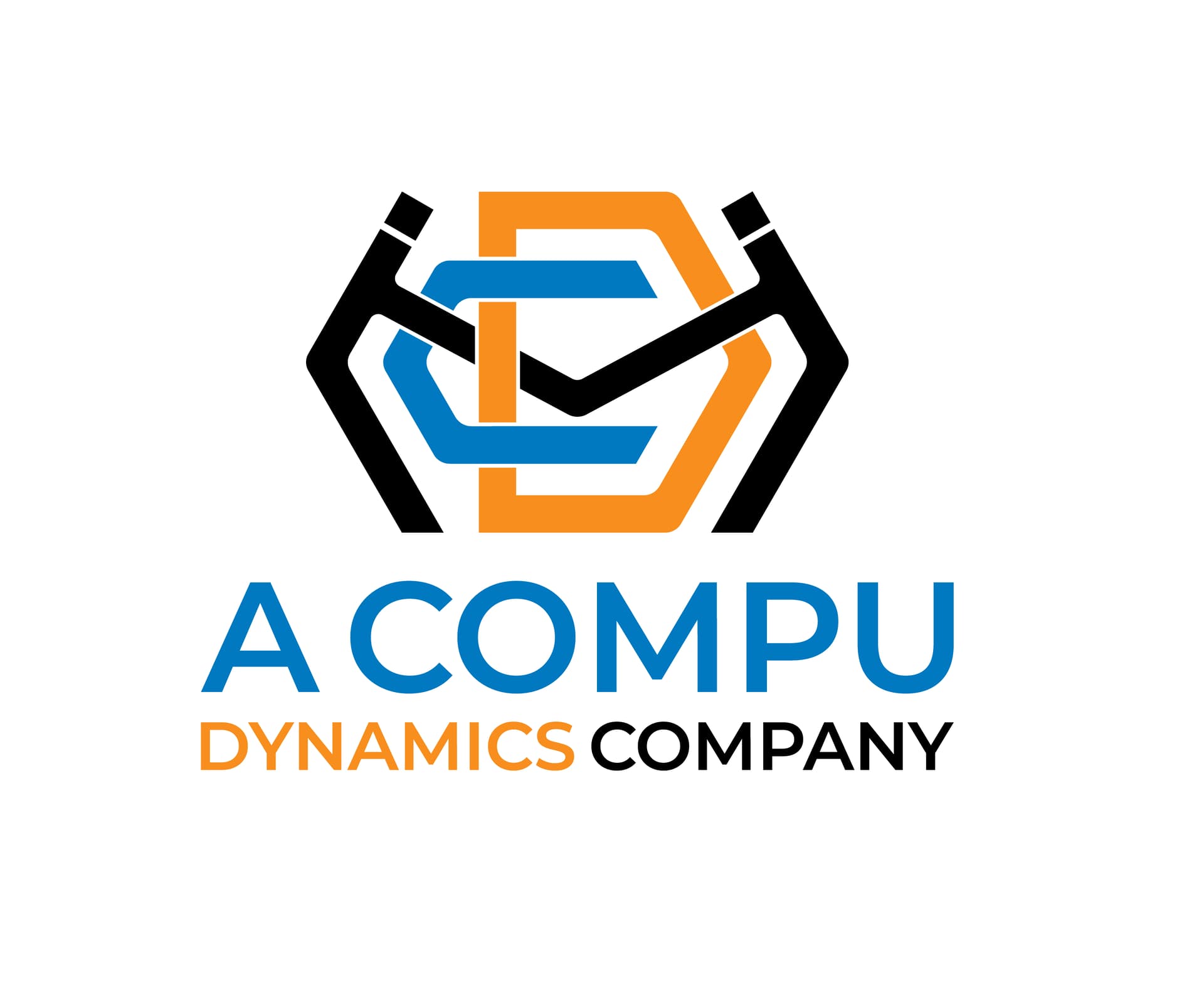
I am new to this forum, I’ve been designing for many years in raster format, but now I am working in vector. There have been 3 years of learning. I am attaching my recently designed logo and I need your kind feedback.
The client brief was
" I would like a logo design for a new business called Compu Dynamics Modular. We intend to call this company “CDM”. CDM will be an affiliate of an existing company called Compu Dynamics (www.compu-dynamics.com) so we would like to use the same colors. The logo for CDM should be displayed in a less elongated format… more square or rectangular and not spread out. CDM‘s business is designing and building modular data centers, so it would be interesting to incorporate some stylized outline or vague representation of a data center building in the logo itself. Data centers are typically shaped like simple rectangular boxes. We may want to add a line of text below the CDM logo, which says “a Compu Dynamics comp
Looking at it before reading your brief, I see C and D and two abstract guys shaking hands. I did not read the black art as an M or an H. Then I was trying to figure the company name and thought it could be Acompu Dynamics Company because it didn’t make sense that the company name would be “A Compu Dynamics Company.” It never crossed my mind that this was CDM and you were saying CDM is a division of Compu Dynamics. Sorry. Back to the drawing board.
Ditch the two-guys-shaking-hands thing.
Taglines should be smaller than the company logo.
Lose the thin white strokes around the letters, they’ll be lost when made smaller, say, on business cards or other substrates or printing methods.
The letter lockup looks awkward and reads as just CD until you mentioned the M it was hard to grasp.
And now it reads MCD or MDC due to the positioning and hierarchy.
I was trying to work out what COMPU DYNAMICS COMPANY was and thought it was the full name of the company.
The hierarchy of the letter combination and the tagline sends out miscommunication and confuses the reader.
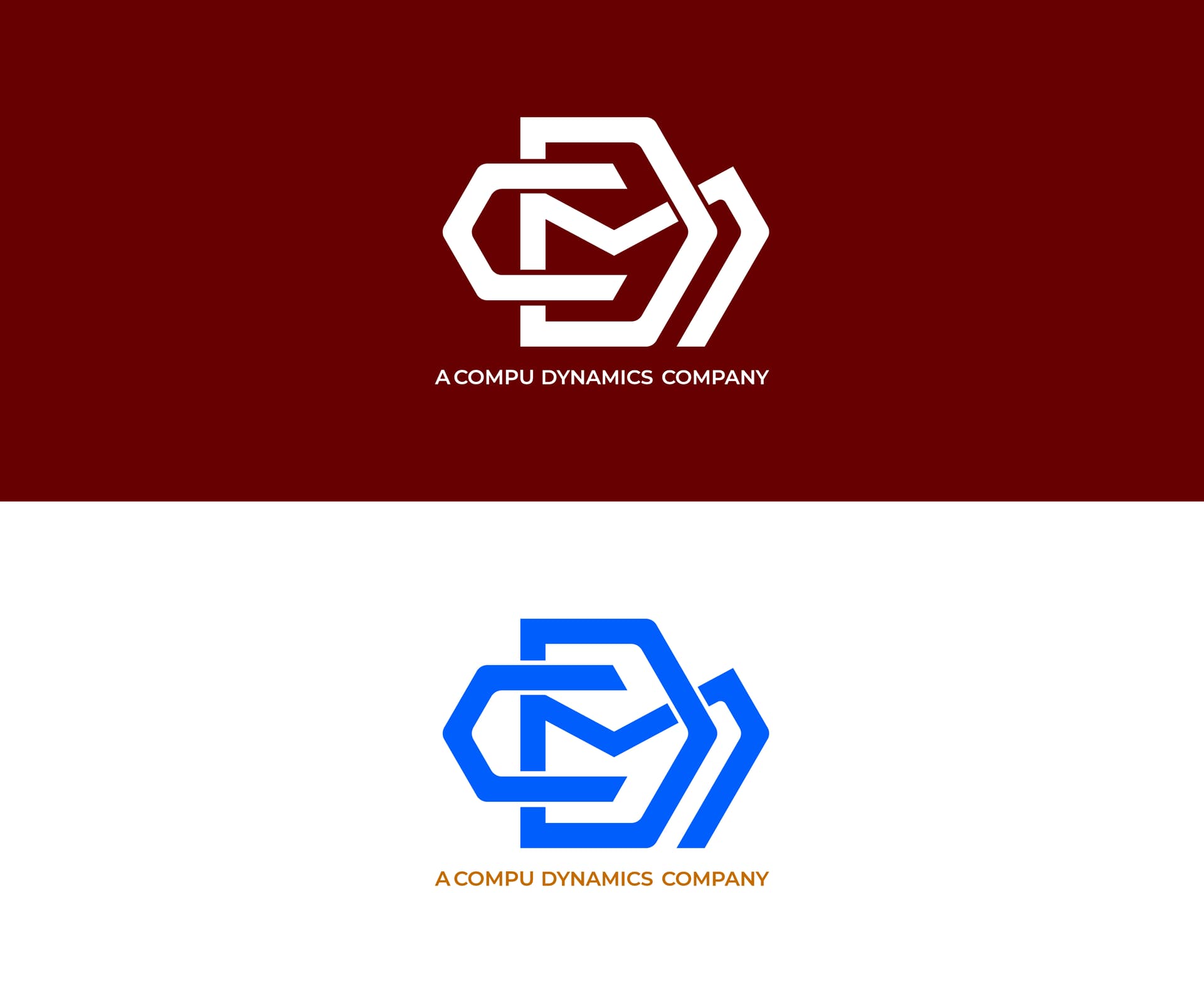
Ops, it was CDM, but I was just checking, how the reaction will be from the most seniors.
I got my answer. You mean shifting the letters by adding more white space for clear visibility.
Yup, reread the brief… You totally missed the mark.
Just gonna note, as a sign guy, I happen to like the gaps between the colors. Avoids me having to make exact registrations when doing cut vinyl signage.
do you have sketches on actual paper of other ideas? Right now this looks like you took the initials and just started playing around with trying to make interconnected shapes overlapping things. It doesn’t look like there is any thought behind it.
What do the interlocking letters convey about the company? I see that the brief gave pretty clear ideas of what was expecting, but sometimes the client is not always right. Then again sometimes you do what is requested and call it a day. They mentioned a data center building, which I don’t see in your design. But, at the same time, logos don’t always have to be so literal. HP doesn’t have tech or computers in their logo, coke doesn’t have soda in their logo, Nike doesn’t have shoes/apparel, etc. Now I know that those are large established brands. But a logo is part of a larger brand and a logo should convey that brand messaging, that brand presence. At the moment I don’t get much of anything from just some jumbled letters.
Also, as this ties in to an existing brand, other than you using blue and orange, nothing about this looks as if it is part of the larger brand.
I hate to give a negative critique, but this logo doesn’t work — either aesthetically or conceptually. Contorting letters into a knot of lines never works. Doing so only creates a confusing and aesthetically unpleasing hairball.
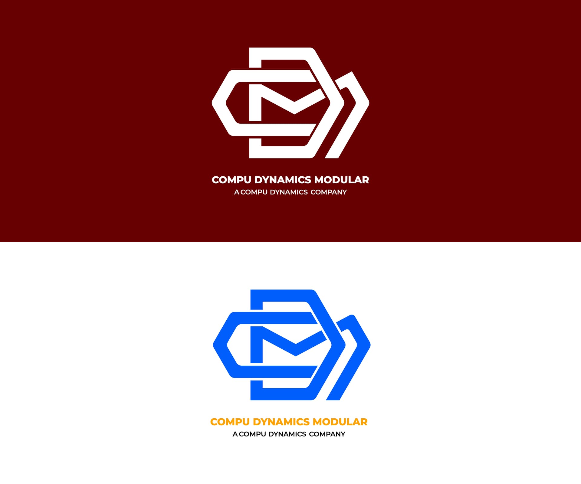
Your latest versions’ typography is too small. It looks like a footnote rather than the company’s name.
I’m sorry, but I’d start from scratch and do something different.
I agree with @CraigB’s thoughts. The brief makes suggestions that aren’t conducive to creating a good logo. I’m not saying it couldn’t be done, but it’s placing unnecessary sideboards onto the problem you’re struggling to accommodate.
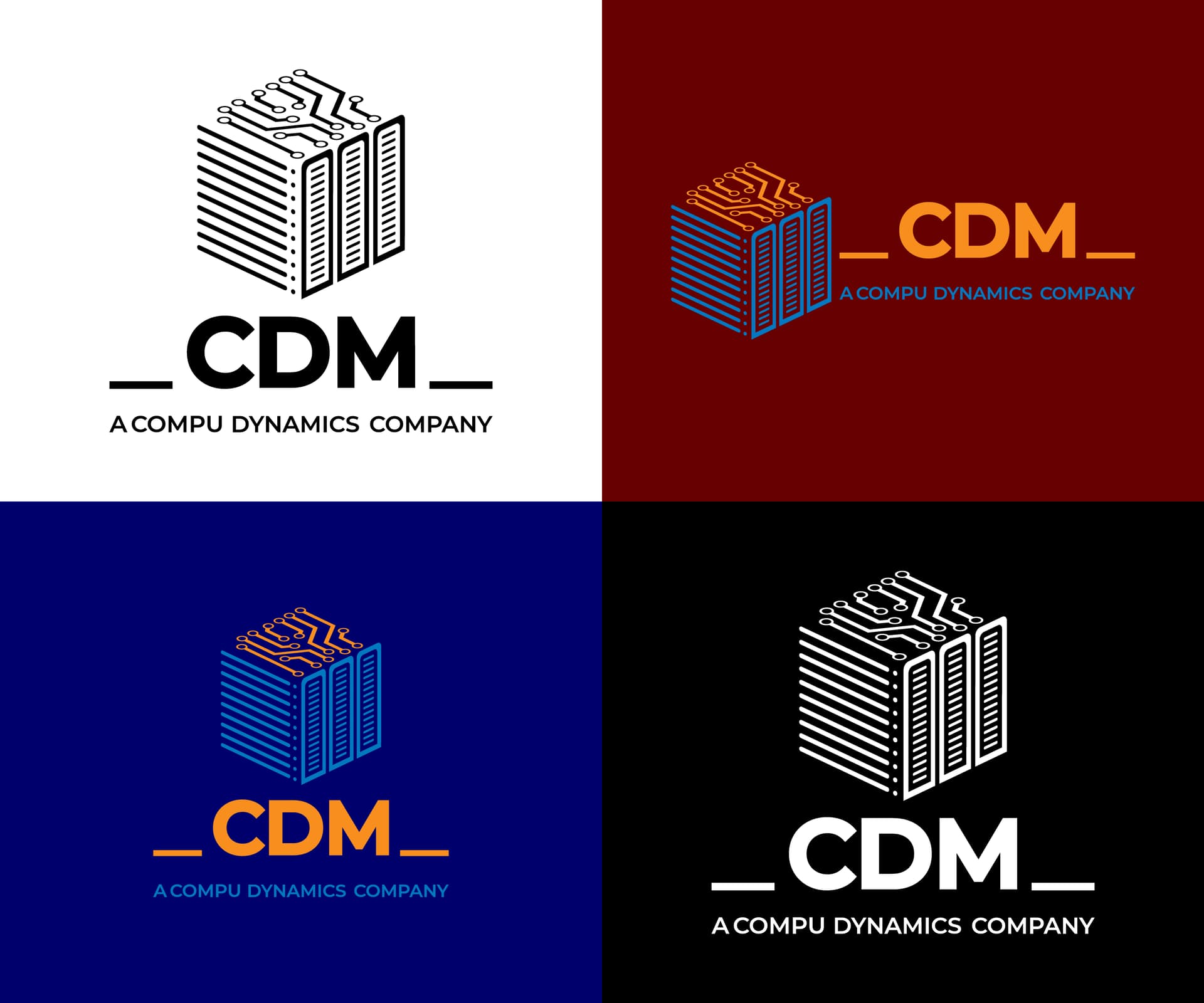
The brief sounds like a crowdsourcing project, so I assume you have limited contact with the client. You might consider creating three logos — two would be what I consider best for the client, and one similar to what was requested.
I agree with @Just-B and Craig. Still, I have seen logos with interlocking letters which are visually nice.
You could explore and stylize just the letter C and skip D and M letters.
Or create something different, apart from using letters in the logomark.
Yes, you’re absolutely right. It’s a design contest website. I’ve spent a lot of time promoting my freelance gigs and services on social media and other platforms, engaging with followers and clients. While I’ve seen some positive results at times, I’m currently working as a solopreneur.
What would be your advice if participating in contest websites turns out to be a complete waste of time?
I have already read the forum rules, I understood that crowdsourcing contests and spec work are completely a waste of time. In any of the above posts, I didn’t try to promote or advocate any crowdsourcing website by pointing to their name or links, but I am trying to enhance my expertise. I just need your feedback, if I don’t participate there, then where should I be?