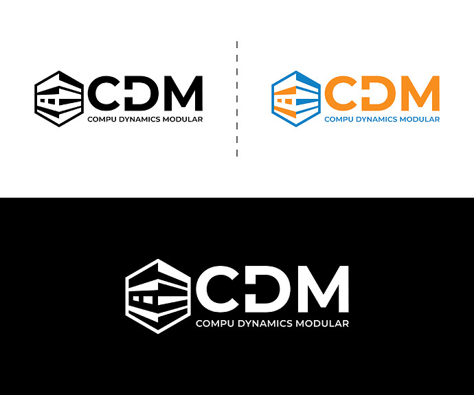
It really has nothing to do with the crit of this piece. If you win share the prize with all of us…
That’s what I saw too.
The latest one will look great on the stem of a freebie promotional pen (well, so will all of them).
I’ll cut that last one in vinyl and let YOU weed it. ![]()
Thanks, Stevee, for your kind feedback. That’s why I changed my mind and designed another sample to recheck. I think it will work or…
I didn’t participate yet anywhere bro. I only want to check whether I can do that after kind feedback.
That’s exactly what it will be.
The kind of clients who entrust their business to competition sites are not the kind of clients you want to be working for. The kind of clients you do want to be working for are not going to be using the kind of designers who participate in competition sites.
Neither party knows what they are doing.
It’s a viscous spiral down into the mud.
How to break out of this?
Education. Get yourself a formal education from a decent university (not online). The entrance process itself will determine if you have the requisite ability and talent. From what I can see, you have not been through this process. Your work has far too many basic errors and the fact you are even deigning logos in isolation exposes the reason you are not where you want to be.
Please don’t take this as malicious criticism. I know it seems harsh, but it is intended to help nudge you in the right direction. Those of us who have been doing this for years can immediately see the holes in the bottom of the boat, letting in water.
The fact you are even attempting to design logos in isolation from briefs which don’t give you anywhere near enough information – and, moreover, you haven’t gone back to ask them, again exposes the reason this dollar shop approach to design is fundamentally flawed.
A logo is only ever part of a wider brand identity. It’s not about looking pretty in the top corner of a letterhead.
It is far too big a subject to explain in a few sentences here, which is why there are degrees that teach it.
The original brief for that was so woefully inadequate, they are never going to get something to do the job they need. Sometimes, it is a designer’s job to explain where a client is going wrong and what information is required. If the designer themselves doesn’t know what they need to know, there’s little hope of a successful solution to the problem at hand.
Again please take this the way it’s intended. The fact that, in your own words, you have been ‘designing for many years’ and have got nowhere near where you want to be must show you that something is not right.
Perhaps you could put more of your work up on this forum for an honest critique,. Be prepared though and put a thick coat on; it can be brutally honest sometimes.
Good luck
I appreciate that you’re open to feedback and trying to improve.
Again - keep it simple - something I’ve already said, yet the logo keeps coming back more complicated.
A strong logo works even in black and white, at small sizes, and without excessive detail. Ask yourself what’s the absolute minimum needed to communicate the message?
You didn’t understand the brief.
A logo isn’t just about looking good; it needs to reflect the brand’s identity. Have you answered the questions? What are the company’s values? Who is their target audience? If a brief is vague, it’s the designer’s job to dig deeper.
If you’re looking to build a career in design, contests and spec work aren’t the way forward. Instead:
Work on real-world projects, even if they’re self-initiated.
Connect with small businesses that actually need branding.
Build a portfolio that shows your process, not just final logos.
Keep learning if you’re still struggling to get where you want, consider working on the fundamentals, ypography, composition, and brand strategy. A strong foundation will help you create better designs and attract better clients.
Competitions or Spec work
You’re working for free with no guarantee of payment. How much work will you have to do before you get paid? A real client wouldn’t expect a builders to compete to construct a house before deciding which one they like and how much they’ll pay for it.
When Jobs was asked what it was like to work with Rand, he said, “I asked him if he would come up with a few options, and he said, ‘No, I will solve your problem for you and you will pay me. You don’t have to use the solution. If you want options go talk to other people.’”
Clients who use contest sites often don’t value good design. They’re looking for something cheap and fast, not something strategic or well-crafted.
These contests rarely lead to real career growth. Instead of helping you build long-term relationships with clients, you end up stuck in a cycle of competing for low-value projects.
Most winning entries are chosen based on personal taste, not good design principles. Even if you win, it doesn’t mean your work was strong it just means it was the one they liked at the time.
Yes, this is what will help me get out from the quagmire. I knew that just a 3-month online course or certification is not quite enough for any field than a physical institute or university, but can be an initial stage of some awareness, especially as a graphic designer.
Your “EDUCATION” section defines me well. The reality was, I didn’t have the resources for physical university, that’s why I took this way to make it possible for me to get some passive income. Empty pocket ruins everything. I think I need to break it into slices and then digest it one by one.
Now I’m dam sure that with the help of your honest critique and expert advice, help me to straighten my way, it doesn’t matter what types of critique come from. It will enhance my expertise.
I’m highly grateful to you for your deep, and honest feedback
Hey @whaghb786, I totally get it - I myself had to figure out a different way to go about learning design because of the lack of resources for a traditional design education.
Below is a quote from myself in which I shared my thoughts on this topic with another GDF member - hope the info. helps you too.
To add another learning resource that isn’t too expensive but is more comprehensive than Baseline, you could look at the Briefbox course, which also has a community component and an option to for 1-on-1 mentoring sessions.
Thanks, bro, I am grateful to you for your kind advice, and course references.
Looks ‘MCD’ to me
With everything said above, I still see this as a decent exercise for both creating a legible logo that works at any scale.
As to the design, I like the cube concept, it’s just far too busy, unless you want to start getting into specific version usage scenarios (ask me how I know that’s a total $#!tfight you don’t want)
I’d simplify the cube faces to flat planes with just a couple simple divisions to make it look like a block of blocks (think Rubick’s cube, but maybe just 2x2x2). that should give it the “modular” feel
As to the typography in your last version, I have a personal aversion to underscores that meet round glyphs like C, O, G, U etc, I tend to raise them to the x-height, or go with a complete, unbroken stroke separating the acronym from the by line.
Hi, Bro. I hope this message finds you well. I’m grateful for your kind analysis and deep thinking. Here is another version of this logo. I simplified it and removed blocks. I need more feedback and hints on how to improve it.
250px X 100 px. “Horizontal”
160px X160px. “Vertical”
however 180px X 180px is common
Smallar sizes are for websites. but I just scaled up for more visibility and insights.
Smaller sizes are just for websites are they???
Pens & Pencils
USB Sticks
Keychains
Product Packaging & Labels
Tiny tubes, jars, or medicine bottles leave little room for a full-sized logo.
Snack Wrappers & Bottle Caps
Clothing Tags & Embroidery
Neck Labels in T-Shirts
Embroidered Caps & Polo Shirts
Smartphone Cases
Earbuds & Smartwatches
Lanyards - serial numbers / plates or engravings
Business Cards
Stamps & Seals
CE, FCC, or Recycling Symbols
Cycle to work schemes - Bicycle Frames
Helmets (construction)
Motorcycle Exhaust & Parts
Watches
Engraved Rings & Cufflinks
Opps, something slipped. sorry for the inconvenience. I didn’t say “just for websites”, but I aimed to say these are the sizes fit for websites. However, I know that every brand is recognized by its logo.
Don’t lose sight that logos need to be replicable at varying sizes for more things you can imagine.
The more complex your logo is the harder it is replicate at small sizes, and that is not great.
Sure you can come up with a version that works at smaller sizes, plenty of logos include this in a brand strategy.
But I don’t think you’re even thinking about the finer details and applicability across various substrates and sizes.
Logos can’t just look like it fits a brief - it has to work harder than anything else in the brand. It’s the lifeblood of the company.
If you’re not solving the problem then you are the problem.
It’s just a sample, whether it fulfills all the requirements or not.
I kept it simple, scalable, and versatile, maintaining its impact across various substrates and sizes, from small print to large billboards, and in both color and grayscale.
Here are some finer details and applicability considerations:
- Simplicity and Legibility:
- Font Choice
I chose the “Montserrat font”
- Color Palette:
Orange: #f78e1e
Blue: #1081c5
- Details:
There is no use of excessive or tiny details that might become lost or blurry when the logo is scaled down.
- Vector Graphics:
I ensured that the logo was created as a vector file, which allows for scaling without loss of quality.
- Substrate Considerations:
- Print: I kept in mind how the logo would look on different types of paper and materials.
- Embroidery: I also kept in mind the thickness of the embroidery thread and how it might obscure small details or text.
- Digital: I have created a large file ensuring the logo works well on various screens and devices, considering different resolutions and screen sizes.
- Size Considerations:
- Large Format
I also kept the logo impactful and recognizable on large billboards or banners.
- Small Format
I designed the logo in a way that it is still recognizable and legible on small promotional items like pens or keychains.
- Website:
I consider the standard logo sizes for websites, including horizontal and vertical layouts.
- Social Media
I also had a glance while designing different logo sizes and requirements for various social media platforms.
- Brand Identity Consistency:
- Typography I used a consistent font style throughout all brand materials.
- Color Palette I tried to maintain a consistency in the use of brand colors across all applications.
- Overall Style I tried to ensure the logo’s style aligns with the overall brand identity and target audience.


