A lot of that is pure drivel it really comes down to that you’re wrong and can’t accept that which is worrying.
It’s not a good logo. Being nice about it is not helping you.
It’s bad for a lot of the reasons you think is good.
A lot of that is pure drivel it really comes down to that you’re wrong and can’t accept that which is worrying.
It’s not a good logo. Being nice about it is not helping you.
It’s bad for a lot of the reasons you think is good.
Oh, you are too clear about it, which means I have wasted my time preparing all this stuff. I want to clarify that I am not forwarding this project to any client; I only want to learn more and more and enhance my skills bro. So don’t be rude.
As you know, I am a beginner, not a perfect or experienced one. However, your deep thinking and kind feedback will organize me and my skills.
As you said, “it’s bad for a lot of the reasons you think is good”. That’s why I feel eager to learn here, bro. what the reasons are, and how should I resolve them? Sorry to bother you.
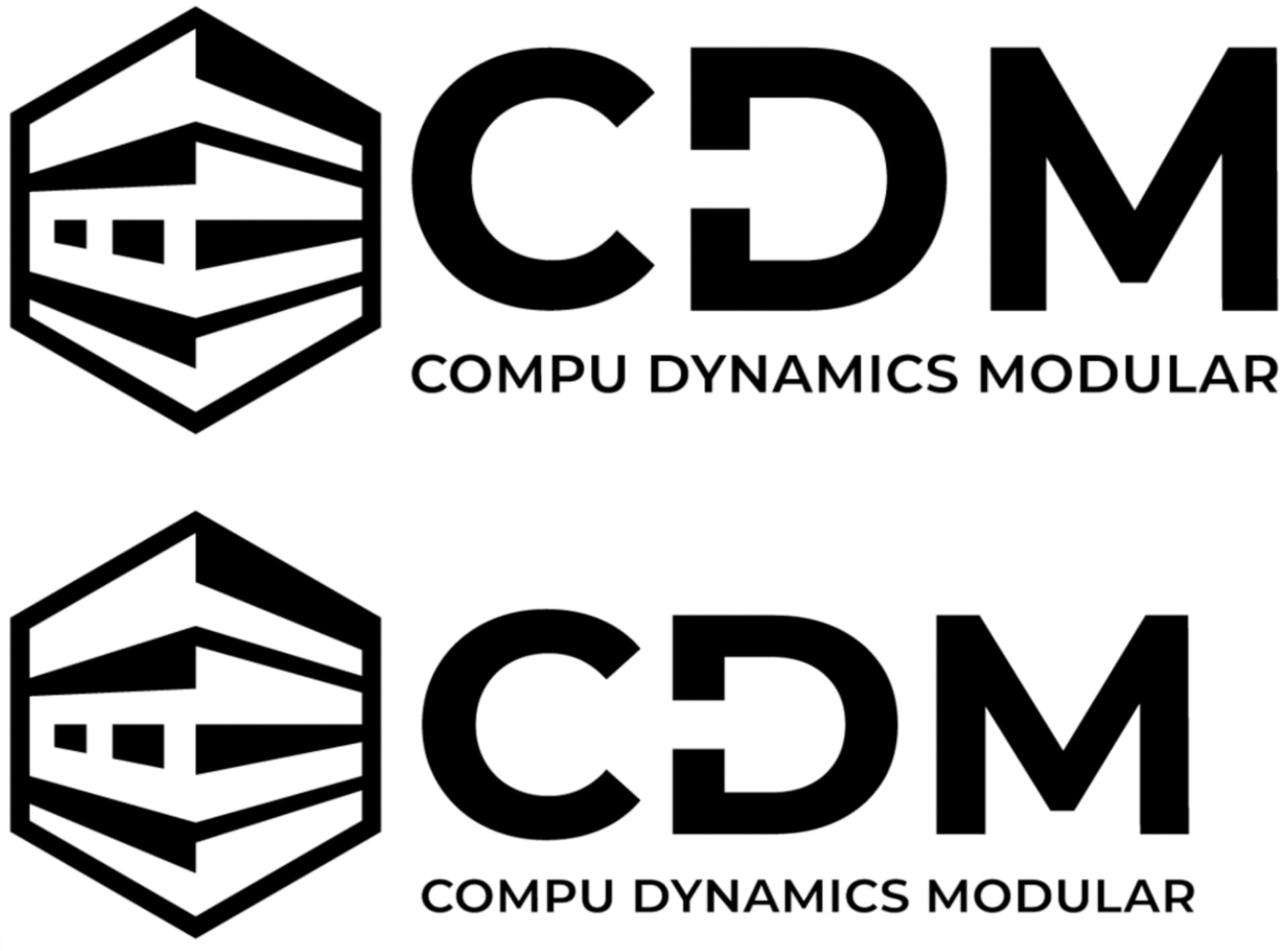
This is radically better than your first and second attempts. For that matter, I like it.
Turning it into a hexagon was a nice touch. I doubt anyone would immediately recognize the logo as a stack of servers, but in this case, the nice-looking and simple geometric composition contains a surprise — modular computer servers.
As I mentioned, I think it’s good, but I do have a couple of small suggestions.
First, the C in CDM is too small (it lacks overshoots). This isn’t a problem with Montserrat. For some reason, it appears as though you’ve made the C with the same vertical dimensions as the M and the D, but the round letters in a font need to extend slightly above the top of the flat letters and slightly below the baseline. This is to offset the optical illusion of the round letters appearing smaller than those with flat tops and bottoms. Any good-quality font uses overshoots for the glyphs with round tops or bottoms.
Second, the CDM letters are approximately the same height as the right side of the hexagon. If it were me, I’d vertically center the CDM with the logo while making the CDM and the tagline a little smaller so that their vertical dimensions visually align with those of the hexagon.
That’s a little hard to explain, so here’s an example.
Hi, Sir. Before going further, I’m very grateful to you from the depths of my heart. I got first appreciation, which is a noble prize for me because it will make me more confident about learning and doing better.
You highlighted a link about overshoots. It’s attentionable and very helpful. Thank you for this, too. As you pointed out about C. So, there is no excuse, I tried to align dimensions vertically as the M and the D, without knowing it would make it thinner than D and M. It’s my mistake. Next, I will keep in mind the optical illusion.
Your advice about the alignment between text and hexagon has sound reason.
Today, I watched a YouTube video about the Log and text alignment. A designer drew 4 lines on the text from top to bottom and aligned them vertically. Then copied the upper 3 lines and pasted them over the top one.
Again, he copied 2 lines and pasted them below the bottom line. In this way, he aligned the logo and text. What do you think? Is this a good idea for alignment?
Much better that the first one and the second one, as @Just-B mentioned.
Try to reduce details (lines) from the logo mark. See some opportunities there? The left side of the hexagon could be a C, and the right a D. Maybe.
Give some space to breathe between logomark and text. Don’t forget the overshoot of the round letters (C). I think that the kerning between D and M needs some adjustment.
Overall it’s a good update and progress.
I can’t say one way or another without first seeing the video. However, I will say this: aligning objects within a composition helps create orderliness and cohesion. In other words, doing so can help make all the parts look like there’s a reason for them being there rather than being arbitrarily fitted together.
On the other hand, being a slave to making things align isn’t the solution either. An important goal is to make the logo (or any design) work and to be visually compelling. When aligning things helps, do it. When it doesn’t help, don’t.
This alignment thing touches on a more extensive technique that designers use — invisible grids. If you haven’t studied them, I suggest doing so. For example…

Hey @whaghb786
I just joined GDF, and on reading through the post timeline, I simply want to appreciate you for posting in the first place. I must say I’ve picked up a lot from the post and every contributor here. Thank you!
Thanks so much for sharing this! @efmgdesign. It was quite timely for me amidst some of my confusion.
I am currently at a stage of being more serious with graphic design as a career (seeking to transition from crowdsourcing/freelancing). My pressing question is what you would recommend as the possible ways to get a solid work engagement after the relevant education.
Would just love to hear what you personally think.
Hey @Baklect, glad you found my post helpful!
As for your question, this is a tough one to answer cause there are multiple ways depending on one’s circumstances and path to design. I myself am still trying to figure out the job situation - a more experienced person may be more helpful answering this question. If you choose to get mentoring, this is a great question to bring up.
Though, one thing I do know from my design teachers is that networking is an important piece of the puzzle toward building a design career. I suggest reaching out to individual designers, studios/agencies, and businesses you admire, whether they’re local or not, for a chat and/or one-on-one portfolio review. You never know what opportunities can come from doing so.
Hope this helps!
This! Networking will more often than not bring opportunities that were never foreseen.
The suggestions are pointers I’d work on exploring. I believe opportunities will show up with each positive step.
And yes! The answer surely helps. Thank you!
This topic was automatically closed 365 days after the last reply. New replies are no longer allowed.