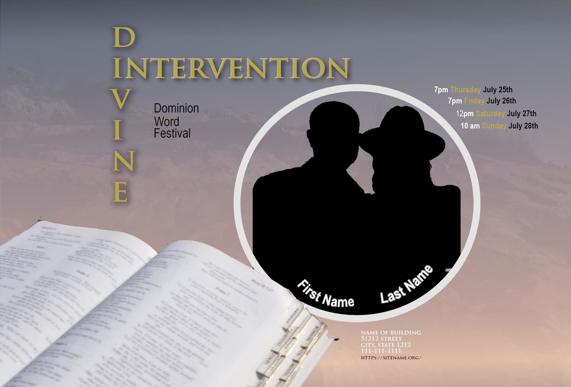
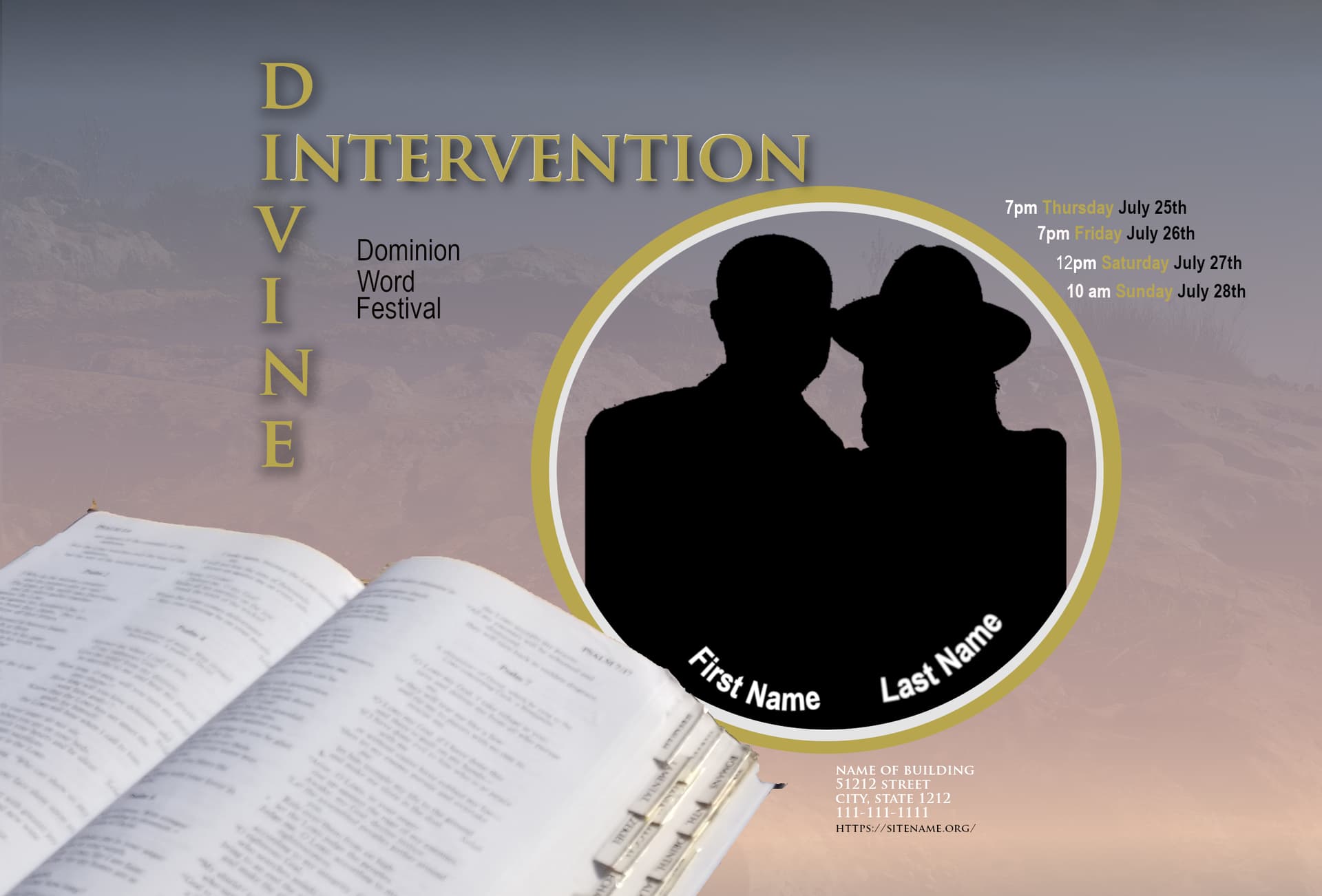
Hello everyone. I spent tonight working one 1 design for this upcoming event. I think this one is definetly better then others I’ve shared. Please critique these two. Honestly, idk if i will make another design I am really proud of this one. I spent about 6.5hours on this one from start to finish.
I did use a grid and i did experiment w/the intervention elongated (like how divine is now) but it ended up being too long for everything to fit. I did try just a solid outline of white, gold, and black with either word but I wasn’t fond of it, it seemed too wonky so I figured this was the best display.
Maybe I am just tired but after looking at this more I still feel like its a little but flat but I feel like I do see progress but maybe thats just me.
As always your opinons and advice is appreciated. I think the gold circle one ties everything better together then just the one white circle.
I used silhouettes again for just privacy honestly. I was contemplating keeping the actual pic but out of respect for them I would rather not put there face on the flyer till they pick the design they like and then i’d put it up on there site.
the canvas size is 2415 (w) x 1638 (h) pixels. 300ppi. Hope that answers your question. I don’t know what is necessarily standard for it. We do not print these we just use them digitally as a JPEG or PNG image online when we are ready to share it. they only every want this landscape layout never the portrait layout.
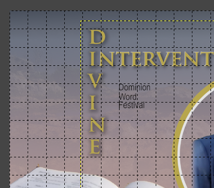
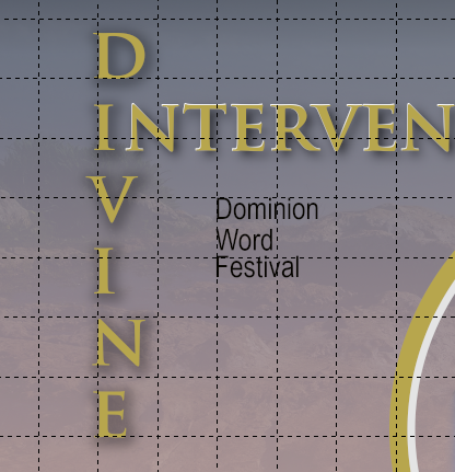
Thank you. I noticed that a little bit too after I posted but wasn’t sure. Yes I am thinking of bolding the white or chaning it to a black outline. It is “Word”. Is it to hard to read, that I didn’t see an issue with when I look at it to me I see Word not World. Thank you for bringing that to my attention though.
I am not understanding what you mean when you say “The copy inside the circle does not follow the contour, and neither does the copy outside at two o’clock.”
Also, the times to the top at 2 oclock probably need to be adjusted a bit, is that what you mean?
As in more placed spacially better.
He’s saying the lettering does not stay evenly spaced in relation to the outer circle.
I thought it was a World Festival.
But it’s “Word” like the ministry, maybe. Probably not something you have to worry about for viewers of the website, though I might think about stacking it differently if that’s what it’s supposed to be.
The poster seems kind of boring for a “festival.”
The font you’ve chosen doesn’t lend itself to stacking like that.
It is 3-4 days of a service, that our local church does every year (we have other churches in one other area geographically). One person from our congregation speaking.This flyer is for our local church it is not a flyer for the other geographicly located area as they do there own flyers. The theme of this year’s festival is divine intervention.
Sorry to tag you a 2nd time. I originally deleted this comment and was going to add it to the 1st reply I had tagged you in but then once I deleted it, I realized I couldn’t go back and edit a reply I made. So here I am, replying/tagging you again.
That’s part of the issue I feel like, maybe or maybe I am wrong for thinking this. It is called a festival but there is nothing festivialish about it like games or entertainment it’s 3-4 days of services with food. The theme is whatever they are speaking on for those days. They want the dwf wording on there so I leave it. And yes it is word as in ministry.
Well. In the past 3 years i’ve been doing this voluntarily we have only printed 1 and that was the first time they asked me to do the flyers and it was bad (the design was not the printing lol).
What would they be referred to as if they are only posted on social media and a website and sent out through text message then if not called a flyer?