Hello. I was asked to design a label for a lemonade.
The client wanted something unique, as it will be a private label, and the product will be sold in specific stores, not super markets etc.
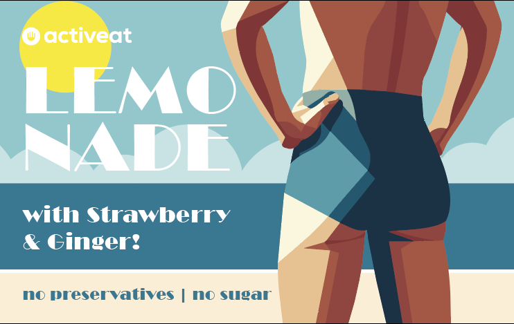
This is what I designed. Do you find it extremely bold, provocative, out of context and “off” ?
It will be a small label 17,5 X 5.5 cm sticked around a small glass bottle.
I like the style of illustration. It’s very nice.
However, if this is a label to alert people in a shop that the bottle contains lemonade, the typography might be a little problematic. You’ve split the word into two parts and placed the white letters against a light bluish-green and yellow background, which compromises the legibility — especially from a distance.
Thanks for the answer. To be honest, there are more products apart from lemonade. Splitting lemonade was a decision in order to keep the font large and “fit” in the front view of the bottle.
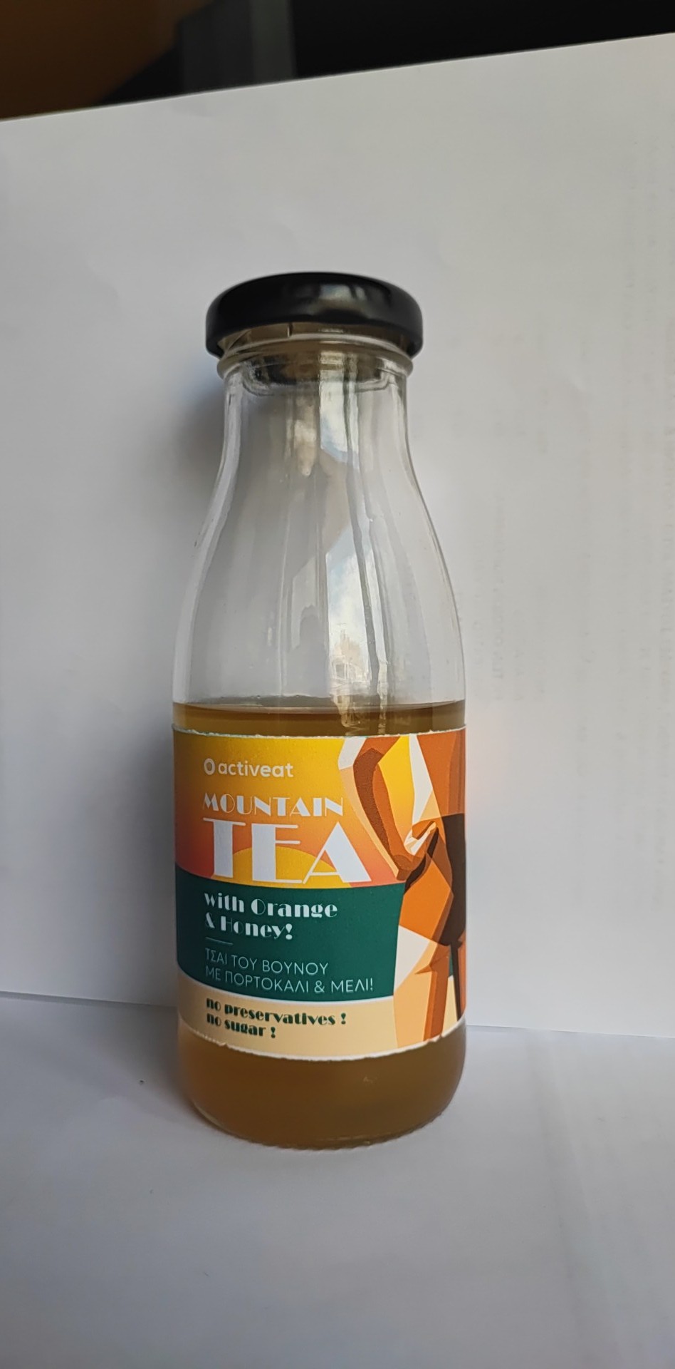
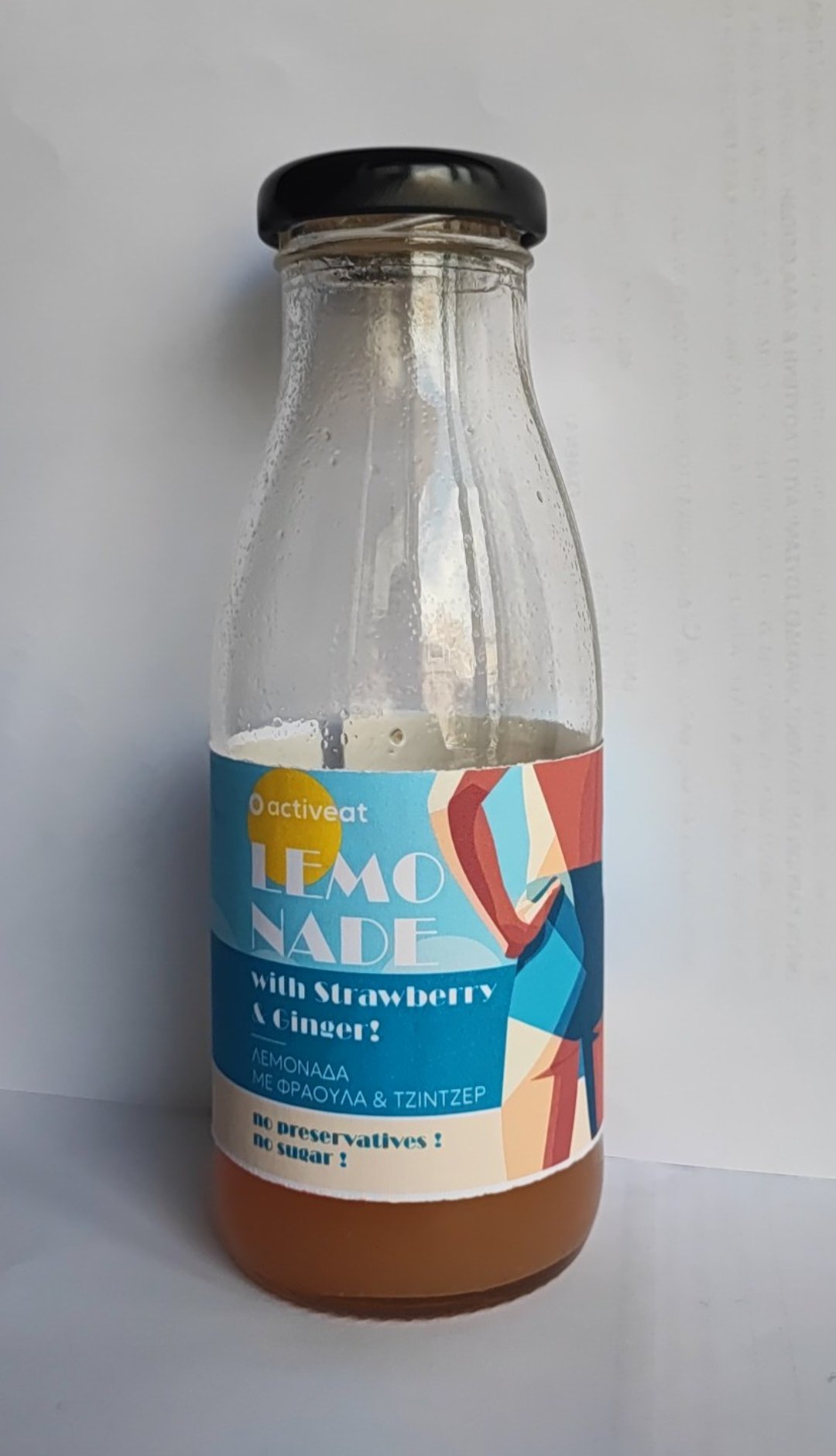
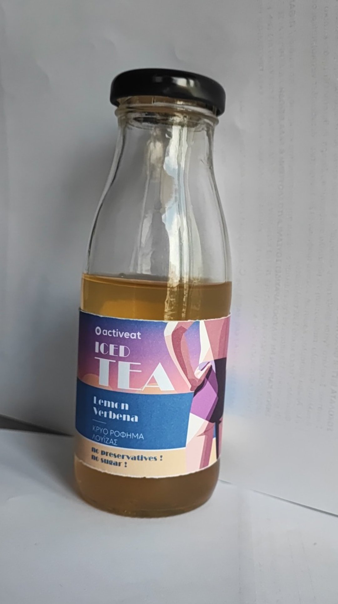
These are the rest.
What’s your opionio about the “concept” ?
Is it too cocky? My thought behind that was to create “scenery” of tranquility, restfullness, a bit nostalgia of the summer vibes (I live in Greece, and summer in Greece means beach for 99% of the people). Apart from that I used a more “non-binary/gender fluid” body type and swimsuit (because the client is very LGDBQ friendly).
She liked it a lot, but I have second thoughts about the concept. Thank you again.

To me it looks more like sunscreen than tea.
How does it look on the bottle?
Always be aware of context.
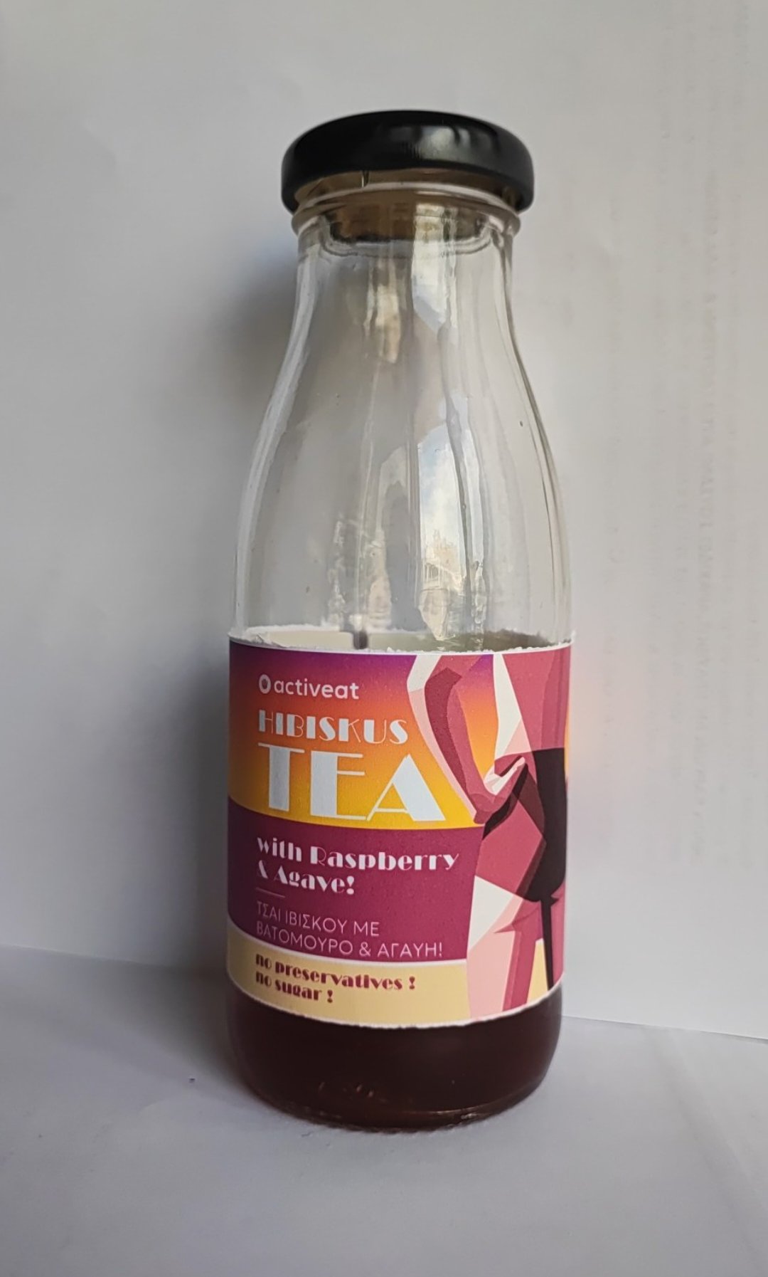
Pardon the inkjet muted printing (I have an inkjet printer), the half empty bottle, the product is expired (and changed color), and I am not a proffesional photographer!
Splitting Lemonade like that is a little weird (in the US the split would be after the n)
But I really like the vibe of the line.
1 Like
Yes I know about “lemonade”
But thank you for your kind comments!
I don’t see LGBTQ overtones in the illustration. To me, the figure looks male without being overly masculine. However, I see no reason to give the illustration an LGBTQ vibe, so if the LGBTQ-friendly client is OK with the look, I wouldn’t be concerned.
Although this might be beyond the budget’s scope, have you considered a version with a female figure done in the same style?
I have reservations about the typeface (Broadway?). It’s a beautiful Art Deco face, but it can be challenging to read. If it were me, I might consider using it only for the product name and a more straightforward typeface for the smaller words, similar to what you’ve done with the Greek words.
Thankfully I didn’t design the woman version aswell because at end the client was convinced by her friends that it’s a silly concept to show a buttom. (personally I disagree because its something a bit different and bold).
As for ther gender fluid, it’s a male body structure but the suimsuit has high waiste line, so it’s more “modern” let’s say. Very subtle lgtbq vibes.
The budget is low unfortunatelly, so I believe I exceeded her expectations already.
No she ordered me to design a woman surfing and drinking from a bottle.
I 'll do it and that’s all.
I keep the “bold” concept for my portfolio though because I spend some hours designing.
I think your intuition was right about it being different and bold — the important thing is that it works
2 Likes
The client wasn’t that bold (but she liked a lot the concept) and had a specific request. To design someone on surf board drinking from a bottle. So I made these drafts (I will make some corrections here and there, fixing colors a bit, shades, some minor adjustment to alignment, maybe illustrations come in foreground -not behind the text, etc).
What do you think? Is it too cluttered?
You think that the stamp style (no preservatives/no sugar) is it out of context ?
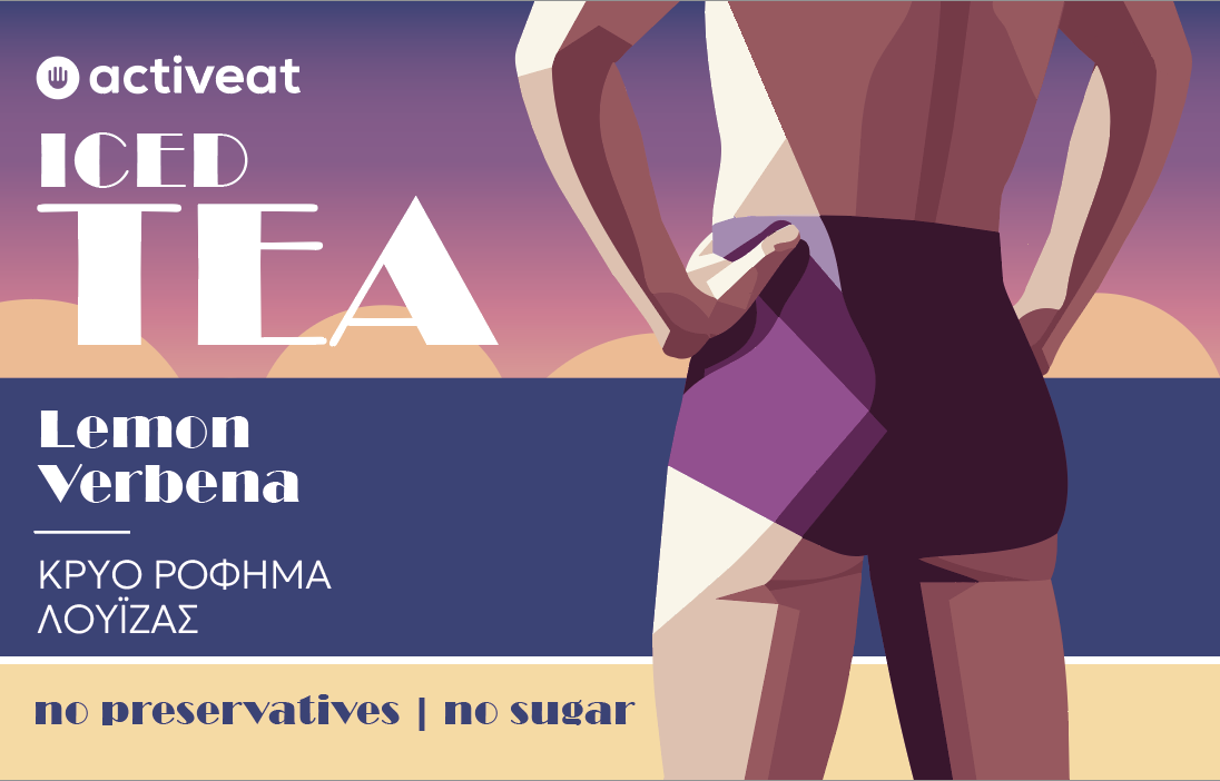
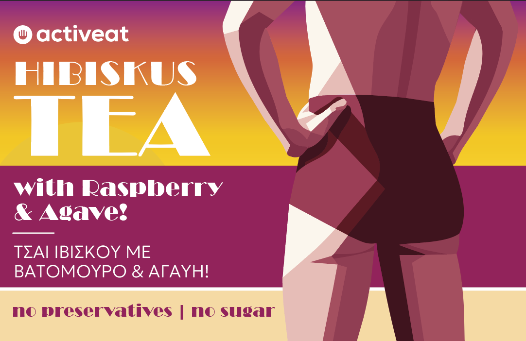
Because 3/4 are Tea based beverages, and only one is lemonade, I designed a bit different illustrations.


Isn’t it ‘Hibiscus’ with a c not a k?
Why is there an exclamation mark on 1 and not the others?
Why a surf board? Are you aiming for a surf market?
Would it stop me buying it? No. Would it make me a surfer? No.
Hibiscus - raspberry - pink
Ice Tea - Lemon Verbena - blue?
Lemonade - strawberry ginger - blue?
Moutain Tea - orange and honey - burnt orange
Colour choices are strange.
Can’t read the 'No preservatives it’s obscured.
The print is quite small for label printing - would require testing print labels and making adjustments to type weight.
Doesn’t the top line of text say no sugars/preservatives?
Why is one at the top and the other in English in a circle?
Typically - especially in a lot of countries there’s health requirements that means the english text must be displayed alongside the other text.
It can be requirements to have them grouped together in the same area and not separated.
You should really enquire about this if there is EU legislation requirements - otherwise the product may not be saleable.
Usually with negative type that is small it’s best to use a font style like regular/medium/bold/etc. rather a light version - and it’s better to include increased tracking so in print the letters won’t blend together due to mechanical processes involved in the process.
Am with the others here, while the illustrations are nice and I get that your client wants something unique, am not sure whethere them and the colours align with the product.
There seems to be an Art Deco theme to the designs, why is that?
And when you say they will be sold in private stores, who are the patrons and what kind of stores are they?
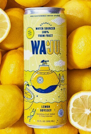
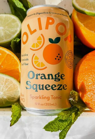
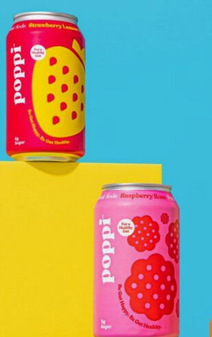
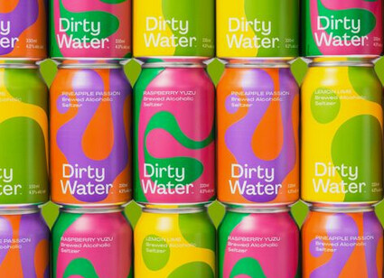
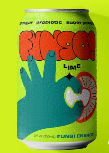
I had a look around online to find other examples of packaging for beverages that I would call unqiue, and this is what I came up with:
Just to add the r mark in activeat will be non printable at that size.
For negative print at this size on labels the thickness needs to be minimum 0.25mm (.7pt) and in height must 1.5mm min
Typical rule would be at small sizes do not superscript the r mark. Have it the same size as the text in a bold style and then baseline shift.
Thanks for the comments.
These are just drafts, of course I will fix spelling errors etc.
About the concept, it’s my clients request as I mentioned, like a straightforward command to keep the style of my original design, but design a surfer drinking from a bottle.
About the colours I’m sceptical too, I will reapproach it.
About the uniqueness, I think the packages Pluto posted has a style that is today very overused. Especially the orange has nothing unique to my opinion. Pinterest, dribbble and Behance have tons of similar designs, which of course I like, but I am somehow fed up of them.
That’s why I chose the art deco style, to be a bit different.
The truth is that the label is quite small, 5.5cm in height and there is much text to be placed and be visible on the shelf.
I will ditch the circled text aswell.
could you give me an example of that?
Example of what?
The r mark?
You can find info online
Ok - so you’ll probably print large bulk quantities for bottles (even if niche shops) it would be more cost efficient to print in bulk, and apply to bottles after etc.
Anyway - if doing digital might not run into an issue.
But thin white lines out of 4 colour print in large quantity printing (typically litho print) can result in Halos - where any off register colours will overlap into the white.
When it comes to print registration - there is a tolerance.
So for your R mark in your print - you want to be on the safe side of the tolerance for printing to avoid registration issues
As it’s a mechanical process you will have movement as it shifts through the machines in print.
By designing around tollerances of print - and ensuring the thickness of the line around the R mark is within the tolerance - you are safeguarding the print.
You’d probably want that line around the R and the R itself to be 1.3mm minimum.
®
®
®
®
®
®
®
®
®
Same goes for any white text out of any background, especially dark backgrounds.
I wouldn’t go below 6pt size on white text on a colour background.
At that size I’d use a heavier font style, not light, - regular, medium, bold or other.
Increase the tracking and leading so it’s readable.
I’d probably go to a light font at 8 or 9 pt size - but I’d have to check the thinnest part of the letter to ensure it meets print tollerances.
You can just measure it.
I like to draw a circle as a guide at 1.3mm - then move it around the letter form to ensure it matches in size.
Hard to know what font size you’re at on your small label.
It’s definitely a struggle to fit all copy content on small piece - usually requires informing the client about these tolerances and that you want the text to be readable when printed.
You certainly don’t want parts of the letter filling in.
Especially with thin small text.
The way it’s made for printing is on metallic plates.
Like this one
And the emulsion is washed away in the making of the process, the hardened emulsion stays.
This is a chemical process, and you can imagine thin lines being problematic and could potentially wash away, leaving a letter not fully formed - or thinner than visibly desired.
Thank you so much for sharing such valuable info and for your time! I really appreciate it!
It will be digital print on a pp white which is waterproof (as the printer said)
Honestly I didn’t know that I have the “right” to make changes to a logo.
About printing, I have printed labels with 5pt font (myriad pro), every letter was distiguishable. Hard to read of course because of the size, but distinguishable for sure. I have to mention that it was digital printing, black text on beige background. It’s very challenging to place so much text in a labe of 5cm height (give that you will leave a 0.3cm margin at least= 4..4 cm). 8 pt text is out of question for such labels of course.
Now back to Tea/Lemonade labels. Let me explain my color choices:
I tried to keep the color of the board and the liquid in the bottle close to the actual drink color.
-So, Ibiscus (with “C” as you very well mentioned, but with “K” is what the client gave me as text)
has a burgundy color, and raspberrry a quite close more pink-ish color.
-Lemon Verbena: the drink has this yellow/orange color, so I chose these teal background for contrast.
The flower of lemon Verbena is bright purple so I migh go with that.
-Mountain Tea: Again the color of the board/liquid is pretty close to the actual drink. And this gold/brown/orange is chosen because of the tea/honey/orange pallete.
-Finally Lemonade, again, has this dark yellow color, so I chose blue just for contrast. I was thinking about strawberry color background but the taste of strawberry is not that strong, it’s very subtle actually.
The " ΧΩΡΙΣ ΖΑΧΑΡΗ | ΧΩΡΙΣ ΣΥΝΤΗΡΗΤΙΚΑ" text means “NO SUGAR | NO PRESERVATIVES”
and the text below is the Drink in Greek.
I didn’t know that I should group similar information English/Greek together.
The circle I liked it aestetically, but I was very sceptical about it’s function there.