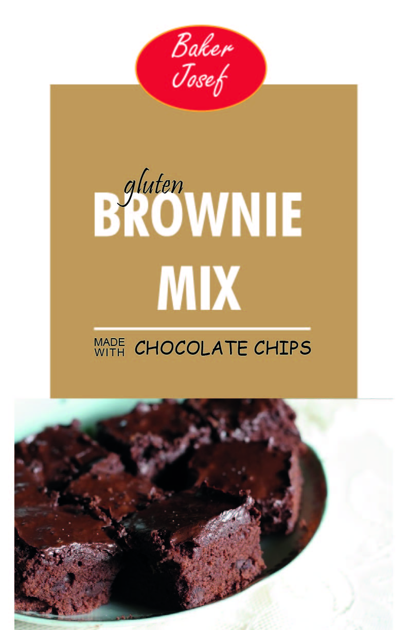
This is just for a class im taking, not an actual redesign for a company. I was going for a more modern look. I wanted to redesign it to make it feel more modern but at the same time not completely change it. That’s why I kept the centered treatment. The demographic would be parents who would use this for bake sales or events and could make with their children. I didn’t want to make a childish package however because I felt it would lose other potential buyers. Some of the fonts I feel don’t work together and I can change, such as the chocolate chips font, I feel like the spacing between brownie and mix has a big gap and the line feels weird. I like the box and photo however.. any feedback and ways to improve would be great, thanks
1 Like
Your new one should probably say Gluten-free Brownie Mix instead of Gluten Brownie Mix.
1 Like
thanks,ill change that. Do you have any other opinions?
I think the photo of the brownies are a little off because the photo is not centered with your design. everything is centered, but the brownie focus is to the left.
also I would move the words in the brown box a little more up.
It looks more modern, but it does seem that you completely changed it. The homemade look of the original is completely gone, and any old-fashioned goodness has been replaced by something that suggests easy-to-make, lower-quality and cheap.
I’m not saying that’s bad, however. In a real-world situation, if the client wanted to abandon the old look and go with something brand new, that’s fine.
You also changed what I assume is Baker Josef’s logo. It’s not often that a company will change a logo just for the sake of a new package design.
If it were me, I might make the top of the brownies overlap the brownish square instead of being cut off by it. I might make the words in that brownish square larger too since they seem to just be floating in the middle of it. I would also avoid using Comic Sans for the words Chocolate Chips. Comic Sans is almost universally despised by every designer in the world.
The white background is throwing me off. It looks like 2 individual pictures.
As B said that should be gluten free … not just gluten and I really don’t like it being embedded in the next word.
There is no easy way to say this .. but to me. You took a cozy, homey feel and made is stark and boring. There is not one thing that would make me choose that package if I was in a store and looking to bake brownies.
So remember your target audience. I totally get wanting to give it a more updated look .. but don’t update it to the point of no one wanting it anymore ![]()
1 Like
Thank you for telling us that you’re a student and this is a class assignment. Based on that, I will temper my critique.
– Overall sense of balance and weight are off. It’s like you stuck on a logo, threw on some type, and grabbed a stock photo of brownies. Think about a hierarchy. What’s going to grab the consumer’s attention? It’s probably the hero shot if the brownies, so make that the focus of the package.
– There is too much white. Start with a base of a solid color or gradient and layer the graphics.
– The logo is way too similar to the Betty Crocker logo. Also, the Freestyle font is pretty dated, and the type isn’t centered in the oval vertically.
– You have five different fonts on this. That’s way to many. Rework this using no more than two font families.
– You’re right about brownie and mix being too far apart. Tighten that up so that they look like they belong together.
– Ditch the Comic Sans pronto.
– As someone else said, the photo looks off center. The photo itself is probably centered. But the visual weight of the photo is all on the left. It fades off to a white table cloth. Put that next to your white background, and it looks wonky. Crop that photo to eliminate the right side of the image.
Hope that helped.
1 Like
I can’t figure out what the brownies are kept on/in. Is it a plate or something else? The photo also seems to have an odd greenish tinge to it on top and a bit at the bottom.
You might consider touching it up or perhaps finding a different one.
You picked a beast of a project to redesign.
First, I’ll mention some of the technical misses.
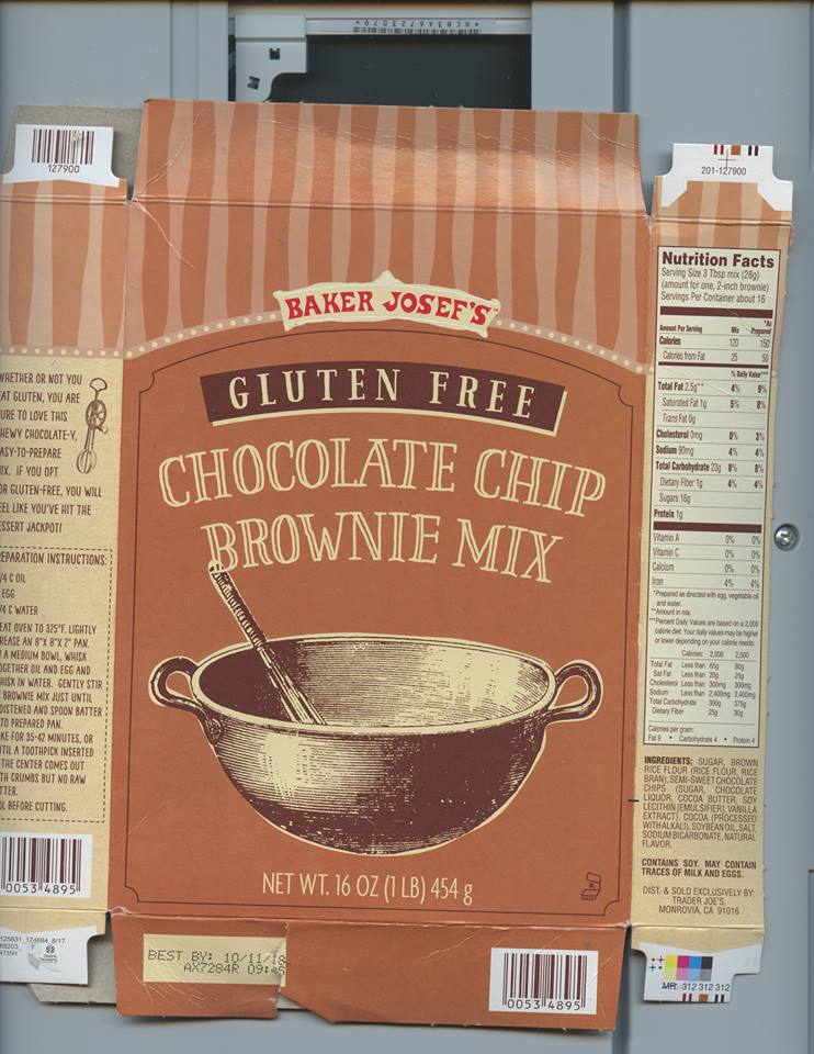
1: As Just-B already pointed out, it should say Gluten Free and it’s unlikely that the brand will change their logo for this one package. Also, it’s “Baker Josef’s”, not “Baker Josef.”
2: You completely removed the Net Weight statement. This is included on all food packaging for a reason.
3: “Gluten Free” is a money-maker. Notice how the original design recognizes that and made it stand out on the packaging. Yours kinda disappears.
Moving on to some of the finer details.
“Chocolate Chip Brownie Mix” is not the same as “Brownie Mix Made with Chocolate Chips.” They also have other products named “Cinnamon Crumb Coffee Cake Mix,” “Golden Yellow Cake Mix,” and “Chocolate Cake Mix.” If they were to follow your examples for the rest of their brand, it would say, “Coffee Cake Mix Made With Cinnamon Crumbs,” “Cake Mix Made With Golden Yellow,” “Cake Mix Made with Chocolate.” Hopefully, you notice how un-appetizing that sounds.
Finally, the design.
I think you should spend some time and research the brand values of Trader Joes. Their whole aesthetic is old-world imports and global goods. It’s why the original design uses wood-cut imagery and typography instead of photo-realistic images of what the products could be.
I found this blog post that might be good for inspiration. The orange juice package, in particular, is modern but fits well with the rest of Trader Joe’s brands.
Here’s a portfolio piece of another designer, Matthew Gordils. http://mattgordils.com/portfolio/totally-organic/
I hope this helps give you some inspiration.
4 Likes
Nice demonstration of how to think and act like a designer, CRHain88. I expect much of the student traffic here will benefit from the good example. I suspect they aren’t really being taught just how much of Graphic Design happens outside of the software.
1 Like
CRHain88, that is a most excellent post!
Someone already touched on this, but i’d certainly add some type of background pattern/texture/image/color.
It might also be neat to see how you could make a portion of the brownie image overlap the bottom of the brown square.
I’d try and find a brownie image that isn’t cut off on one side and would be more centered on the “packaging.”
Hope this helps!
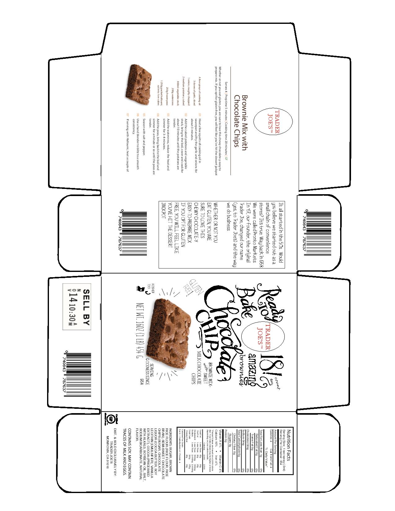
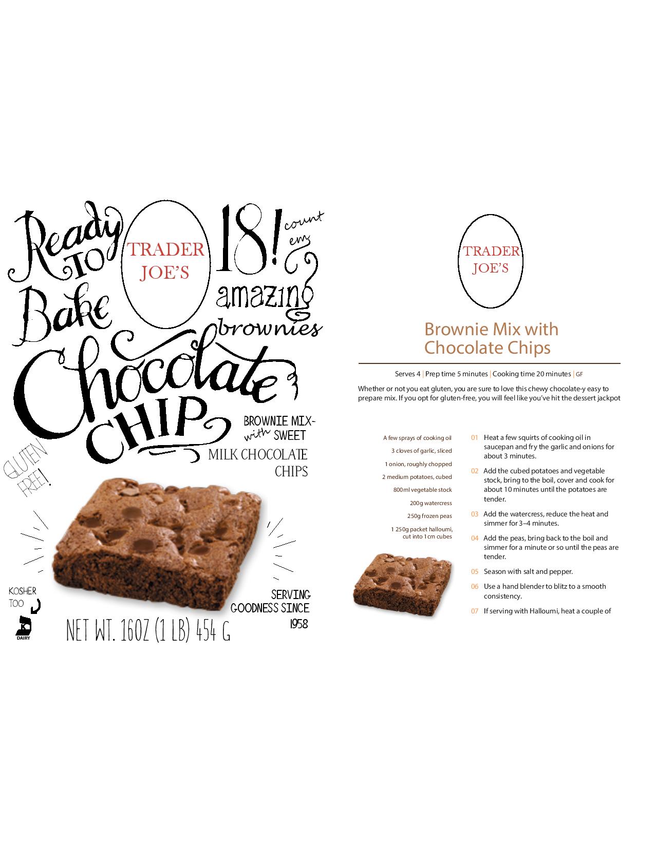
thanks everyone for the feedback, I went back to the drawing board and tried something different. I wanted to keep the cozy feel of the package since it is brownies. As far as the logo is concerned, I dont have it so I cant incorporate it unless I download a png of it. Im also reworking the dieline to make everything line up like it is supposed to.
There is (almost) always a logo to be had…
traderjoes.com > Careers > Employment Application (PDF) > Open in Illustrator, release a clipping mask or two, and voila; Trader Joe’s logo in vectors. Took me 41 seconds just because I didn’t already have Illustrator running.
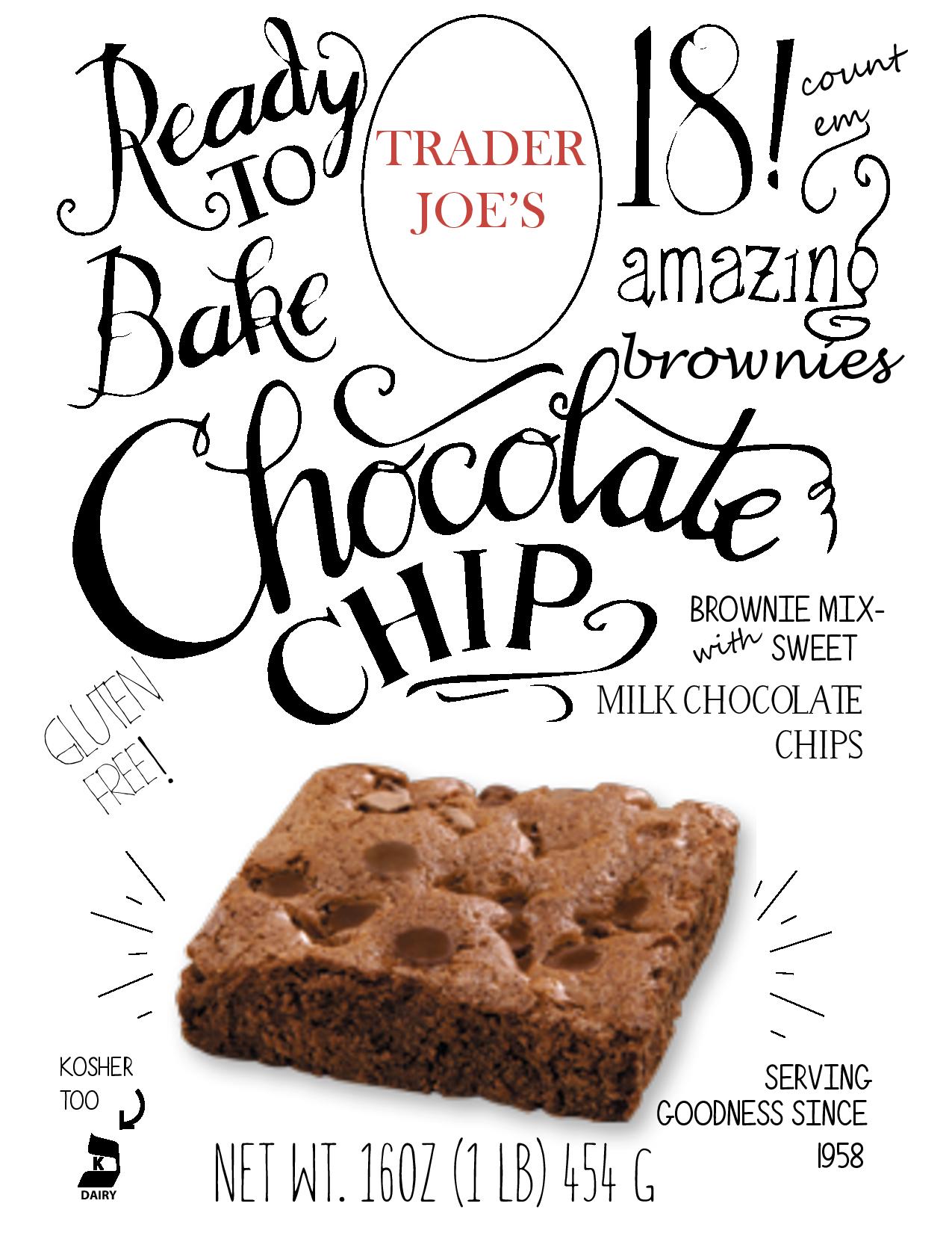
Your new go at it is surely more interesting and novel. It’s a better start than the first version, but still needs refining. While the style you’re attempting thrives on a crowded layout to a certain extent, stay mindful of readability and hierarchy. I think you can do better getting the primary and secondary focal points right and the plain, thin-stroked oval around the brand is just far too weak.
I like the new package much better. I don’t know if it fits all that well with Trader Joe’s brand/image, but this is a school assignment and it’s an opportunity to take a few chances.
The handwriting is quirky, and a shopper just might notice it for that very reason. It also conveys the sense of being handmade, and there are few things better than homemade brownies. I think this package could work.
As HotButton mentioned, pay attention to the legibility and hierarchy of the information. Also pay attention to what’s being said, some of it is just a little confusing.
This is a brownie mix, yet the package only says brownie in very small letters. I’m thinking you might be relying on the photo of the brownie to convey what it is, but shoppers just might think it’s a box of chocolate chips that might be used for making brownies. In a real-world situation, most clients tend to be literal thinkers, and if it doesn’t actually say “brownies,” they’ll be uncomfortable with it.
The “serving goodness since 1958” is a little confusing. I doubt a gluten-free brownie mix was available since 1958. For all I know, Trader Joe’s has been “serving goodness” for 60 years, but I’m not sure that’s what the words imply.
Also “gluten-free” is hyphenated because it’s a compound adjective. “Brownie mix with sweet milk chocolate chips” should have no hyphen.
Where you say “18! count 'em,” I’m assuming you’re mentioning the number of brownies that can be made with the mix, but it’s less clear than it should be. At first, I thought you might be saying there were 18 calories per brownie.
I’m not really a fan of that slightly pinkish tan color on second box. It just doesn’t look, rich, mouthwatering and appetizing. I am liking the white box, though.
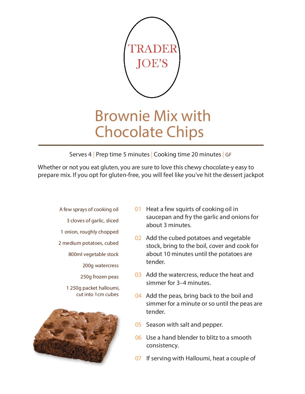
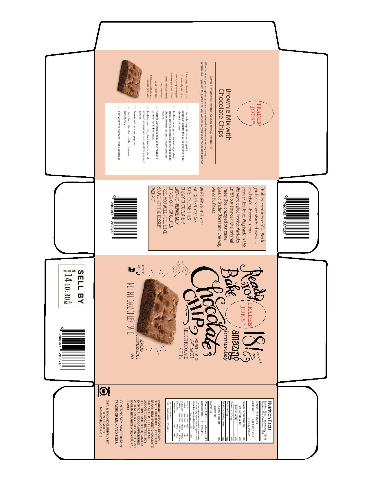
I’m still laughing at the instructions for making these “brownies.”
Heat a few squirts of cooking oil in saucepan and fry the garlic and onions for about 3 minutes?
Add cubed potatoes?
Watercress?
Peas?
Blitz to a smooth consistency?
Pretty yucky sounding brownies!
18 brownies serves 4?
(in my house that serves 1 but who’s counting. ![]() )
)
You could get 100 brownies out of a 9x9 pan if you want quantity. They are gonna be really small though. The number of brownies you get out of a pan only matters if the pan is large, and comes in the box.
For a mockup, use a png. Don’t change the logo.
Or follow HB’s instructions. It’s funny sometimes how clients can’t find their vector logo to give you but have readily available online PDFs with one right there. (though sometimes converted to rgb, which isn’t very helpful if you don’t have the brand standards.)
1 Like
Once the chocolate chips are added it should taste much better.
1 Like
Isn’t the name of the company Baker Josef’s and not Trader Joe’s? Or am I missing something?
Baker Josef’s is a Trader Joe’s brand.
Trader Joe’s uses the word Joe in different ways in all their branded products. It’s the store generic, but sure beats the boring labeling usually seen in store generics.
From Wiki:
Trader Joe’s sells many items under its own private labels, at a significant discount to brand-name equivalents, and requires its brand-name suppliers not to publicize this business relationship.[2] Trader Joe’s labels are sometimes named in accordance with the ethnicity of the food in question, such as “Trader Jose’s” (Mexican food), “Baker Josef’s” (flour and bagels), “Trader Giotto’s” (Italian food), “Trader Joe-San’s” (Japanese food), “Trader Ming’s” (Asian food), “JosephsBrau” (beer), and “Trader Jacques’” (French food and soaps). By selling almost all of its products under its own labels, Trader Joe’s “skips the middle man” and buys directly from both local and international small-time vendors.[25]
Yes! The new direction is a lot more fun. Make sure to carry that feeling onto the back of the box.
Some notes on the back:
chocolatey is a word, no need to hyphenate it.
Are those the real directions you want to go with? If you’re gonna be campy, go all the way. Show me some peas and onion on the brownie image.