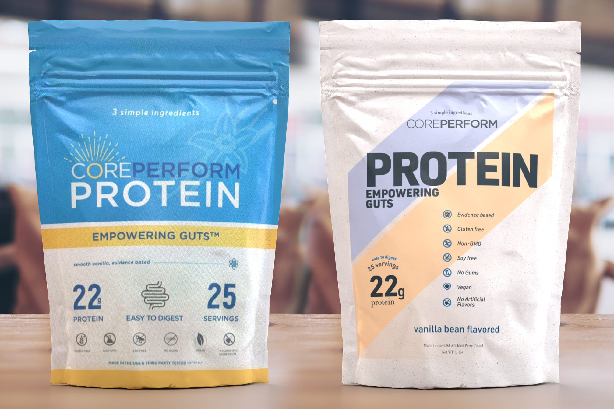
So about a month ago I was contacted by a person fishing around for a quote. They were making a protein powder yada yada and needed a label.
Well, I think my quote was too high and they picked another designer. Today they got the label pack and posted it to social media.
(the icons the designer used were from adobe stock, I used those same icons in mine)
So I figured now that I can see the information why not take a crack at it and see what I would have done. I render out the other designers’ work (Left) and my work (Right) in Adobe Dimensions for a Mockup comparison. I took about 2 hours out of my time, custom made 4 of the symbols. I used URW DIN and URW Bodoni as my fonts. I didnt have access to the logo so i found a font pretty similar. client looks like to be selling only online.
I think yours is the better of the two. For me, it would have more shelf appeal and seems a bit more dynamic.
It always surprises me how so many clients are hesitant to spend money on these sorts of things given the significant return on the investment there is by doing it right instead of doing it cheap. They’ll spend a small fortune on the initial investment, then want to lowball the marketing to bring in the customers.
Yea I dont think I was wrong in quoting the client as well. I quoted 6 hours of work for roughly 15$ a hour, the original quote was 150ish.
Being that I’ve worked with the client before, I’m not very good at making icons. So I’ve used Adobe stocks vector icons before.
I was shocked the see the designer the client used actually used all stock icons. I found the exact ones he used and used 3 of them while designing the other 4.
You really do get what you pay for. Everyone is trying to scrape the bottom line but I only put in 2 hours of work.
Im sure mine has things to work on. I should have made the icons slightly bigger and I would have liked to add a symbol for the flavor
Dear god, they wanted to pay even less than your quote! What is wrong with people? Your quote is a fraction of what it should be, given the worth of the end result to them.
I much prefer the type on yours. However, I think, given the market – predominantly male gym monkeys, I’d imagine – the strength of the colours could be a little stronger. Pastel colours are not something I’d associate with this sector. I like the dynamism and overall It’s far more successful.
Not sure about the icons on either version. What do they add? An icon is usually used in place of text. In this case, they are used more like bullets, so maybe use stylised bullets that pick up on the diagonal theme instead.
I really don’t love the stylised large intestine icon on the left-hand version!
Good design always needs good clients, so perhaps it’s better to move on and find better ones. Clients that want to pay that far under the going rate usually only give you grief.
Pastels because the clients clients are mainly women
Im not a fan of the icons but they could be used in other promo materials or on the back. Not that I’d make more fake projects for this brand. The the gut icon really stands out as ugly. Or mismatched, each designer has a style and you can tell the icons don’t mess together.
Yea its crazy how people really undervalue their brands. Then they wonder where they went wrong.
Are you sure they gave the other vendor the job because your price came in too high?
Am not sure what the market is like where you are, but if someone quoted me $150.00 for that - I would have been nervous too, not because it’s too much money, but because it’s an insanely low price relative to the impact it’s going to have and the amount of work involved.
I’m looking at this and if I only saw your design, I would think the product is called “Protein Empowering Guts” or should it be “Core Perform Protein”?
A hierarchy that puts so much (relative) weight on 'PROTEIN" could make sense if it was one in a family of products; PROTEIN, FIBER, CREATINE, etc., but for such a common word, that will be on every other package on the same store shelf, to outweigh the brand by about 20:1 is something I wouldn’t want if it was my product, first one or otherwise.
Id argue on by not displaying protein in such a big way on store shelves wouldn’t it be less recognizable as a protein powder. Especially since its only in a 1lb batch.
The smaller bag size, and in the left sample id almost mistake it for Dietary Fiber.
You interpreted my note backwards. I didn’t say you should make “PROTEIN” smaller.
Well that’s why I framed my assertion: “if it was my product”. I’d hear your argument, ask you again to boost my brand presence, and after that, you lose.
well, I don’t know the actual estimate that you had demanded but I really don’t find any reason that why did the client rejected your design. Obviously, yours is better than the real one.