I’m putting together a business and personal brand to do some freelance work and I finally have a brand name and logo that appeal to me. My main goals are to do branding and package design for food, beverage, and hospitality companies since that’s the kind of work I’ve done before and enjoy.
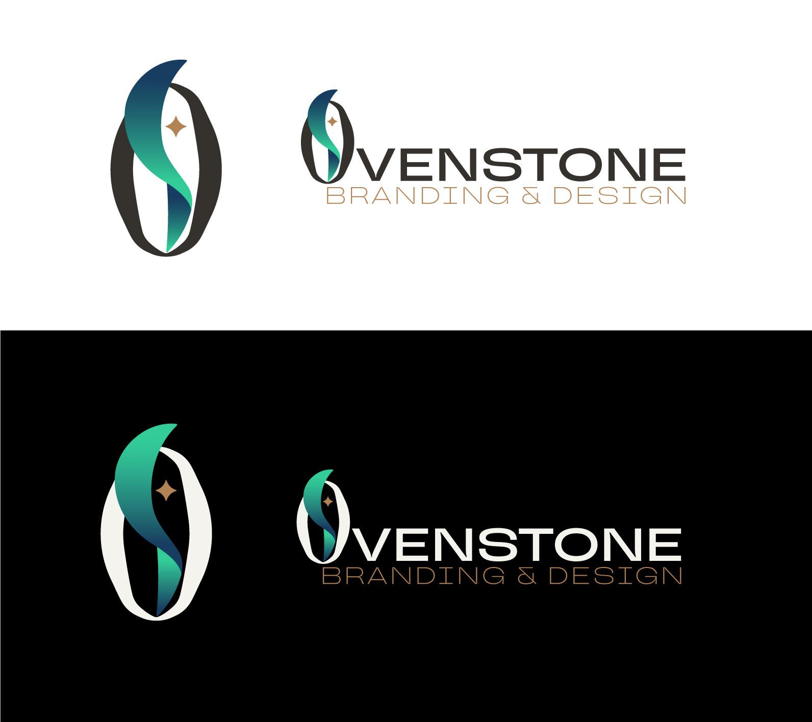
Ovenstone is my last name, and since it’s pretty unique I think it’s memorable for my business. I want to portray a competent, innovative, and elegant feel with this logo. I came up with this concept by breaking down my name into two words, Oven and Stone. The “O” represents the stability of the stone and the “S” represents the flame and energy of an oven. I’ve always liked my name from a creative standpoint because an oven is used to create something beautiful and useful.
My issues: The gold star in the logo, meant to give an accent color and to represent a creative spark, seems a little out of place and perhaps not well integrated into the logo. I’m not dead set on the type for the rest of my name, though I do like that typeface for my brand in general. I don’t think it harmonizes with the more organic shapes of the “O”. I’ll try to customize it and round out the corners to make it softer.
I’m pretty set on this concept in general after working through many others, but I’m aware that it needs some fine-tuning. I’d love some feedback to see if I’m on the right track. Thanks!