This is not a job posting, but if anyone (preferable those that actually do hiring would be nice) wouldn’t mind giving my stationary an overview and maybe give some suggestions if I can improve these anywhere, in design or content.
Thanks, I want to get these out to a few places this week so any feedback is much appreciated.
My portfolio is up and already posted in another topic
Overall, I like the colours and the mountain design aesthetic. The contour lines are a nice pattern and your logo is a clever use of your initials.
If you are looking to be hired as a designer in a company, just be careful some employers might not want someone who already has an existing competing company or brand. If you’re looking to be a freelance designer, no one is going to ask to see your CV.
The fonts you’ve used a really similar. I would experiment with different weights. For example, the serif header can be bold and the sans serif body should be book or regular. Header B looks like it is spaced out too wide.
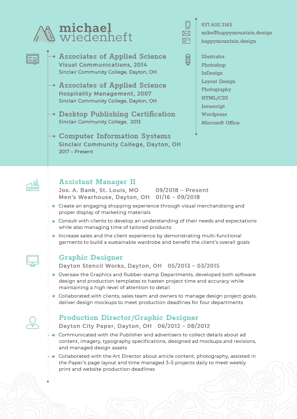
I’m confused what order your education is listed in? Is it order of importance? The dates are throwing me off. Are you still studying Computer Information Systems? If you haven’t completed this yet, remove it.
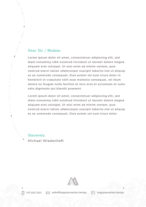
Page 3 - the dashed lines by the bullet points aren’t working. Either make it a dotted line or make the gaps between dashes tighter.
You haven’t worked as a designer since 2015. Someone hiring will ask why.
You might be sending conflicting messages by seeming to position yourself as the owner of Happy Mountain Design (which seems like a design company) and also looking for a job. I’m not saying you can’t do both, but doing both at the same time, on the same materials is awkward. I’d also suggest never using the introduction, “Dear Sir / Madam.”
Aside from that, I like the general layout, personality and looks. The topographical contour lines are a nice touch, as is the trail of dots meandering through the pages, like a trail through the woods.
Ahhh just the two I was hoping to hear from! Thanks guys! when it comes to the personal ‘branding’, I just happened to get a free .design domain and ran with it, but if you have a suggestion to tone certain things down? Maybe taking my name out of the mark in the footer area? Or is it in the website instead of using the word ‘design’ in the header, should I change that to ‘portfolio’?
As far as just history it’s in chronological order. The management job I have been struggling with, bc they’re owned by the same parent company Tailored Brands I’ve just happened to work in both environments. So I wasn’t sure if I should put TB’s for the company, and combine all of the years or not.
@Just-B About the gap in professional in-house designing, I unfortunately left the company bc I needed to make more money, I loved the Dayton Stencil job, but it couldn’t pay the bills, took a job selling cars at the dealership my old roommate worked at for a year, been selling suits every since.
@Buda I am still slowly taking college classes in CIS for Web Development, is there a way I can put that in there or save that for a cover letter?
I would combine the two jobs under Tailored Brands. It would make more sense why you would have two jobs with the same title and details.
It’s up to you and who you’re sending these out to as to whether or not you want to tone your brand down. It’s not so much tone done your branding but tone down the business side of it so that it doesn’t look like you are a business owner looking for a job. Rather a designer with a well designed portfolio and resume looking for a job. If you’re freelancing or contracting, that goes out the window.
These days, when a potential employer sees a gap, they immediately think jail time.
Other than that, my comments echo B’s and Buda’s so no sense in repeating them.
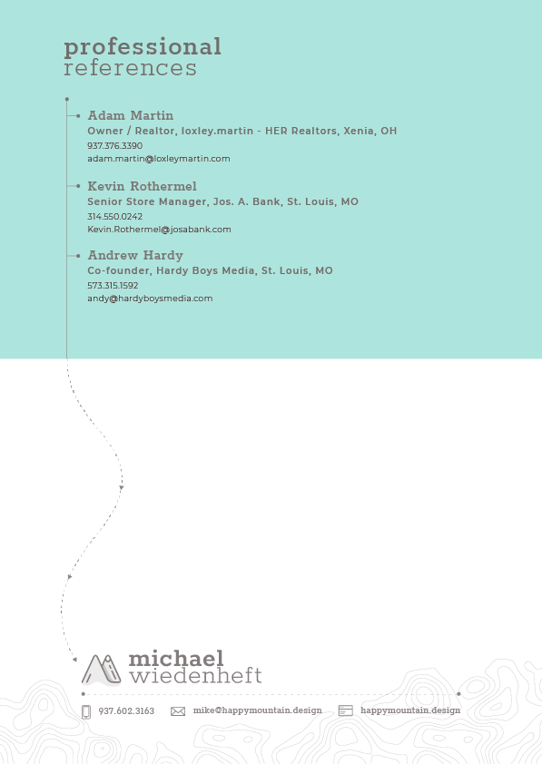
@Buda before I forget, thanks for noticing the mountain ‘M’. The wink in there for myself is that the front mountain is to represent a ‘>’, the / at the bottom is ‘//’ in coding, and the rear mountain is the tip of a pencil. Symbolizing the joining of my Graphic Design and Web Dev studies