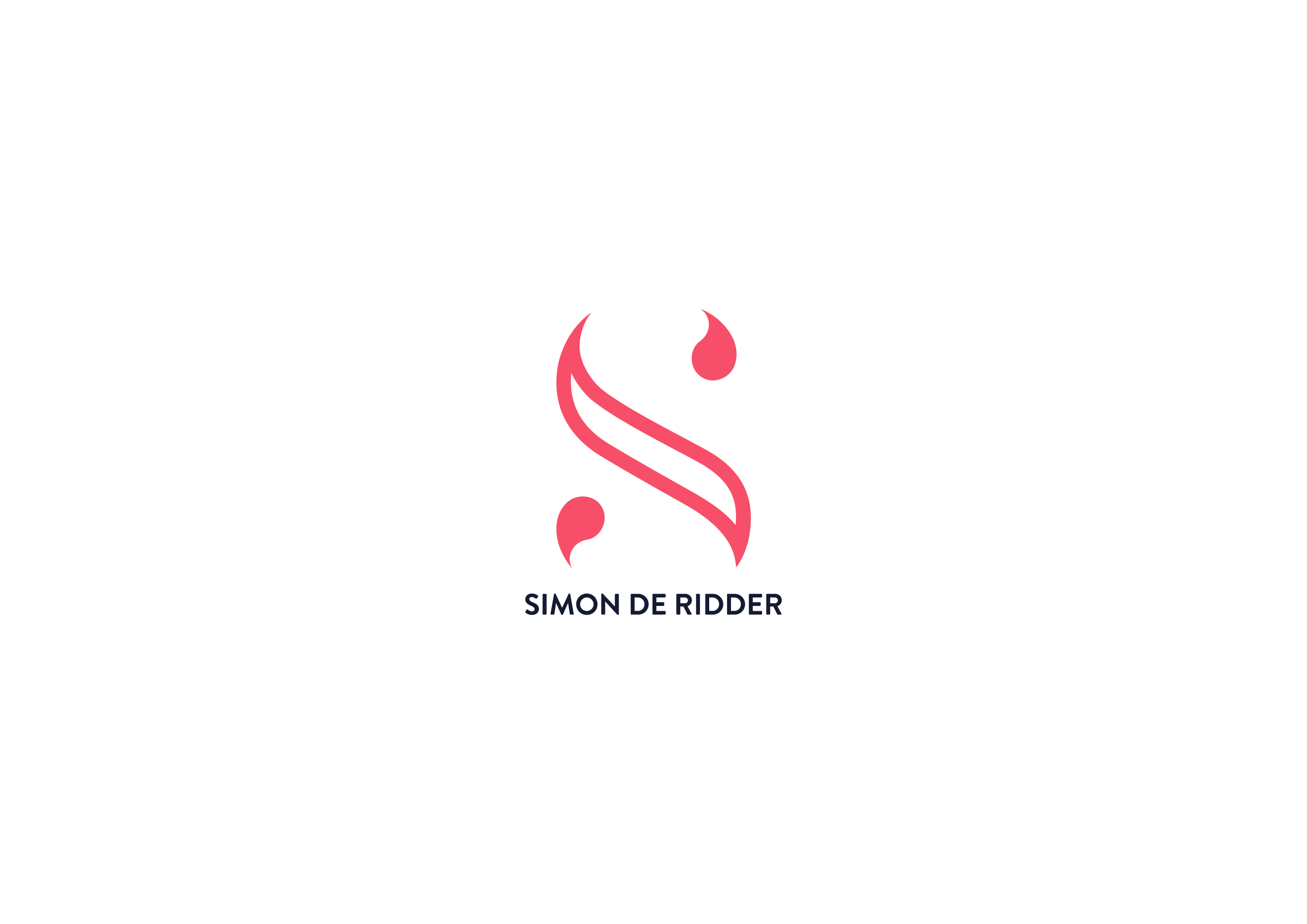
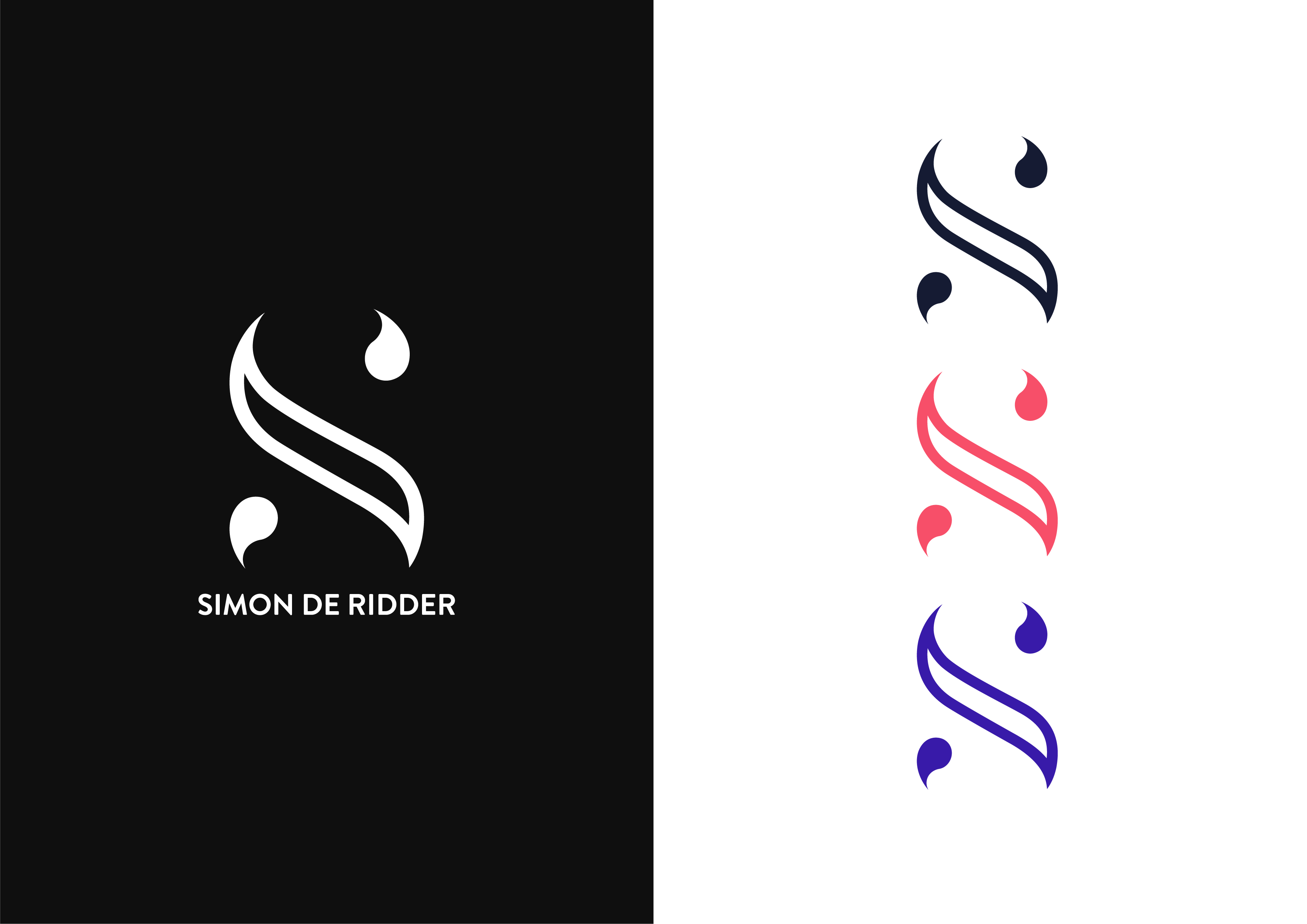
Oh well, last time my logo didn’t really got successful. Here’s now the new and final version (which is completely different).
What do you think guys? ![]()
1 Like
I love it really. The colors, style etc.
Your name, dutch – De Ridder means the knight. So.. have you thought playing a bit with that? Unless it’s gonna be used international of course…
(haven’t seen your previous logo ![]() )
)
Does this logo have a purpose?
I like it. Simple, elegant, fluid and cool. I think it might be the allure of the missing parts that my mind fills in that makes it so interesting.
I’m not quite sure why anyone needs a personal logo, though. Or is this a logo for a freelance business?
Thank you! ![]()
Yes, it has a purpose, I’m building my freelance business. The first thread I made was this one, but it was a little bit confused how I presented it.
I tried to go in the “knight” direction of course, but in the end, I wanted something close to the first logo I designed and more elegant sand simple:

@Just-B, thank you! Yes, it’s for freelance business ![]()
I likes. It’s attractive and interesting (in the way it makes you fill-in the blank). It demonstrates competency in graphic design, which in itself is meaningful for a design business.
2 Likes
This is great, nice use of negative space.
1 Like
I like how innovative and modern the design is.
For me it would be more cooler if the tail of the water drop is a little bit longer
so that it can easily recognize as letter “S” instead of letter “X” or “%” sign. It’s a little confusing but still if you take some time you can see it as letter “S”.
Thank you for your feedback! I actually tried several versions and one of them was with the drop connected to the main part of the S. But in the end, I decided I would go for negative space ![]()