This logo is for a Health and Wellness Coaching Practice. I’d love to hear what you think, and any suggestions you might have.
Is this a business name, a unique product/service name or a generic one, or an organization name? It looks to me like it can easily be replaced by “Chiropractic” or “Cabinet Making” or most anything.
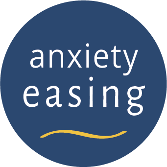
At any rate, kernings could use some tweaking. The thingie at the bottom looks like a grimace which, intentionally or not, contradicts the statement above.
What’s up with the kerning? And no way you’ll see that yellow line when it’s at 100px.
1 Like
Thanks for this. It’s a professional coaching service, for one to one coaching sessions that specialize in anxiety.
That’ a “swoop” at the bottom. Ok, good to hear that feedback.
I don’t know what to do with the kearnings, I’m not familiar with how to tweak that.
Thanks for this. I don’t know how to do anything with the kerning. And the “swoop” size, ok let me work on that.
Mixing two different sans serif fonts is tough. They really need to contrast each other in some way. What you have here is not working, sorry. They are too similar so it ends up looking like a mistake. Instead of easing anxiety, it causes visual tension that even an untrained eye could pick up without knowing why it’s off.
I’m also wondering about putting everything in a circle. It seems constrained which could cause one to feel anxious. If it were me, I’d suggest you work on some more concepts and post 3 - 5 ideas for review. Or consider hiring a professional designer.
Are you a designer?
Didn’t we say that logo wasn’t working over in the handbill poster thread?
Good to know this. Makes sense.
Putting the aesthetic and mechanical problems of the graphic itself aside for a moment, the bigger problem I see here is the name of the business, if you could call it that. It’s a horribly awkward, inverted gerund that will continue to haunt the brand identity no matter how much you might improve the graphic.
Maybe it’s an unfortunate fact, but strong business names always ring like a noun. That is, it’s a person (the person who produces what the customers pay for), a place (the customers’ destination), or a thing (the device or service that fulfills customers’ needs). “Anxiety easing” is underwhelmingly generic and reads like a disjointed fragment of a weak tagline. Imagine a dental practice named “bicuspid filling” or a department store named “goods retailing”. A stronger brand identity is the first improvement this logo needs.
I wouldn’t say ‘easing’ is an inverted gerund - it’s just a gerund.
To get to the bottom of the words used - What is Anxiety? What causes it?
I’ve looked up Anxiety and it’s causes and it’s not rooted to anything really
https://www.mayoclinic.org/diseases-conditions/anxiety/symptoms-causes/syc-20350961#:~:text=A%20big%20event%20or%20a,Other%20mental%20health%20disorders.
That’s why I ask - what type of anxiety to you offer (or the client offer) in their therapy? It is therapy?
Can 1 anxiety doctor/therapist etc. do all the anxiety disorders - or are they specialised?
Or can one do all - but recommend a specialist?
From what I understand it’s a normal emotional response to a situation whether it relates to medical, drugs, life events - it’s an emotional response.
Saying that - you have to consider how Colour is an emotional response for humans - paintings of abstract objects invoke emotions with their shape and their colour.
- Red: Passion, Love, Anger.
- Orange: Energy, Happiness, Vitality.
- Yellow: Happiness, Hope, Deceit.
- Green: New Beginnings, Abundance, Nature.
- Blue: Calm, Responsible, Sadness.
- Purple: Creativity, Royalty, Wealth.
- Black: Mystery, Elegance, Evil.
- Gray: Moody, Conservative, Formality.
You could go with RED - but that is often seen as a danger colour - and paired with Anxiety and Easing it would be awful
Orange - again another ‘warning colour’ - proceed with caution etc.
Yellow - Happiness - hope but also deceit … I guess
Green - that could be good - it relates to New Beginnings and Abundance etc.
Blue - you have used - and it’s calming - but your shade is a bit dark and probably a bit moody.
Purple - wouldn’t use it for this
Black/Gray - no go
So your colour choices really are down to
Yellow
Green
Blue
I think your blue is too moody - it’s almost a gray blue
I think Yellow would be fantastic colour - or Green.
Now for the shape of the logo -
You probably want something positive.
A yellow round face
Turn that yellow swoosh into a smile - green
Just looking here
The first 1 and the 4th one could be good starting points for you.
This is how I approach design work - research - research - research!
What are your competitors doing/who are they/and why did they choose their colours/logo etc.
1 Like
Oy, now we’re critiquing critiques. It was an informal characterization intended to emphasize how awkwardly the two words read in that order. Thanks for the correction. I’ll do better to favor technicality over expression.
Hardly a critique, more of a query about how you arrived at that.
You know what - you’re right - the ‘inverted gerund’ threw me - thinking about it more - it makes sense.
Look, trial by fire @cmdesign, I’m not going to sugar coat this…it’s not something you want potential customers seeing. The design will represent the professionalism of the business.
-try different fonts
-try different elements
-tell people what the business is about in the design!
Best of luck.
A bit of a shocker to read this, but it makes sense, and I think it’s probably true. And thanks for being so direct, even when it’s difficult feedback. However, I’ve registered the trademark, built the website, and I don’t have the time nor the money at this stage to start over. And at the same time, I still like the name, because at the heart of it, it says exactly what I want it to say, and it is exactly what my services are all about. Perhaps “strong brands” are always nouns, but sometimes that’s less important than other factors. One example is Mindfulness Based Stress Reduction, which is similar to my brand, grammatically and in terms of what it offers.
Thanks for all of this. I’ve done plenty of research on color, which is why I’ve chosen blue and yellow/orange. I do find the yellow/orange spectrum difficult to work with because of the way it displays digitally, but I’m paying attention to that as best as my eye is able to discern. And, I’ll look at the choice of blue to lighten it up.
The google search is helpful. I’ve done that in the past using a range of different keywords including easing.
My services are one to one sessions of Health and Wellness Coaching, as well as classes and workshops in mindfulness and other methods to help ease anxiety. My approach is very well defined by the brand name, easing is the word that best describes how I actually thing the whole process works. I don’t like the word “reduction” or “decreasing”, but “easing” communicates it just perfectly.
Thank you, I appreciate these points of advice.
1 Like
It’s just that I have about 10 different logo ideas for you already. All of which answers this.
I’m not a logo designer by any stretch of the imagination, but I have ideas and I find them hard to get from my head to paper.
I think if you reached out to forum members here to have a logo designed for you it would be much better than harping on back and forth and to the point where it still won’t be good enough.
You should seriously consider it.
1 Like
I agree with you. And I wish the designers I’ve hired in the past had “10 different logo ideas”, but it’s always been 2 or 3 at the most.