Please rate my new Logo

Dear All,

I am very happy to join your community.
I’ve been working on a new brand for my consulting company.
Please review my logo. and business cards.
Here Is the required information:
Concept :
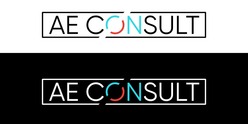
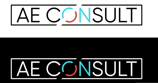
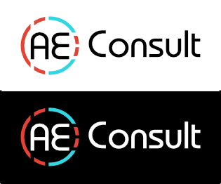
I attach two views of logo(one on black background and one on white)
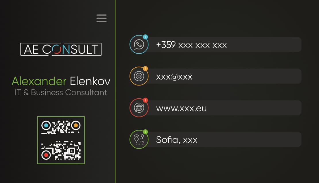
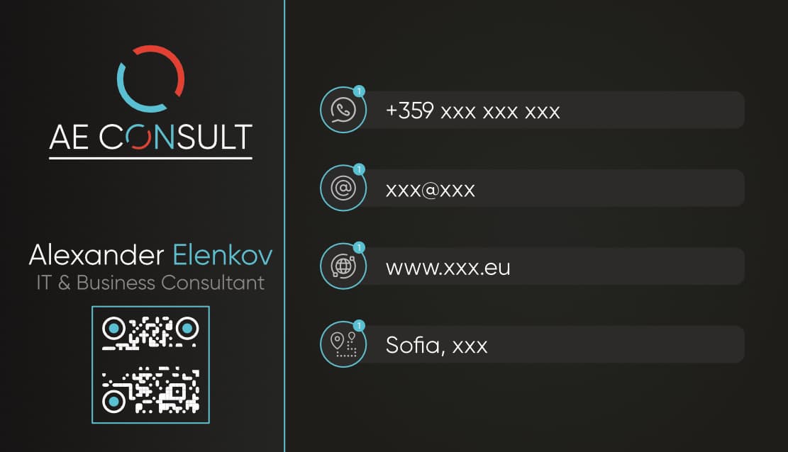
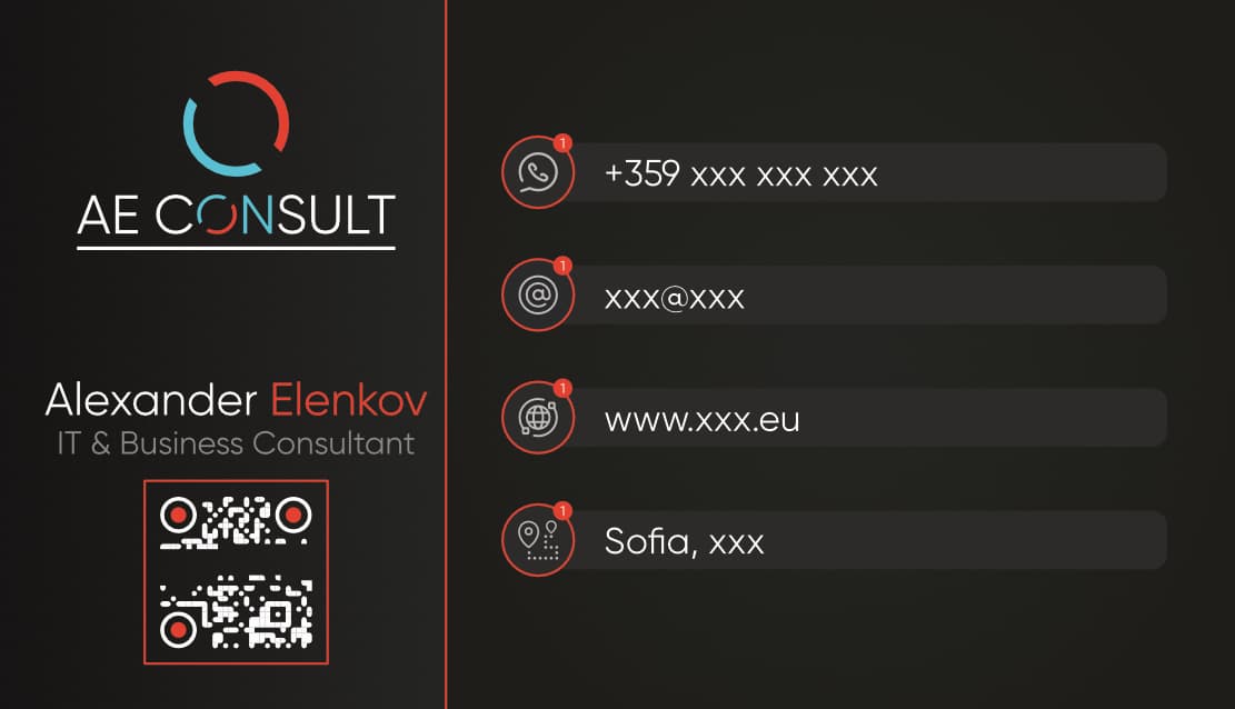
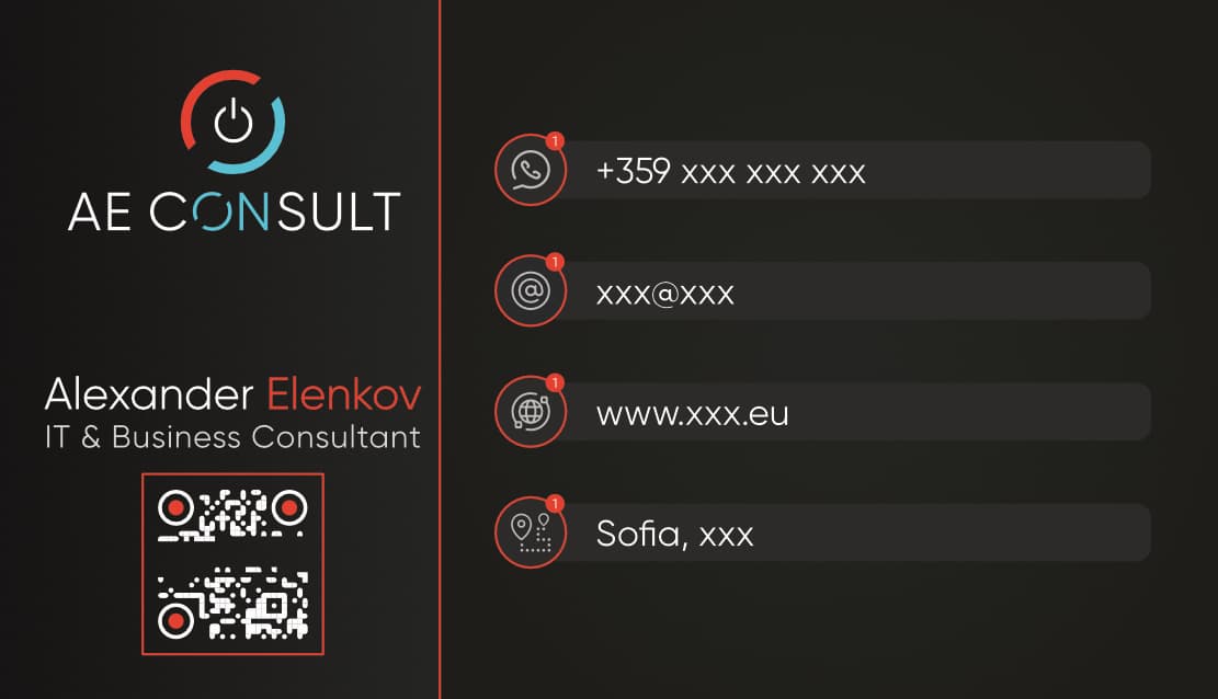
In addition I attach concept for business card. The details are hidden in order to avoid advertising.
Important information:

  1. The accent colour is set to: Vermilion (#E34234). The second colour(the blue one) is complimentary: #34D5E3.
  2. The Name AE Consult is composed by my initials. I am using my name, because I have a name in my industry.

Purpose or Goal
The purpose of the work is to build trust in my new customers, that are not yet aware of my work.
In addition, I would like to have a starting point so I can achieve a unified branding for all documents(Business Proposals, Invoices, Protocols, Website e.t.c)

Format
Both documents are in CMYK colour space - intended for print and web. For sure the ones that will be used for web site, signatures e.t.c will be converted to sRGB.

Audience
The audience is small to medium business owners in all industries.
The service that I provide is a IT consulting operations. In short I create innovative strategic roadmaps for business, allowing them to grow in the digital transformation. In most of the cases, my potential customers have no idea of those technologies(O365, Cloud, Network, Security…) and my focus is to lead them in the business development of the company(Ensuring that they earn from their IT while having optimisations of all their processes and workflows).

Your Experience Level
It’s hard to rate my experience level. I’ve been creating designs, professionally(paid work) for the past 8 years - but it was always side work, and mostly for friends or personal work.

Nature of Job:
This is a job for my own new consulting company.

I would really appreciate your feedback on this!

Thanks in advance.

Most Sincerely,


Hello and welcome,

Its a nice logo and looks nicely constructed. There are some quick points of feedback I’d like to give:

Hierarchy, when the logo is sitting in design (the contact card above the logo) everything is sitting at roughly the same size. There isn’t much scale or contrast so I was hard pressed to identify where the logo was at first.

Size, would there be any reactive marks to this logo so it can exist at a smaller size (i.e favicon) It would appear if this logo was scaled down there wouldn’t be enough padding (or tracking) between the type/the border. I’d even consider the border’s necessity to the logo itself.

Continuing the review of the business card, maybe you would consider reducing the color? It looks like there are 5 colors, a tint and white. I see a hamburger menu, but a physical card wouldn’t have much need for a digital mark.

Its a good start, keep on refining the design.

Best, Billy.

1 Like

My experience is primarily in print, so my critique won’t be about the design per se, but rather the things you need to consider when designing a logo from a colour perspective.

You have issues out the gate.
Hex colours. Mixed with CMYK. Converting to sRGB.
It’s a mess.

Your colour needs to be first set for print world. As Hex Colours and CMYK colours will be differentiating across different things.

To set your logo ready for the print world you’ll need to purchase or borrow (or visit a local printers and ask) to get the correct Pantone Colours for your logo.

You need to have your logos in printable colours.
CMYK - as lovely as that sounds, can differentiate between different print machines: litho, flexo, digital etc. What I see in CMYK colour breakdown on my side might be different to yours - this is usually due to colour profiles being transferred/not transferred etc. between artworks.

In essence, when your CMYK logo goes to print, it’s unlikely the printer will get the breakdown from the client - which means the colour profile could be swapped - or ignored, and the CMYK colours won’t match from printers to printers.

To avoid this, pick Pantone Colours from a Pantone Book.

Then you need to get the HEX colours from the Pantone book - or else the Hex colour might not be exact same as the Pantone version, so you might need to tweak it slightly.
Remember your monitor is only important for you - your website will be viewed by many monitors, so your colours won’t always be exact same from monitor to monitor, for HEX or CMYK or Pantone conversions on the monitor.

However, ensuring you pick the Pantone colour - then the CMYK (from the Pantone book - given the CMYK version of the Pantone ink will differ you’ll likely need to tweak the CMYK to fit closer to the Pantone colour).

This way you can give
Developers the HEX colours,
the Printers the Pantone Colour and/or the CMYK colour.
And you can have a sRGB websafe version if you wish.

Given that you have a mix of HEX, CMYK and sRGB.

It’s best to start off correctly and apply the correct colouring from the start.
or you risk mismatching colours from different mediums and substrates.

2 Likes

To my eye, the logo is disjointed and tough to read. The eye is immediately drawn to the ON, but we are accustomed to reading from left to right, so there is some tension going on there. The bounding box is crowding the type too much. Sorry, but I say back to the drawing board.

1 Like

Another thing that I notice

The spacing between your letters in the black text is further than the text in the white text.

Screenshot 2021-11-11 at 15.39.17

Technically speaking you did the correct thing - increased the thickness of the font.
But when you’re reversing out text - you need to both embolden the text slightly - and also increase the spacing between the letters.

The reason for this is that at smaller sizes, the text in white formatting will be ttoo close to the other letters and could cause them to join (visually) or actually join.

Here’s how it might look in actual size on a business card
Screenshot 2021-11-11 at 15.43.14

You already see on the screen something is start to break apart.

If this was Litho printed - which means it might need to get plated

The thin parts of the logo might break apart.
And the letters close to each other could end up becoming one.

1 Like

Dear Billyjeanplxiv,

Thank you so much for the feedback. Through your eyes I was able to identify almost all of the things that I did not like. Now I know exactly what they are. I’ve made the following changes:

  1. The logo is completely changed, following your guidelines. As confirmed by Steve_O. The frame had to go for sure.
    Steve_O has noticed that the eye is grabbed by the ON, which was my intention. But is it good? What do you think?
    Another thing. The element(the two sliced pieces of the O) is a good reactive mark I think. My idea was to illustrate the complete circle of the Business(blue) and the IT(red). What do you think about that?
  2. The business card received a complete new look, just by replacing the logo. I really begin to like it now JJ. I’ve removed the even sizes between the elements on the right, and it dose not look so sterile. In addition, the colours were a huge concern of mine(even if they were in the same saturation and light), and you singlehandedly resolved it. The only thing is: Which colour should I chose? The blue colour is closer to business(green, blue are business colours as far as I know). The red colour is far too aggressive, but I like it more. Please help me here.


See my comments regarding white on dark backgrounds above.
A lot of the details in the icons will be lost in print. Or very difficult to read.

Also, IT & Business Consultant - this is not bold enough text, and needs spacing between the letters.

Needs work.

I don’t think it needs the underline.
And why is the top logo at a different angle to the one in the text?

I’d make the ‘ON’ the one colour.
And make the symbol look more like a power button.

Does it need to be repeated … probably not.
It would be ok on it’s own though as a larger icon.

Or as the outline of the icons on the right.

2 Likes

How could anyone figure that out?

Also, the icons in contact info are too complex, distracting, and not even visually appealing.

1 Like

Dear Smurf2,
Both of your feedbacks are priceless. I live and work in Bulgaria. Here the level of our printing services is as low as it can get. You’ve reminded me of the time I used to calibrate my screens for print using X1. I use to ask the print shops questions about their machines so I can create a profile for the screen, and they were quite unaware of the existence of the therm Gamma… So print sample was needed before every print…
Anyway - the use of Pantone is a great idea. This is the only think that they can’t mess up.

For the second part - about the spacing - you are right. I did not think of this, but I would like to use Spot UV Varnish, which is absolutely impossible with this spacing. I will make attempt I will send it here.

Thanks once more!

Hi All,

@praxis - you are right. It’s only in my head. The icons are not right I will definitely change them.
@Smurf2 - I’ve used most of your guidelines and it looks better already. What you think? I’ve added additional spacing in the title and the logo’s letters. I am will keep looking for new icons set…

I still fear for the icons when printed. Simplify and thicken the strokes.

Use of the o logo around the icons could be nice.

It might be too much.

That or drop the circle outline on the icons altogether.
Increase size of icons.

1 Like

Why is there a shade of black behind the white text?

Your qr code could be an issue too.

Why not white background with black… Be easier to scan no?

  1. The icons… it’s difficult to find icons that corresponds with all the elements. I’ve tired to use text - what do you think?
  2. There is no share - it’s from the JPG.
  3. QR Code is boring on white background - From technical perspective there is no issue with the dark background - because the camera scans the contrast. It is not scalable now - because I’ve damaged it on purpose(following the community rules.

Based on the rapid changes that have been made to the logo, it seems like you’re throwing stuff out to see what sticks. We’ve seen three iterations in a matter of hours. This really isn’t the best approach to logo design. You should be much more intentional.

Yes, the ON stands out, and you said that was your intention; but I don’t think it stands out in a good way. Sit at arms length, or a little more, and squint. What do you see? AE C SULT … AE C ON SULT … AE C SLUT? The ON stands out, but it breaks up the word.

3 Likes

I agree.

And the icons need thought and process.

Sleep on it

Wake up with Pen and paper.

And draw the logo. Draw the business cards.
Trace the fonts by hand.

That’s right print our the typeface and draw or trace them

I need it seems weird. But once you do this you will get it

Draw the business cards to scale. Draw your margin. Draw the bleeds.

Step back and think.

1 Like

@Smurf2 , @Steve_O - You are right guys. I am used to engineering work, where you start and finish no matter what. In the artistic world, it’s about inspiration.
I will sleep over it and will re-evaluate my goal.

Generally a good idea to communicate something meaningful, or failing that at least some kind of possitive memorable impression.

Dear All,

Thanks for the positive feedback!
@Smurf2 , @Steve_O - For sure I lost the way, which led to the rapid changes from yesterday. I’ve made a full step back and realised, that I was missing the point with the hole ON concept. The ON is not related with my activity in any way. The focus should be on my personal brand. That is why I’ve made my legal name AE Consult Ltd.
Long story short, I’ve made the following:

  1. Change of the font to Belgium. The font is bold - easy to read and easy to print. It’s readable from longer distance, it’s sans-serif and round - in order to compliment the visual element which is round.
  2. Created a visual focus on the AE, which is totally the idea.
  3. Re-arranged the logo on horizontal surface in order to be clearly readable(left to right as @Steve_O suggested)
  4. The round element with AE can be used in smaller places(as fav.icon) and it will not look just scaled (thanks @Billyjeanplxiv )

What do you think?

AEConsult_Logo_V4

Nope

All the same problems as yesterday.

It actually looks worse.
Sorry.