Portfolio Website Critique

Good morning Graphic Design Forum!

I would love to hear the most brutal critique you can give me about my portfolio. I am looking to get a job as a graphic designer and I hear from all of my friends and family “it looks great! Amazing work!”

However, when I apply to Graphic Design roles I get passed up. Whatever advice you have for me I would love to hear it. If you have questions please ask as well, I would love to communicate back and forth to hone in my design abilities.

Thank you all.

1 Like

Hey Claywills :slight_smile:

  1. There appears to be a wayword arrow at the top that does nothing

website

  1. Are there only 4 pieces or am I missing something?

  2. Why do they all have the same wrinkled background? Are they all t-shirts? Is the image in the background part of the design? If neither of those are part of the design, I would get rid of them and let the actual design elements stand on their own.

  3. It did take a little bit for all the images to load, but that could just be my connection :wink:

The arrow honestly has no point and I am glad you pointed that out, because I will erase it now.

There are only four pieces as I did not want to clutter the site with rubbish, I agree there could be more work.

The backgrounds are are there just to serve as a title page for each project, I was making an attempt to show use of imagery in my design. If I were to get rid of the cover images what would you recommend putting in place of them?

The images may be too large if they took a while to load. Do you have recommendations on how to lower the file size?

Thank you for your time

You only have a moment to grasp the attention of anyone visiting your site. As I said I would lose the background stuff. It does a disservice to your work. When clicked on, I can see the actual work and it’s much cleaner. Go with that. Use the image itself on a solid background. I could be way off base … but to me, seeing those first images seems amateurish and I wouldn’t bother to click on any of them. Seeing them uncomplicated is so much better.

Just my opinion of course :wink:

Oh and everything loaded fine this time. I think my connection was just froggy this morning :slight_smile:

Do you use RGB colors for branding?

For anything designed for a screen yes, however, I think I understand what you are saying. Should I put the cmyk alternatives as well in each piece?

I’m racing Pluto to see who can post his comments first.

I looked at your site earlier today, but I did not have a chance to review at the time. It looks like you’ve already made some changes.

Okay, you’re asking for a brutal critique, so I’m not going to pull any punches. A disclaimer ahead of time: all of my comments are genuine and aimed at helping you get a better site.

Starting at the top:

I think the Clay logo is somewhat dated looking. Based on your work samples, I think you can do better. If I didn’t I wouldn’t say anything.

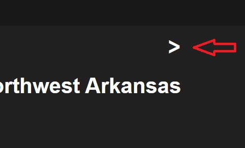
There is still an errant character, it looks like a hyphen, above Arkansas.

The messaging on your site needs work. “Graphic designer based out of Northwest Arkansas” … so what? I’m not sure you could come up with a blander headline than that. Figure out what the goal of the website is and spend some time crafting a message around that goal. I think the copy on the about page needs work, too. Again, what is your goal? Do you want the website to get you freelance clients? Do you want the website to attract potential employers? Figure that out and work on crafting content that will achieve the goal.

Still with me?

I understand you’re using the Adobe Portfolio platform, and I have no idea how much customization and design is allowed their. So maybe this is a limitation of the platform, but I find the overall site design to be very unengaging. There is nothing there to grab my interest. Part of it is the headline set in a field of gray with nothing of visual interest to support the headline. The other thing is the portfolio presentation with the big, heavy boxes.

Between the messaging issues and the boring site, I think you need to redo this. The good news is that I think you have the ability to do better. This just feels like it was thrown together with little planning and no design thinking. If I am a potential employer, I have to wonder if this is what you’d bring to the table. Step it up, and don’t rush it. Take your time to really develop something that is going to grab my attention and make me want to look at your work. This is not it.

Your work is okay. I don’t feel like you’re a senior lever AD or CD, but we’ve definitely seen worse around here. I’d suppose that’s a compliment. I think you could improve the presentation, though. I’m not particularly crazy about the dark gray background.

Okay, I’m probably going to step on some toes with this comment, and not just yours as I’ve seen other people do it. What is the point of listing the hex codes? I get the feeling that people do this to bolster content and try to make their presentations more impressive. Want to impress me? Tell me why you picked the color. What is the significance? How does it resonate with the target market? How does color psychology play into the decision?

Bottom line, you have some okay work, but the site itself needs to be completely reworked. Think about your target market. Think about the message you want to communicate. Now take your time and craft a site that will make them respond.

1 Like

Alright, @pluto, waiting to see what you’re typing. :grinning:

1 Like

Ok you - want brutal, will be short and sharp: :skull_and_crossbones:

  • Design is about solving problems - what problems are you solving and how has your work impacted your clients, has their business improved? Where are their testimonials?
  • I like darkmode, but am not sure whether it suits your website - also when you click on your images some are almost impossible to view:

  • Your case studies all look the same, it’s a bit boring, no one really cares about seeing the hex colours that much and different colour mock-ups of your logos - while it’s not bad to show this stuff its currently much more prominant than the story you’re telling about how you helped someones business, which leads me to…
  • It’s a bit hard to read the copy on your case studies, use your design skills to make the copy more prominant.
  • You fail to identify your target audience and how your work speaks and engages this audience - this is super important, your role as a designer is to be a clear communicator.
  • As for your logos themselves, they look a bit cluttered and complex.

My recommendation:

  • Look at the work being produced by the places you’re applying to and tailor your portfolio to look similar to the work they’re producing.

Hopefully this is helpful mate :beers:!

:laughing: Was thinking of holding off to see what you would say too!

1 Like

I seriously thank you and @Steve_O

The critique is a breath of fresh air, obviously I have my work cut out for me but at least I have a direction.

I will take your critiques and work out my portfolio to better suit what I’m aiming for.

Thank you both very much.

2 Likes

You’ve already gotten some good advice and it largely matches up with what I’d say if I had gotten here first.

When I first opened your site, it wasn’t obvious to me that the images led to more extensive examples of the projects and explanations about them.

You need more samples of your work. I understand that you don’t want less-than-good samples in your portfolio, but only having four things indicates that, well, you’ve only done four good things. This alone suggests you’re a bit of an amateur. I’d put some effort into fleshing it out more — even if that means creating things just for your portfolio.

I agree with the others that the site lacks focus or an obvious audience. The hex codes are gratuitous filler that means nothing to clients or employers. If your goal is to pick up more freelance work, spend more time aiming the site to do just that — provide more of your thought process and how your work can help clients achieve their objectives. You’ve done some of this with the initial description on each project page, but I’m sort of wishing you’d dig into it a bit more.

The northwest Arkansas headline needs to go unless you’re really focusing your efforts and finding clients only in northwest Arkansas. Since it’s the main headline of your site, it comes across as something you feel is very important, when in reality, I suspect you’d gladly accept good clients from anywhere in the state or the country.

Place yourself in the position of the people you’re trying to impress — prospective clients. Design and build a site just for them — one that will convince them you have something of value to offer them.

In your info section, you mention being a 2nd lieutenant in the National Guard. This is fantastic, but it’s a little bit irrelevant unless you feel the target audience — your prospective freelance clients — will relate to it in a way that increases your chances of getting work from them.

Finally, I’m going to say something good. I like your work a lot better than I like your website. Your work shows a good deal of promise, but as I mentioned, there’s not enough of it.

1 Like

@RedKittieKat @Just-B @Steve_O @pluto

If my presentation feels bland, what are some things I can do to make the presentation of my design be more noticeable? Are you saying to not use mock-ups? Should I get into motion design to display the logo?

These are all questions I’ve had forever that I haven’t been able to get an answer. Keep throwing punches please! It’ll only make me that much better in my attempt to become a FT Designer. I want to be better.

I think you should do more mock-ups - I would look at how work is displayed on places like Behance and Dribble by and emulate that in the presentation of your work:

I find it hard to believe that the brands on the website are real. A bar with “drunken” in its name and exclusively brands to artillerymen?

I point this out because if you’re making up a brand you have complete freedom and can make your job easy because of that freedom.

I totally understand what you’re saying, however, believe it or not Drunken Redleg is a true work in progress bar to come to the area haha. It may seem exclusive to artillerymen but due to the economy in the area the area is held up by guardsmen when they come to the area once a month.

All of the projects listed in my portfolio have a client along with them. I appreciate your tips though!

When it comes to branding, there’s no beating Pantone’s Formula Guide Solid: Coated + Uncoated colors.

Pantone is a worldwide industry standard for color matching. Almost every print shop in world will clearly understand what colors you need once you tell them their Pantone numbers. It makes Pantone colors very easy and convenient to use.

Each Pantone color has an ascribed, official RGB value and ahexadecimal code, so there’s no need for any color conversions. You can just take a Pantone color and use it both in print ad on screen.

There are two kinds of Pantone colors:

Coated Pantone colors (C) are meant for coated surfaces, which don’t absob ink, resulting in more saturated and vivid colors.

Uncoated Pantone colors (U) are meant for uncoated surfaces, which absorb ink, resulting in less saturated colors.

To make sure that the versions of your design meant for coated and uncoated surfaces look as closely as possible, sometimes you have to use Pantone inks with different numbers, like 152 C and 3564 U.

In the case of Adobe’s software you need a propriatery Pantone plugin - for some $60 - in addition to a subscription of Pantone Connect, which gives you access to a database official RGB, HEX and LAB values of all Pantone colors, among other things.

Here in the UK, there are quite a few. There is a famous one in the Lake District called the Drunken Duck. I know of a Drunken Cow in Glasgow too. I am sure there are loads more.

That’s two, and do they also brand exclusively to artillerymen?