Poster about Disco Events


Omg! you’re right! the kerning was awful!
Is it better now? I think it’s more balanced.
Dj sets is the first thing, and thats what the poster is about, then Fridays and Disco capaki come second and third.
About Fridays it’s plular, because all of the dj set events are on Fridays. The club owner is not sure about the event name yet, though.

Much better.

As always… THANK YOU A LOT!

I’d also change Dj to DJ … perhaps that is just me but DJ should always be capped as it is an acronym for Disc Jockey

2 Likes

Of course! small detail, but you’re right!

ααα
This is my last take.
To be honest, I will revise it tomorrow, maybe the disco ball distracts the viewer more than it should be, but now my eyes cannot see it clearly and need rest!

Maybe, but it does seem to complete the composition, and it reinforces the whole disco thing. Another thing it does is repeat the reddish coloration of the word “CAPAKI,” which was something of an outlier color in your first versions that looked like it didn’t quite belong.

Speaking of CAPAKI, why have you reduced its size in relation to the word “DISCO” above it? You might have good reasons that I’m not considering, but I liked the two words together when they were both the same length.

well, the reason behind making CAPAKI smaller is to balance the composition, given that the visual “axle” is “Resident Dj and Doors open”
Thus, on the left side of the axle, "guests "and “dj sets”
are not of the same size, so I wanted to achieve that on the right side of the axle, between “Disco” and “Capaki” words.
Excuse my English, I hope you understand what I am trying to say.
As for the the disco ball, you described exactly my thinking behind placing it.

There’s still a lower case j

3 of 'em.

I see the other j’s now that I’m not the phone.

Needs a space before the parenthesis too.

I presume they’re dates 8 IOYAIOY (sorry don’t have Cyrllic keyboard installed on this laptop)
If it’s 8, 15, 29 then 12 should be a different month.

But if that’s not the dates and month - then it’s a freaky coincidence cos 8, 15, 29 of July are all Fridays.

I think it’s sort of a psuedo-Greek.

@Stefanos1984, I’m curious about the months. Why is everything but the months in English? And why don’t you use a Greek font rather than a Latin font that doesn’t contain the correct letters? The substitution of the Greek Λ with a Latin A sort of makes sense, but why have you substituted the Σ with a Y?

I know very little about Greek other than being somewhat familiar with the alphabet, so my ignorance is showing. Then again, that’s why I’m curious and asking about it.

Happy to answer. Well it’s not pseudo Greek!
The client gave me the text (with errors), which I copied and pasted without checking it.
Yesterday all I wanted is to discuss layout, balance and focal point, so I didn’t pay attention that much.
Indeed the last date should be “ΑΥΓΟΥΣΤΟΥ” which means “of August”, and all previous dates are “ΙOYΛΙΟΥ” which means “of July”.
The client wanted the DJ to be with lowercase j.
The final Poster (after tweaking and correcting words) is this:
Screenshot_39

As for Υ and Σ: Greek grammar is very complicated. ΙΟΥΛΙΟΣ is nominative case, whereas ΙΟΥΛΙΟΥ is possessive case, which means “of July”. So in dates we use possesive cases. I wish I could explained more thoroughly!
I didn’t get what you mean with “Λ” and “Α”, though.

1 Like

Thanks for explaining that to me @Stefanos1984. I suspected the mysterious last letter might have something to do with the context in which the month was used, so I was curious. Thanks for explaining that it had to do with case. That makes sense now.

I was looking at the word on my iPhone and the Lambda looked like an A, which made me wonder why you were using a Latin letter to simulate Greek. Now that I’m on my desktop computer with a larger display, I can see I was mistaken.

By the way, I like the last version of the poster with the disco ball in the lower right-hand corner. You’ve made significant improvements on every version. Looks really good!

1 Like

Thank you for your kind words!
You know after a break, I find things that could be improved, almost every time.
The more you look at something, the more you get used to what you see, even if it is not correct.
So a good sleep, a walk, a coffee break, work miracles in “reseting” your eyes.
Now should find a way to make it printable, because, I think that dark purples will be messy…

You’re worried about the dark purple…

among other things.
I have almost no experience in printing to be honest… :frowning:
Can you direct me?
The poster is mainly for social media, but the client plans to print it aswell.

You know enough about it to realize there might be a printing issue. :wink:

Those dark, subtle background patterns might darken during printing, which would make them all but disappear. If it were me, I’d lighten them slightly.

The possible printing problem relates to dot gain and total ink coverage. These are two separate phenomena that are too involved to explain here, but a Google search will turn up lots of information. Either of these things can cause printing problems at darker values. The higher the amount of ink laid down in each CMYK layer, the more problematic the dot gain becomes.

The type of paper (coated vs. uncoated) affects the degree of dot gain. More absorbent paper surfaces will have higher levels of dot gain. For example, if your poster prints on newsprint, I’m certain the dark purple background patterns would turn into a purplish black.

In addition to paper stock, the degree to which one should compensate for these issues differs with the type of printing process involved. Offset, for example, is different from digital printing. Even in digital printing, toner is different from ink. With offset printing, the results on a sheetfed press will differ from a web press.

Luckily, the software you’re using (probably Adobe software) compensates for these issues (to a degree) if you set up the color profiles correctly while considering the printing process used and the type of paper on which the file will print. A good printing company will also make adjustments based on their experience with their equipment.

The whole subject involves so many variables that it’s often best to avoid the problem. As I said, I’d lighten the background a little to be on the safe side. I’d also make sure that the total ink coverage in the darkest areas didn’t exceed 280 percent.

I can’t express my gratitude for such info! Really thank you!
I hate the fact that in graphic design school never told us about ink coverage (we have 1 year studies to go, though).
Well, I imported the image to Photoshop, and with the info tool I noticed that some areas had 360% ink coverage!
So by using Curves and replacing fine-tuning the percentage of K in some areas, I managed to keep ink coverage below 280%.
Of course the poster looks more washed out compared to the social media version.
I can’t wait to print test my pdfs (I have many version, with many tweaks) to see which looks the best.
Thank you again!

I probably tossed too much information at you without sufficiently explaining it. Different printers will give different advice on total ink coverage that their experience has determined is most appropriate for their presses and the paper stock being used. In addition, depending on the company that’s used, printers will adjust the total ink coverage as part of their prepress preparations. Quite honestly, most designers don’t concern themselves with these things and let their printers worry about them. I mentioned it primarily because you specifically brought it up as an area of concern when you mentioned thinking the dark areas might fill in.

When I’m working directly with a printer, I can ask them for recommendations regarding this kind of thing. When I’m simply providing files to a client for them to have printed, I typically play things a bit safer. A 280% ink coverage is generally pretty safe, so when I’m working in Illustrator or InDesign where I can easily control ink percentages, I’ll do it. With photos, I don’t worry about it as much unless the photo has large dark areas that might fill in. I don’t know how you produced that background pattern and whether it was done in a vector app or in Photoshop, so I kept my comments rather general.

I’m also much more familiar with offset printing than digital printing, so I tend to think in offset terms. I don’t know which printing technology will be used to print your poster. If it’s a short-run job of, say, under 1,000 copies, it’ll probably print digitally. Bigger jobs typically print offset since, at larger quantities, it becomes cheaper. @PrintDriver is much better acquainted with digital printing than I and is in a better position to provide advice about file preparation regarding digital printing.

You mentioned converting your files to Photoshop to test the ink coverage. so from that, I’m guessing the background was prepared originally as vector art. In any case, what Photoshop indicates isn’t necessarily what the total ink coverage will be since Photoshop and the other Adobe apps will, as I mentioned, adjust things a bit depending on your color profile settings (another subject, which you probably ought to look up if you haven’t done so already).

Summing this up, total ink coverage is something most designers don’t worry about. On a background like yours, though, I probably would concern myself with it, but that’s just me based on 40 years of doing this kind of thing. Most printers will handle it themselves and prefer that designers not meddle with things they know little about. Adobe Acrobat, by the way, contains some excellent tools for measuring total ink coverage.

This isn’t the first time the subject’s come up here. Here’s a link to a past discussion on it. More than anything, it’s just something to be aware of when it could potentially be a problem, as it might be on your background.

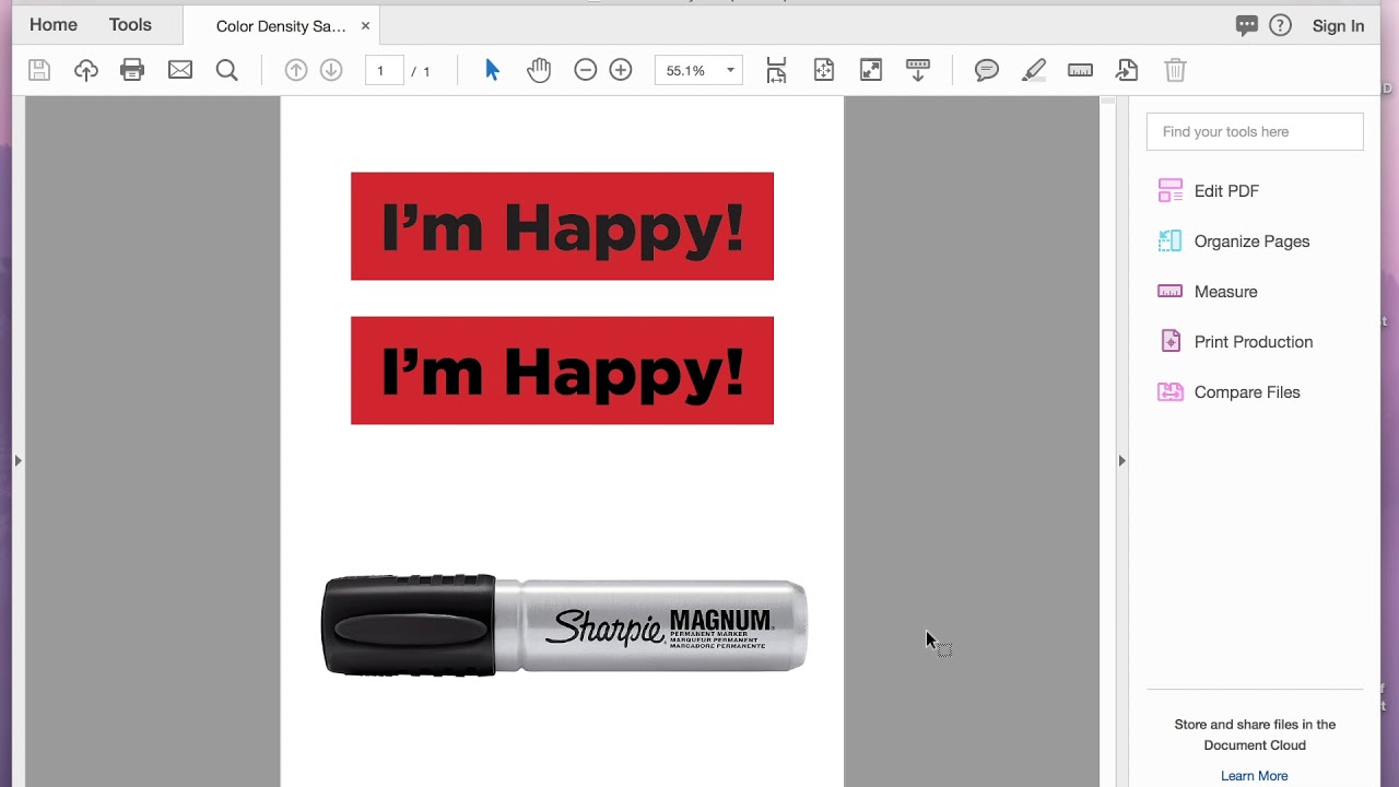
I found this video too, which might contain some good information. I didn’t watch the entire thing, so I’m not vouching for it. However, it does discuss these issues, so it might be worth watching if you’re still curious.