Hi everyone,
I would like to criticize the logo I created for my printing company.
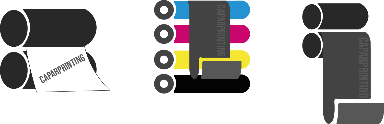
beware these are some fast made logo only thing what i wanna know on which idea
You have two issues going on with all three of these. The first issue is legibility. The name is rather difficult to make out – particularly on the middle and right options. The second is that they rely on industry cliches. I think you need to go back to the brainstorming phase and work on a few more concepts.
3 Likes
This is your business. There should be nothing “quick” about branding your business.
All are bad ideas.
Do a dozen sketches. Then do a dozen more. By the fourth or fifth dozen you will have gotten past all the bad ideas.
4 Likes
I agree with Steve and PrintDriver, so I won’t repeat them.
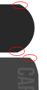
In addition, here’s a quick drawing tip: circles don’t have sharp corners. When you view circles from an angle (which in this case, comprise the end of cylinders), they become ellipses, which also never have sharp corners.
Thank you for your feedback guys.
I just changed my whole idea i dont think the printer icon fits in my idea, so is just decided to do only things with cmyk colors
Caparprinting = my company name
waar jouw uitrstraling begint = my motto stands for “where your appearance starts”
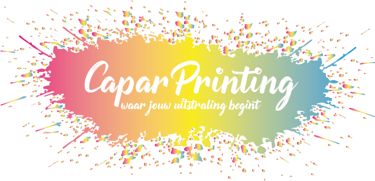
Would you hire a printer whose logo was a messy, washed out, muddy gradient spatter of multicolor ink?
Keep sketching.
Gradient is sowieso een afrader onder logo’s (zeker met zoveel kleuren) ![]() Tenzij je het kan veroorloven om op al je media-uitingen met verloop te gaan maken. Maar dat gaat, zoals gezegd, beetje viezig uitzien op meeste media-uitingen.
Tenzij je het kan veroorloven om op al je media-uitingen met verloop te gaan maken. Maar dat gaat, zoals gezegd, beetje viezig uitzien op meeste media-uitingen.
Misschien is het een idee om iemand anders (een pro iig) een logo te laten schetsen voor je? Omdat je dan nieuwe perspectieven krijgt.
–
Creating a logo for your own company is hard. Point.
Forum: I’m not sure about rules of language, I just noticed this person is dutch so i figured it was easier to explain in dutch. I’m sorry if I broken any rules.
1 Like
I just gonna use this logo only on marktplaats atm. I am still experimenting with it.
My advice is to go simple. Your initial idea was simple, but it comes from the mind of a printer. As someone who isn’t in the printing business (i.e. most of your customers), they likely don’t think of rollers, but rather the stack of finished prints. The splatter with gradients looks a bit too wild and implies this explosive energy. Most people want dependability and trust with a printer… not a burst of energy. Lean more on a corporate/creative hybrid aesthetic to balance this expectation.
White type on a light background, like yellow, does not provide sufficient contrast to make it easily readable.
Thanks for the advice guys
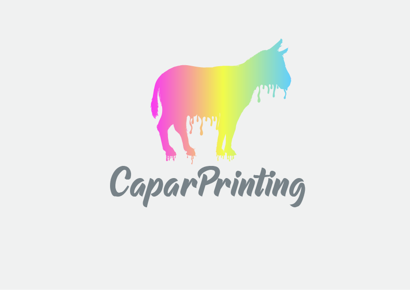
Capar?
Really???
I hope it doesn’t mean the same thing in Dutch that it means in Spanish…
No meaning in dutch. It only refers to a place somewhere in Indonesia, which I never heard of.
I think it’s a name.
… i don’t want to find out the meaning in Spanish…![]()
Do you know what a Capon (chicken) is? It’s the verb for the process that makes them what they are.
Are you serious with this logo? Please explain why you’ve made your design choice.
Calm down guys, this is not my logo i am still trying. And Capar is my last name
Yeah, but those guys take their time and gave you a very precise advice - and I got the feeling the message didn’t get through.
A logo isn’t just an illustration, it’s a part of branding. It needs to explain what your company is about. Simply put: a goat in rainbow isn’t telling people anything.
Nothing wrong with experimenting, but before you create your logo you need to think first about the ‘‘what’’ and later the ‘‘how’’. It doesn’t matter if you put it on marketplace (marktplaats), facebook etc. A good logo is going to be remembered, a bad logo will be forgotten.
I realized my message is perhaps too harsh, I don’t mean that way.
My advice is: read this and apply it to your own company:
You are right. i gonna work on it.
I’ll have to disagree with this. A really bad logo can be remembered even more vividly than the good ones, albeit still a bad one.