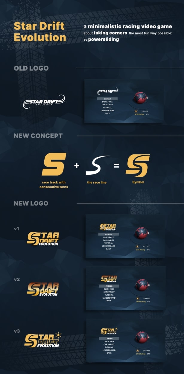
Hello, I made some logo redesigns for a racing video game, which has some retro-feel on it. (it has a low-poly art style)
Sorry for the low quality, I had to compress the image a lot to achieve the 100kb limit.
So you can see all your issues just by the post here
Can you be more specific?
I’m assuming this is a practice exercise. It appears to be a mockup presentation to show a client.
If that’s the case, as a client, I’d want to see the logo as it might be used. I likely would question how my money was being spent if it appeared the designer spent more time on presentation aesthetics than on the logo. In other words, you seem to have focused more on creating a nice-looking layout than a functional, informative, and convincing sales pitch.
You asked for a logo critique, but I’m having difficulty getting beyond the presentation.
I understand your idea for the ‘s’ in the logo but I think it needs more work. It feels a bit clunky to me. I think the presentation looks very nice, but I agree that the logo doesn’t look like it’s of the same quality.
1 Like
Thank you for the reply!
Well, this is an existing video game.
I created the whole presentation, but this is not a real job I got.
I made this just to add it to my portfolio.
The mock up screens on the right side are showing the real in game menu.
I had the idea of making this logo look more “arcade-ish” and somehow “old-school”
because the game itself is a top-down racing game (like 80’s 90’s racing games).
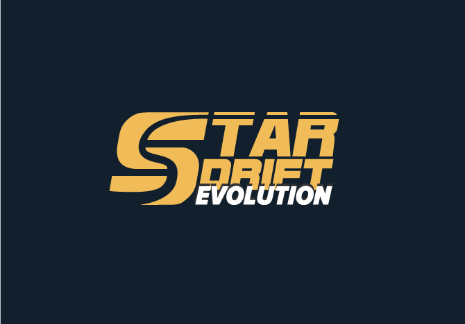
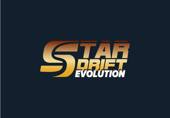
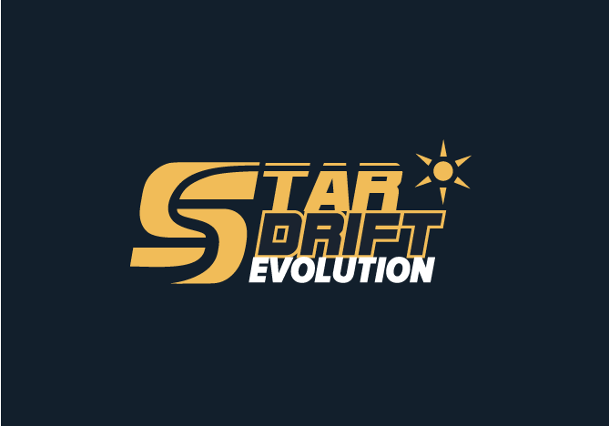
I reupload the plain logos, so you could tell me what to fix.
Are they too simple? Not fancy?
Should I abandon completely the idea of the “S is the track”?
Keep in mind that this is a minimalistic racing game, with low poly art style.
The old logo was better?
Thank you in advance!
How have you solved last logo issues?
Be careful with using existing trademarks for branding excercises. The creators of the game might even send you a cease and desist letter.
To be in the clear, change the name to something like “Star Race”, “Star Racer” or “Star Racer Arcade”.
Now, the race line makes the “S” illegible. You should discard it altogether.
The star symbol is unnecessary.
The brown gradient further decreases the logo’s legibility. You should use a the same one you used for the word “drift”.
You should also increase the spacing between the words.
Also, the word “drift” is more legible when it’s solid, rather than only outlined.
1 Like
What do you mean?
That doesn’t solve copyright issues.
Even if you change it 99.9% that .1% is still protected.
What makes your version better than the original
Thank you for your comments!
Of course I asked for permission from the developers to use their brand.
As for the star symbol, it is an asset used ingame for many things, that’s why I used it.
I never thought that S is illegible!
Thanks for noticing!
Not necessarily, but I would just think about it a bit harder. You are over-complicating what is a very simple idea: S = chicane. It feels like you have made the classic pitfall. Get to your first idea and stop. Usually first ideas are best thrown out. To be used only as a springboard to get closer to where you need to be.
With this you are trying to shoe-horn ideas together and the end result is a little ugly and fairly ungainly.
Think harder, longer, deeper.
Good luck
Thank you!
I should start from scratch, i think.
To be honest, the reason I decided to work with that logo, is the idea with the S letter with the raceline inside that came up to me.
It’s a project just for me, not for sale, not for use.
I ve seen many designers to redesign famous logos , just for fun and discussion. There will be no legal issues I think.
Thank you all for your comments.
I will share an update.
Strange you can’t answer my simple questions.
The reason I’m asking is because you should know the answer.
Ah sorry!
I missed your reply!
Well i thought that my versions would look better because:
-
The color makes good contrast with the background
-
The typeface (bold and italic) is more appropriate for a racing game, looks more energetic
-
The compact style gives a more solid feel
-
Somehow it reminds me of old 90s games, as it has a retro feel on it
-
I explained above the concept behind the S letter
-
The old version is somewhat weak to me, to catch and communicate the feel of a racing arcade game.
Well, it looks like I’m in the vast minority, but I actually like the symbol itself as a standalone mark. The rest of the type doesn’t really grab me, but I am completely out of touch with this market, so it would be difficult for me to offer an educated opinion.
I’ll add this, though. What you’re presenting, in my opinion, is not three different logos. It’s three variations on one logo. If I am presenting three logos to a client, each logo is distinct and different. What you here is essentially the same logo with the type tweaked.
My issue is that no problems with the current logo are solved.
And the new logo actually creates more issues.
It’s supposed to be Star Drift Evolution - Star - and you’ve put a Sun in - ok on a technicality the Sun is a star - but iconographically there’s a difference.
There’s far too many elements overlapping.
The race track - the drop shadow - the overlap - the gradient + drop shadow - the Sun rather than a star.
It’s all crammed into one space - there’s no air.
These are reasons I was asking what have you solved.
Which you still haven’t answered, really - you gave very vague safe answers.
At the smallest sizes you can see it is illegible - this was my first thing I said to you - you can already see the issues with it. Yet it didn’t sink in.
Your brief says a ‘minimalistic’ racing video game.
And you’ve over-produced the logo - it’s anything but minimum.
What the original logo achieves is a sense of drifting - the beautiful swirls and the minimum application - you get a sense of drifting.
I don’t get that with the new logo.
It’s a good swing - but for me - it’s a miss.
Thank you again for answering.
As for the star, it is an asset that is used widely in the game, as you collect stars ( exactly the same symbol) by winning games.
You can see it in the right lower corner of the main menu mockup.
Not knowing anything about the game I can only comment on what I can see.