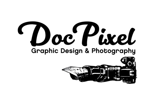
I’m exploring a new concept for my logo. This is a rough draft, and I would appreciate suggestions to make it spiffier.
(Why is it so hard to work on my own stuff!)
I’m exploring a new concept for my logo. This is a rough draft, and I would appreciate suggestions to make it spiffier.
(Why is it so hard to work on my own stuff!)
Sorry DP but … one of my pet peeves … more like rant … is using a freemium cursive/calligraphy font to represent one’s own personal touch. In your case Kitten Swash.
Create your own … way bester!
And as an overall logo when scaled down to a 1/3 size the tag line and that awesome nibcam (new word?) which do think has potential … fails to a smudge.
You can’t mean create my own font… right? ![]() Not my area, but I appreciate the feedback on the font! I’ll try to personalize it more.
Not my area, but I appreciate the feedback on the font! I’ll try to personalize it more.
Also good feedback on the nibcam. Thanks!
You don’t need to do the whole font. Just whip up some calligraphic lettering so it isn’t all machined.
I almost had the nib, but it wasn’t relating to the rest of the image. The rest of the image is not recognizable.
Simplify.
Thanks for the suggestion, PD, it makes sense.
Yes, too much detail; not enough induced cognitive reflex.
First of all, I’d agree with you that working on your own stuff, at least your logo, is hard. As others have pointed out, you have way too much detail going on. If you’re going to stick with the pen / camera motif, definitely simplify. That said, I’d spend some time exploring the doctor / medical motifs. Capitalize on your name and break away from any design or photography stereotypes.
im pretty sure you could also get rid of the whole “graphic design & photography” part.
Coca Cola is just plain coca cola, not Coca Cola sugar coffein drink.
as everyone else said: simplify! ![]()
I like that you’re moving away from the serif font used in your current logo. And I like that you added a visual element.
I agree with the comments so far about simplifying, dropping the tag line from the logo, and breaking away from design and photography stereotypes.
Two other things that stood out to me:
Let me share my humble opinion Milady. ![]()
Overall i like the vibe of the style, if i may say that.
About the extension, i also like the clean, simple and modernist
aproach, but for me it needs to be there. Feels more personal if you are aiming for that
and points out your proficiency and passion. If you want to be exact it tells something
about your attitude for work.
The graphic can be implemented after addresing the problems /as previously mentioned/.
The camera actualy attracts me, with more compact composition can achieve more heraldic feel.
Last but not least, the small text can be capitalized for better scaling, ofcourse.
And, the most important thing is that i like the mockup! Nice take, makes me wanna play with it.
One qustion. > How you gonna use it?
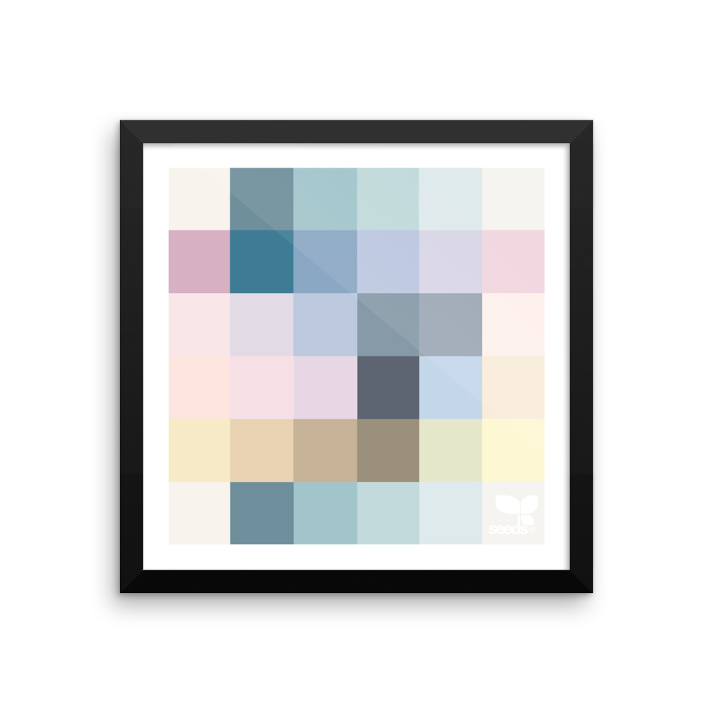
Also one suggestion came to me… if you want to use color, i’m visualising some pixelated palettes,
may or not to be literal like artist plate for colors, but something like this >>>
Hope this reply was appropriate.
I am grateful for the oh-so-helpful suggestions to my question! Obviously, I need to go back to the drawing board.
(Maybe a graphic stethoscope feeding into a box of pixels… hmmm…)
Thank you all!