Hello everyone. Here is a 4" x 4" post card for a Health and Wellness coaching practice that specializes in anxiety. Any critique or positive feedback on any aspect is very welcome. Including colours, spacing, overall appeal, visual hierarchy, etc.
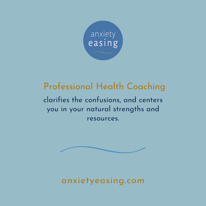
Thicker font for the white in the circle for ‘anxiety’.
The little yellow squiggle also needs a bump in thickness.
I wouldn’t have ‘resources.’ on one line by itself.
You could new line at ‘,and’ centers’
I’m not familiar with US posting sizes - 4inch by 4inch accepted?
Actually it’s not for mailing, but it’s a poster. I just edited the topic to reflect that.
Thanks, that’s helpful. I was not completely sure on the logo font thickness, and also the curve line.
That yellow isn’t readable on the blue. Are you printing these on white or blue stock?
What size is the poster?
It will be on white stock. Ok, yes I see what you’re saying. I’ve tried various things but haven’t been fully happy with the yellow there. The thing is that I like using blue as a background because blue is calming, but that makes it a little cool overall, so I’m using the yellow / orange to warm it up.
4" x 4". It’s like a post card only a little smaller. It’s like a cross between a poster and a business card. They are distributed around the city and people pick up a copy and take it with them.
Is this your copy?
It needs some work in clarifying the confusion overall. That sentence might make sense to the professional involved but makes my brain go “huh?”
Anyway, what about this would make you pick it up?
Whatever that is needs to be top of the hierarchy.
Everything else needs to be subordinate. Right now? No clue what I’m supposed to look at. No real call to action going here either.
No phone number? No address? No (yech) QR code? Just a website that has to be manually typed cuz it’s a piece of paper?
Yes I wrote the copy as well as created the design.
Thanks for your critique, it’s very helpful.
Re. visual hierarchy: I don’t know how to create that with this design. My perception is that the logo pops first so people see that first. But I’ve only asked one other person to confirm that.
The phone number and other details will be on the back of the card, once people pick it up. But maybe I need to rethink that. I hadn’t considered QR code, but will research that option. Also these days people often take a photo of adverts and look it up when they get home. That’s what I was going with.
For me the logo doesn’t pop because without any focus, my eyes fall to the center where the word “confusion” is. If you put your eyes there, the text in the circle just blends in with the background and looks like a blue dot on a light blue background. There isn’t enough weight there to draw my eyes up. It also didn’t occur to me that was a logo. I kinda read it as “anxiety easing professional health coaching” not as a place called Anxiety Easing.
I guess too,a question to ask is, is this little card going to accomplish whatever marketing communication goal is happening here? Are people suffering from anxiety going to pick up this card?
First it’s a postcard. Then you say it’s a poster. Then you say it’s something to be picked up when seen around town.
Since the whole point is to effectively communicate a message, these are all very different things requiring different strategies. A postcard is retrieved from a personal mailbox and looked at from 18 inches away. A poster needs to grab people’s attention from a distance and communicate a quick message before that person passes by. A small 4x4-inch card meant to be picked up (from where) really needs to grab attention or nobody will see it, let alone decide to pick it up and carry it with them.
Assuming there isn’t something else not yet mentioned, let’s go with the last thing you said — a small something to be noticed, picked up, taken and referred to later. Where will it be distributed? Scattered on the sidewalk like little ads for Las Vegas escort services? In little freebie racks in hotels and convenience stores? On the counter at a doctor’s office? Where? All these things make differences that need to be considered as prerequisites to the design.
If this were a postcard retrieved from a mailbox, that’s a different situation. Nobody throws their mail away without at least glancing at it first. For the target audience — people with anxiety disorders — this card might catch their attention before it went into the trash bin. On the other hand, a pale, light-blue, 4-inch card with small, relaxed type is likely to remain largely unnoticed in a rack, by the door at a convenience store.
My point is that I’m not sure you’ve adequately defined the problem. You might be placing the cart before the horse by focusing on the aesthetics first rather than this being an effective solution to a specific problem.
1 Like
Thanks, these are great points. Below is a revision that addresses most of these and other’s suggestions.
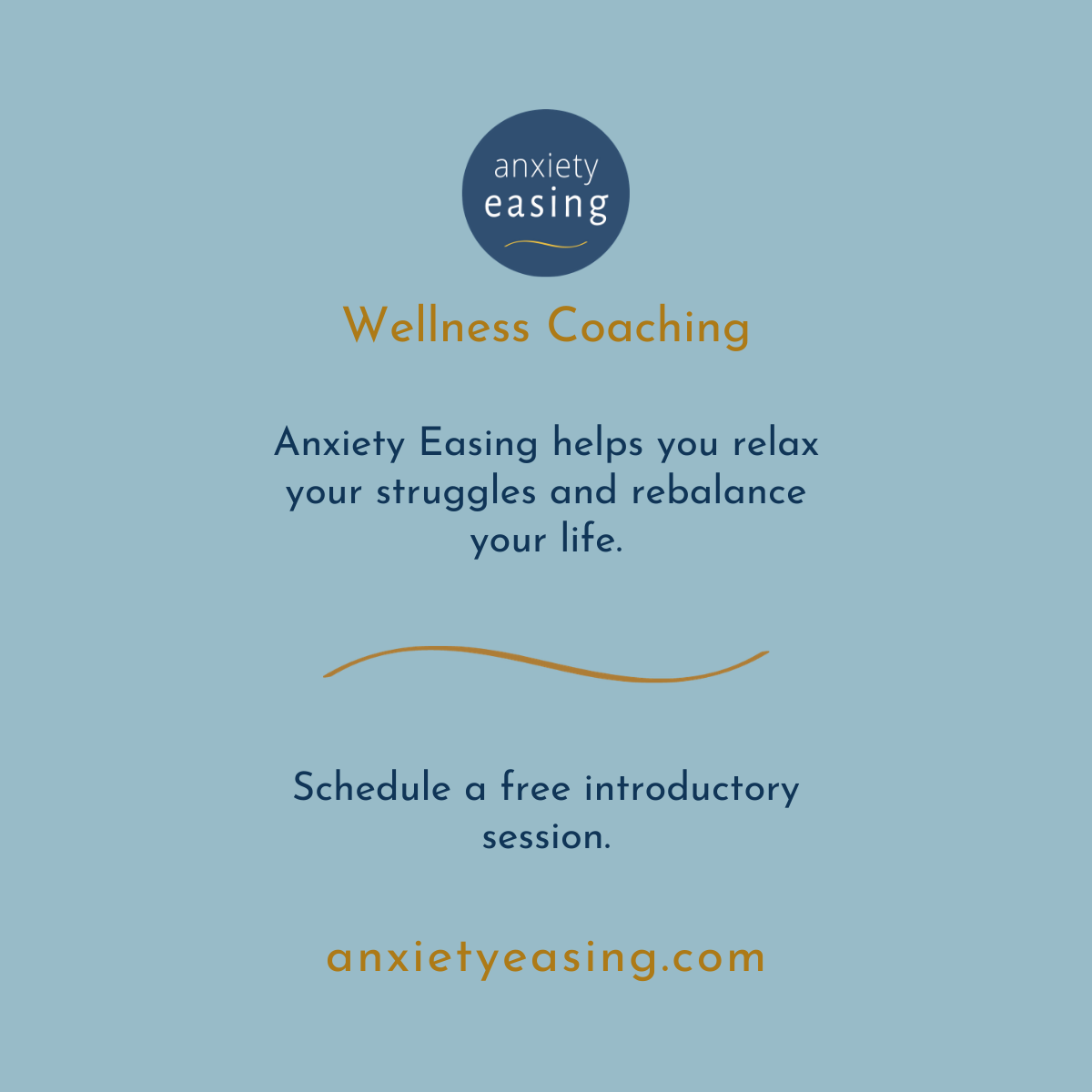
Sorry, but it needs work. It reads like a short list of gratuitous buzzwords interspersed with the articles necessary to make it something other than a list.
“clarifies the confusions”
Aside from plurality not really applying to confusion, clarifying confusion would actually be the opposite of clearing it.
“centers you in your natural strengths and resources”
If you really think about how empty that promise is, I expect you’ll see it need to be reformulated. A health coach, whatever that is, might be able to help me identify my natural strengths — maybe even ‘leverage’ (ugh) them — but “centering” me in any way other than physically, probably isn’t an act someone can carry out. My natural resources?
Granted, health-supportive services isn’t my area of expertise, and, anxious as I am, buying into this type of concept isn’t likely for me, in case you couldn’t tell. But copy writing is something that I do take very seriously, and this piece calls for something a lot less nebulous and more substantive if it is to be effective.
Okay so you were revising as I was typing. The copy in these later versions is better, but I’d still reach for a better benefit than “relax your struggles”.
Thanks so much for your helpful reflections and comments.
The card, will be used three ways: One is that it gets posted on public space boards in coffee shops, health food stores, etc. Another is that it gets “hand delivered” by walking into businesses and saying, “I’m out promoting my business, do you mind if I leave a card?” Third, is that it gets placed by the cash register or shoe rack of various business such as cafes, yoga studios, and others.
Your point about it being too small for a poster: Yes that seems true. Maybe I need to rethink that and have a separate, larger card for that. People often use traditional 4" x 6" for posters, which I was going to do, but lately I see the 4" by 4" around the city more so I thought I’d go with it since it can then be multipurpose.
Thank you, OK I’ll work on that.
Okay. That narrows it down.
In some ways the job requires mutually incompatible approaches. First, it needs to catch the attention of people who, prior to seeing the card, were thinking about something else and doing something else. Second, you want the card to reflect the relaxing, calming emotions that the advertisement promises.
Yanking people’s attention away from what they’re doing while out and about usually requires the opposite of relaxing colors and relaxing messages. Have you considered the counter-intuitive approach of making the card scream out ANXIETY by making it look jarring, intense and shrill, then following it up by promising relief from the very thing that caused the anxious person to notice it?