I appreciate your comments and suggestions.
Regarding “Also I’d suggest making the baseline of the lettering in the logo follow the swoop.”, I don’t know what you mean. Are you saying to make the letters of the word “easing” take the shape of the swoop, so they go up and down vertically? Or for both words?
Glad you saw it, I thought they deleted it. I didn’t know it was against the forum rules to show examples.
Anyway, I hope your a better health and wellness coach than a graphic designer ![]() because I recall the panic attacks when I had panic disorder and they were no fun at all.
because I recall the panic attacks when I had panic disorder and they were no fun at all.
I’ve never had panic attacks, but lots of anxiety. Yes I’m a much better coach than graphic designer.
I’ve learned a lot from everyone’s suggestions and have been able to come up with something completely different. Here is the latest version.
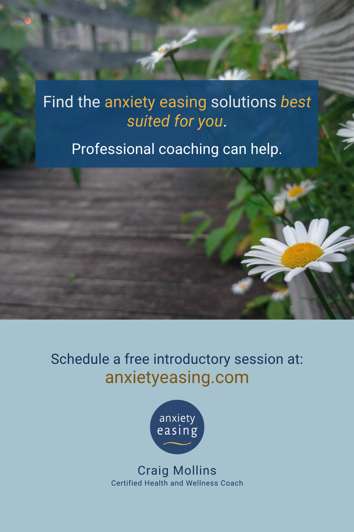
Better, but you still left a nit hanging out there for me to pick:
It would be “suited to” not suited for.
For what it’s worth, I admire your ability to take criticism, sort through all the conflicting advice and design something better than what you began with.
In addition to the grammatical nit that HotButton picked, there’s an anxiety-causing punctuation problem in that first sentence. I know it might look awkward but you’ve used anxiety easing as a compound adjective to modify the word solutions. This requires a hyphen, as in anxiety-easing solutions.
I’d also remove the colon after the word at — it’s not needed. Those two lines of type form a complete sentence, which requires a period (full stop). Even so, I’d likely leave it off to keep it from looking like part of the URL, which you’ve already done.
Much better, our design coaching is paying dividends. ![]()
For the headline I think the following is easier to read and has more punch. If the tailored coaching aspect has value or is part of a brand strategy then maybe the message shouldn’t be muddled with the competing (and redundant since it’s repeated several times) highlight of anxiety easing.
Find the anxiety easing solutions
best suited to you.
vs
Find the anxiety easing solutions best
suited to you.
Thanks, yes good observation.
Ok great, thanks for these. And, the feedback has been very helpful so I find it easy to adjust and move on. I asked for it after all!
1 Like
Excellent, I appreciate this suggestion.
“Much better, our design coaching is paying dividends.” -It’s been super helpful and I’m impressed at how much people are willing to help in this forum.
Love the improvement. I have two things that I might suggest:
First, just a little housekeeping on your type, it’d read smoother if “best suited for you” were on the same line, and your top line and bottom would be more balanced as well. Try nudging “best” down to the next line.
Second, after reading your three potential uses, I think this would stand out wonderfully on a pin-board in a college or other place, where most signs and posters are trying to be as loud as possible - it’d be a place of quiet amongst all the noise, and that would work fantastically for attracting the attention of someone who is anxious. I’m a little concerned that in the other two situations, where your card might be standing on it’s own, that it won’t attract the same kind of attention. It depends on the context of where it’s going, which you will know better than any of us, but you might consider adding a header of some sort that quickly clarifies what’s going on - maybe just “Relax.” But that’s only if you think that this might be going somewhere where communicating quickly is a problem - not everything needs a title, and the rest of your design stands on it’s own.
That being said, I appreciate the heck out of your white space. So many people are afraid of “wasting” space, but especially when dealing with an anxious audience, it goes a long way.
Thanks for your suggestions. Yes I’ve made that adjustment with the line of text.
I like the idea of having a title for certain uses. I can see that being useful for situations where I leave a stack of the post cards on the counter, at a yoga studio, for example.
I like the white space as well. To my way of thinking people need space in order to process information, so I typically make things with a lot of space.
You’d be better off just hiring a Designer don’t you think?
2 Likes