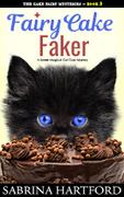
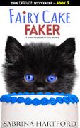
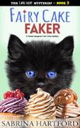
I am making a cover for the third book in my sweet magical cat cozy mystery series.
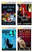
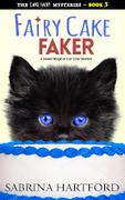
As most people are not familiar with this type of book, here are examples of other best selling titles in the genre:
(Click to make bigger)
Essentially books in this genre revolve around an amateur sleuth who bakes for living, but solves murders in her spare time, with the help of a pet cat. She also learns that she has magic powers. Although she solves murders, everything is light hearted.
However, for this new book, I want to make it more eye catching, as the current book covers don’t get many people clicking on them.
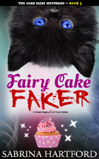
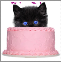
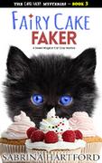
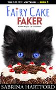
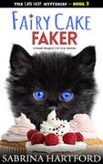
Here is my cover so far:
(Click to make bigger)
Most of my readers say they buy the books because of the cat on the front, so I have kept him from the previous versions. I know the subtitle is small but that will be on the Amazon page.
I’d appreciate any feedback.
I am not sure if the cover looks too dark (e.g. as if to suggest the book is sinister/horrific) . Cozy mysteries are light hearted, although as demonstrated by the covers from other books (above) it’s not uncommon for them to use a darker color scheme.
PS. Once I have finalized this third cover, I will redesign the previous ones to match, so I am not concerned about sticking to the design of the previous books.
I also know that all the best sellers use custom illustrations, but I don’t have the money for that
If it’s lighthearted, I would lighten up the background. That would bring the cat more forward and increase contrast, which is more attention-getting, which is the job of a book cover and is your goal.
In fact, try it with a stark white background. Pink accents, cupcake, keep the whimsical font, and a striking cat face.
Although I get that you are trying to use a font which has a “murder” feel, IMO it makes the cover look too aggressive and the fonts don’t go well together at all.
Use a font which matches better which isn’t too busy and try different background variations.
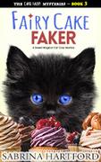
That’s a nice photo of a kitten.
The two major elements of the cover don’t have a connection. They are just sitting separately at different ends of the book. How about using just the cat with the sparkles and a background with no gradation?
You could also think about a more lighthearted font as suggested by Kuyt21.
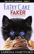
I like the white background. It doesn’t compete visually with the main elements. But…
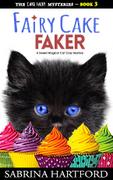
It looks unbalanced and top heavy visually, with the large head at the top. What about changing the cupcake to a full size cake and make it fairly large on the page? The cake and cat would be balanced and more connected.
Another idea might be to put the cat’s head right side up, popping up behind the cake.
Here’s a very rough idea of what I mean. This concept would give you more room for different text colors against the black and pink, as well as connecting the two elements.
I’m not quite sure if the title font is too aggressive or if it gets lost in the cover.
The white background looks nice. However, the book is part of a series, so I am not sure if I should use different colors to differentiate them (Although, I guess I could just use a different cake on each one). I am also not sure if the cat is still cute now that he is no longer playfully upside down.
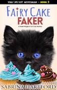
I’m not wild about the chocolate cake version. It’s not immediately clear what it is.
I look at the little round things on top and try to decipher what they are. Nuts? Chocolate covered raspberries? Then my eye goes down and oh, now I get it, it’s a chocolate cake. It takes time to understand, in an environment where seconds count.
Perhaps either a chocolate cake without the small round things, or else a lighter color cake? A fancier one that supports “fairy?”
I like the font there. Have you picked up the blue in the title from the kitten’s eyes? Nice touch.
I have to agree with the others that a simpler cake will stand out more.
Also, you might be able to get away with not having a band under your name if you have the font in a contrasting colour. Top and bottom bands make the cover look a little hemmed in.
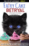
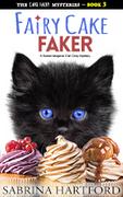
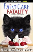
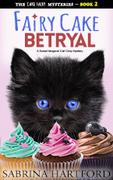
Do any of these revisions work? I like the cupcake ones, but I am not sure if it looks odd because of the scaling. If more than one cake works, that’s good, because I have three books in the series, so I can use them for the other titles.
I am also not sure if I should go for a white or colored background. I like the colored backgrounds because it will help to differentiate the titles in the series, but I think the white ones might jump out more.
I am also not sure if the cat still looks as playful now that he is no longer upside down.
(Click all to make bigger)
Cover A
Cover B
Cover C
Cover D
Cover E
Cover F
Cover G
I know the cake cut outs are bit ropey, but that’s because they are preview images. For the final covers, I will purchase the actual images and do proper clipping paths (Although curly things are always a bit tricky to do right!).
Cover A and Cover D seem to be working the best, mainly because the cupcakes and cake are lighter in colour and therefore contrast well with the kitten.
In A, I’d suggest not hiding the nose of the kitten. It kind of adds to its cuteness.
Your name without the band works well in D, but not so much in A unless you can make the outer glow merge more seamlessly with the cupcake paper. Alternatively, you could try a black to none gradient from bottom to top for the entire cover background, but I can’t guarantee it’ll work.
Schweta, don’t you think the white cake in particular blends in too much with the background and makes the kitten half face seem to be floating?
“A” works better as it gives the cupcakes some grounding.
I’d be more apt to go with B or G. But G only if the story is set in colder months. The colors are “colder” than B.
I hadn’t noticed that, PD, but now that you mention it…
Though visually I still find A and D far more appealing than the others, simply because the lighter colours contrast well with the kitten’s black fur and blue eyes. Perhaps a light background colour might help to eliminate the floating effect?
Yes, the cupcakes bleeding off the sides, as in version B, produces the most natural looking composition. The food-spread foreground appearing “bigger” than the kitten-head makes the difference.
When the kitten (so cute) is upside down, it becomes an immovable focal point. That could distract from the title.
Cats have amazing eyes with great depth back to the flat surface of the iris. I think the blue in the design is starting to look sort of like a marble surface because the color is so predominant. A slight (only 5-10%) desaturation and maybe fake highlights would make them look more natural and give them more depth.
But really, this is just nitpicking at this point. Nice work.