Thoughts on current logo for cosmetics company

I would be interested to know people’s thoughts on this existing logo for a cosmetics/beauty products manufacturer.

The company describes itself as "Leaders in beauty manufacturing for more than 20 years, providing end-to-end bespoke solutions to brands and retail giants worldwide.

With trend forecasting, design, formulation and manufacturing capabilities all under one roof, we work seamlessly to bring your brand vision to life.

An energetic and vibrant company, we continue to expand through our unique offering of Premium Concept - Exceptional Value"

Thank you in advance if you take the time to share your insights

Forum rules prohibit posting work for critique that you didn’t design.

1 Like

If it’s an existing logo for an existing company, I don’t see the issue.

I have no idea what “beauty manufacturing” is.
Is this a marketing company or a cosmetics company name?

If you designed it, could you please show some images of final placement, e.g. product packaging, stationery, etc.?

There’s all kinds of that on a google search.

I have no idea who the focus market is; The people who buy cosmetics? or the people that buy packaging to put cosmetics into. Innovate & Create seems an odd tag for a tube of lipstick on a shelf (but I don’t buy lipstick so who knows.)

Now I’m wondering if this is a homework assignment.
Designosaur, what are YOUR thoughts on this logo?

1 Like

To expand on PrintDriver’s “I have no idea…” statement, you really haven’t given us anything in the way of context around your post.

No it doesn’t , but your failure to to state outright that you did design it is still rightly suspect.

Okay, but not a cosmetics brand, right? That makes huge difference. If it were a brand, we could at least imagine it on the store shelves next to other brands we know; Loreal, Cover Girl, Almay, etc., but if it’s a B2B operation, manufacturing for other brands, that’s a whole other market that’s not nearly as visible to we ordinary consumers. It’s hard to offer “insights” when you’re an outsider.

Perhaps even more important, is your motivation for posting it here and asking strangers for those insights.

Mechanically, it is what it is:

  • Too light(weight)
  • Kind of cryptic
  • Short of versatile, as a graphic

That’s all I got.

2 Likes

As @Steve_O mentioned, the forum rules prohibit critiquing other people’s work unless it’s a high-profile situation, such as a well-known company making changes to its visual brand.

The general advice you’ve gotten regarding logos has been good, even though it might not have been what you expected. Spotting a bad logo is easy. Determining whether or not a logo is good is much more difficult since what might be a great fit for one company is a bad fit for another.

1 Like

Since it is a violation of forum rules, I will not help you. Plus your vailed attempt to hide whether it was your creation reveals dishonesty. Please don’t. We can see right through such statements.

Amelia Knight is a “global beauty firm” with over 500 employees.
I’m not quite sure how discussing the logo is any different than discussing any largish firm logo, whether the OP designed it or not. I could post the logo of a local bank that I hate because it’s so terrible, and we could discuss it even though I didn’t design it.

If they sell cosmetics, then the softness of the logo works for the market, probably.
Though it does remind me somewhat of the old Calvin Klein logo.

I’m still unsure of the market dynamic though. Whatever the name and the tag, it doesn’t fit the online descriptor of the company. Do they sell beauty products or do they “provide Market-ready beauty innovation at exceptional value.”
Whatever that means.

I still think this is fishing for a homework question. We used to get a lot of that around this time of year (school finals.)

1 Like

And you still haven’t.
And your internet rankings are still second after Amelia Stewart Knight.

Now that you mentioned it, I agree. I had never heard of the company and should have looked them up before now. The company’s website emphasizes how much they’ve grown and its extensive worldwide retail outlets.

That being the case, discussing Amelia Knight’s logo seems to be fair game under the forum rules.

I don’t understand what you’re referring to. Maybe I’m missing something else that’s obvious.

When I search for Amelia Knight, almost the entire front page of the goog is Amelia Stewart Knight , the1800s pioneerwoman who wrote a diary about her passage on the Oregon Trail. Could be a regional thing. A.S.K. came from the state of MA and it might just be returning that woman’s info first, based on IP.

Dang, with my ancestors having traveled much of the Oregon trail to relocate out west, I should have known that. I’ve got some reading to do now.

Now that we’ve established that it’s OK to critique and comment on Amelia Knight’s logo and with the company’s website providing a little more context about the company and its branding, here are a few of my thoughts.

image

I think logos should be judged as a component of the overall visual branding, so I will conflate the two.

The general look seems to fit within the general look of their industry. This isn’t a bad thing since it fits within the industry norms, but having a generic cosmetics company look also ensures mediocrity in that it blends in with all the other companies in the industry.

According to their website, they’re a cosmetics manufacturer for other companies, not a retail brand. This distinction creates a problem in that the difference seems to call for a visual identity that’s different yet similar to cosmetic retailers. What the solution there might be, I don’t know off the top of my head, but I don’t think their current branding is hitting the mark.

As for the logo fitting in with the rest of the company’s branding, I suppose it does, but I think the company’s branding generally seems a bit clunky. For example, I pulled the following off their website. This reads exactly like a buzzword slogan from 1999.

image

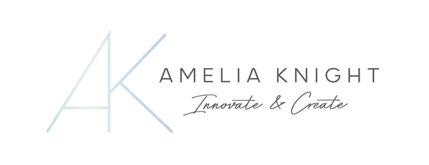
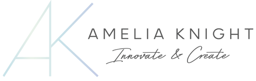
I dislike the Innovate & Create tagline under the logo you posted. I don’t know how often they use that version of the logo, but the script typography looks like an alien bit of stuff tossed in because someone in the company thought a meaningless tagline would somehow help.

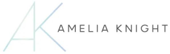
I also dislike the all-too-subtle light blue-green gradient in the logo. At first, I thought it was an error. In print, it would look like a printing mistake.

I pulled the following off one of their inside pages. Apparently, they feel that they have some expertise that eludes me.

If I needed to grade their logo, I’d give it a B or B minus. I might give their visual branding, as a whole, a C or C plus. In other words, it’s average but could be much better or much worse.

I’m still curious why you’re asking for opinions on this.

A new kind of ‘free work.’
Rebranding advice.
:roll_eyes: