Vertical or Horizontal Business Card? Opinions?

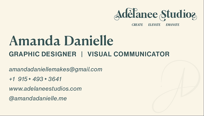
I’m a graphic design student getting ready for a portfolio show and I’ve been working on my self-promotional materials — logo, card, resume, all that fun stuff. I’m torn between two layouts for my business card: horizontal vs vertical.

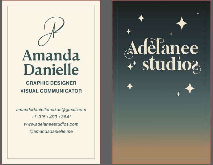
The front has my personal name/branding (Amanda Danielle), and the back is for my creative studio name (Adélanee Studios). Same content and vibe on both — clean serif type, gradient background, and some sparkly star elements. But I’m going for slightly different feels:

  • The horizontal one feels more classic and formal — easy to scan.
  • The vertical one feels more unique and boutique — kind of like a mini print or art piece.

I’m not trying to advertise my portfolio or anything (just want to be clear since that’s a rule!) — I’d just love some feedback from other designers on which layout feels stronger or more memorable for a portfolio show environment.

Have any of you done vertical cards before? Or do you think horizontal is still the way to go?

Thanks in advance for any thoughts


Before even thinking vertical / horizontal formats; my question has to be, why does it look so different to your portfolio? Makes your offering look very disjointed. In fact, neither of them really reflect your work.

I like your ceramics. It is your strongest work in my opinion. However, I am not a fan of the way your portfolio just merges from the graphic design work to ceramics

I know that this does not answer your original question, but I think this needs to be addressed first. Give your work and your brand focus before worrying about card formats.

For what it’s worth, I think the portfolio is cleaner than the business card. Needs refinement, but the business card feels more like it is for a shop selling crystals than that of a designer. Certainly that is the case for the reverse. The front is entirely forgettable, I’m afraid.

Are you a ceramicist or a designer? You can be both, if you make it clear, but as it stands your brand identity is all over the place.

Hope this helps rather than deflates.

Thanks for checking out my site! Just wanted to mention that what you saw is actually my old branding — I’m in the middle of reworking everything for a portfolio class right now.

The class has us focusing only on our identity as graphic designers, so I haven’t been able to include my ceramics or other art stuff in the new materials (even though that’s a big part of what I do). I know it probably feels a bit all over the place at the moment — you kind of caught me mid-transition :sweat_smile:

Totally appreciate the feedback though — it’s all part of the process and I’m excited to get everything aligned once the class wraps!

Is that a backward s after studio or is it a flourish of some kind? Either way, it’s a confusing oddity. You’ve also not capitalized studio on the vertical version.

This won’t be especially helpful, but I prefer the vertical format for the information side of the card and the horizontal version for the other side. Of course, you can’t mix and match. To me the big, blank, left-over space beneath the name and stars on the vertical card is a problem, so I’d probably choose the horizontal format.

I find all the essential information hard to read.

If I received the business card for the first time, I’d be wondering why the sides provided different identities.

I tried stretching my imagination and still read your logo as AP.

The reversed frame on the back is awfully thin as to disappear at printing, while the black version is not necessary at all.

Thin white strokes over a four-colour gradient are always going to cause trouble in print. Digital might just about get away with it, but litho presses? Not a chance. Those fine white lines won’t hold up well they’ll likely disappear or blur, and it’ll look messy.

Also, why’s there a tagline on one version but not the other? And the stroke colour changes too what’s going on there? It’s inconsistent and a bit confusing.

The squiggle signature? I don’t mind it. It kind of reads like “AP” but could just as easily be “AD”. It’s passable, not amazing, but it won’t hurt.

Now, about the business card border - ditch it. Borders are a nightmare at trimming. They never line up perfectly, so you end up with a stack of cards that all look a bit off. Same goes for tiny little details, especially anything white being knocked out of a 4 colour background – they just don’t hold up in print.

Do you even need double-sided business cards? A clean, single-sided design would probably look sharper. You could pop the company name at the top of the white version and skip the signature altogether it simplifies everything.

And speaking of logos, why are there two? Is it AD Design or Adelanee Studios? Pick one. Right now it looks like two completely separate businesses mashed into one card.

Cut the flourishes, lose the clutter. Go with a thicker font or pick a similar one that has a bit more weight. That ‘o’ in ‘studios’ – swap it for the star symbol you’ve already used in the background. It’d tie things together better.

Overall, it just feels overworked and a bit disjointed. Keep it clean, keep it simple, and make sure it’s going to actually print well. That’s the key.

PS I don’t mind either format.

I originally mistook that for trim lines. I agree with @Smurf2, ditch them for the reasons he mentioned.

It is you who decide which one is better, but in my own opinion :
Vertical = a flyer and Horizontal = Business Card.

Double sided business cards are an added expense and often don’t register exactly. Ditch the border, like they^ said.
Also, I use the backs of business cards to write other info on (on occasion.)
They used to also go into a business card binder (plastic sleeves) with another one back to back, so you never see the back unless taken out. I still have that binder. Haven’t looked at it in years.
Though we still do have business cards where I work, I rarely hand them out any more.
It’s all 'smart’phones now.

Had some business with Chinese businesses, and there’s a whole ritual to handing over a business card, it’s very formal and respectful.

In general they’re a neat leave behind, and cheap.

I’ve had notepads, pens, labels for water bottles (not so much anymore) and all sorts of things made up.

Badges, key rings, tote bags, USB keys, all sorts.

Depending on the client of course…

But business cards are a smart way to introduce your business and leave something for them.

Vertical was rarely preferred, as most wallets had horizontal holders.

And it was usually preferred to have the name of the company at the top so it pokes out the top of the holder.

Business cards can be very useful tools.

Hey everyone —
I’m in a portfolio development class right now, and honestly, I’m feeling pretty torn and disheartened.

My professor is very old-school (he’s 85) and wants us to approach our branding with a traditional lens — serif-heavy, formal layouts, rigid hierarchy, etc. While I totally understand and respect that history, my own design voice leans toward something more modern, expressive, and emotionally driven.

I’m working hard to create a business card, personal logo, and brand that reflects who I really am as a creative — something that could hold up in the actual design world, something I’d be proud to hand out to a potential client. I’m even putting in my own rent money to produce the best version of this that I can.

But I keep getting hit with criticism — not just critiques, but deeply personal, degrading comments. My professor has said my designs are “crap,” told me I shouldn’t have won an award I received last year, and even got me removed from a paid internship by telling them I was a waste of time. I don’t even know how to process that.

Meanwhile, I’ve been trying to rebrand myself under my longtime creative identity, Adélanee Studios — something I’ve built up since the beginning of my higher ed journey, and something that really feels like me. But now I’m being told that my aesthetic, my voice, even my monogram… is “ugly.”

I’m genuinely not trying to be rude or defensive — I’m just really struggling with this and trying to figure out:
Why are designers so harsh to each other?
Aren’t we supposed to be encouraging creativity, pushing boundaries, and helping each other grow?

I’m still trying. I’m still learning. But man, it’s hard to feel like your work is valid when the people who are supposed to help shape you seem determined to break you down.

If you’ve ever been in a situation like this — torn between staying true to your creative vision and trying to meet the expectations of someone who doesn’t understand it — I’d love to hear how you handled it.

Thanks for letting me vent. Just needed to get that out.

Just to clarify — the screenshots I shared are from my AI files, and what looks like a border is actually just a note for myself to stay within the safe zone. That’s not part of the final design.

Also, I didn’t include the tagline in the vertical version on purpose — that version was more of an exploration without a tagline, just to see how it reads more minimal and clean. It’s not finalized yet — I’m just trying out a few different directions and weighing how much info I actually want to include.

Thanks for all the feedback so far — I appreciate you taking the time to look and comment!

Consider your professor as your client. You have to make them happy to get paid (graduate.)
It’s hard to grasp, but Graphic Design is a commodity to be sold, not your “art.”
Who you are as a designer has to take somewhat of a backseat to what sells.
A lot of design students don’t find this out until it’s too late.

I’m not telling you not to be you.
But you do have to read the room.

How did the professor remove you from a paid internship?
Were you placed by him? Or were you hired by the company?
If the latter, that is a bone of contention I wouldn’t leave alone.

The same is true in Japan. The exchange ritual is elaborate and formal.

2 Likes

Thanks for your comment — I know it’s meant to help, and I do understand where you’re coming from. I truly do.

That said, I want to clarify some things because this is way deeper than a student just not “reading the room.”

Last semester, my professor’s course included a practicum-style project where a company came to him looking for a design for their annual report. The design selected by their CEO and board would lead to a one-year, paid internship as the company’s graphic designer. My design was chosen.

While in the middle of that internship — and a project — I got hit hard by COVID. I’m immunocompromised and going through ongoing medical treatment, but I’ve never let that define me or hold me back. Even while I was very sick, I reached out to HR proactively to request a modified schedule or the ability to work remotely temporarily. I didn’t want to let the team down — I wanted to show up, just in a way that was medically safe.

Rather than discuss it with me, the company went directly to my professor. I wasn’t looped into any of those conversations. When I returned to class, I was blindsided: my professor told me he had submitted someone else to replace me, citing that I wasn’t “committed.” He then told me I should drop the course or fail — despite my near-perfect attendance and all of my absences being fully documented and excused.

I also later learned that one of the reasons they let me go was due to “inability to accommodate my service dog.” That was something I never brought up, never used as an excuse, and frankly, didn’t think would become an issue — but it did.

So while I respect your point about design being a business — and I completely agree that client-focused work is part of our job — this wasn’t about a failure to understand the market or deliver what “sells.” I delivered. My design was chosen by the client. I was doing the work. I got sick. And I still tried to honor my responsibility.

This was about being punished for things that had nothing to do with my talent or professionalism. It hurt — and yeah, it’s personal now.

I’m still here, still working hard, still trying to balance who I am with what the world expects. But please know that it’s not always as simple as “reading the room.” Sometimes the room has already decided who it wants to listen to — and who it doesn’t.

Perhaps this to fix the “AD” looking like an “AP”?

Honestly, I think critique is one of the most valuable parts of being a designer, but it can also be one of the hardest to deal with especially when it feels like it’s more about tearing you down than building you up.

Design is personal. You’re putting part of yourself out there, so yeah, it stings when someone comes in swinging. But not all criticism is made equal. There’s a big difference between someone pointing out where your composition could be stronger or your type choices feel off, versus someone just slating your whole piece with no real feedback. The first one helps you grow. The second one? You bin that and move on.

I’ve seen people get completely thrown by brutal feedback especially in college, where you’re still building your confidence. Some tutors lean into the old-school, tough-love approach. That’s fine up to a point, but when it slips into personal digs or ego trips, it stops being helpful. That’s when it’s fair game to call it out as unprofessional.

At the same time, you’ve got to be open to feedback that challenges you. The traditional stuff, serif fonts, strong hierarchy, clean grids, that’s there for a reason. It works. But you don’t have to follow it blindly either. Use it as a foundation and build your own thing on top of it. That’s how you find your voice.

And let’s be real the design world outside of college can be even tougher. Clients can be harsh. Bosses might rip your idea apart. But if you learn now how to separate yourself from your work, take what’s useful, leave what’s not, and stay open to evolving, you’ll do alright.

Personally I’ve seen my boss tear into a designer in front of the client during a pitch, the boss had no feedback prior to the presentationa and thought it was great - but came out swinging and the poor woman left in the middle of the pitch crying.

Another designer I worked with got a call and ended up in floods of tears as the client tore into her - she quit on the spot.

The real design world is tough - the problem is that you have egocentric dickheads who love to go on powertrips.

I’ve never walked out of a job, I’ve never walked away from a client, and I’ve never let a boss speak down to me. The first utterance of anything like that and I call them on their bullshit. I know this is not a method for everyone - as everyone is different and approach things differently.

In college an old professor, not disimilar to your position was nearly getting into a fist fight with a class mate, he was 70’s and the young lad was only 19. And they were at each other every day, and it almost came to blows. I lost it that day, and tore strips off them both, in front of everyone, and it didn’t happen again after that.

Enough about me.

Best thing you can do? Surround yourself with people who give proper feedback people who want to see you improve, not tear you down. And when you get critiqued, take a breath, don’t react emotionally straight away, and ask yourself: “What can I learn from this?”


Anyway, keep your head up. If it burns a little, it probably means you care. But don’t let anyone else define your worth as a designer. Ever.
After a lot of back and forth (and a ton of emotional ups and downs), I’ve decided to strip everything back and just focus on me and what I want to put into the world.

Instead of going for gloss, embossing, or double-sided layouts, I’m keeping it one-sided and using just two flat colors. No frills. Just clear design.

I’m leaning fully into Adélanee Studios — my personal brand that’s followed me through my creative journey. The AD monogram is staying too — not as a logo that tries to be perfect or universally approved, but as a signature of who I am and what I stand for as a designer and artist.

This card is clean, functional, and feels like me. I know it’s not trying to be trendy or overly polished — but I’m okay with that.

Open to feedback and solutions as always

To an extent, that’s great. You don’t want your business card to suggest otherwise. However, keep in mind the reciever’s viewpoint and whether your card will make a positive impression from that person’s perspective. For example, if your business card is wild and crazy, it will only resonate with clients who are wild and crazy. Designing the card to be a little more conservative will provide a bit more wiggle rooom/

From what you’ve shown here, I disagree with your rude professor. You’ve received critical comments here, but they were all meant to be helpful. There’s nothing wrong with your sense of aesthetics. The cards you’ve shown here are quite nice, and the comments have all been about details, not major mistakes or lack of ability.

I haven’t found that to be the case, so I think you’re dealing with the exception rather than the rule. Some people are just unpleasant.

Welcome to the real world of professional design. I’m sorry to say this, but you’ll find that this is almost always the case in every client or employer relationship. They’re paying you to produce something for them, so they understandably think they have a voice, even when they’re a bit clueless.

Even so, their perspectives are important since they will know more about their business needs than you do. This is where negotiating skills are important. Designers need to understand their client’s viewpoints, then counter them as necessary with alternatives that address their legitimate concerns while giving them confidence that you know what you’re doing and that they can trust your judgment. Developing these skills requires experience and practice.

When I was a new designer working at design studios and ad agencies, I would often request to accompany the art directors and account managers to business meeting with clients. I primarily wanted to observe and learn how it was done. These kinds of business skills are typically taught in design schools, but they’re important.

Read PrintDrivers comments, then read them again and take them to heart. There are several decades of experience speaking, which will require many bruises to learn on your own. There’s a least a semester’s worth of knowledge contained in those few lines and he’s given it to you free of charge.