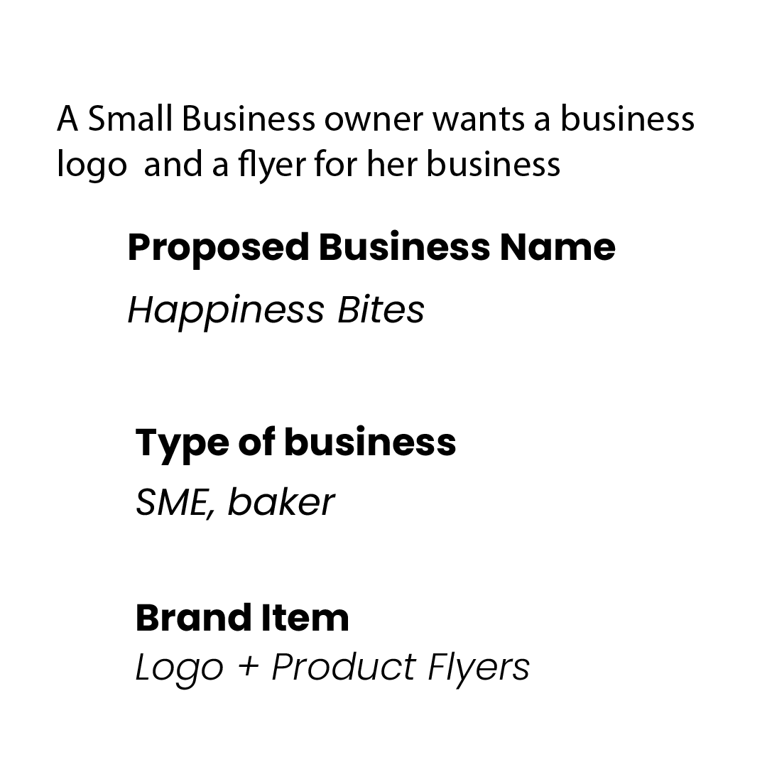
A small scale baker has asked for logo designs for her baby business “Happiness Bites,” after gathering a short design brief from the client.
The following ideas were developed and created. What do you think about the design.?
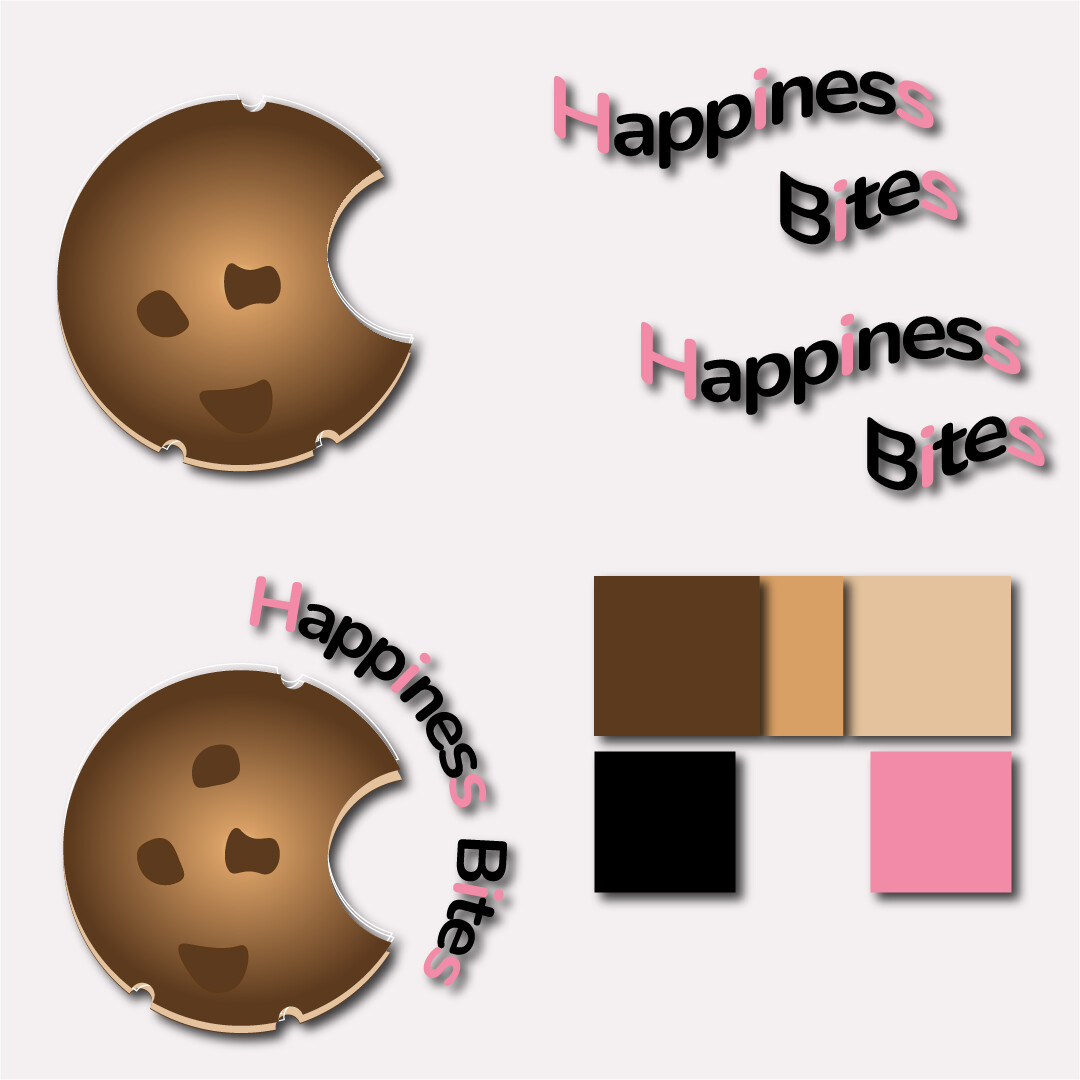


It doesn’t work in terms of basic design principles (for logos). For example, versatility, legibility, recognizability.
Without the briefing, it’s impossible to say whether it meets the briefing requirements.
3 Likes
There should be a color balance with the fonts and the cookies, also check this page for the color combination with pink : https://creativebooster.net/blogs/colors/colors-that-go-with-pink. Keep in mind that the font typeface is very important in the graphic design (to make the message readable).
It’s been a long time since I’ve seen this style, and I think the logo could really benefit from simplifying some of the effects. Right now, elements like the drop shadows, gradients, wavy text, and small strokes are making it harder to read, and the typography feels a little inconsistent. The cut-out circles don’t really suggest a ‘bite’ the way I think you were aiming for.
I’d suggest trying a cleaner, more minimal approach this would make the logo feel more timeless and professional. Unless the design is specifically for children, some of the current effects make it feel a bit too playful for a bakery. Also, while cookies are great, you don’t want to pigeonhole the business into looking like it’s only about that, unless it’s a flagship product that defines them.
If you look at many bakery logos, they often lean toward elegance and warmth, really showing the personality of the baker.
For me, this feels like a chance for a fresh start. You clearly have the drive now it’s just about refining, simplifying, and polishing until it matches the quality of what bakers themselves do, refine, style, and improve every time. Keep going you can definitely pull off something stronger with a bit of rework.
3 Likes
I don’t see a logo. I see an illustration of a cookie with confusing typography.
What if this baker decides to sell the cookies by the dozen in an inexpensive box with the logo printed on top. Typically, in this situation, keeping printing costs as low as possible is important. Unfortunately, your logo would require four-color printing instead of one or two spot colors.
The entire purpose of typography is to be read and communicate a message. Yet, you’ve compromised the legibility of the words with waviness, wrapping around a circle, gratuitous switches between pink and black letters, and pointless drop shadows that make the typography almost unreadable.
You need to think through the problem from end to end and simplify the design to make it flexible enough to be used in almost any application.
Sorry, but I am going to be a lot harder in my response than the others.
The images you have presented demonstrate a lack of understanding of basic design principles. If you are 14 and wanting to pursue a career in design, I’ll pull my head in a bit – we all start somewhere. For you, the next step I’d recommend is don’t do any more commercial work until you have an education and a grasp of what you don’t yet know.
If you are older and pitching yourself as a professional designer, actually the same advice applies, I’m afraid.
Learn before you sell your services, or you will be doing clients a disservice at best.
Good luck
3 Likes
Thanks for you review.
As a matter of seriousness, it’s why I posted it here for suggestions and review. If you could take out a little of your time to show what the design could really benefit from your expertise, I would be more than grateful.
Kindly assist by dropping off any model to guide my learning. Thank you
Good day,
I hope my message gets to you.
Kindly make a mockup of what I should do, so that I can improve my skills. I am self learned and obviously, it is very visible that I am still on my way to mastery.
Kindly help me with a pro prototype to aid my journey.
Thanks and Regards
Humble me.
C I Arts
You may want to review the forum rules. They prohibit asking for free work. Asking for advice is great, but asking for a mockup is the kind of thing most of us get paid to do. Sorry.
1 Like
Can do, it will cost you though.
3 Likes