Title: Giving away $10,000 to the first stranger I see!
The brief: Along the same vein as Mr. Beast’s big giveaway videos, this video features a man on a mission who has decided to film his giving away $10,000 to the first stranger he sees at his local park. He wants the thumbnail to really command attention.
I’m just asking is it a good thumbnail? If there’s something I can improve. The lessons are just on color theory, layout and then we’re given a fictional brief to put skills learned into practice to create a thumbnail and this is what I came up with.
Then again none of the youtube covers are good for things like this.
Where does yours stand on others similar - probably a bit better.
I hate being harsh when someone is learning.
But you need to start over.
Really think how you’re going to connect with the audience.
That image shows a guy in a park flashing cash - what is he doing? Is he selling drugs, buying/selling prostitutes… how is that captivating the audience.
On the thumbnail - does it say once
£100,000 CASH GIVEAWAY!
Where’s the call to action - where’s the draw?
What is he doing in the park with a load of cash???
Title: Giving away $10,000 to the first stranger I see! The brief: Along the same vein as Mr. Beast’s big giveaway videos, this video features a man on a mission who has decided to film his giving away $10,000 to the first stranger he sees at his local park. He wants the thumbnail to really command attention.
I think it does. I kept zooming out to view it on a smaller scale. Since this is fictional I thought making it appear like he was somewhere (in the park) and holding cash to make it seem like it was from the actual video. Did I succeed?
I’m not sure how an actual brief would be…This was just the brief I’m given…
Looking into the video and Mr.Beast’s audiences, most of the thumbnails don’t even have words or clips of the video or more like an exaggerated view. Like the video of his: I Gave People $1,000,000 But ONLY 1 Minute To Spend It! (There’s just a boy with a card and that’s it.)
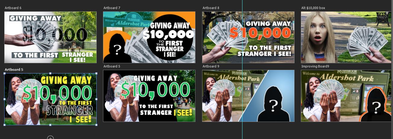
I initially did have to add that very long title into the video (followed the brief and lesson) and now I’m doing one straying away from the brief a little and at least adding “10k Giveaway!”.
I’m really struggling here and could use some help in letting me what and how I can improve it. I have used the following photos from stock images to create the thumbnail and I just can’t seem to work it out…I’ve been at this for several weeks now with no direction/s just told that it’s not good and that doesn’t help me out.
Well, you have only posted 1/2 of a design here - it didn’t have any copy on it at all. I won’t give feedback on ideas. I need to see a design, you haven’t posted one yet. We will be helpful if we can.
?? I started this post with my design and asked for critiques and feedback on it.
it didn’t have any copy on it at all
I’m not sure what’s being asked here. Should I posted on the student thread instead since I’m still learning as I mentioned above and could use some directions.
Lots of these YouTube thumbnails for giveaways include the promotional copy as part of the thumbnail image using some sort of copy treatment. I’m saying you need to complete your thought. You didn’t post your completed design, you posted something in progress and missing the giveaway copy. Adding that might change everything, it might be better or worse but I don’t know because you didn’t finish the design and post it.
I don’t care where you put your post, that’s not a concern for me. What is a concern is that by posting your assets, you seem to be asking for someone to literally take those and show you how to make something good out of it. I won’t do that, in fact I think it might be against forum rules.
You’ve gotten feedback, you’re just having trouble turning it into concrete actions. Ok, try these concrete steps:
Incorporate all of the elements - images, copy, logos etc. Establish some hierarchy between them. Get one attempt done all the way. Then, try another one that’s completely different except for the required copy. Different images and treatment. Then do it again one more time. That’s the iterative process. Don’t use the same stuff and try to make one perfect effort, use different stuff and try different things. The first one is always the hardest but muscle through it.
Try to make those options different in a purposeful way. Emphasize the copy on one more or a specific image on another. Try to think about what is important and what the promotion is trying to accomplish. This is about thinking. It’s about communication. It’s about accomplishing something with this promotion.
Make it as real as possible as early as possible. Do a search for money giveaway videos. Screen capture the resulting thumbnails and replace one of them with yours. Now you can see yours in a real context. Ask yourself if it fits. Is the copy legible at that size? What did they do that you didn’t? What can you do better than they did?
Present your options for feedback with your thinking at the same time. That way I can tell you what was successful and what wasn’t. I can’t tell if you succeeded unless I know what you were trying to accomplish.
Lots of these YouTube thumbnails for giveaways include the promotional copy as part of the thumbnail image using some sort of copy treatment. I’m saying you need to complete your thought. You didn’t post your completed design, you posted something in progress and missing the giveaway copy. Adding that might change everything, it might be better or worse but I don’t know because you didn’t finish the design and post it.
The thing is most of these designs or videos as I mentioned above don’t have any words so that’s why I showed without the words and I did add the assets because I want to show that it’s happening at a park but it’s either my lack of knowledge or inability to get the point across. If that’s not allowed then I apologize. Seeing examples helps me and to see a different perspective.
I think to myself okay…I put a random ? person on the right and a person with money on the left and a “park” and that should get it through. I’ve been at this for weeks…so I supposed this is point no.1. “Different images and different treatment.”
In my lesson, we’re supposed to bring together images and create a thumbnail and I frankly do not know about screenshot others video and if that’s even allowed. I did search giveaway videos but I mentioned above…the thumbnail was very simple…shocked boy looking at credit card, no words.
I’m trying to work with the design again and I feel stuck all over again…I felt like the previous blue wasn’t working and the layout …wasn’t going well together…I don’t know.
I’m gonna do this in multiple posts as I get a few moments here and there. It was great to see your other options. Always show multiple options…for internal reviews I showed ideas I thought were bad and often they were the ones everyone else loved. Frankly, I like artboard 6 & 8 better than the other one you keep highlighting.
I don’t agree with you, that’s what I’m saying. I searched myself. I saw thumbnails that incorporated copy. Regardless, the design looks incomplete without it.
Why do I like those two better? Because there’s a stronger focus. I mentioned hierarchy earlier. In the thumbnail you keep showing, the man holding the money seems too equal to the silhouette, no clear hierarchy.
Further, I don’t think the silhouette does anything all that useful, hell you could put the copy over it. It’s just a shape and it’s not that interesting. It certainly doesn’t need to be that prominent.
You’re thinking about this like a math equation and it’s not always that simple. Sometimes you need to use the images to convey something emotional. Here, I think you should be trying to make this exciting! It’s a promotional giveaway!!! Why show people looking shocked rather than celebrating?
Look, I could be wrong about the priorities, I didn’t hear the brief. That’s a problem because really understanding something makes the next point possible → I think you’re being overly literal or pedantic maybe. Have a point of view, have an opinion… it makes the design better.
You are not understanding me here. I’m not telling you to use other peoples work. I’m telling you to screenshot those so that you can evaluate yours. For yourself, as a design practice.
In my work, I get images of competitors products and compare them to my designs. My team does actually use those for internal reviews, but I would never show it to a client.
You don’t have to show that to anyone else, but you should do it for yourself. Why? So that you can see your work in context and ask yourself questions about your design in that context.