I have a little problem with my eyes (short-sighted). Does the forum logo read ‘aDf’ or no? the first and last letters seem like lowercase whilst the ‘D’ is uppercase. What’s with the f? it looks like a snub-nose Revolver or a deformed p. Looking at individual letter forms it does read as its supposed to but as a collective its odd.
Not trying to come across as intrusive or rude, I am new here after all.
When the forum moved to it’s new location, there were lots of suggestions regarding the new logo from forum members. I can’t remember which forum member finally came up with the one you see now. I think most of us like it, though.
The letters, by the way, are GDF, as in Graphic Design Forum.
Niat, welcome to the forum. Please take a moment to familiarize yourself with the forum rules. Rules prohibit posting someone else’s work for critique which seems to be what you’re suggesting.
The logo is inspired by the original GDF logo from years ago, based partially on my design, but it was really a community effort, with kerningMatters giving it the final shine.
I agree, it can indeed be misinterpreted for aDF, but it’s meant to be GDF. Since you only the see the logo together with the domain name or next to the text Graphic Design Forum on social, I feel it’s OK to make the logo less legible, and more like a symbol.
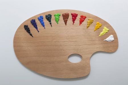
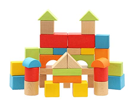
The logo represents the basic shapes and colors, we designers work with to create our designs. You can think of it as a combination of the two objects below:
Sorry for the insanely late reply. I saw this on my phone but didn’t get on my PC until now. I went through and explored all of the thoughts and planning that went into the logo and it was a wonderful process - very collaborative. Surprised this process isn’t available to the forum it would have been very interesting and would have helped set the tone for the forum really well I think.