Last year, I had a client who wanted to design a logo for a clothing store.
Casual clothes, mostly for men, not very expensive and he probably would make an eshop in the future.
Low budget in general.
I made these logos, but the client respond me that “those suck! I wouldn’t pay a penny for them”
That make me very insecure about myself and I was very sad for a long time.
I don’t care about the money, really.
Tell me your opinion please. I would like to mention that I had only one week deadline.
1 Like
absolutely no need for that
i am sure the “client” was just afraid to tell you the real reasons, like
ran out of money
or promised the job to a relative
There are small things about them, I could comment on, but over all don’t beat yourself up. You can definitely hold your head up with these as a first punt. There would be refinements from here, but that’s normal. Is suspect this issue is more with the client.
I know nothing about this person, obviously, but I my experience, people who positively peddle cheaper wares as their core business, tend to be cheap.
In my experience (and we’ve all been there), these are the red flags that would make me not want take such a client on. I suspect, he will be haggling on the price of your work soon. ‘My son could do better’
I’d say, find out his specific objections and refine. You do need to learn how to handle these situations and this is a good one to use. If you can find a solution from this that they are happy with – and that works – and that you get paid for – that’s the best outcome.
As I say, I think more, them than you in this case. There are some pretty solid options to work from there.
Good luck. Let us know how it goes.
1 Like
Thank you for your reply!
I have no news from this client since then.
He never told me what he didn’t like specifically, except for this crude commend I mentioned in the first post. That’s all. No further communication.
I really doubt myself because I can’t see why these logo “SUCK” or “Don’t worth a penny”.
If you have some spare time, I would appreciate some constructive criticism.
Initially I read your post and thought, if it was me I’d politely rescind my services and go my separate way.
I hope you got a 50% upfront, lesson learned if you didn’t. All new clients for me pay 50% non-refundable.
That being said, it’s difficult to know what went wrong - do you have the exact brief you were given to follow?
From what I can see - these logos could be for anything.
Especially with a name like Marco Polo.
For me, seeing the name would envisage a range of adventure gear, perhaps sailing or nautical, boats, and things for boats/sailing - and for sea adventures.
None of the logos actually say Clothing Range.
‘Adventurous Clothing Ranges for Men’
or a tagline like that.
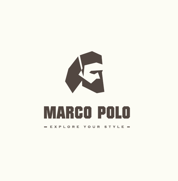
You’ve fantastically executed a likeness to the person. It looks really good, sharp and easy to understand - and incorporated the tagline.
Then there’s a version with a Sextant - again eluding more to maritime than clothing-time.
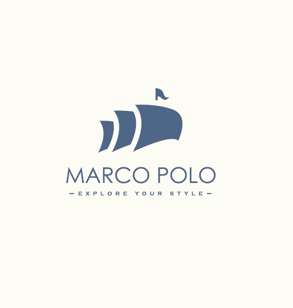
Then there’s the version with sails.
Again without knowing the brief. It’s hard to know how you arrived at these itterations.
None of them speak of clothing.
Plus - that person is in for a rude awakening - there’s already a clothing line/store called Marc O’Polo.
So there’s that.
But if the person didn’t give feedback of constructive nature and was that rude to me.
I would email them back and tell them that as a client I cannot work with them with an attitude like that.
Wish them the best of luck and move on with my life.
Thank you for your reply!
The whole briefing was what I wrote in the first post. He didn’t know more to help me, he even did not know what brand he will include.
As for “speak of clothing”. Is it really necessary?
I remember a podcast about graphic design . Someone said “A logo’s purpose is not to describe, but to identify”. How many clothing store logos have a logomark that does not speak of clothing?
This stands for many brands other than clothing.
And of course, if I wrong with this, correct me! I am just a newbie that has a lot to learn.
Thank you again!
1 Like
That’s fine for established brands.
Adidas with three stripes everyone knows it’s sports apparel.
But for an unknown clothing company - you need to crawl before you can walk.
Is it necessary - maybe with accompanying material, but certainly not on it’s own.
And when I look it up it brings be a different Marc O’Polo website that is established.
Look at Apple.
Their first logo was hideous - it said Apple Computers on it.
But it doesn’t have to say that anymore.
Same with Starbucks
Started with Starbucks coffee
Now they don’t even have Starbucks on it
This is a Established Brand vs Emerging Brand.
That being said you’re right it doesn’t need to state what it does on the tin.
But the variations you supply make me think of nautical themes and adventures at sea rather than a clothing line.
But when I see the apple logo I don’t think of apples, I think of computers.
1 Like
The brief sounds like a crowdsource.
As far as logo designs speaking the product, show me how many brandy-new graphic designers have a computer and a lightbulb in their logos.
I dislike designing logos — primarily because so many clients approach them like a blind date and hope to fall in love at first sight. The logo can be perfect for the situation, but if it doesn’t tickle the client’s fancy in just the right way and make the client’s heart flutter, they’re disappointed and immediately begin making counter-productive suggestions and changes.
Clients (especially owners of small businesses and start-ups) know the logo will stay with their company throughout its existence, so they want to feel a personal connection to it in a way that embodies their hopes and dreams. Instead of seeing the logo as a practical business tool to help establish credibility, memorability, recognition, and customer engagement, they make naive emotional judgments based on irrelevant and ignorant personal opinions and preferences.
Stefanos1984, what you’ve posted here doesn’t “suck.” I don’t know enough about the situation to say whether or not they’re appropriate for the job. However, from what you’ve said, you’ve run head-first into another run-of-the-mill clueless client.
4 Likes
Agree.
1 Like
First of all, let me say this. Looking at the work in a vacuum, it’s really nice. The illustration work is great, nice typography, nice color palette, good proportions. Good job.
My thoughts are going to be similar to those of @Smurf2.
For lack of a better word, I wouldn’t say any of these particularly telegraph casual, cheap men’s wear. Does a logo for a clothing store have to show clothes or a hanger or whatever cliche? Absolutely not. I’d be hard pressed to come up with a men’s clothing brand that does.
If anything, I’d say your work exudes more of a upscale brand than casual and cheap. That could be the disconnect with the client. Put yourself in the shoe’s of the target market. How would they perceive the brand?
In the interest of offering you a takeaway, look at the logos you’ve designed compared to the marketplace. I don’t know what type of places this particular store might be competing against. Maybe H&M, Hot Topic, Rally House, T.J. Maxx, Kohl’s, Dick’s Sporting Goods? There might be others that are more appropriate, I don’t know, I’m not a big fashion guy.
One thing you might do is experiment with the proportions of the symbol to the type. Perhaps if the symbol was smaller, it would put more emphasis on the name and tagline.
1 Like
Just regauging everything, there’s not much difference in text treatment. It’s pretty much the same except for the fonts.
I’m not sure if this was restrictive to the brief or if there was no additional way to reapply the text in a different manner.
At first glance, after reading your post and seeing the logos, saying they simply “suck” is pretty disanalogous and vague to say the least. It would be better if we had some context for the tone and personality words - if any - used, or at least what kind of feel the client was going for with the logo design, and what you had to work with in general.
The brand name going along with the imagery used makes sense; Marco Polo. I’m assuming that’s why it was used; and that’s what the client wanted. Yeah, saying they “suck” isn’t much for feedback, either. You did mention it was a budget clothing brand. I would say you would be outdoing yourself with this fidelity of work for a truly budget brand you’d find in an attached clothing section of a grocery store, or discount store. It isn’t criticism as much as it is saying that you may have exceeded expectations. At least for me, it doesn’t scream “budget clothing”. It would be on par with a higher-end brand. A budget brand example is Joe Fresh. If you want that for reference. Now that’s economy in design.
Thank you all for your time!
Really.
You know, when you are new to graphic design, hearing the words “you suck” really hurt your self esteem and make you feel very inadequate because I coudn’t see why these logos “suck”.
I don’t say they are perfect, but when I delivered them to the client I had some confidence of delivering something decent (given the budget and the deadline).
Your comments made me feel better and regain some confidence about my skills.
My guess is that, if your client did not say “My son/nephew/neighbour’s kid can do better” he’d have that in mind already. All he had to do is tell you off, and turn around to show your work to the son/nephew/neighbour’s kid, and nobody’s the wiser.
In my world, the client is always half-empty.
3 Likes
Some of these are working well and definitely give off a masculine, adventurous vibe, specifically the astrolabe (I think) and the sails. The logo mark is in good proportion to the type, and your fonts work well.
I’m truly sorry that you had to deal with a shit client, but his negativity speaks more about his poor attitude than it does about your skills. Don’t give up and keep on creating!
1 Like
Really thank you for your encouragement!
Oh! and the instrument is called sextant!
1 Like
Of no particular importance, but since you mentioned it, sextants weren’t invented until the 1700s — 500 years after Marco Polo. Just for the heck of it, I bought a sextant a few years ago to play around with.
Haha! I know it when I was making my research! But most people does not know it, so I did it!
1 Like
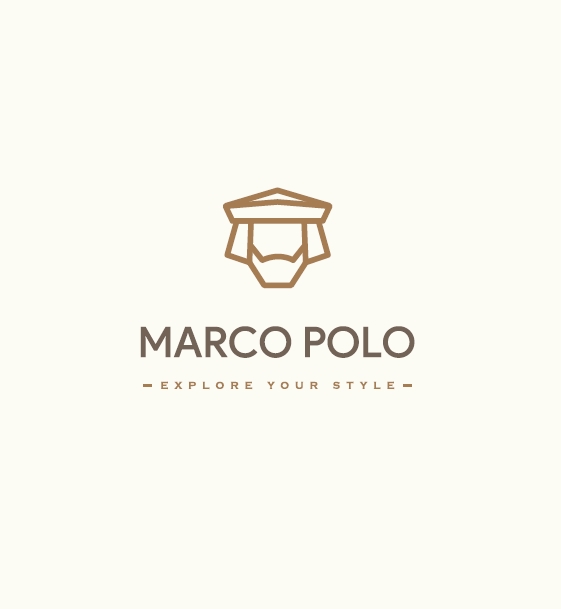
The firat one is pretty good.
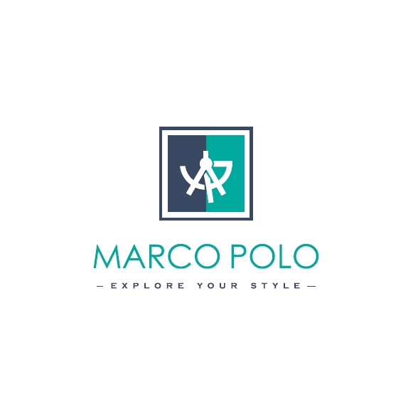
The second one is OK.
The third one’s iconic mark is a bit overcompilcated. Also, the font could be thicker,
The last one is a tad generic, but still OK, though - again - you coud make the wordmark thicker.
The tagline could be easier to read.
Objectively, there’s room for improvement, but non of the designs is truly bad.
You should definitely work on your self-esteem and self-confidence.