The website helps users to make dashboards of websites.
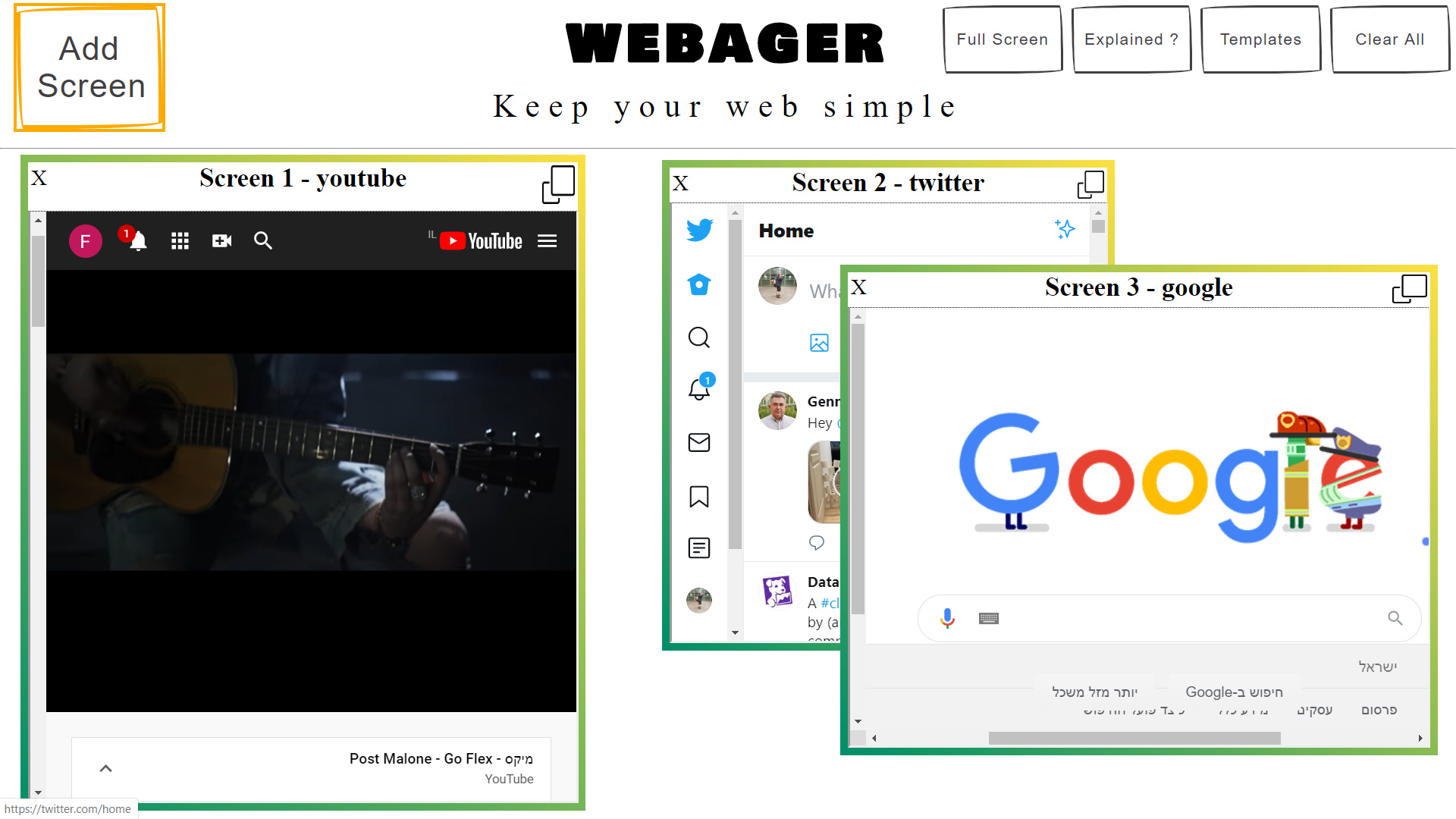
Recently I changed the screen borders to colorful yellow/green and I really liked it.
But I think the menu needs to be changed with that.
I tried to work with the color wheel, but sadly I really suck at design.
I think the background in the screen area should stay white because it needs to be convenient, and only change the grey line and the menu above.
I’m not sure I’ve understood exactly. I’m guessing your site is called webager, and the menu you’re talking about are the 4 boxes on the top right. Generally, I think you are quite far from concluding what your site will look like, so it’s hard to help. I would like to have a little more information about what you are trying to achieve, what look/feel you are going for.
However, if the question is simply, “the form borders are yellow/green, should I change the menu boxes (top right)?”, then my answer is yes… you should! I’m not sure that it’s the best way forward, but with the limited information, if I have to pick yes or no, I pick yes!
Thanks for the response.
Actually I tried to say how to design everything above the hr tag (The tiny grey line).
My goal is to make the website as the simplest as I can.
I want every part (Including the design) on the website to be useful and clear.
For example, the white background (In screens area) + big “ADD SCREEN”.
White background to make the screens very bold and clear + big button for “add screen” because it’s the main use on this website.
I think it called minimal/clean design or something like that.
Well, in that case, I like it the way it is! I don’t mind the orange around the Add Screen. It makes it a little livelier.
A couple of options might be to move the title and tagline (WEBAGER Keep your web simple) a little to the left, or somehow move the small boxes further to the right (that might not be possible, or you may have to shrink them).
However, I should say I’m a beginner myself, so perhaps you can wait a little till someone with more experience can tell you what they think!
I am making the assumption that the image you attached represents the home page for a website you’re working on.
Based on that assumption, I have to say that if I came across this home page, I’d have no idea what the website was about, and I’d move on in a heartbeat. What is the purpose of the website? What does it do? What is the benefit to the user? None of these answers are immediately clear.
After reading through all of the posts in this thread a couple of times, I think I get what you’re going for, but you can’t assume someone is going to study your site to figure it out. You need to quickly convey what the website does and the benefit to the user.
It might help to link to the other topics/posts from @firefun365.
For those who have been here for awhile, firefun365 was the person asking for suggestions on how best to design a website for the purpose of selling paper bags in which to ripen fruit. I’m unsure if this Webager site is an extension of that or something separate.
@firefun365 I know you said to not take inspiration form other websites, but there is a huge difference between clean minimalist design and just minimal. I would say your example is minimal or possibly even “not designed”. I’m not saying that in a critical sense.
This page has a lot of examples of actual minimalist design, which IMO would be beneficial to consider and look at. Even the very minimalist examples of “Northbound Design” and “Karem Suer” at this link show that while minimal, the designs have been thought out and actually designed.
Pinterest is another example. They keep a minimalist design to allow the pins to standout.
So, my 2 cents: a simple layout does not mean it’s minimalist design. It still needs to be designed thoughtfully and with purpose.
As a concept, without having done any research on it, it looks ok. I can see that some people would like to have a bunch of screens on one page in a browser. I’m not sure that I’d use it myself, but I do think some people would like it.
The site itself… from a design point of view, I think is below average. I’m sorry!
A few issues:
-There’s a lack of consistency. For example, the W on the tab (favicon) is a pink W. However, there’s no pink on your screen. So, I would never think that it’s for your page.
-The colours of webager, are google’s colours (it would seem). They might get upset about that…
-The fonts on top of the page (“banner”) do not match. The “add screen” fonts, do not match the “keep your web simple” fonts for example.
-The English on the start/about page is not very good. You might want to get that sorted out too.
The above issues, make the page look a little less than professional. However, there are a couple of positives too.
-The video explaining how the site is used is professional. It ends a little abruptly, but it’s a proper video. Well done with that.
-The site is simple enough to use, so these issues might not affect the traffic you will get so much.