A logo for Prime: My Ideal Programming Language

Prime is an upcoming statically weakly typed programming language built for the laziest programmers (yours truly included). It features tons of built-in types, functions and syntactic sugar to your heart’s content.

The mountain reflects the size of the language. Its round shape represents the language’s sweet and convenient syntax. The red is my passion for this language.

The font used is Righteous.

1 Like

Hi and welcome.

I assume that you are looking for a critique of your logo, rather than promoting your new programming language, as you have put this in the crit pit? That being the case…

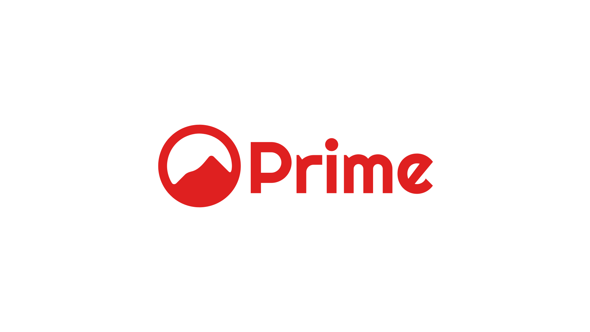
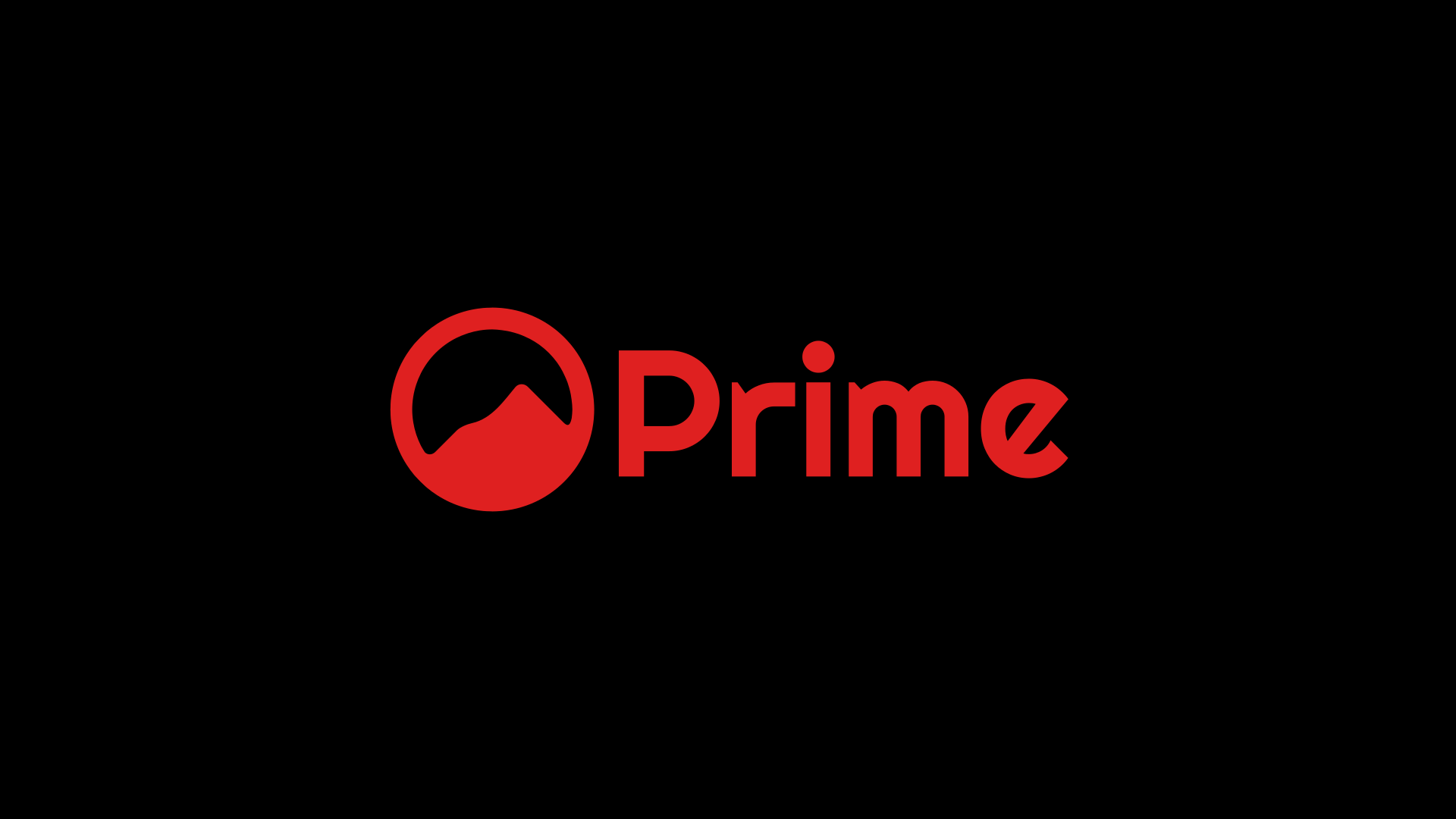
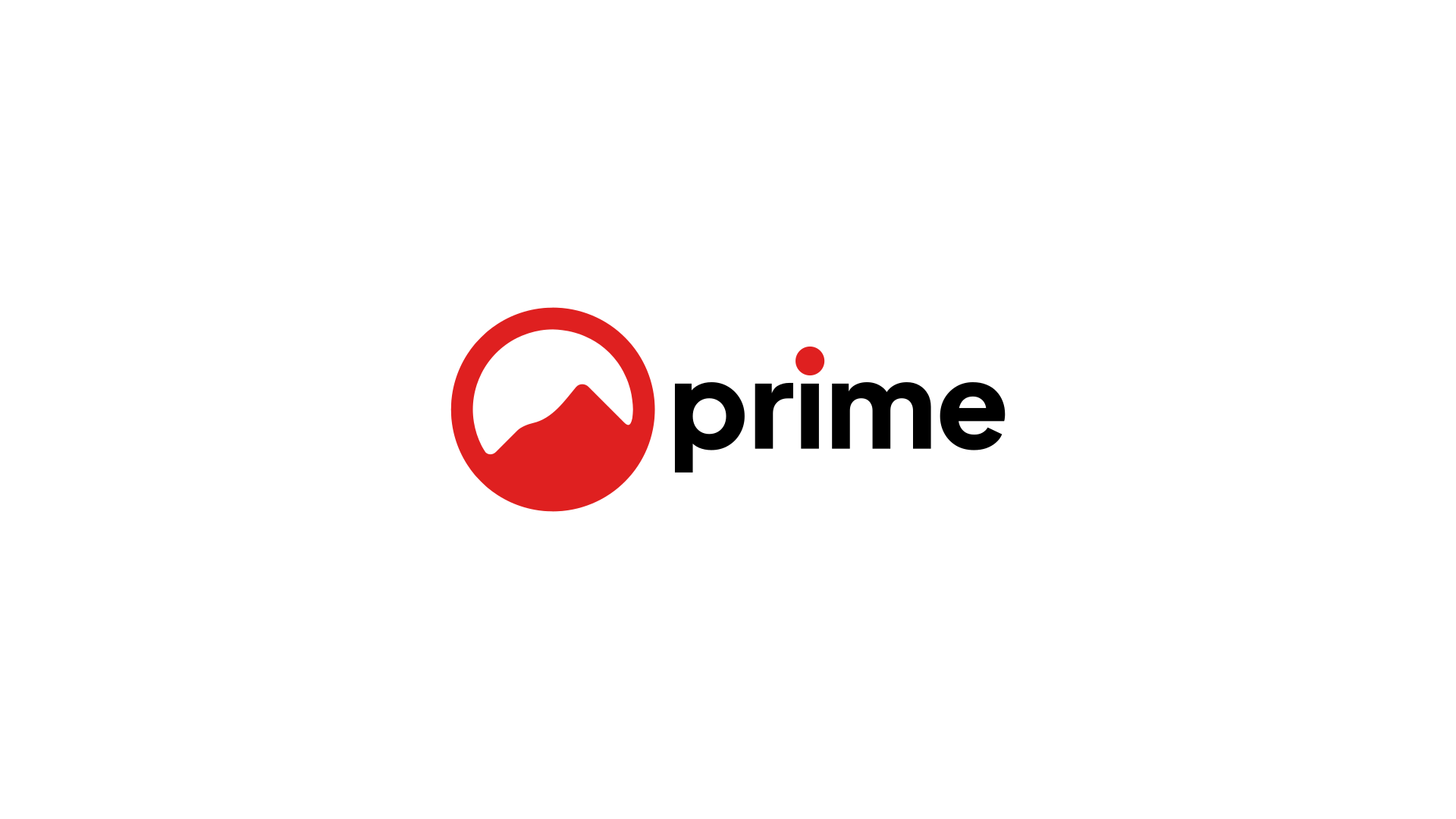
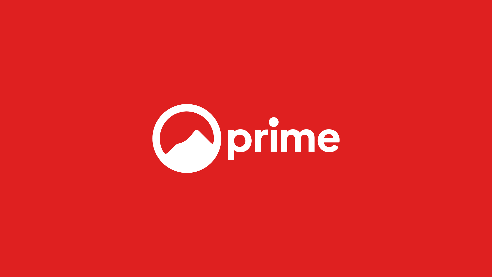
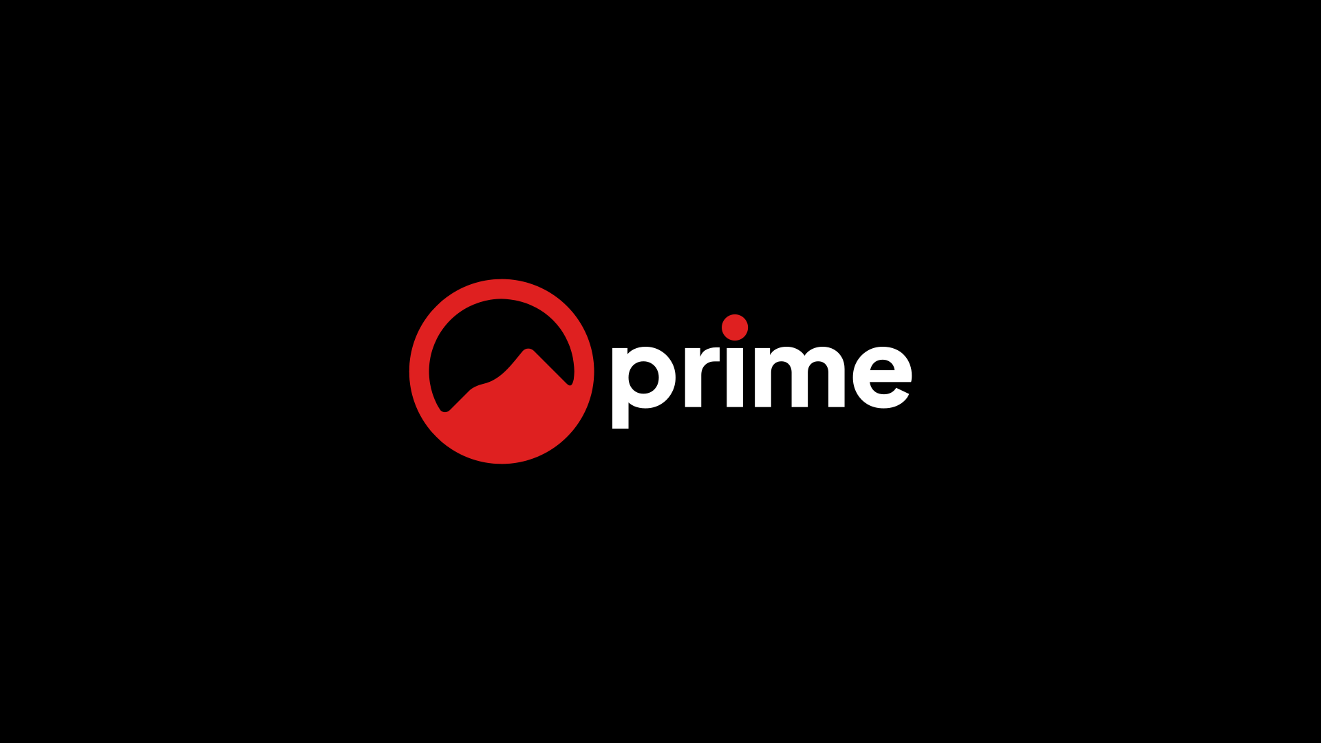
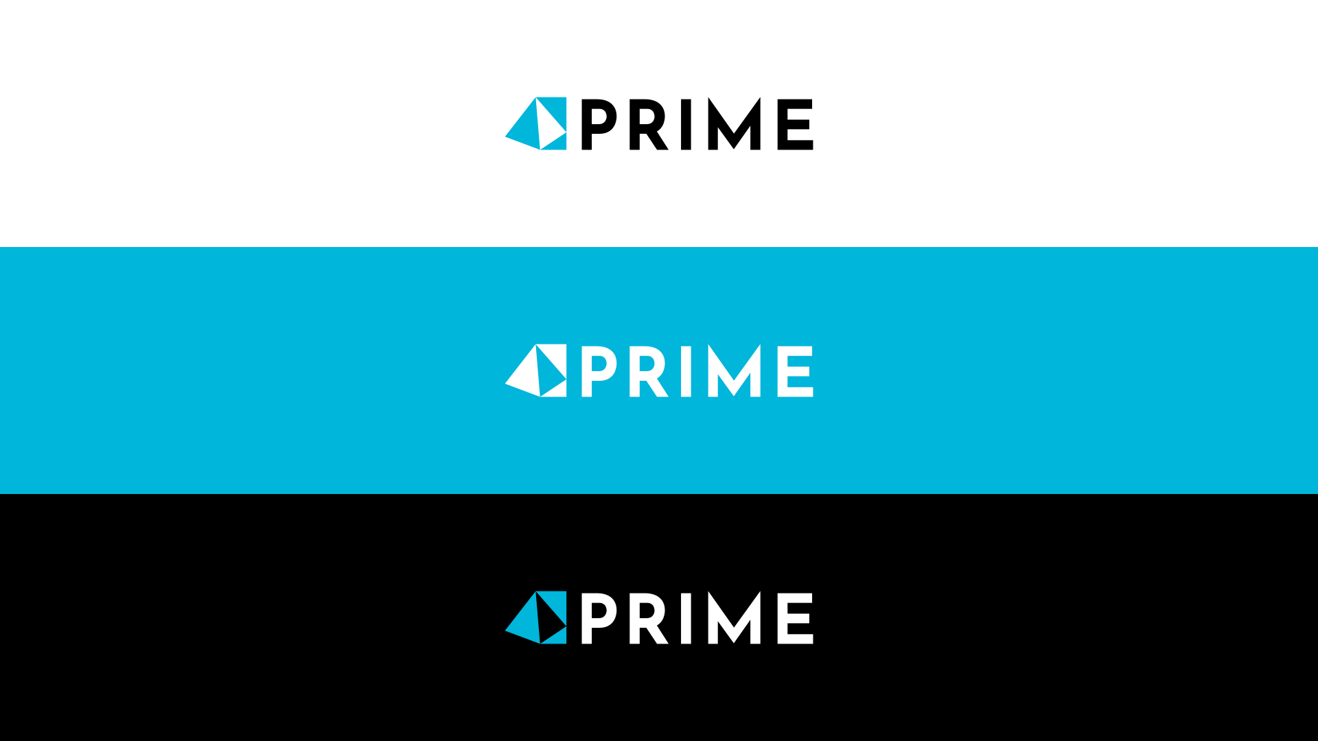
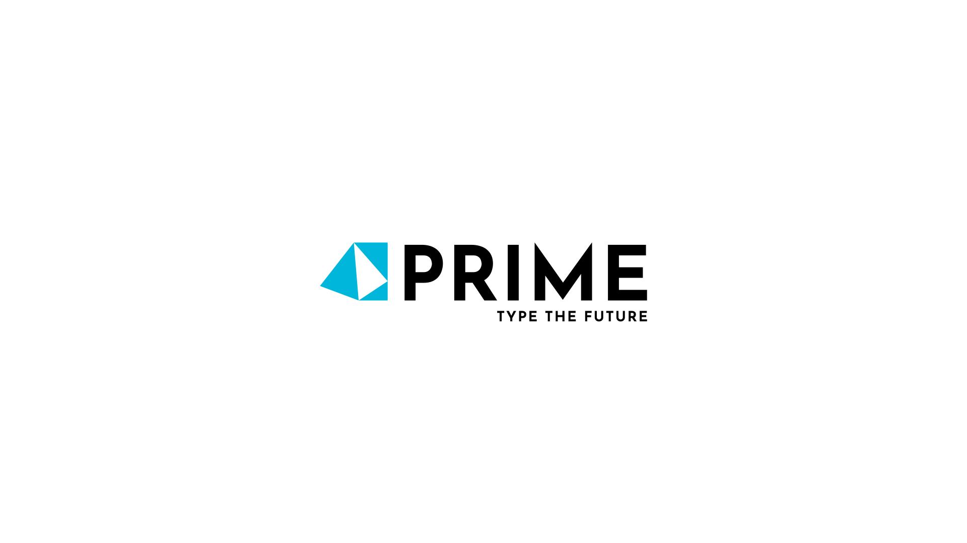
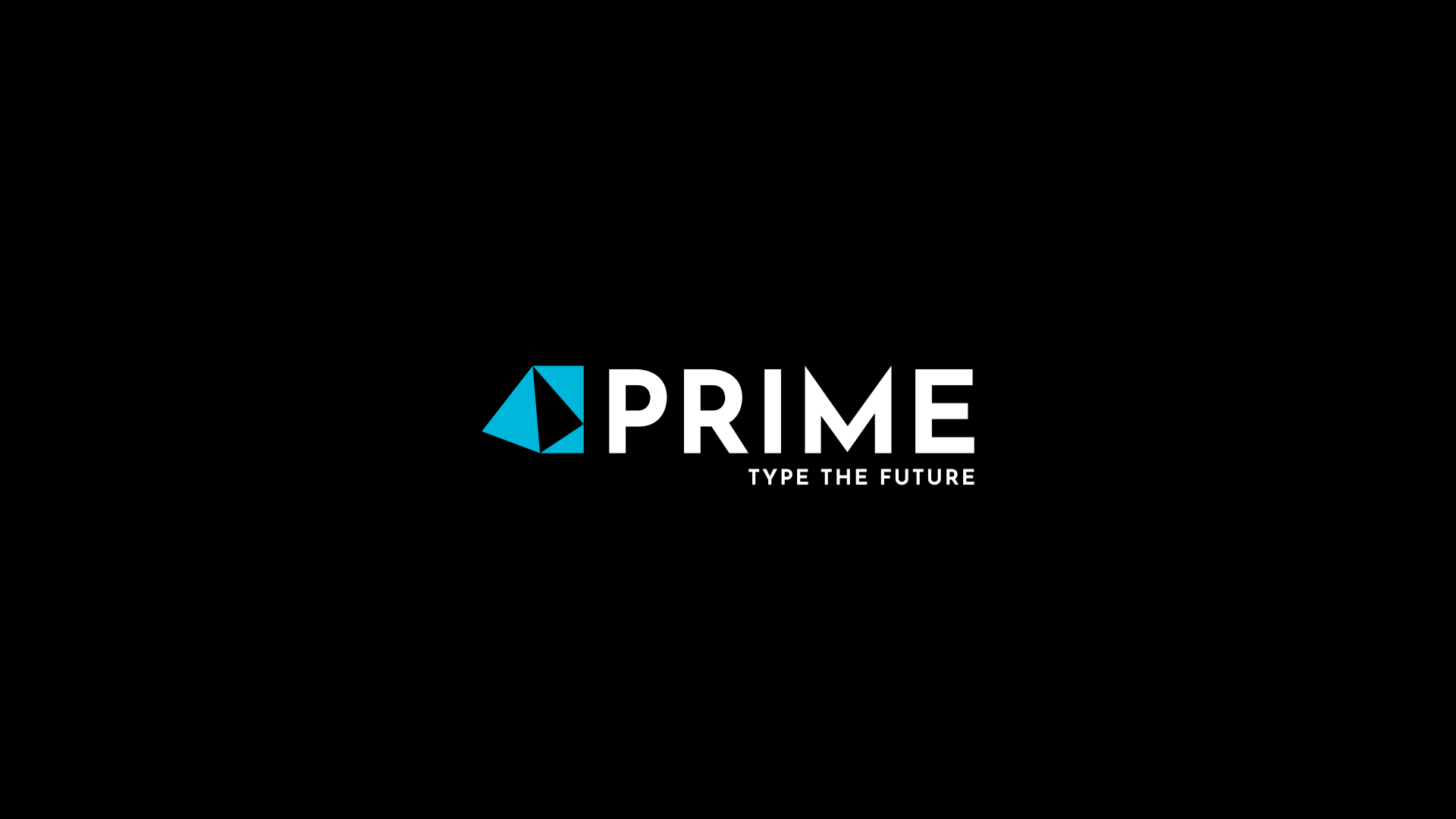
Firstly, your rationale feels a little back-painted and a bit spurious. The end result looks more like a hiking apparel brand than a programming language, despite the reasoning. If it were, I’d quite like it (although it brings to mind, one I’ve seen before, but can’t recollect), but as a programming language, it feels like it’s missed its mark. You appear to have thought more about your feelings towards it, than what it is and it’s likely users.

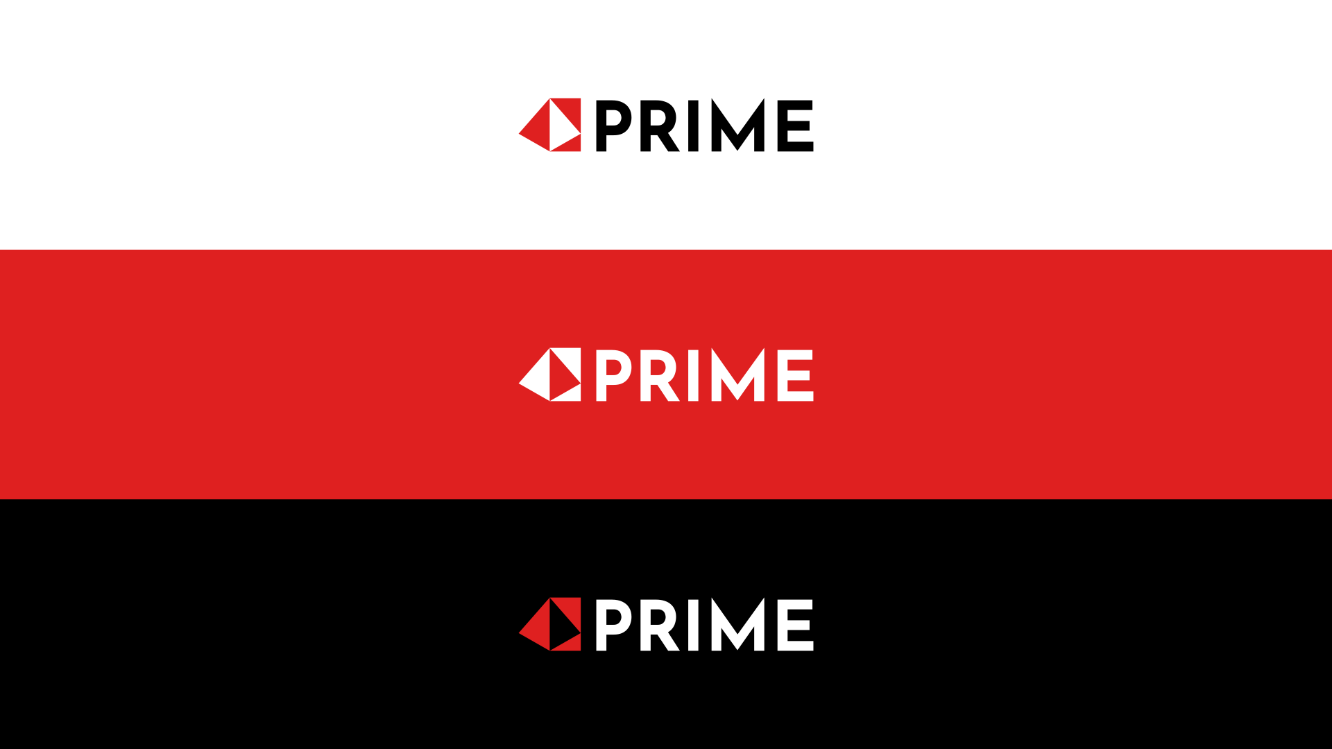
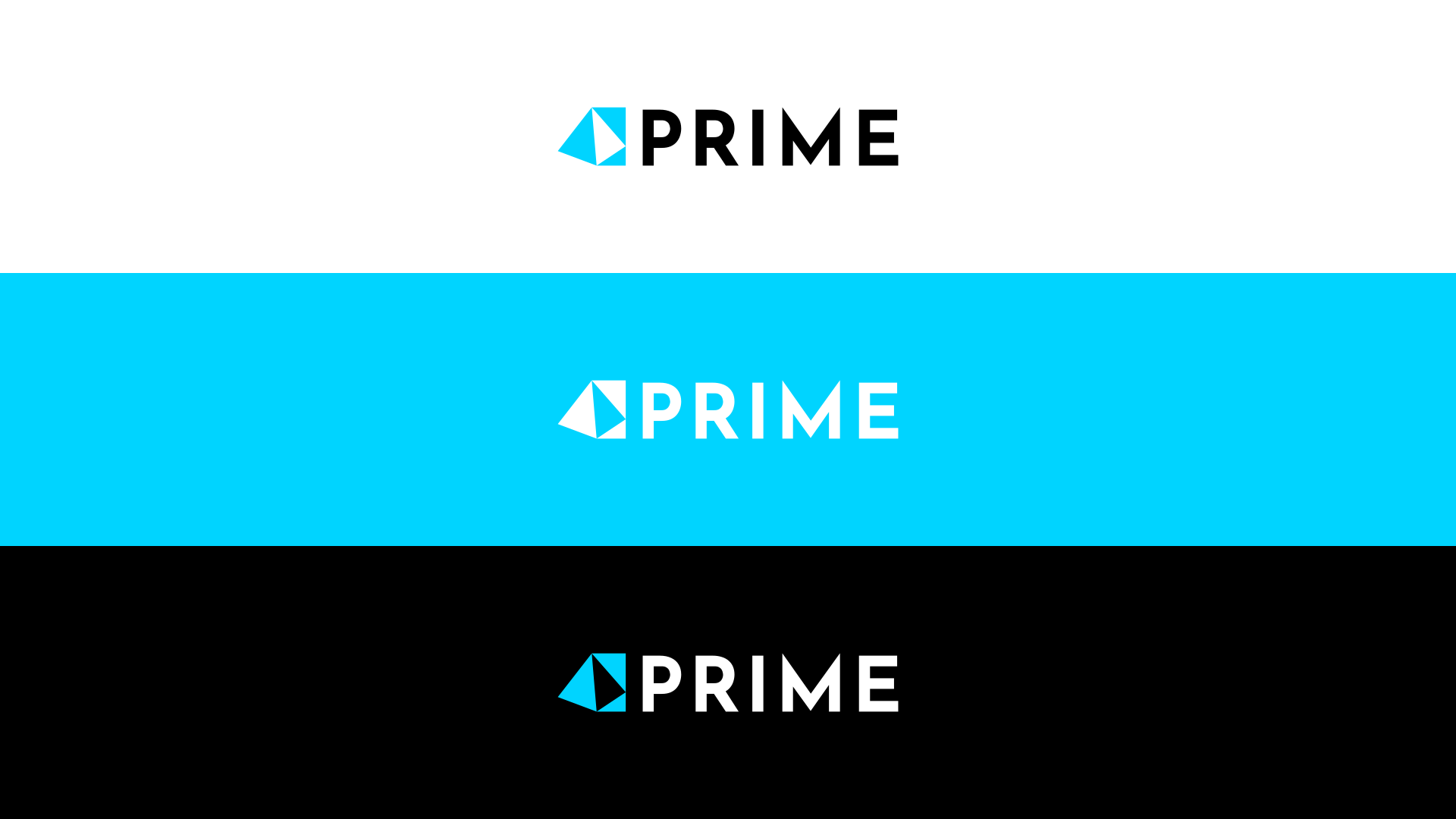
This brings me to my main criticism. The font. It is anything but righteous. It hurts to look at. I am assuming it is a free font from somewhere? The weights and stresses are all over the place and the transitions between curves and straights are too abrupt. They interrupt the smooth continuation of line, leaving a visual bulge. Look at the right hand side of the m. And… that lower case r needs shooting.

I know none of this is directly your fault, but you chose it. My advice would be to tweak it, or change it altogether. That kind of, unharmonious and disjointed is not something you really want associated with any product or service.

There are so many similar well-constructed, well-drawn geometric fonts out there.

OK, I just went and looked up Righteous font and it is, of course, a freebie – albeit, a marginally higher calibre of freebie; it made it to Google Fonts. Ironically, it too, has a worthy rationale, but the end result is flawed.

‘Righteous was initially inspired by the all capitals letterforms from the deco posters of Hungarian artist Robert Berény for Modiano.’

Suitably lofty, but unfortunately, rather than being inspired by and improving upon, it has copied, verbatim, the flaws in the original lettering and in many cases, exacerbated them.

Not what you wanted to hear, I’m sure, but I hope it helps on some way, all the same.

2 Likes

I was wondering what’s the “replying…” popping in and out all about, LOL. Thanks for sharing your thoughts. So, are you saying that the font needs to have no sharp edges at all?

No, that is definitely not what I’m saying. It is about where straight lines transition to curves. In cheap/free fonts, this is often one of the common faults. (along with vertical vs horizontal line weights). They are often, as in this case, too abrupt and the create a visual bulge, where it is not done well.

1 Like

This made me snorkle my morning coffee, I’m laughing so hard. It’s not a pretty look, but I enjoyed that.

If, as a designer, one cannot pick out the flaws of a poorly drawn typeface…one has to wonder…

1 Like

We aimz t’ pleez!

1 Like

Turn that r on its side, and it becomes its own pistol.

image

@Unlimiter, there’s much to like about the logo at first glance. It’s simple, clean, and compact. The weight of the logo is in harmony with the weight of the logotype. All things considered, when I first saw it, I liked it.

On closer inspection, though, it’s full of problems.

As already mentioned, the typeface has flaws.

The word prime means first, foremost, or best, suggesting some interesting possibilities for a logo. However, you’ve chosen a mountain, which seems unrelated and chosen for no immediately apparent reason. Besides, there are lots of mountain-in-circle logos. A Google search turns up hundreds.

As Sprout mentioned, your reasoning seems “back-painted” and made up to provide a rationale for your choices. Even if the mountain is symbolic of the language’ size (whatever that means), this connection won’t be apparent to anyone unless you’re there to explain it to them.

You wrote, “Its round shape represents the language’s sweet and convenient syntax.” Seriously? Come on. That’s a bunch of malarkey you made up to draw a concocted metaphor so broad that the statement could apply to any round shape used in connection with anything else.

As for the red representing “passion,” OK, yeah, red is passionate, but again, one could use that logic to justify coloring anything red.

3 Likes

Could you give me an example of a font that doesn’t have this problem?

How about this:

prime

Clearer, more relevant thinking, than trying to emote your own feelings towards it. I assume ‘pinnacle’ is where you were going? Possibly a little simplistic and generic now.

However, the first thing I saw was, off-kilter HSBC. Font is much better, though the kerning could do with some tiny tweaking. Not a huge amount, just fiddling.

Overall, there is something that doesn’t quite work with the horizontal asymmetry. It is fine on the left, but with the block and negative space on the right half, it creates some tensions.

It is much better that the first incarnation. I like the way the pyramid shape is emulated in reverse with the deep cap M. Maybe you could explore that further?

However, those are my thoughts only on the aesthetics. As to its effectiveness and the job it has to do, I can’t get ‘bank’ out of my head because of the similarities, as I mentioned, with HSBC. Perhaps a colour change would be enough. That red doesn’t necessarily feel right for a new, approachable programming language. I think the colour itself is lovely, but, perhaps not for this. It feels a bit conservative (as much as red can), leaning towards being a little claret, velvet and gentleman’s club feel. It is not quite a bright, primary, exciting red. It falls between the two stools. As I say, it’s a really nice red and works well with the black and white, but for this application…?

Maybe try an orange? This would help alleviate the bank connotation too. That may just be me. Other people here my not see it so strongly, but if I do, you can be sure others will once it is out in the wild.

Also, I think you may need to speak more about what it does. If it is a language – from what I have understood – that is less complex and has a more ‘building block’ approach to its construction, then this could be something to explore which goes in the direction you seem to be headed now. Just a thought.

I think you are going the right way, but you still need to dig a bit deeper.

Getting there. Good luck.

2 Likes

Changelog:

  • Added horizontal balance to the logo
  • Added slight font kerning
  • Changed the red to neon blue to represent futurism
  • Added a slogan

@Unlimiter, I’ve combined your three topics on the same subject into one single topic. The forum rules prohibit creating duplicate topics.

I like your more recent attempts at the logo much better than the first. They preserve what worked in your first examples (clean, simple, solid, straightforward) and improved what wasn’t working.

The typography is much better. I’m still a little confused about the relationship between the logo (a pyramid) and the word prime. However, I suppose there’s a connection if the pyramid also suggests pinnacle or apex. I like how the pyramid repeats the shape of the M in prime.

Colors are often subjective, so take my feelings on cyan with a grain of salt. Blue is nice, but cyan is a weak, impotent blue that’s passive and calming. It’s a nice color for a hospital, but for a programming language where you previously expressed the desire to use a passionate red, the color is a pretty big shift away from that.

I’m unsure about the “Type the future” tagline, though. Wouldn’t “Code the future” or something along those lines be a little more apropos?

Despite any remaining reservations I might have, they’re mostly limited to my personal subjective opinions at this point. What you’ve done is really pretty good. I like it.

1 Like

Thanks, all. Where can I read the site rules?

The Forum rules.

1 Like

I did a mistake by choosing red as the logo’s color. It reflected my feelings, where it should’ve reflected the user’s: trust and comfort.

As for “Code the future”, it did come to my head, but I thought it was a little too generic. Plus, the word “type” has to do with the text cursor of the previous design, where a pyramid appears to be typed, and it stuck in my head.

BTW, the cyan is supposed to look brighter:

That blue band is hard on the eyes.

1 Like

Nor is it reproducible in CMYK.

image

1 Like

That would also go for the blue in the logo so

1 Like

Yeah. I shouldn’t make the cyan dominant.